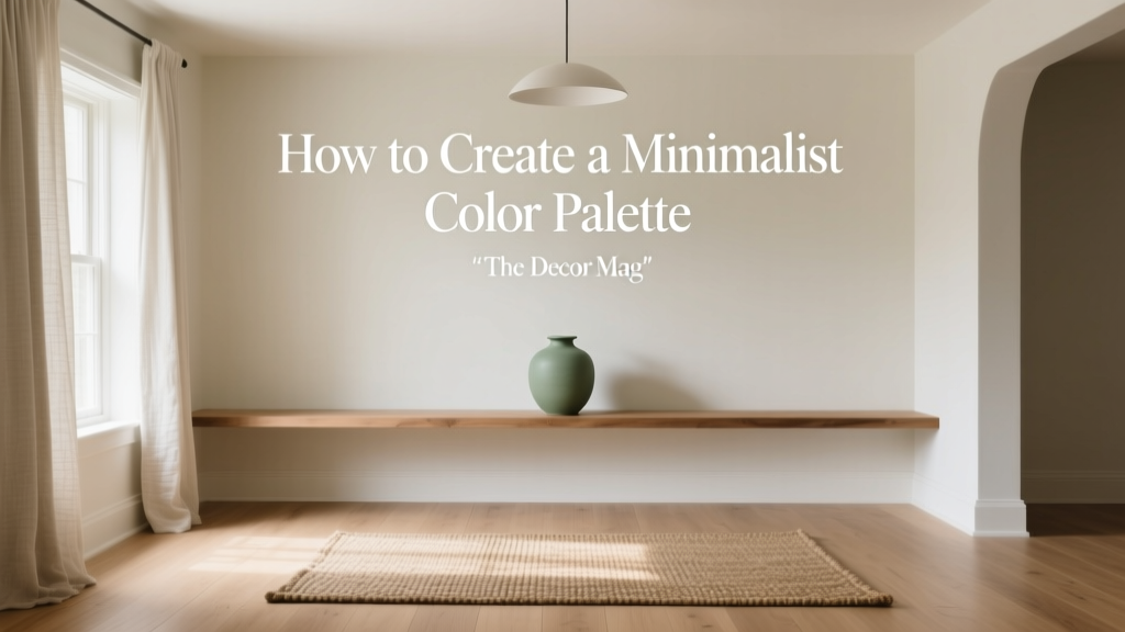
How to Create a Minimalist Color Palette - The Decor Mag
Minimalist interiors look effortless when the color palette is doing the heavy lifting. The right minimalist color scheme can make a home feel calmer, brighter, and more intentional—without relying on constant styling or clutter-free perfection. When color choices are edited and cohesive, furniture, architecture, and light become the “decor,” and the entire space reads as curated rather than sparse.
Minimalism isn’t the absence of color; it’s the discipline of choosing fewer colors and using them better. A thoughtful minimalist paint palette reduces visual noise, supports good flow from room to room, and creates a backdrop that works with everyday life (kids, pets, changing seasons, and evolving tastes). With a few design principles—and a handful of reliable paint colors—you can build a minimalist palette that still feels warm, personal, and livable.
This guide breaks down how to create a minimalist color palette using color theory, color psychology, and real-world application scenarios, with specific paint recommendations you can sample today.
What Makes a Color Palette “Minimalist”?
A minimalist color palette is defined less by the colors themselves and more by the structure: limited hues, controlled contrast, and consistent undertones. The goal is visual clarity—where nothing feels random or competing.
Core traits of a minimalist color scheme
- Fewer hues: Typically 2–5 colors used repeatedly.
- Subtle contrast: Contrast comes from value (light/dark), texture, and sheen rather than lots of different colors.
- Undertone consistency: Warm-with-warm or cool-with-cool is easier to keep clean and cohesive.
- Intentional repetition: The same whites/neutrals appear across walls, trim, ceilings, and adjacent rooms for flow.
Minimalist color psychology: why it feels calming
From a color psychology standpoint, minimalist palettes tend to rely on low-saturation colors (soft whites, warm grays, taupes, muted greens). Lower saturation reduces stimulation, helping rooms feel restful. Consistent undertones create predictability, which reads as “order” in the brain—one reason minimalist spaces often feel soothing even when they’re simple.
Start with Your Non-Negotiables: Light, Fixed Finishes, and Lifestyle
Paint is flexible; your flooring, countertops, large upholstery pieces, and natural light are not. Minimalist interior color design works best when you choose paint to support what already exists.
1) Evaluate natural light (north, south, east, west)
- North-facing rooms: Cooler, flatter light. Warm whites and greiges help counteract a chilly cast.
- South-facing rooms: Warm, abundant light. You can handle cooler whites or soft grays without feeling cold.
- East-facing rooms: Bright mornings, softer afternoons. Balanced neutrals perform well.
- West-facing rooms: Warmer afternoon light can intensify creamy tones; test samples to avoid “too yellow.”
2) Match undertones to fixed finishes
Minimalism can fall apart when undertones fight each other—like a pink-beige wall next to a green-gray tile. Identify whether your fixed elements lean warm (golden oak, travertine, cream) or cool (blue-gray tile, marble with cool veining, espresso floors).
3) Consider lifestyle and maintenance
- Busy households: Mid-tone neutrals and washable finishes are forgiving.
- Minimal decor lovers: Softer, warmer whites prevent rooms from feeling stark.
- Art collectors: Neutral walls with controlled contrast help artwork stand out.
The Minimalist Palette Formula (That Designers Actually Use)
A dependable minimalist paint palette can be built with a simple structure. Think in roles, not just colors.
A practical 5-part palette
- Primary wall color (60–70%): A white, off-white, or light neutral.
- Secondary color (15–25%): Slightly deeper neutral for depth (an adjacent room, built-ins, or a feature wall).
- Accent color (5–10%): Muted, nature-inspired color used sparingly (pillows, one painted piece, a powder room).
- Trim/ceiling color: Often a cleaner white or the same color in a different sheen for a seamless look.
- Dark anchor: A small amount of near-black or deep charcoal (hardware, lighting, a frame) to sharpen the palette.
Minimalist contrast: value over variety
Instead of adding more colors, add contrast through:
- Value shifts: Pair a soft white wall with a medium greige cabinet and a charcoal accent.
- Texture: Linen, boucle, raw wood, plaster, matte ceramics.
- Sheen changes: Matte walls + satin trim creates definition without new color.
Reliable Minimalist Paint Colors (With Brand References)
These paint colors are popular among designers because they’re versatile, subtle, and workable across many lighting conditions. Always sample first—undertones can shift dramatically from screen to wall.
Whites and off-whites for minimalist walls
- Benjamin Moore White Dove (OC-17): A soft, warm white that reads calm and lived-in, not stark. Great for open plans.
- Sherwin-Williams Alabaster (SW 7008): Creamy but not overly yellow; flattering in bedrooms and living rooms.
- Benjamin Moore Chantilly Lace (OC-65): A crisp, clean white for modern minimalism and bright spaces.
- Farrow & Ball School House White (No. 291): A gently muted off-white with depth; lovely in heritage homes and softer minimal looks.
Greige, taupe, and light neutrals for warmth and depth
- Benjamin Moore Pale Oak (OC-20): A light greige that feels airy; pairs beautifully with oak floors and warm metals.
- Sherwin-Williams Agreeable Gray (SW 7029): A balanced greige that’s easy to use for whole-home continuity.
- Benjamin Moore Edgecomb Gray (HC-173): A warm neutral that reads sophisticated and soft, especially in hallways and kitchens.
- Farrow & Ball Ammonite (No. 274): A quiet, modern neutral that leans slightly cool—excellent with stone and concrete finishes.
Muted accent colors that still feel minimalist
- Benjamin Moore Healing Aloe (1562): A gentle blue-green that works as a whispery accent in bathrooms or bedrooms.
- Sherwin-Williams Evergreen Fog (SW 9130): A muted green-gray that adds sophistication without overpowering.
- Benjamin Moore Boothbay Gray (HC-165): A calm blue-gray for a minimalist office or laundry room cabinetry.
- Farrow & Ball Pigeon (No. 25): A complex blue-green gray—beautiful on built-ins or a front door for subtle character.
Dark anchors for definition
- Benjamin Moore Wrought Iron (2124-10): A soft charcoal-black that feels velvety rather than harsh.
- Sherwin-Williams Iron Ore (SW 7069): A deep charcoal with warmth; great for doors, railings, or a kitchen island.
- Farrow & Ball Railings (No. 31): A moody near-black with blue undertones; striking in small doses.
Minimalist Color Combinations You Can Copy
These combinations are built around undertone harmony and controlled contrast—two essentials for minimalist interior color design.
1) Warm minimalism (inviting, soft, timeless)
- Walls: Benjamin Moore White Dove (OC-17)
- Secondary neutral: Benjamin Moore Pale Oak (OC-20)
- Accent: Sherwin-Williams Evergreen Fog (SW 9130)
- Anchor: Sherwin-Williams Iron Ore (SW 7069)
Best for: Homes with warm wood floors, brass accents, and cozy textiles.
2) Modern crisp minimalism (bright, clean, gallery-like)
- Walls: Benjamin Moore Chantilly Lace (OC-65)
- Secondary neutral: Farrow & Ball Ammonite (No. 274)
- Accent: Benjamin Moore Boothbay Gray (HC-165)
- Anchor: Benjamin Moore Wrought Iron (2124-10)
Best for: Contemporary architecture, lots of daylight, black window frames, and streamlined furniture.
3) Earthy minimalism (grounded, natural, serene)
- Walls: Sherwin-Williams Alabaster (SW 7008)
- Secondary neutral: Benjamin Moore Edgecomb Gray (HC-173)
- Accent: Benjamin Moore Healing Aloe (1562)
- Anchor: Farrow & Ball Railings (No. 31)
Best for: Stone countertops, clay/ceramic decor, rattan, and linen upholstery.
Real Room Examples: How to Apply a Minimalist Color Palette
Open-plan living + dining: create flow without boredom
Scenario: You want a cohesive look across connected spaces but still need definition.
- Use one wall color throughout: Try Benjamin Moore White Dove in a matte or eggshell finish.
- Define zones with the secondary neutral: Paint built-ins or a dining nook in Benjamin Moore Pale Oak.
- Repeat the anchor: Blackened hardware, picture frames, or a charcoal rug (echoing Iron Ore) adds structure.
Tip: Keep ceilings the same white as trim to simplify sightlines. Minimalism thrives on fewer transitions.
Kitchen: minimalist doesn’t have to mean all-white
Scenario: You want a light kitchen but worry pure white will feel sterile.
- Walls: Sherwin-Williams Alabaster for warmth.
- Cabinets: Keep uppers light (Alabaster or a clean white) and use a muted accent on lowers (Evergreen Fog) for a calm, modern contrast.
- Anchor: Choose Iron Ore for island stools, pendants, or window trim to sharpen the palette.
Tip: Use matte or satin cabinetry finishes for a soft look; high gloss can feel busy in minimalist color schemes.
Bedroom: use low-contrast layers for a restful feel
Scenario: You want a soothing bedroom color scheme that doesn’t read “gray and cold.”
- Walls: Benjamin Moore Pale Oak (soft, cocooning greige).
- Trim: Benjamin Moore White Dove for a gentle transition.
- Accent: Healing Aloe in linens, art, or a single painted nightstand.
Tip: Keep contrast low (light walls, light bedding, medium wood). Add interest through texture—linen curtains, wool throws, and matte ceramics.
Bathroom: a perfect place for a bolder minimalist accent
Scenario: You want personality without turning the whole house into a color experiment.
- Walls: Farrow & Ball School House White for softness.
- Vanity: Farrow & Ball Pigeon for depth.
- Anchor: Matte black faucet and mirror frame.
Tip: Bathrooms often have cooler light and tile. Test warm whites to keep skin tones flattering.
Finish and Sheen: The Minimalist Secret Weapon
In minimalist interior color design, sheen is part of the palette. You can use the same paint color in multiple finishes to create subtle dimension.
- Walls: Matte or eggshell for a soft, modern surface that hides minor imperfections.
- Trim and doors: Satin or semi-gloss for cleanability and crisp definition.
- Ceilings: Flat ceiling paint to reduce glare and keep attention on the space, not the shine.
Common Minimalist Color Mistakes (and How to Fix Them)
1) Choosing whites without checking undertones
Problem: A “clean white” looks blue in one room and yellow in another.
Fix: Compare 2–3 whites on the same wall (large sample swatches). Look at them morning, afternoon, and night.
2) Using too many neutrals that don’t relate
Problem: Beige, gray, and greige all show up, but the home feels muddy.
Fix: Pick one neutral family (warm or cool) and repeat it. Use value shifts (lighter/darker) for variety.
3) Ignoring the color of the light bulbs
Problem: Your minimalist paint palette feels dingy or overly yellow at night.
Fix: Aim for consistent bulbs, typically 2700K–3000K for warm, home-friendly light. Keep it consistent across adjacent spaces for better flow.
4) Going too stark and losing warmth
Problem: Bright white everywhere reads clinical.
Fix: Add warmth with a creamy off-white (Alabaster, White Dove) and natural materials (oak, linen, leather). Minimalism looks best when it feels human.
5) Overdoing accent colors
Problem: The “accent” becomes the main event and the palette stops feeling minimalist.
Fix: Keep accents to one or two moments per room. If you love color, choose one muted hue (like a green-gray) and repeat it lightly throughout the home.
Actionable Steps: Build Your Minimalist Color Palette This Week
- Photograph your fixed finishes (flooring, counters, tile) in natural daylight.
- Choose your undertone direction: warm, cool, or balanced (most beginners succeed with warm or balanced).
- Pick one main wall color and commit to it for most of the home to create flow.
- Select a secondary neutral one step deeper for built-ins, a hallway, or a bedroom.
- Add one muted accent (green-gray, blue-gray, or clay-leaning neutral) for controlled personality.
- Choose a dark anchor for contrast—lighting, hardware, or a single door color.
- Test large samples (at least 12"x12" or larger) and view them in multiple lighting conditions.
FAQ: Minimalist Paint Colors and Color Schemes
What is the best minimalist wall color for an open floor plan?
A soft, versatile off-white is usually the easiest: Benjamin Moore White Dove (OC-17) or Sherwin-Williams Alabaster (SW 7008). They create continuity while still feeling warm and welcoming.
How many colors should a minimalist palette have?
Most minimalist color schemes work best with 2–5 colors total, including whites and neutrals. Think one main wall color, one secondary neutral, one accent, plus trim and a dark anchor.
Can minimalist interiors use beige, or is it all gray and white?
Beige can be beautifully minimalist—often more inviting than cool gray. Look for modern beiges and greiges like Benjamin Moore Pale Oak (OC-20) or Edgecomb Gray (HC-173).
What’s the difference between warm white and cool white paint?
Warm whites lean creamy, soft, or slightly yellow/red (cozier, flattering). Cool whites lean blue/gray (crisper, modern). The right choice depends on your light exposure and fixed finishes.
How do I keep a minimalist palette from looking flat?
Use value contrast (light walls, medium textiles, a few dark accents), add texture (linen, wood, wool), and vary sheen (matte walls + satin trim). Minimalism looks rich when materials do the talking.
Should trim match the walls in a minimalist home?
Both work. Matching trim to walls (same color, different sheen) creates a seamless minimalist look. Using a slightly cleaner white on trim adds crisp structure—especially with higher ceilings or detailed millwork.
Next Steps: Make Minimalism Feel Like You
Choose one main paint color you can use broadly, then build your minimalist color palette with a supporting neutral, a muted accent, and a dark anchor. Keep undertones consistent, rely on texture for depth, and sample paint colors in your actual lighting before committing.
For more paint color ideas, whole-home color schemes, and room-by-room guidance, explore additional color guides on thedecormag.com.
More Articles
 Best Neutral Paint Colors for Every Room - The Decor Mag
 Best Avocado Green Paint Colors - The Decor Mag
 How to Create a Grounded Color Palette - The Decor Mag
 Best Red Paint Colors for Drama and Warmth - The Decor Mag
 Best Tomato Red Paint Colors - The Decor Mag
 How to Use Muted Colors for Sophistication - The Decor Mag
 How to Create a High Contrast Color Scheme - The Decor Mag
 Best Lemon Paint Colors - The Decor Mag
 Best Apple Green Paint Colors - The Decor Mag
 Best Sage Green Paint Colors for Serenity - The Decor Mag