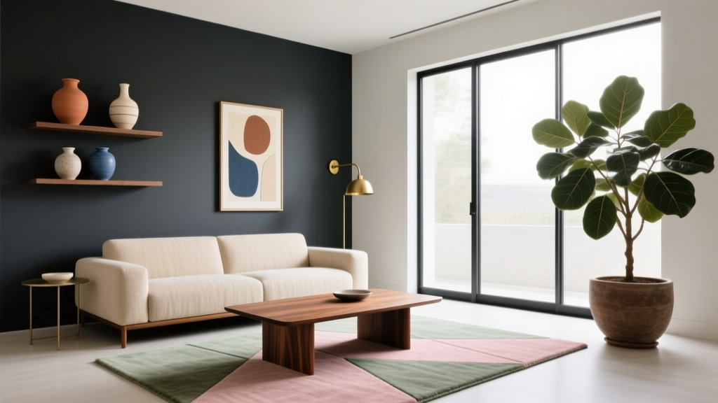
Best Color Palettes for Contemporary Living Rooms (2026)
A contemporary living room works hardest in the home. It’s where you unwind after work, host friends, take video calls, and—if you’re like many homeowners and renters—store a few everyday realities in plain sight. Color is what pulls all of that into a space that feels intentional rather than accidental.
The right living room color palette can make a compact apartment feel calmer and larger, help an open-plan layout feel more defined, and instantly elevate basic furniture into something that looks curated. In this guide, you’ll find the best modern color palettes for contemporary living rooms, plus practical tips for choosing paint, layering neutrals, adding contrast, and getting the look on a real-world budget.
Expect specific paint-direction guidance, finish recommendations, common mistakes to avoid, and easy, step-by-step ways to test colors before committing—whether you’re refreshing a rental-friendly space or designing a forever home.
What Makes a Color Palette “Contemporary”?
Contemporary design is about what feels current while staying livable—clean lines, thoughtful negative space, and a balanced mix of textures. When it comes to color palettes, contemporary living rooms typically share a few traits:
- Grounded neutrals (warm whites, greige, taupe, charcoal) as the base
- Controlled contrast (black accents, deep moody tones, or high-contrast trim)
- One to two accent colors used deliberately (not scattered everywhere)
- Texture doing some of the “color work”: bouclé, linen, wool, leather, wood grain, metal finishes
The 60-30-10 Rule (A Modern Version)
This classic guideline is still one of the easiest ways to create a cohesive living room color scheme:
- 60% base color (walls + large rug or sectional)
- 30% secondary color (curtains, chairs, large decor pieces)
- 10% accent color (pillows, art, a throw, styling objects)
For contemporary spaces, the “10%” can be a bold color or a strong material (black metal, walnut, polished nickel) that reads like a color from across the room.
How to Choose the Right Palette for Your Living Room
Start With Fixed Elements
Before you fall in love with paint swatches, look at what isn’t changing:
- Flooring (oak, espresso, gray LVP, tile)
- Upholstery you’re keeping (a beige sofa leans warm; a true gray leans cool)
- Large casegoods (TV console, built-ins)
- Stone or brick (fireplace surround, exposed brick, countertops in open-plan homes)
Read Your Natural Light
Light changes everything. As a simple cheat sheet:
- North-facing rooms often look cooler—warm neutrals (creamy whites, warm greige) feel more inviting.
- South-facing rooms get strong light—soft whites and muted colors stay stable and don’t wash out.
- East-facing rooms have bright mornings, softer afternoons—balanced neutrals perform well.
- West-facing rooms can go golden late day—avoid overly yellow beiges; choose grounded taupes or soft warm whites.
Paint Finish Recommendations
- Walls: matte or eggshell for most living rooms (eggshell is more wipeable)
- Trim: satin or semi-gloss for crisp, clean edges
- Ceiling: flat white to minimize glare
Rental tip: If painting isn’t allowed, use the palette on a large rug (at least 8' x 10' for most seating arrangements) and window treatments to set the tone.
8 Best Color Palettes for Contemporary Living Rooms
1) Warm White + Natural Oak + Soft Black (Modern Organic)
This is the go-to contemporary palette for a calm, elevated look. It blends timeless neutrals with just enough contrast to feel modern.
- Base: warm white walls
- Secondary: natural wood tones (oak, ash, light walnut)
- Accent: soft black (matte metal, picture frames, lighting)
Real-world scenario: A renter with white walls can still achieve this by adding an oak-toned coffee table, a textured ivory rug, and black curtain rods.
Product-style recommendations:
- Textured ivory rug (wool or wool-blend for longevity)
- Oak or oak-look console (choose a matte finish for a contemporary feel)
- Matte black floor lamp with a linen shade
Budget range: $400–$2,500 depending on rug size/material and whether wood pieces are solid or veneer.
2) Greige + Charcoal + Crisp White (Clean and Architectural)
Greige (a gray-beige hybrid) is a contemporary staple because it adapts to warm and cool furnishings without feeling flat.
- Base: greige walls or a greige sectional
- Secondary: charcoal in a media console, accent chair, or rug pattern
- Accent: crisp white in trim, pillows, or art mats
Design tip: Keep undertones consistent. If your greige leans warm, choose a warm white (not stark blue-white).
Budget range: $300–$1,800 for a refresh focused on paint + textiles + lighting.
3) Beige + Cream + Camel Leather (Soft Contemporary Luxe)
If you want a contemporary living room that feels welcoming (not sterile), this layered neutral palette delivers. Camel leather adds warmth and sophistication.
- Base: beige walls or a cream sofa
- Secondary: camel leather (chair, ottoman, or pillows)
- Accent: brushed brass or antique gold hardware/lighting
Material recommendations:
- Choose top-grain leather if possible for better aging; faux leather works for rentals and kids’ spaces
- Use linen or a linen-blend for curtains to keep the palette airy
Budget range: $800–$4,000 (leather is the biggest variable).
4) Soft White + Sage Green + Light Wood (Fresh, Calm, Trend-Forward)
Sage green remains a favorite in modern living room design because it reads as neutral while adding personality. It pairs beautifully with light wood and warm whites.
- Base: soft white walls
- Secondary: sage green (accent wall, sofa, or drapery)
- Accent: black or bronze accents to sharpen the look
Step-by-step: If you’re unsure about green, start small:
- Add two sage pillows and a throw.
- Introduce one large sage element (an accent chair or curtain panels).
- Only then decide on paint for an accent wall or built-ins.
Budget range: $150–$1,200 for a renter-friendly upgrade using textiles and decor.
5) Warm White + Terracotta + Clay (Earthy Contemporary)
Terracotta and clay tones are having a moment, and they also feel timeless when used in muted, natural shades. They’re especially flattering with warm lighting and textured materials.
- Base: warm white or creamy walls
- Secondary: terracotta in pillows, art, or a statement chair
- Accent: clay, rust, and natural fibers (jute, sisal, woven shades)
Real-world scenario: An open-plan apartment with a basic gray sofa can feel intentional with terracotta pillows, a cream rug, and a large abstract print featuring warm earth tones.
Budget range: $200–$1,500 depending on rug choice and artwork size.
6) Navy + Warm White + Walnut (Classic Meets Contemporary)
Navy is a powerful contemporary color that feels grounded and elegant. Paired with walnut and warm white, it becomes timeless rather than trendy.
- Base: warm white walls
- Secondary: navy (accent wall, built-ins, or a sofa)
- Accent: walnut wood + brass details
Placement tip: If you choose a navy accent wall, use it where your eye naturally rests—behind the sofa or fireplace wall. Keep adjacent walls light to avoid shrinking the room.
Budget range: $400–$3,500 (navy upholstery or custom drapery increases cost).
7) Charcoal + Taupe + Black (Moody Minimalist)
Moody living rooms can still feel contemporary and inviting if you balance deep colors with warm neutrals and tactile textiles.
- Base: taupe or warm gray walls
- Secondary: charcoal in a rug or sofa
- Accent: black in lighting, frames, and small decor
Make it livable:
- Layer lighting: floor lamp + table lamp + overhead (aim for 2,700K warm bulbs)
- Add texture: bouclé pillows, wool throws, slubby linen curtains
Budget range: $300–$2,000 for textiles and lighting updates that change the mood fast.
8) Soft Gray + Blush + Brass (Modern Soft Glam)
Blush has evolved into a sophisticated contemporary accent—less “pink room,” more warm neutral with a flattering glow. It works especially well in apartments with cooler light.
- Base: soft gray (not icy) walls or a gray sofa
- Secondary: blush accents in pillows, art, or an ottoman
- Accent: brass or champagne metal finishes
Design tip: Keep blush muted and grown-up by pairing it with stone, marble-look surfaces, or black accents for contrast.
Budget range: $150–$1,500 depending on lighting and decor upgrades.
Practical Color-Planning Tips (That Make Any Palette Look Better)
Get the Rug Size Right
Rug sizing is a quiet make-or-break detail in contemporary living room decor:
- Small living rooms: start with 8' x 10' if possible
- Larger rooms/sectionals: 9' x 12' often looks best
- At minimum, the front legs of the sofa and chairs should sit on the rug
Use Curtains to “Tint” the Room
- Hang curtain rods 4–8 inches above the window frame (or just below the ceiling for height)
- Extend the rod 6–12 inches past each side so the fabric stacks off the glass
- Choose linen or linen-blends in warm white, oatmeal, or soft gray for a contemporary look
Balance Hard and Soft Materials
To keep contemporary color palettes from feeling flat, layer materials:
- Soft: boucle, wool, cotton, linen
- Hard: wood, stone, glass, metal
- Natural: rattan, jute, ceramic, travertine-look accessories
Common Mistakes to Avoid
- Choosing paint first. It’s easier to match paint to a rug/sofa than the other way around.
- Ignoring undertones. A warm beige next to a cool gray can look “off” even if both are neutrals.
- Overusing accent colors. Contemporary rooms look best when bold color appears in a few larger moments, not 12 small ones.
- Forgetting lighting temperature. Cool bulbs (4,000K+) can make warm palettes feel dull; aim for 2,700K–3,000K in living rooms.
- Using too many whites. Mixing three different whites (ceiling, trim, walls) without intention can look messy. Keep whites coordinated.
- Skipping test samples. A color that looks perfect online can shift dramatically in your room’s light.
A Simple Step-by-Step Plan to Build Your Living Room Color Palette
- Pick one anchor item you love: rug, sofa, or a large art piece.
- Identify two neutrals within it (example: warm white + taupe).
- Add one contrast element (black, charcoal, navy, or dark walnut).
- Choose one accent color (sage, terracotta, blush, etc.).
- Repeat each color at least twice around the room (pillows + art, vase + throw) for cohesion.
- Finalize paint last using sample boards viewed morning, afternoon, and night.
FAQ: Contemporary Living Room Color Palettes
What is the best neutral paint color for a contemporary living room?
The most flexible choices are warm whites and greige tones because they work with both warm and cool decor. If your room gets cooler light (north-facing), lean warmer; if it gets lots of sun, you can handle cleaner whites and soft grays.
How many colors should I use in a contemporary living room?
A reliable formula is 3–5 total: two neutrals, one deeper contrast, and one accent (plus metal/wood finishes acting as supporting “colors”). More than that can look busy unless you’re very intentional.
Are gray living rooms still in style?
Yes—when the gray is softened (warm gray, greige) and paired with texture and warm materials like oak, walnut, leather, and linen. Flat, icy gray-on-gray rooms are what feel dated.
What accent colors work best with a beige or cream living room?
Sage green, terracotta, navy, charcoal, and muted blush all pair beautifully with beige/cream. Choose based on your preferred mood: earthy (terracotta), calm (sage), bold (navy), or moody (charcoal).
How can renters update a living room color palette without painting?
Focus on the “big visual surfaces”: a properly sized rug, curtain panels, pillows, throws, and large art. Add cohesion with matching hardware finishes (like matte black or brass) in lamps, frames, and decor.
What’s the easiest way to test paint colors accurately?
Use large sample swatches or paint sample boards (at least 12" x 12"), and check them on multiple walls at different times of day. Your light and surrounding finishes will shift the color more than you expect.
Next Steps: Choose Your Palette and Make It Real
Pick one of the palettes above that matches your natural light and your existing furniture, then commit to it with the biggest impact pieces first: a well-sized rug, consistent window treatments, and layered lighting. Once those are in place, your paint and accents become much easier—and your contemporary living room will feel pulled together instead of piecemeal.
For more modern living room ideas, color guides, and decor inspiration tailored to real homes and apartments, explore the latest at thedecormag.com.
More Articles
 Checklist Alternatives to Studio Living That Fit Your Life
 Living Room Statement Piece Furniture Guide - The Decor Mag
 Best Nesting Table Arrangements - The Decor Mag
 Contemporary vs Modern Living Rooms (2026)
 Budget-Friendly Living Room Makeover Ideas - The Decor Mag
 Best Hidden Storage for Living Rooms (2026)
 Kid-Proof Living Room Furniture That Looks Chic
 Leather Furniture for Living Rooms (2026)
 Console Table Behind Sofa: Styling Ideas (2026)
 Living Room Natural Light Maximizing Tips - The Decor Mag