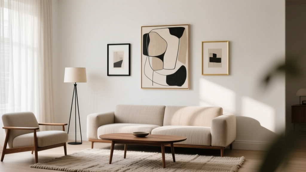
Living Room Art Placement Guide - The Decor Mag
Art is one of the fastest ways to make a living room feel finished, personal, and intentionally designed. It can pull together a color palette, balance the proportions of a large wall, soften the hard lines of a TV setup, and add the kind of layered character that furniture alone can’t provide. Yet art placement is also where many living rooms go sideways—frames hung too high, pieces that feel “floaty” above a sofa, tiny prints lost on expansive walls, or gallery walls that look more chaotic than curated.
This guide breaks down living room art placement into practical, repeatable steps. You’ll learn the ideal heights and spacing designers use, how to choose the right scale for your wall and furniture, where art works best in common living room layouts, and how to build cohesive groupings. Along the way, you’ll find real-world scenarios (renter-friendly included), common mistakes to avoid, and budget-smart product recommendations so you can create a living room design that feels elevated—but still like you.
The Core Rules of Living Room Art Placement (That Always Work)
Rule #1: Hang Art at Eye Level—But Use the Right Reference Point
The most reliable guideline for wall art height is to place the center of the artwork at 57–60 inches from the floor. This aligns with average eye level and is used in galleries for a reason: it looks natural and balanced.
- Standard height: Artwork center at 57–60 inches
- If ceilings are very high (9–12 ft): Stick to eye level; don’t “chase” the ceiling
- If people usually view the art seated (common in living rooms): You can cheat slightly lower, aiming for 55–58 inches
Rule #2: Above Furniture, the Gap Matters
When hanging art above a sofa, console, or mantel, the space between the furniture and the bottom of the frame is what makes the arrangement feel anchored rather than floating.
- Ideal gap above a sofa/console: 6–10 inches
- Ideal gap above a mantel: 4–8 inches (mantels already create separation)
- If you have tall cushions or very high-backed sofas: Aim closer to 6 inches
Rule #3: Scale the Art to the Furniture
A common living room decor mistake is choosing art that’s too small for the furniture beneath it. For a polished look, your artwork (or gallery grouping) should be about 2/3 to 3/4 the width of the sofa or console.
- 90-inch sofa: art/grouping should be roughly 60–70 inches wide
- 72-inch sofa: aim for 48–54 inches wide
- 60-inch console: aim for 40–45 inches wide
Rule #4: Keep Spacing Consistent in Groupings
Whether it’s a triptych or a full gallery wall, consistent spacing reads as intentional.
- Between frames in a set: 2–3 inches (modern and crisp)
- Between frames in an eclectic gallery wall: 2–4 inches (a little looser is okay)
- Between shelves and art leaning on them: Keep a visual “margin” of 1–2 inches around pieces so they don’t look cramped
Step-by-Step: How to Plan Art Placement Like a Designer
Step 1: Identify Your “Anchor Wall”
Most living rooms have a natural anchor wall—usually the wall behind the sofa, the fireplace wall, or the wall where the TV is mounted. Choose one primary art moment per room to avoid a scattered feel.
Step 2: Measure Your Wall and Furniture
Grab a tape measure and note:
- Wall width and height
- Sofa/console width
- Ceiling height
- Distance from furniture top to ceiling (helps determine vertical scale)
Step 3: Choose a Layout Type
Pick a format that fits your lifestyle and your room’s vibe:
- One oversized statement piece: Clean, modern, high impact
- Diptych (2 pieces) or triptych (3 pieces): Balanced and easy to hang
- Gallery wall: Personal, layered, trend-forward
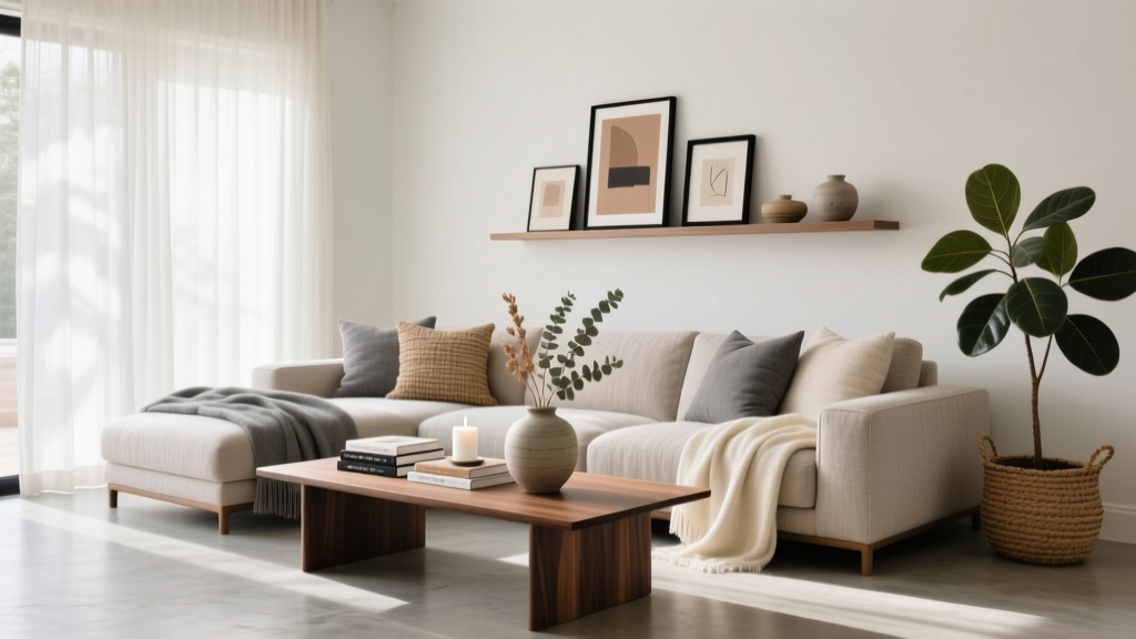
- Picture ledges: Flexible for renters and frequent refreshers
Step 4: Mock It Up Before You Commit
Two easy methods:
- Painter’s tape outline: Tape the outer edges of frames on the wall to test scale.
- Paper templates: Cut kraft paper to frame sizes, tape them up, and adjust spacing.
This step saves time, prevents extra holes, and helps you see if the composition feels centered and grounded.
Where to Hang Art in the Living Room: Placement Scenarios
Above the Sofa: The Classic Focal Point
If you want the living room to feel cohesive, start with the wall above the sofa. It’s usually the largest uninterrupted wall and naturally draws attention.
Best options:
- Oversized art: 40x60, 48x60, or 54x72 inches depending on sofa width
- Two large pieces: Two 30x40s or 24x36s side by side (keep 2–3 inches between)
- Gallery wall: Great for mixing family photos, prints, and paintings
Real-world example: A renter with an 84-inch sofa in a neutral apartment chooses two 30x40 framed prints (matte black frames, off-white mats). Hung with a 7-inch gap above the sofa and 2.5-inch spacing between frames, the wall feels intentional without needing a giant custom piece.
Above a Console Table: A Styling Power Move
Console tables are common in living room layouts—behind a floating sofa, along an entry-adjacent wall, or under a large mirror. Art above a console works best when layered with lighting and objects.
- Hang art so the bottom is 6–10 inches above the console.
- For a modern look, choose one large piece about 2/3 the console width.
- For a collected look, layer a medium piece with a small piece leaned on the console.
Trend tie-in: Warm minimalism and “quiet luxury” spaces often use one oversized, textural piece above a console—think neutral abstract art, linen-wrapped frames, or muted landscapes.
Fireplace and Mantel: Balanced, Not Top-Heavy
Art above a fireplace can look amazing, but it’s easy to overshoot the scale or hang it too high. Keep the art visually connected to the mantel and the surrounding architecture.
- Keep the bottom of the frame 4–8 inches above the mantel.
- If the fireplace wall is tall, choose a larger piece rather than pushing it upward.
- Consider a vertical piece if the fireplace opening is wide and the wall above is tall.
Real-world example: A homeowner with a traditional mantel replaces a small 16x20 print with a 36x48 framed landscape and adds two slim sconces. The larger scale instantly makes the fireplace wall feel more proportional and updated.
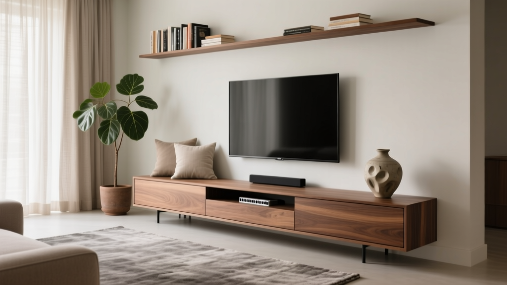
TV Wall: Making the Screen Feel Intentional
Most living rooms revolve around the TV, and you can still make the TV wall feel designed. The trick is to treat the TV as part of a composition rather than something you’re trying to hide.
- Option A: Symmetry — Place matching frames or sconces on either side of the TV.
- Option B: Asymmetry — Add a vertical stack of frames on one side and a tall plant or floor lamp on the other.
- Option C: Media wall gallery — Mix art around the TV with consistent frame finishes and spacing.
Tip: Keep artwork near the TV more subdued (simple line art, black-and-white photography, tonal abstracts) so it doesn’t compete with the screen.
Awkward Walls and Corners: Small Moves, Big Payoff
Narrow walls, corner nooks, and the space between windows often get ignored—but they’re perfect for finishing touches.
- Narrow wall: Try one vertical piece (e.g., 18x24 or 24x36) or a stacked pair.
- Corner reading chair: Hang a single piece slightly lower for a cozy, intimate feel.
- Between windows: Choose a piece that’s at least 2/3 the width of the space between trims.
Choosing the Right Art Size, Frame, and Materials
Popular Living Room Art Sizes (That Work in Real Homes)
- Small accents: 8x10, 11x14, 12x16 (best in groups or on shelves)
- Medium statement: 16x20, 18x24, 24x36 (great for narrow walls)
- Large impact: 30x40, 36x48, 40x60 (ideal above sofas and consoles)
- Oversized: 48x60, 54x72+ (best for open-plan living rooms and high ceilings)
Frame and Glazing Recommendations
- Frame finishes: Matte black (modern), light oak (Scandi/warm minimalism), walnut (mid-century), brushed brass (glam), white (coastal/airy)
- Mats: Use a 2–4 inch mat for a more elevated look, especially for photography and smaller prints.
- Glazing:
- Acrylic (plexiglass): Lightweight, safer for renters and high-traffic areas
- UV-protective glazing: Worth it for sunny living rooms or valuable pieces
- Anti-reflective glass: Great near lamps and windows (reduces glare)
Budget Ranges: What to Expect
- Printable art + basic frames: $30–$150 for a full wall moment
- Ready-made framed prints (medium to large): $80–$350 per piece
- Canvas or large-format art: $150–$700 depending on size and brand
- Custom framing: $150–$800+ (varies widely by size and materials)
Budget tip: Spend more on scale before you spend more on brand. A properly sized, thoughtfully framed piece often looks more expensive than a tiny premium print that feels lost on the wall.
Gallery Wall Guidance: How to Make It Look Curated
Pick a Unifying Element
A gallery wall feels cohesive when at least one element stays consistent:
- Same frame color (all black, all oak, all white)
- Same mat color (classic white or warm ivory)
- Same art style (photography, abstracts, line drawings)
- Same color palette (neutrals, earth tones, moody shades)
Use These Layout Templates
- Grid: Best for modern living rooms and clean lines (equal sizes, equal spacing)
- Salon-style cluster: Best for eclectic, collected spaces (mixed sizes)
- Linear row: Best for narrow walls or above a long sofa (frames aligned along top or center)
Pro Spacing and Alignment Tips
- Keep the overall gallery width at 2/3 to 3/4 of the sofa width.
- Align by centerline if frame sizes vary (it looks calmer).
- Start by placing the largest piece slightly off-center, then build outward.
Common Mistakes to Avoid
- Hanging everything too high: If your art feels disconnected from the furniture, lower it.
- Going too small: Tiny art on a big wall reads unfinished. Add scale or group pieces.
- Ignoring glare: Avoid placing glass-front art where it reflects a window or lamp directly—use anti-reflective glazing or reposition.
- Mixing frame finishes randomly: Mixing is fine; randomness isn’t. Repeat finishes intentionally (e.g., 70% black, 30% brass).
- Overcrowding a gallery wall: Leave breathing room. Negative space is part of the design.
- Not testing placement: Templates or tape take 20 minutes and prevent a weekend of patching.
Product Recommendations for Easier, Cleaner Hanging
- Picture hanging hooks (rated for weight): Choose hardware rated above the frame’s weight for safety.
- Wall anchors: Essential if you can’t hit a stud—especially for large framed art.
- Command strips (renter-friendly): Best for lightweight frames and small-to-medium pieces; always follow weight limits.
- Picture ledges: A flexible option for renters or anyone who likes to rotate art seasonally.
- Level + measuring tape: Simple tools that instantly improve results.
FAQ: Living Room Art Placement
How high should I hang art above a couch?
Aim for the bottom of the frame to sit 6–10 inches above the sofa back. If your sofa is tall, lean closer to 6 inches so it feels connected.
What size art should I use above a sofa?
Choose art (or a grouping) that’s about 2/3 to 3/4 the width of the sofa. For a 90-inch sofa, that’s roughly 60–70 inches wide.
Should living room art be centered on the wall or the furniture?
Center art on the furniture it relates to (sofa, console, mantel), not necessarily the entire wall—especially in open layouts where walls don’t visually read as symmetrical.
How far apart should frames be in a gallery wall?
Keep spacing consistent at 2–3 inches for a polished look. You can stretch to 4 inches for a more relaxed, eclectic feel, but try to stay consistent across the whole arrangement.
Can I hang art in a rental without damaging walls?
Yes. Use removable hanging strips for lightweight frames, or try picture ledges and lean frames for a layered look. For heavier pieces, small picture hooks often make less noticeable holes than big screws.
How do I decorate a living room wall with a TV and art?
Treat the TV as part of the composition: add symmetrical art on both sides, or create an asymmetrical grouping with consistent frame finishes and a calmer color palette so the wall looks intentional.
Your Next Steps: A Simple Plan for This Weekend
- Choose one anchor wall (behind the sofa, fireplace, or TV wall).
- Measure your sofa/console and aim for art that’s 2/3–3/4 the width.
- Mark your height: center at 57–60 inches, or keep the bottom 6–10 inches above furniture.
- Mock it up with tape or paper before making holes.
- Finish with lighting (a floor lamp nearby or sconces) to make the art feel like a true focal point.
Art placement is one of those living room decorating skills that pays off every single day—you feel it the moment you walk into the room. For more living room ideas, wall decor inspiration, and layout tips, explore the latest guides at thedecormag.com.
More Articles
 Living Room TV Stand Styling Tips - The Decor Mag
 Living Room Polished Casual Style - The Decor Mag
 Best Color Palettes for Contemporary Living Rooms (2026)
 Warm, Budget-Friendly Living Spaces in 2026
 Living Room Warm Minimalist Approach - The Decor Mag
 Colorguides for Living Spaces: Step-by-Step Guide 2026
 Living Room Furniture That Lasts: 2026 Picks
 Kid-Proof Living Room Furniture That Looks Chic
 Small Bedroom Ideas 2026: Smart Space-Saving Designs
 Living Room Indoor-Outdoor Flow: Summer 2026