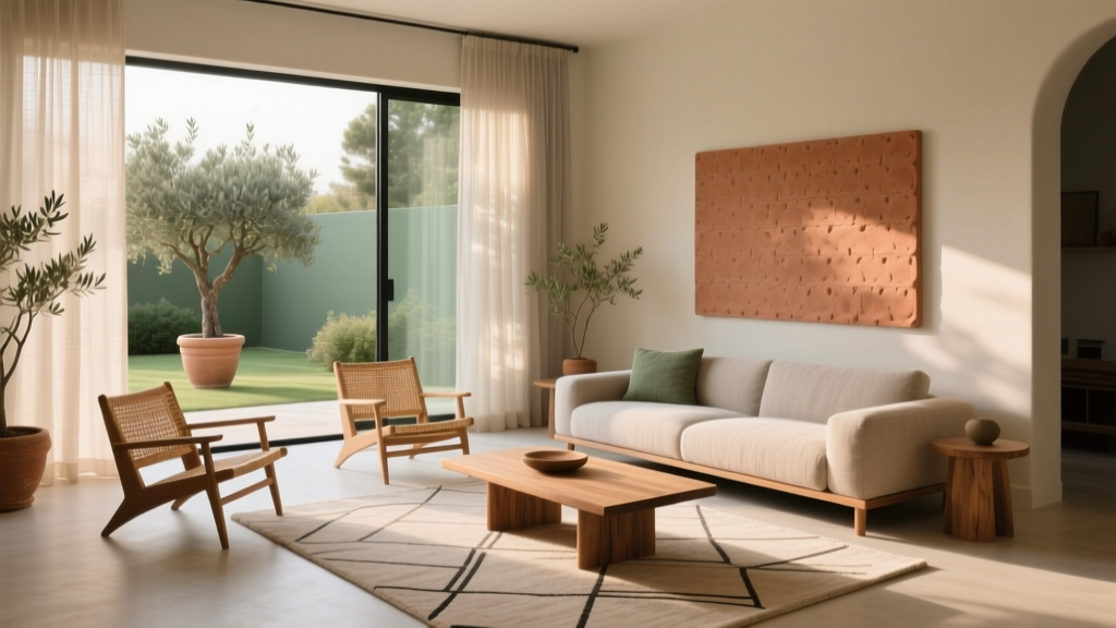
Living Room Earth Tone Color Palettes - The Decor Mag
Earth tone living rooms have a special kind of staying power. They feel grounded and calm, they flatter most architectural styles, and they’re forgiving in real life—where muddy shoes, pet hair, and everyday clutter are part of the picture. If you’ve been searching for a living room color palette that looks pulled together without feeling “done,” earth tones are one of the smartest places to start.
Earth tones aren’t just beige. Think warm clays, soft sages, mushroom grays, caramel leathers, cocoa browns, and sunbaked terracottas—colors pulled from stone, soil, wood, and plants. The right mix can make a small apartment living room feel cozier, help an open-concept space feel more defined, and add richness to a neutral scheme without committing to loud color.
This guide breaks down the best earth tone color palettes for living rooms, how to choose undertones, paint and material recommendations, and step-by-step ways to layer color through rugs, sofas, curtains, and decor. You’ll also find real-world scenarios, budget ranges, common mistakes to avoid, and a quick FAQ to help you design with confidence.
What Counts as “Earth Tones” in a Living Room?
Earth tones are colors found in nature—typically warm, muted, and slightly complex. They’re often described as “soft,” “dusty,” “sunbaked,” or “stone-like,” rather than bright or neon.
Common Earth Tone Colors (and Where They Work Best)
- Warm whites: creamy off-white, ivory, oatmeal (great for walls and ceilings)
- Tans and beiges: sand, wheat, camel (ideal for large upholstery and rugs)
- Browns: cocoa, chestnut, walnut (perfect for wood tones, leather, accent furniture)
- Clay and terracotta: rust, adobe, cinnamon (excellent for accent walls and pillows)
- Muted greens: sage, olive, eucalyptus (strong for paint, textiles, and plants)
- Muted blues: slate, dusty denim, stormy blue-gray (useful when you want earth tones with a cooler edge)
- Stone grays: mushroom, greige, warm taupe (great for modern living rooms and transitional styles)
How to Build a Balanced Earth Tone Living Room Palette
A cohesive earth tone palette is less about matching and more about layering. Use a simple framework so your living room decor feels intentional.
The 60-30-10 Rule (Earth Tone Version)
- 60% Base: walls + largest visual surfaces (paint, large rug, main sofa)
- 30% Secondary: accent chairs, curtains, key storage pieces, wood tones
- 10% Accent: throw pillows, art, table decor, small lighting details
Quick example: Warm white walls (60%), camel sofa and walnut coffee table (30%), rust pillows and black iron lamp accents (10%).
Choose Undertones First (Warm vs. Cool)
Earth tones can lean warm (cream, tan, terracotta) or cool (mushroom, olive-gray, slate). Mixing undertones is possible, but it needs a “bridge” color.
- If your floors are warm (honey oak, red oak, terracotta tile), prioritize warm whites and warm neutrals.
- If your floors are cool (gray LVP, ash wood, concrete), lean into greige, mushroom, and muted olive.
- Bridge colors: camel, taupe, and warm gray help warm and cool elements live together.
7 Earth Tone Color Palettes for Living Rooms (with Styling Recipes)
1) Warm White + Camel + Walnut (Timeless and Rental-Friendly)
This is the “always works” palette—perfect for renters who can’t paint or homeowners who want a clean, classic base.
- Walls: warm white or soft ivory
- Upholstery: camel, sand, or biscuit
- Wood tones: walnut or medium oak
- Accents: matte black, aged brass, or off-white ceramics
Product picks: camel performance-fabric sofa; walnut veneer coffee table; textured ivory rug (wool or wool-blend); linen-look curtains in oatmeal.
Budget range: $600–$1,800 for a sofa; $250–$900 for a rug (5’x8’ to 8’x10’).
2) Greige + Mushroom + Charcoal (Modern, Calm, and Architectural)
Great for modern living rooms, condos, and open plans where you want subtle contrast.
- Walls: greige with warm undertones
- Textiles: mushroom and taupe layers
- Contrast: charcoal (frames, lamps, occasional chair)
- Metals: blackened steel or brushed nickel
Real-world scenario: In a north-facing living room that feels cool, greige keeps things soft while charcoal adds depth so the space doesn’t read flat.
3) Sage + Cream + Natural Oak (Fresh, Relaxed, and Trend-Forward)
Sage green is a current favorite in living room paint trends because it reads neutral while still feeling alive.
- Walls: sage (all-over) or a single accent wall behind the sofa
- Upholstery: cream boucle, off-white performance fabric, or light beige
- Wood tones: natural oak, birch, or ash
- Accents: woven baskets, linen curtains, tonal green pillows
Material tip: Pair sage walls with a wool rug in ivory to keep the room breathable and not “too green.”
4) Terracotta + Sand + Olive (Warm, Sunbaked, and Inviting)
If you love a cozy, Mediterranean or desert-modern feel, this palette delivers warmth without looking overly orange.
- Walls: sand, warm beige, or soft white
- Hero accent: terracotta (pillows, art, a painted cabinet)
- Secondary color: olive green (throw blanket, accent chair)
- Textures: clay pottery, jute, woven leather
Budget-friendly move: Keep walls neutral and bring terracotta in through removable covers, art prints, and pillow covers (often $15–$40 each).
5) Chocolate + Cream + Brass (Moody but Still Warm)
Dark browns are returning as a sophisticated alternative to black. Used strategically, they make a living room feel elevated and cocoon-like.
- Walls: creamy off-white or warm taupe
- Anchors: chocolate brown sofa, leather chair, or dark wood media console
- Metals: aged brass (lamp bases, frames, hardware)
- Softness: plush rug and boucle/chenille pillows
Lighting note: Darker palettes need layered lighting. Plan for at least three light sources: overhead + table lamp + floor lamp.
6) Clay Pink + Oatmeal + Walnut (Soft, Warm, and Unexpected)
Clay pink isn’t pastel—it’s a dusty, earthy neutral that plays beautifully with wood.
- Walls: oatmeal, warm white, or a very subtle blush-beige
- Accents: clay pink in pillows, art, or a small ottoman
- Wood tones: walnut or dark oak
- Balance: add black accents for definition
7) Slate Blue + Taupe + Natural Textures (Earthy with a Cooler Edge)
If you prefer cooler palettes but still want the grounded look of earth tones, slate blue is your friend.
- Walls: taupe or warm gray
- Accent color: slate blue (rug pattern, curtains, artwork)
- Warmth: leather, wood, and woven textures to keep it from feeling cold
Step-by-Step: How to Apply Earth Tones in Your Living Room
Step 1: Start With the Rug Size (It Sets the Palette)
For most living rooms, the rug is the easiest way to introduce earth tones and pattern.
- 8’x10’: best for standard living rooms; front legs of all seating should sit on the rug.
- 9’x12’: ideal for larger spaces or open-concept layouts.
- 5’x8’: works in small rooms, but avoid the “floating rug” look—make sure at least the front legs of the sofa are on it.
Material recommendations:
- Wool: best for comfort and longevity
- Wool blend: great mid-range option
- Jute/sisal: budget-friendly and earthy, but can feel rough and stain more easily
Step 2: Choose a Sofa Color That Matches Your Lifestyle
- Best “hides everything”: camel, taupe, or heathered brown
- Brightens a room: cream/off-white (choose performance fabric if you have kids or pets)
- Feels cozy and rich: chocolate or cognac leather
Budget guide: $900–$2,500 for a quality sofa; $300–$800 for apartment-size options and sales.
Step 3: Layer Textures (This Is Where Earth Tones Shine)
Earth tone interiors look expensive when they’re texture-rich. Aim for 4–6 distinct textures across the room:
- Linen or linen-look curtains
- Wool or boucle pillows
- Wood (oak, walnut, rattan)
- Leather (chair, pouf, or trays)
- Ceramic or stone decor
- Metal accents (aged brass or black)
Step 4: Get Your Curtain Measurements Right
- Hang height: 4–6 inches above the window frame, or 1–2 inches below the ceiling for a taller look.
- Width: curtain rod should extend 8–12 inches beyond each side of the window so panels can stack without blocking light.
- Fullness: total panel width should be 2x the window width for a relaxed, luxe drape.
Best earth tone curtain colors: oatmeal, flax, warm white, and soft taupe.
Step 5: Add Personality with Art and Accent Decor
- Art: landscapes, abstract neutrals, botanical prints, or textured wall hangings
- Accent colors: rust, olive, ink, or charcoal—repeat the accent 2–3 times around the room
- Plants: olive tree, rubber plant, snake plant (instant earthy vibe)
Real-World Living Room Scenarios (Earth Tones That Actually Work)
Small Apartment Living Room with Beige Carpet
Instead of fighting the beige, build on it:
- Add a patterned rug (yes, layered over carpet) in taupe/ivory with a hint of rust
- Choose a compact sofa in camel or warm gray
- Use black frames and a black floor lamp to sharpen the look
- Bring in one strong accent: terracotta pillows or olive curtains
Open-Concept Living Room That Feels “Floated”
Earth tones can help define zones:
- Use a 9’x12’ rug to anchor seating
- Repeat wood tones (walnut + oak) across coffee table and shelving for continuity
- Add a warm, oversized pendant or woven shade to visually “cap” the living area
North-Facing Living Room with Low Light
Low light can make some neutrals look gloomy. The fix is warmth and reflectivity:
- Pick warm whites and creamy beiges over cool grays
- Add brass or warm metal finishes
- Choose a rug with an ivory base to bounce light
- Use bulbs around 2700K for cozy warmth (dimmable if possible)
Common Mistakes to Avoid with Earth Tone Living Rooms
- Going too matchy: If everything is the same beige, the room can feel flat. Add contrast with black, charcoal, or darker wood.
- Ignoring undertones: Mixing a pink-beige with a yellow-beige can look “off.” Bring home swatches and test near floors and upholstery.
- Forgetting texture: Earth tones need tactile variety—wool, linen, wood, leather, ceramics.
- Choosing the wrong white paint: A stark bright white can make earth tones look muddy. Warm whites are usually more flattering.
- Too many accent colors: Stick to 1–2 accent colors and repeat them. Too many “earthy” hues at once can feel busy.
FAQ: Living Room Earth Tone Color Palettes
Are earth tones still in style for living rooms?
Yes. Earth tone living rooms align with current trends like warm minimalism, organic modern design, and biophilic decor. They’re also timeless because they’re rooted in natural materials and classic neutrals.
What’s the best earth tone paint color for a living room?
A warm white, greige, or soft taupe is a reliable choice for most homes. If you want color without committing to bold paint, try a muted sage. Always test large samples in different lighting before painting the full room.
How do I make an earth tone living room look modern, not rustic?
Keep lines clean and add contrast: pair warm neutrals with black accents, choose streamlined furniture, and use oversized art. Mix in smooth materials (glass, metal) alongside wood and textiles.
What accent colors go best with earth tones?
Rust, terracotta, olive, charcoal, and slate blue are all strong choices. For a lighter look, try clay pink or soft eucalyptus green. Limit accents to one or two and repeat them around the room.
Can I mix gray with earth tones?
Absolutely—choose warm grays (greige, mushroom) rather than icy blue-grays, and bring in wood, leather, and warm metals to keep the palette balanced.
What are the best materials for an earthy living room?
Wool rugs, linen curtains, leather accents, solid wood or wood veneer furniture, ceramic decor, and woven natural fibers (rattan, jute) create an earthy look that feels layered and high-end.
Actionable Next Steps for Your Earth Tone Living Room
- Choose your base: warm white, greige, or taupe for walls and the largest pieces.
- Pick one hero accent: sage, terracotta, olive, or slate blue.
- Anchor with the right rug size: aim for 8’x10’ in most rooms.
- Layer 4–6 textures: linen, wool, wood, leather, ceramics, and metal.
- Check lighting: add at least three light sources and use warm bulbs (around 2700K).
If you’re ready for more living room color ideas, layout help, and decor guides, explore the latest inspiration on thedecormag.com.
More Articles
 Luxury Living Room Design Trends - The Decor Mag
 Living Room Styling for Everyday Comfort (2026)
 Open Concept Living Room Furniture Arrangement
 Art Scale for Living Rooms: How to Choose (2026)
 Island Bedroom Ideas 2026: Coastal Calm & Smart Layouts
 Smart Space Allocation for Real Homes in 2026
 Living Room Ceiling Design Inspiration - The Decor Mag
 Best Swivel Chair Options for Living Rooms - The Decor Mag
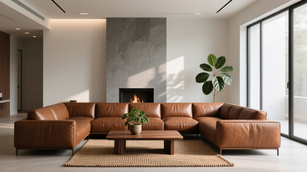 Leather Furniture for Living Rooms (2026)
 Sofa for Small Spaces: Best Picks (2026)