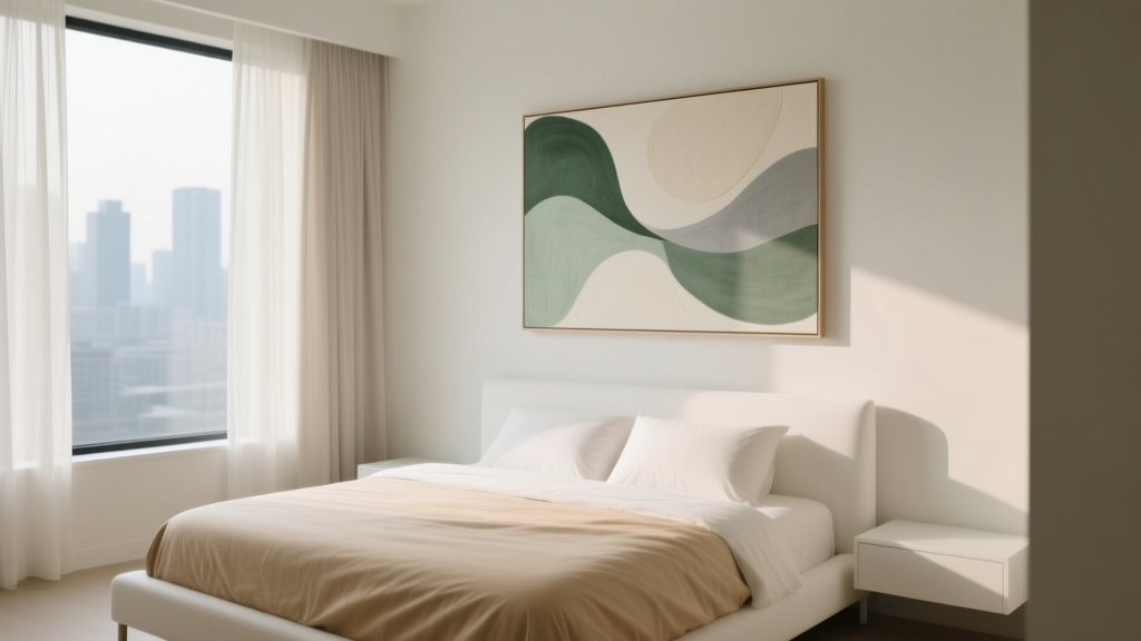
How to Choose Bedroom Art for Relaxation - The Decor Mag
Your bedroom isn’t just where you sleep—it’s where your nervous system resets. The art you hang (or lean) in this space quietly shapes your mood each night, influencing how quickly you unwind, how safe your body feels, and how easily your mind releases the day. When bedroom decor supports relaxation, your sleep environment becomes a cue for rest rather than stimulation.
From a sleep wellness perspective, visual inputs matter. Bright contrast, chaotic scenes, and high-energy color can keep your brain more alert at bedtime, while soothing imagery and balanced composition can help lower mental “volume.” If your goal is better sleep quality, choosing bedroom wall art is less about trends and more about creating a gentle, consistent atmosphere.
This guide breaks down what to look for—style, color, size, placement, framing, and lighting—so you can choose calming bedroom art that complements your layout, bedding, and overall bedroom design.
Start With the Feeling You Want at Bedtime
Before shopping, define your “wind-down mood.” Relaxing bedroom art is personal, but it tends to share a few qualities: softer colors, less visual clutter, and imagery that feels safe and spacious.
Pick a relaxation theme (then stick to it)
- Nature and landscapes: coastlines, foggy forests, dunes, mountains, botanical sketches
- Abstract calm: slow gradients, minimal linework, gentle shapes, watercolor washes
- Still life and quiet interiors: simple arrangements, muted palettes, warm light
- Black-and-white photography: works well for minimal bedrooms when contrast is soft
A quick “nervous system” check
Use this 10-second test: when you look at the piece, do your shoulders drop or rise? If it feels energizing, suspenseful, or busy, it may be better for a hallway, office, or living room than your sleep space.
Choose Colors That Support a Restful Sleep Environment
Color is one of the most powerful tools in bedroom design for sleep quality. Art can either reinforce your calming bedroom color palette or unintentionally fight it.
Sleep-friendly art palettes
- Soft neutrals: ivory, warm beige, greige, mushroom, taupe
- Muted blues and blue-greens: dusty blue, slate, sea glass, soft teal
- Gentle greens: sage, olive-gray, eucalyptus
- Warm earth tones: clay, terracotta blush, sand, muted rust (in small doses)
Colors to use carefully in bedroom wall art
- High-saturation reds and oranges: can read as energizing and visually “loud”
- Neon and bright primaries: stimulating, especially under warm bedside lighting
- Harsh black/white contrast: can feel sharp at night unless softened by matte finishes
Practical tip: Match your art to your bedding and curtains first, then to wall color. If your duvet cover is patterned, choose simpler art; if your bedding is solid, art can add gentle interest.
Scale and Placement: Where Bedroom Art Works Best
Even the most relaxing print can feel “off” if it’s too small, too high, or visually crowded. Good placement helps your eyes settle, which supports a calmer sleep environment.
Best locations for calming bedroom art
- Above the headboard: a classic anchor point that frames the bed as the focal zone
- Opposite the bed: ideal if you like to read or decompress visually before sleep
- Over a dresser: creates balance and keeps the bed area serene
- In a reading nook: reinforces calm rituals like journaling or stretching
Size guidelines (easy rules that work)
- Over a queen/king bed: aim for art that’s about 2/3 the width of the headboard
- Over a nightstand: one medium piece or a pair of smaller pieces feels intentional
- Gallery wall: keep spacing consistent (about 2–3 inches between frames)
Height and spacing for a restful layout
Hang the center of the artwork roughly at eye level (often 57–60 inches from the floor). Over the bed, keep the bottom edge about 6–10 inches above the headboard for a grounded, secure feel.
Sleep-friendly consideration: If you’re sensitive to feeling “watched” at night, avoid faces or direct gazes positioned over the bed.
Material and Finish: Pick Art That Looks Soft Under Bedroom Lighting
Bedrooms typically use warmer, dimmer light than living spaces. That means glossy surfaces can cause glare and visual stimulation right when your brain is trying to power down.
Relaxation-friendly art materials
- Matte prints: lower glare, softer feel under lamps
- Textile art: woven hangings, linen banners, felted pieces for a sound-softening effect
- Canvas with a matte varnish: gentle texture without shine
- Framed paper with a mat: adds calm “breathing room” around the image
Frame and glass choices
- Wood frames: oak, walnut, ash, or bamboo add warmth and reduce visual harshness
- Metal frames: choose brushed finishes rather than shiny chrome
- Glazing: consider anti-reflective acrylic or museum glass if you have bedside lamps aimed toward the wall
Budget ranges:
- $20–$80: digital downloads + budget frames, poster prints, unframed textile hangings
- $80–$250: larger giclée prints, framed sets, linen-look canvases
- $250–$800+: original works, large-scale photography, custom framing, museum glass
Coordinate Art With Furniture, Bedding, and Lighting
Art feels relaxing when the whole bedroom design speaks the same quiet language. Use your largest pieces—bed frame, rug, and curtains—as the foundation, then let art support that story.
Furniture recommendations that complement calming art
- Upholstered or wood headboards: soften the wall line and make art feel integrated
- Rounded nightstands: reduce sharp visual edges near the bed
- Low-profile dressers: keep sightlines open, especially in small bedrooms
Bedding and textile pairings
- Cotton percale: crisp and breathable for hot sleepers; pairs well with minimal art
- Linen or linen blends: relaxed texture that complements landscapes and abstract washes
- Wool or wool-blend rugs: visually grounding and sound-dampening
Lighting tips so your art stays calming at night
- Choose bedside bulbs around 2200K–2700K (warm, cozy light).
- Use dimmers or plug-in dimmer switches for rented spaces.
- Avoid aiming a bright lamp directly at glossy art across from the bed.
- Consider picture lights only if they’re dimmable and warm-toned.
Wellness tip: If you wake often at night, reduce reflective surfaces in your line of sight (glossy frames, mirrored art, high-shine metallics). A softer visual field can make it easier to fall back asleep.
Types of Bedroom Art That Promote Relaxation (With Practical Examples)
1) Large single statement piece (simple and grounding)
Best for: minimal bedrooms, small rooms, renters who want impact without many holes in the wall.
- Look for one calm focal image (misty landscape, abstract gradient).
- Choose a matte finish and a warm wood frame.
- Budget: $80–$300 framed, depending on size.
2) Diptych or triptych sets (balanced and soothing)
Best for: wide headboards, symmetrical layouts, couples who want visual order.
- Keep colors consistent across panels.
- Use identical frames for a quieter look.
- Budget: $120–$450 for a coordinated framed set.
3) Textile wall hangings (soft texture, less visual “noise”)
Best for: echoey rooms, cozy bedroom decor, boho-leaning but still restful spaces.
- Choose natural fibers like cotton or linen; avoid highly patterned, high-contrast designs.
- Use a wooden dowel or simple rail for clean lines.
- Budget: $40–$250.
4) Framed sketches and line drawings (quiet and airy)
Best for: Scandinavian, modern, and neutral bedroom design styles.
- Botanical drawings, minimal figures, or architectural lines in muted ink tones.
- Add a generous mat for softness.
- Budget: $25–$200.
Sleep-Friendly Layout Tips: Keep the Bedroom Visually Uncluttered
Relaxation isn’t only about what you add—it’s also about what you reduce. Art should support a calm bedroom, not create a “to-do list” feeling on the walls.
- Limit the number of pieces in your direct view from bed. One to three well-chosen works often feels more restful than a full gallery wall.
- Protect negative space. Empty wall space can be calming, especially in smaller bedrooms.
- Create a visual “landing zone.” Let the bed be the anchor; place art to frame it rather than compete with it.
- Consider sound and softness. Textile art, curtains, and rugs can reduce echo, which supports a more soothing sleep environment.
Common Mistakes to Avoid
- Choosing art that’s too stimulating: busy patterns, intense contrast, or action-heavy scenes can keep your brain alert.
- Hanging art too high: it creates tension in the layout and makes the room feel less grounded.
- Ignoring glare: glossy prints and standard glass can reflect bedside lamps and feel visually sharp at night.
- Overcrowding walls: too many frames can read as clutter, even if each piece is pretty.
- Mismatching undertones: cool art in a warm room (or vice versa) can make the bedroom feel subtly “off.”
- Skipping safety over the bed: heavy frames without proper anchors can be risky; use secure hanging hardware rated for the weight.
FAQ: Choosing Bedroom Art for Relaxation
What kind of art is best for a relaxing bedroom?
Nature scenes, soft abstracts, minimal line drawings, and gentle photography tend to be most calming. Look for muted colors, simple composition, and matte finishes that reduce glare in warm bedroom lighting.
Should bedroom art match the bedding or the wall color?
Match the art to your bedding and major textiles first (duvet, curtains, rug), then let it coordinate with wall color. This approach keeps the room feeling cohesive and supports a restful bedroom design.
Is it okay to hang art above the bed?
Yes—just keep it proportionate to the headboard and securely anchored. Choose lighter materials when possible, use wall anchors rated for the frame weight, and avoid placing very heavy pieces directly over where you sleep.
How do I make bedroom art feel calmer without buying new pieces?
- Swap shiny frames for matte or wood.
- Add a larger mat to soften the presentation.
- Relocate high-energy art to another room and replace it with a neutral print.
- Adjust lighting (warmer bulbs, dimmers) to reduce harsh contrast.
What’s a good budget for upgrading bedroom wall art?
A noticeable upgrade can happen in the $80–$250 range by choosing one larger print and a quality frame. If you’re on a tighter budget, a $20–$60 digital download printed locally plus a simple frame can still look polished.
Can art really affect sleep quality?
Art influences the mood of your sleep environment by shaping what your brain processes as you wind down. Calm imagery, balanced composition, and low-glare finishes can reduce visual stimulation—one of several bedroom design factors that support easier relaxation and better sleep.
Next Steps: A Simple Plan for a Calmer Bedroom
- Stand in your doorway and from your pillow. Identify what you see most—those are your highest-impact art zones.
- Choose one calming palette. Pull 2–4 colors from your bedding and keep art within that range.
- Start with one “anchor” piece. A single large matte print above the headboard or opposite the bed often changes the whole feel.
- Check glare at night. Turn on bedside lamps and confirm the art still feels soft and quiet.
- Refine with texture. Add a textile hanging, a linen-shaded lamp, or a wool rug to deepen the cozy, sleep-friendly mood.
Your bedroom art doesn’t need to be perfect—it needs to be restful. With a few intentional choices, your walls can become part of a sleep-supportive bedroom design that helps your mind and body exhale at the end of the day.
For more calming bedroom decor and sleep wellness ideas, explore the latest inspiration on thedecormag.com.
More Articles
 Bedroom Reeded Wood Nightstand Trend - The Decor Mag
 Best Bedroom Humidifier Placement - The Decor Mag
 Best Bedroom Tie and Belt Storage - The Decor Mag
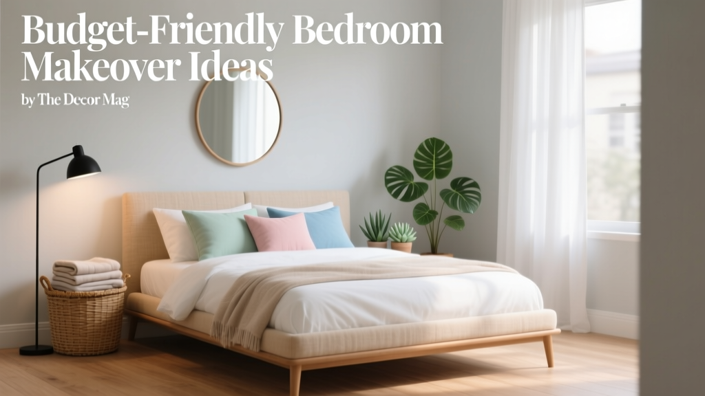 Budget-Friendly Bedroom Makeover Ideas - The Decor Mag
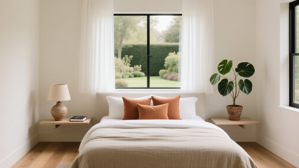 Bedroom Styling with Intentional Design | The Decor Mag
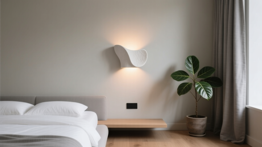 Bedroom Plaster Sconce Wall Application - The Decor Mag
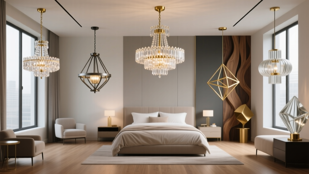 Best Bedroom Chandelier Styles - The Decor Mag
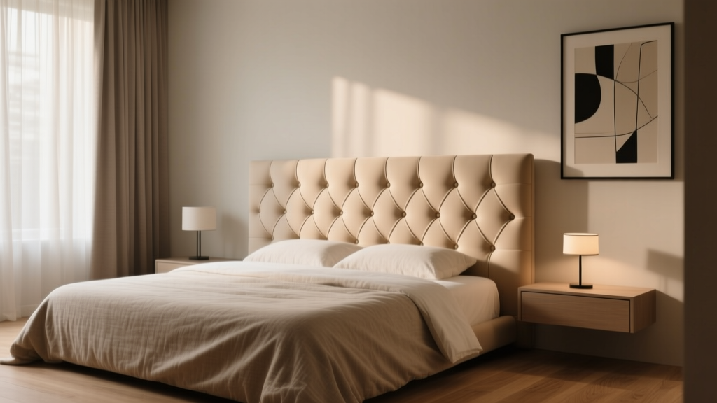 Bedroom Channel Tufted Headboard Guide - The Decor Mag
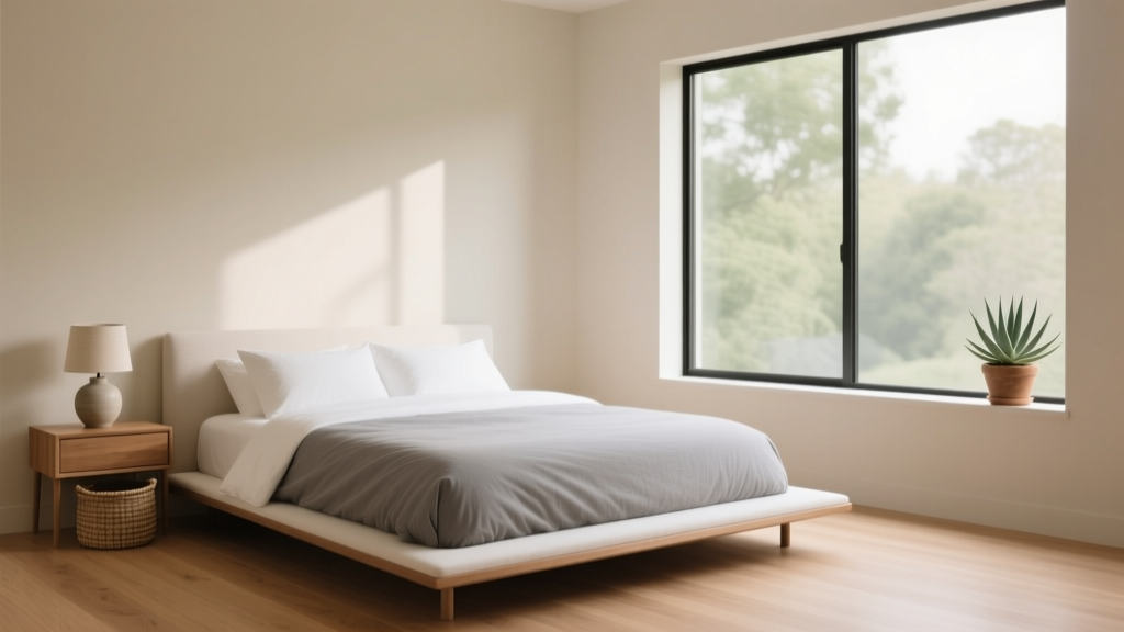 Minimalist Bedroom Styling: Simple Ideas (2026)
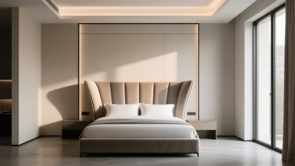 Bedroom Wingback Headboard Design - The Decor Mag