
Bedroom Paint for Sleep Quality | The Decor Mag
Your bedroom isn’t just a place to store furniture—it’s the environment your nervous system returns to every night. The color on the walls quietly shapes how the room feels: calm or stimulating, cozy or cold, spacious or cramped. Because color influences light perception, mood, and how “busy” a space feels, bedroom paint can either support sleep quality or work against it.
If you’ve ever walked into a softly painted room and felt your shoulders drop, you’ve experienced how design affects wellbeing. Paint is one of the most cost-effective bedroom design upgrades, and it can have an outsized impact on your sleep environment—especially when paired with thoughtful lighting, bedding, and layout choices.
This guide will help homeowners and renters choose bedroom paint colors that encourage relaxation, reduce visual stress, and create a sleep-friendly bedroom decor plan that actually feels good at bedtime.
Why Bedroom Paint Color Affects Sleep Quality
Color doesn’t “put you to sleep” on its own, but it influences the conditions that help sleep happen. The right bedroom paint makes a room feel quieter, darker at night, and gentler in the morning. The wrong choice can amplify glare, feel energizing at the wrong time, or make a space feel unsettled.
How color supports a restful sleep environment
- Perceived brightness: Light-reflective colors can make a room feel brighter (helpful in the day, less ideal at night if paired with harsh lighting).
- Emotional temperature: Warm or cool undertones affect whether a room feels cozy, crisp, or stimulating.
- Visual noise: Highly saturated colors, high contrast walls, or strong patterns can keep the mind “on.”
- Light interaction: Paint reacts to sunlight and bulbs; a calming color in morning light can look harsh under cool LEDs at night.
Start Here: Assess Your Bedroom’s Light, Size, and Use
Before choosing a paint chip, take a quick inventory. The same “best bedroom color for sleep” can feel completely different depending on exposure, bulbs, and the amount of decor in the room.
1) Check your natural light direction
- North-facing rooms: Cooler, dimmer light—paint can look grayer. Consider warmer off-whites, soft greige, muted clay, or warm blue-greens.
- South-facing rooms: Bright, warm light—many colors look vibrant. Softer, dustier tones keep things calm.
- East-facing rooms: Bright morning light, calmer afternoons—great for gentle greens, warm whites, and soft blues.
- West-facing rooms: Warm, intense evening light—avoid overly warm or saturated colors that can feel “amped up” at night.
2) Consider room size and ceiling height
- Small bedrooms: Mid-light muted tones or soft off-whites can expand the space without feeling sterile.
- Large bedrooms: Slightly deeper, muted hues can create intimacy and a cocoon effect.
- Low ceilings: Lighter ceilings reduce heaviness; try a flat ceiling paint for fewer shadows.
3) Be honest about how you use the room
- If your bedroom doubles as a home office, choose a calming base color and separate “work energy” with lighting and a defined desk zone.
- If you read in bed, you’ll want wall colors that don’t create harsh contrast behind a headboard lamp.
- If you’re sensitive to clutter, stick to lower-contrast paint to reduce visual stimulation.
Best Bedroom Paint Colors for Sleep (and Why They Work)
For sleep quality, the goal is usually low saturation (not too bright) and soft contrast (not too stark). These shades tend to feel steady, breathable, and easy on the eyes at night.
Soft blue: calm, spacious, and quiet
Muted blues can slow the feeling of a room down—especially when the undertone leans slightly gray or green. Avoid bright, sporty blues, which can feel energetic.
- Works best with: warm white bedding, natural oak, brushed brass, soft linen drapes
- Skip if: your room is very cold/north-facing and you hate cool tones—choose a warmer blue-gray instead
Sage and dusty green: grounding without heaviness
Green is strongly associated with nature and restoration. For bedroom decor, sage, olive-gray, and eucalyptus tones are especially sleep-friendly.
- Works best with: cream textiles, jute or wool rugs, walnut or black wood furniture
- Pro tip: Pair with warm lighting (2700K) to keep greens from looking clinical
Greige and warm taupe: cozy neutrals that reduce stimulation
Greige (a blend of gray and beige) is a popular choice for a calming bedroom because it lowers contrast and plays well with most bedding colors.
- Works best with: layered whites, oatmeal knits, textured throws, minimalist wall art
- Pro tip: Choose a greige with a soft warm undertone for a more inviting sleep environment
Warm off-white: bright but gentle
If you love a clean look, a warm off-white can still support relaxation—especially when you add texture in bedding and window treatments. Avoid icy whites that read blue.
- Works best with: linen curtains, boucle accent chair, light wood, woven baskets
- Make it sleepier: Choose a low-sheen finish and use dimmable bedside lamps
Muted blush, clay, and soft terracotta: soothing warmth
Soft earthy pinks and clays can feel nurturing and quiet, especially in rooms that get limited sun. Keep saturation low—think “dusty rose,” not bubblegum.
- Works best with: warm woods, cream bedding, matte black accents, vintage-inspired rugs
- Skip if: your lighting is very warm and yellow—test first so it doesn’t skew too orange
Pick the Right Finish and Paint Type for a Healthier Bedroom
Paint isn’t only about color; the sheen and formula affect glare, durability, and even indoor air quality. For a sleep-friendly bedroom, aim for soft visuals and low odor.
Best paint sheen for bedrooms
- Matte/flat: Most calming (minimal glare), great for walls with imperfections. Slightly less washable.
- Eggshell: A practical middle ground—soft look, easier to clean. Often ideal for bedrooms.
- Satin: More sheen = more reflected light. Use sparingly (trim or kids’ rooms) if you need durability.
Look for low-VOC or zero-VOC formulas
Since your bedroom is where you spend long hours, choose low-VOC or zero-VOC paint to reduce odor and support cleaner indoor air. This matters even more if you have allergies, asthma, or chemical sensitivities.
- Product types to look for: low-VOC interior wall paint, zero-VOC primers, odor-reducing formulas
- Practical timing tip: Paint at least 3–7 days before you plan to sleep in the room, ventilate well, and wash new bedding after painting to reduce lingering smell.
Test Paint the Sleep-Smart Way (So You Don’t Regret It)
A paint chip under store lighting doesn’t tell you how the color will feel at 10 p.m. with lamps on. Testing is where great bedroom design decisions happen.
A simple, reliable paint testing checklist
- Sample 2–4 colors in the same family (for example: three blue-grays plus one greige backup).
- Paint large swatches (at least 12" x 12") on multiple walls or use peel-and-stick samples.
- View at three times: morning, late afternoon, and nighttime with your usual lighting.
- Check from bed: sit where your eyes will be at bedtime and notice if the color feels busy, harsh, or calming.
- Test next to bedding: hold your duvet or pillow shams up to the wall color to confirm harmony.
Pair Paint with Bedroom Design Choices That Improve Sleep
Color works best when the rest of the sleep environment supports it. These practical bedroom decor choices help your paint color do its job.
Lighting: keep evenings warm and dimmable
- Bulb color temperature: choose 2700K (warm white) for bedside lamps; avoid 4000K–5000K in the bedroom at night.
- Use layers: overhead light + two bedside lamps + optional floor lamp creates a calmer feel than one bright ceiling fixture.
- Product types: dimmer switches, plug-in dimmers for lamps, wall sconces with warm LEDs, amber night lights for midnight trips.
Bedding materials that feel cooler, quieter, and more luxurious
- Best breathable picks: cotton percale (crisp), linen (airy), bamboo lyocell (silky and cool).
- Cozy picks for cold sleepers: cotton sateen, brushed cotton flannel (seasonal), wool blanket layers.
- Color tip: keep bedding tones within 2–3 shades of your wall color family for low contrast and a calmer bedroom aesthetic.
Furniture: choose calm silhouettes and reduce visual clutter
- Nightstands: enclosed storage reduces the “stuff on display” effect that can feel mentally noisy.
- Bed frame: upholstered or wood headboards soften the room visually (and reduce echo compared to metal).
- Finish pairing: warm woods complement cool wall colors; black accents add structure without shouting.
Layout adjustments for a more restful bedroom
- Clear the path: keep the walkway from door to bed uncluttered to reduce stress cues.
- Wall color placement: consider an accent wall behind the headboard in a slightly deeper shade to create a cocoon effect without painting the whole room dark.
- Mirror placement: avoid mirrors facing the bed if reflections feel distracting at night; position them to bounce daytime light instead.
Budget Ranges: What a Sleep-Friendly Paint Refresh Costs
- Budget refresh ($50–$150): one gallon of quality interior paint, basic rollers/brushes, painter’s tape; best for a single room with minimal prep.
- Mid-range upgrade ($150–$400): paint + primer, higher quality tools, spackle/sanding supplies, new warm LED bulbs, plug-in dimmers.
- High-comfort makeover ($400–$1,200+): premium low/zero-VOC paint, new blackout curtains, area rug for sound softening, upgraded bedding set, wall sconces or dimmer installation.
Sleep-Friendly Wellness Tips to Use Alongside Paint Choices
- Protect darkness: pair calming paint with blackout curtains or lined drapes to support melatonin-friendly nights.
- Reduce glare: matte/eggshell wall finishes plus warm lighting helps your brain shift into rest mode.
- Quiet the room: add a wool rug, upholstered headboard, or heavier curtains to reduce echo (a surprisingly helpful sleep environment upgrade).
- Keep the air comfortable: ventilate after painting; consider a HEPA air purifier if you’re sensitive to odors or allergens.
Common Mistakes to Avoid When Choosing Bedroom Paint
- Choosing color under store lighting only: always test at night with your actual lamps.
- Going too bright or saturated: vivid reds, intense oranges, and neon-like tones tend to energize the space.
- Stark white with cool bulbs: this combo can feel clinical and make it harder to wind down.
- Ignoring undertones: a “gray” can turn purple, green, or blue depending on light and nearby materials.
- High-gloss walls: shiny finishes reflect light and highlight imperfections—rarely relaxing in a bedroom.
- Skipping prep: stains, patchy walls, and uneven texture show through and create subtle visual stress.
FAQ: Bedroom Paint and Sleep Quality
What is the best bedroom paint color for sleep?
Most people sleep best in muted, low-saturation colors such as soft blue, sage green, warm greige, and warm off-white. The best choice depends on your room’s natural light, your lighting temperature at night, and your personal comfort with cool vs. warm tones.
Are dark colors bad for sleep?
Not necessarily. Deep, muted shades (like smoky navy or deep olive) can feel cocooning and restful, especially in larger bedrooms. The key is keeping lighting warm and dimmable and avoiding high contrast with bright white trim or overly cool bulbs.
Should I paint my ceiling the same color as the walls?
It can work beautifully for sleep quality if you want a wrapped, calming feel—especially with a soft, muted color. If your ceiling is low, a lighter ceiling often feels more open. A popular compromise is to paint the ceiling one shade lighter than the walls.
What paint finish is best for a calming bedroom?
Matte is the most calming visually because it reduces glare. Eggshell is a great practical option if you want easier cleaning while keeping a soft look.
How can renters improve bedroom paint impact without painting?
Try peel-and-stick wallpaper in a muted tone behind the headboard, removable wall decals in calming colors, or large fabric hangings. You can also shift the room’s color balance with linen curtains, a large area rug, and warm lighting to create a more restful bedroom atmosphere.
How long should I wait to sleep in a freshly painted bedroom?
With low-VOC paint, many people feel comfortable after 24–72 hours, but for best air quality, aim for 3–7 days of good ventilation, especially if you’re sensitive to odors. Run fans, open windows when possible, and consider an air purifier.
Next Steps: A Simple Plan for Choosing Your Bedroom Paint
- Pick a direction: soft blue, sage green, warm greige, warm off-white, or muted clay.
- Match your lighting: switch bedside bulbs to 2700K and add dimmers before finalizing paint.
- Test at night: view samples from bed with lamps on and blackout curtains closed.
- Choose a low/zero-VOC paint in matte or eggshell for a calmer look and healthier sleep environment.
- Finish the feel: add textured bedding, a soft rug, and clutter-reducing storage to support sleep quality.
Your walls set the tone for the entire bedroom design—choose a color that feels like a deep exhale. For more calming bedroom decor ideas, sleep-friendly color palettes, and practical room refresh guides, explore the latest inspiration on thedecormag.com.
More Articles
 How to Layer Bedding Like a Designer - The Decor Mag
 Best Bedroom Sleep Environment Checklist - The Decor Mag
 Best Bedroom Sleep Mask and Pillow Spray - The Decor Mag
 Mid-Century Modern Bedroom Furniture Guide - The Decor Mag
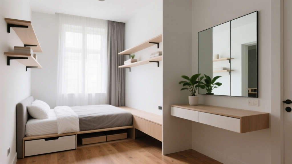 Small Bedroom Layout Hacks for Apartments (2026)
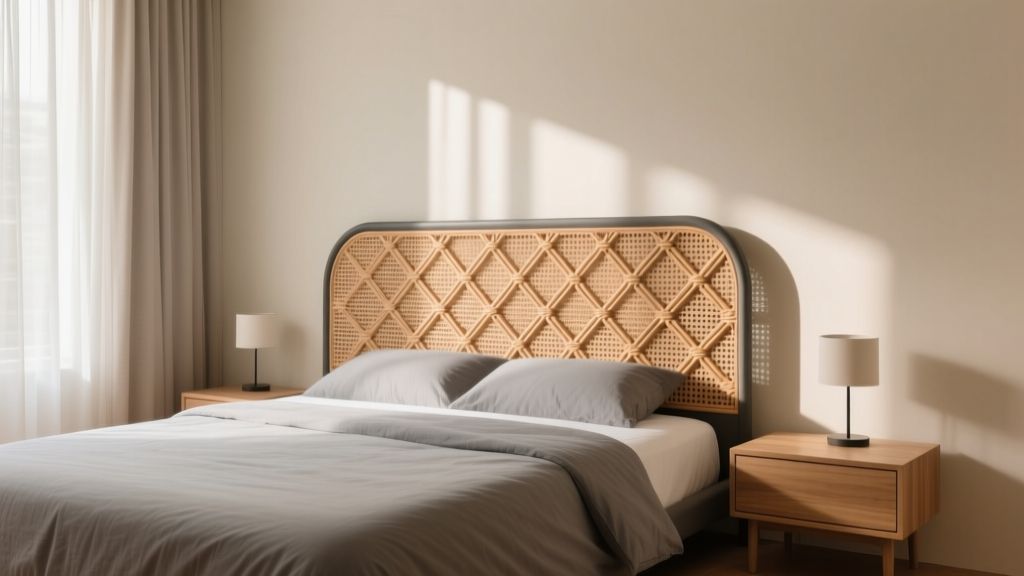 Bedroom Cane Webbing Headboard Ideas - The Decor Mag
 How to Organize Your Bedroom Closet - The Decor Mag
 Best Bedroom Inspiration for Living: Designing a Space That Supports Rest, Connection, and Daily Well-Being
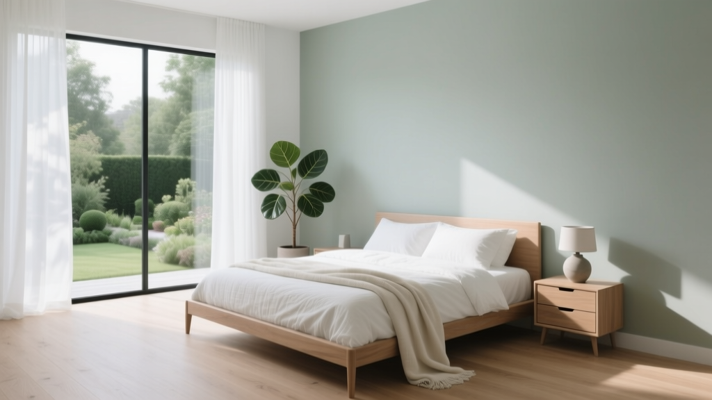 Cool Summer Bedroom: Sleep Better in Heat (2026)
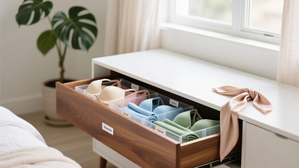 Best Bedroom Lingerie Drawer Organizers - The Decor Mag