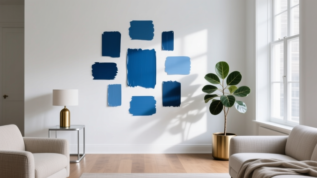
Best Cerulean Blue Paint Colors - The Decor Mag
Cerulean blue sits in that sweet spot between sky and sea—bright but not icy, calming but not sleepy. It’s a color that instantly signals freshness and clarity, yet it can also feel sophisticated when paired with the right materials and finishes. For homeowners who want a blue that reads cheerful in daylight and composed at night, cerulean is one of the most versatile options in the paint deck.
Why does cerulean matter in interior color design? Because it solves a common “blue problem”: many blues either skew gray (and can look flat) or skew navy (and can feel heavy). Cerulean brings light and color energy without overwhelming the room. When used thoughtfully, it can amplify natural light, add architectural definition, and create a mood that supports focus, relaxation, or playful creativity—depending on where and how you use it.
This guide breaks down the best cerulean blue paint colors, how to choose the right one for your space, and the color schemes that make cerulean look intentional rather than accidental.
What Is Cerulean Blue (and Why It’s So Livable)?
Cerulean is typically a medium-to-light blue with a noticeable green (cyan) undertone—think clear midday sky rather than denim or navy. In color theory terms, it lives closer to blue-green than violet-blue, which explains its clean, airy character.
Color psychology: the mood cerulean creates
- Calm + mental clarity: Blue is associated with stability and focus; cerulean’s brightness keeps it from feeling somber.
- Freshness + openness: The subtle green undertone adds a “breath of air” quality—great for rooms that need lift.
- Optimism: Compared to gray-leaning blues, cerulean reads more energetic and inviting.
Cerulean vs. similar blues
- Sky blue: often lighter and softer; cerulean has more saturation and definition.
- Turquoise: typically greener; cerulean stays firmly in the blue family.
- Cobalt: deeper and more intense; cerulean feels sunnier and more approachable.
How to Choose the Right Cerulean Blue Paint Color
Paint selection is less about one “perfect” shade and more about matching undertones, light exposure, and the room’s purpose. Use these design principles to narrow your options.
1) Evaluate your light (direction + intensity)
- North-facing rooms: cool, indirect light can make cerulean feel sharper. Choose a slightly softer or grayer cerulean to avoid a “neon” look.
- South-facing rooms: warm, abundant light makes cerulean glow. You can handle cleaner, more saturated options here.
- East-facing rooms: bright in the morning, cooler later—cerulean will shift noticeably. Sample and check it at multiple times.
- West-facing rooms: warm afternoon light can push cerulean toward teal. If you want “true cerulean,” avoid overly green-leaning picks.
2) Decide your role for cerulean: main act or accent?
- Whole-room walls: aim for a slightly muted cerulean for long-term livability.
- Accent wall or built-ins: you can go more saturated for a confident hit of color.
- Ceiling or “fifth wall”: cerulean can mimic sky and make rooms feel taller—especially with white walls.
3) Match undertones to fixed finishes
Look at what can’t easily change: floors, countertops, tile, and upholstery.
- Warm woods (oak, maple, walnut): cerulean is a beautiful counterbalance; avoid overly green-teal if your wood is already golden.
- Cool stone (marble, slate, concrete): choose a cleaner cerulean to keep things crisp.
- Brass fixtures: cerulean + brass reads elevated and slightly coastal-luxe.
- Chrome/nickel: leans modern; pick a cerulean without too much green to avoid a clinical feel.
Best Cerulean Blue Paint Colors (Designer-Approved Picks)
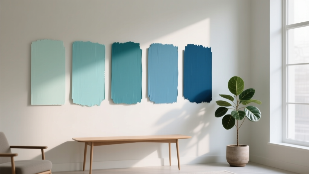
Below are cerulean-forward paint colors across popular brands. Always test with large swatches (poster board or peel-and-stick) and view them in your room’s lighting.
Benjamin Moore: standout cerulean blues
- Benjamin Moore Blue Lake (2053-40): A bright, happy cerulean that reads like clean summer sky. Ideal for playrooms, powder rooms, and accent cabinetry.
- Benjamin Moore Turquoise Haze (2060-60): Airier and lighter—great when you want cerulean energy but not full saturation. Lovely in bathrooms and sunrooms.
- Benjamin Moore Pool Blue (2048-50): A pool-water cerulean with a fresh, inviting feel. Works well in bedrooms with crisp white trim.
- Benjamin Moore Aegean Teal (2136-40): Not a classic cerulean, but a deeper, sophisticated cousin with a grounded undertone—use when you want cerulean’s character with more maturity.
Sherwin-Williams: clear, modern ceruleans
- Sherwin-Williams Lochmara (SW 6502): A confident cerulean that still feels livable. Excellent for accent walls, front doors, and statement nooks.
- Sherwin-Williams Bluebird Feather (SW 9066): Bright and clean with a sunny personality—great for laundry rooms or a breakfast banquette.
- Sherwin-Williams Tame Teal (SW 6757): Slightly greener; use when you want cerulean to lean coastal. Beautiful with warm whites and natural textures.
Farrow & Ball: elevated cerulean-leaning blues
- Farrow & Ball Blue Ground (No. 210): A fresh, uplifting blue that can read cerulean in brighter light. Gorgeous for kitchens with warm wood and creamy stone.
- Farrow & Ball Borrowed Light (No. 235): Lighter and more delicate; when paired with white trim, it creates a breezy, sky-washed effect.
Behr: accessible ceruleans with big impact
- Behr Bluebird (PPU13-07): A vibrant, energetic cerulean for craft rooms, kids’ spaces, or an accent wall behind open shelving.
- Behr Lagoon Teal (PPU13-03): A cerulean-leaning teal that feels fresh and modern—excellent for bathrooms and small offices.
Real Room Examples: Where Cerulean Blue Shines
1) Living room: cerulean as an accent wall that lifts the space
If your living room has neutral foundations—white walls, beige rugs, gray upholstery—cerulean is a high-reward accent color. Paint the wall behind the sofa or the fireplace surround to create a focal point.
- Try: Sherwin-Williams Lochmara (SW 6502)
- Pair with: warm white trim, walnut wood, and a textured ivory rug
- Style tip: add 2–3 accents in related hues (navy pillow, aqua vase) to make the wall feel connected
2) Kitchen: cerulean on lower cabinets for a tailored, cheerful look
Cerulean works especially well on cabinetry because the color is “contained” by hardware, countertops, and uppers. Consider cerulean lowers with white or light oak uppers for balance.
- Try: Benjamin Moore Blue Lake (2053-40) on lowers
- Pair with: white quartz, matte black pulls, and zellige backsplash in warm white
- Finish tip: use a cabinet-grade enamel in satin or semi-gloss for durability and easy cleaning
3) Bedroom: a cerulean “soft statement” behind the bed
For better sleep, keep cerulean slightly softened and let textiles do the cozy work. A cerulean headboard wall can feel serene without going icy.
- Try: Benjamin Moore Pool Blue (2048-50)
- Pair with: creamy whites, flax linen, and small touches of brass
- Lighting tip: choose warm bulbs (2700K) to keep the room inviting at night
4) Bathroom: cerulean that feels clean, spa-like, and bright
Cerulean plays beautifully with white tile and polished nickel. In smaller bathrooms, it can visually “freshen” the space the way daylight does.
- Try: Benjamin Moore Turquoise Haze (2060-60)
- Pair with: crisp white subway tile, pale gray grout, and white towels
- Practical tip: choose a moisture-resistant bath paint in satin or pearl for better wipeability
5) Home office: cerulean for focus without feeling corporate
Blues support concentration; cerulean adds optimism. Use it on a single wall behind your desk to frame video calls and create a “zone.”
- Try: Farrow & Ball Blue Ground (No. 210)
- Pair with: white built-ins, warm wood desk, and camel leather
- Design principle: keep the rest of the palette low-contrast so cerulean can do the heavy lifting
Best Color Schemes to Pair with Cerulean Blue
Cerulean is friendly, but it still needs the right supporting cast. These combinations work across paint colors, textiles, and decor.
Classic coastal (fresh, not themed)
- Cerulean + warm white + sand beige
- Add natural textures: jute, rattan, light oak
- Metal finish: brushed brass or aged bronze
Modern contrast (crisp and graphic)
- Cerulean + bright white + charcoal
- Use black accents in frames, hardware, or lighting
- Keep patterns minimal for a cleaner look
Analogous harmony (easy, layered color)
- Cerulean + teal + navy (vary saturation, not just hue)
- Add off-white to prevent the palette from feeling heavy
- Works well in bedrooms and living rooms
Complementary pop (high-energy done right)
- Cerulean + soft coral or terracotta accents
- Keep the warm accent to 10–20% of the palette (pillows, art, a vase)
- Great for eclectic homes and creative spaces
Common Cerulean Blue Mistakes (and How to Avoid Them)
- Choosing based on a screen: Cerulean shifts dramatically with light. Always sample in your room; view morning, afternoon, and nighttime.
- Ignoring undertones: If your tile leans warm and your cerulean leans green, the room can feel slightly “off.” Match undertones: warm finishes like warmer ceruleans; cool finishes like cleaner ceruleans.
- Too much saturation on every surface: Cerulean on four walls plus ceiling can feel intense. If you want a color-drenched look, balance with a softer cerulean and consistent trim color.
- Wrong sheen in high-traffic zones: Flat paint in a hallway scuffs; high gloss on walls can highlight imperfections. A safe rule:
- Walls: eggshell or satin
- Trim/doors: semi-gloss
- Ceilings: flat
- Forgetting trim temperature: Ultra-bright white trim can make cerulean look more intense. Warmer whites soften the effect.
Practical Tips for Sampling Cerulean Blue Paint
- Sample at least 2–3 ceruleans (one cleaner, one slightly muted, one slightly greener) to see what your space prefers.
- Paint a large test area (at least 2' x 2') or use two coats on foam board you can move around.
- Check next to your “fixed” items: flooring, countertops, sofa fabric, and any large rug.
- Look at it under your actual bulbs at night—cerulean can swing cooler under LED lighting.
- Commit with continuity: if cerulean appears in one major place (like an accent wall), repeat it subtly elsewhere (artwork, pillows, ceramics) to make the color scheme feel designed.
FAQ: Cerulean Blue Paint Colors
Is cerulean blue a good wall color for small rooms?
Yes—especially lighter or slightly softened ceruleans. They can make small rooms feel airy and clean. To avoid visual intensity, pair cerulean walls with warm white trim and lighter textiles.
What white paint goes best with cerulean blue?
Warm whites and balanced whites tend to flatter cerulean. Look for whites that aren’t overly icy. If your cerulean is very bright, a slightly warmer white helps it feel more relaxed.
Does cerulean blue work with gray floors?
It can, as long as you pay attention to undertones. With cool gray floors, choose a cleaner (less green) cerulean. Add warmth through wood furniture, woven textures, and brass accents to keep the room from feeling chilly.
Can I use cerulean blue in a north-facing room?
You can, but it’s best to choose a cerulean that’s slightly muted or softened so it doesn’t feel overly sharp. Use warmer lighting (2700K) and incorporate warm neutrals to balance the cool daylight.
What’s the best finish for cerulean blue walls?
Eggshell is a reliable all-around choice for living rooms and bedrooms. Satin is great for kitchens, baths, and kids’ rooms where you want more wipeability. Save semi-gloss for trim and doors.
Next Steps: Bring Cerulean Blue Home with Confidence
Start by choosing where cerulean will have the most impact—an accent wall, cabinetry, or a smaller room that can handle a bolder color moment. Sample three candidates, evaluate them in your lighting, then build a simple color scheme around warm whites, natural textures, and one or two supporting hues (navy, teal, sand, or soft coral).
If you’re ready to keep exploring, browse more paint color ideas, color schemes, and room-by-room guidance on thedecormag.com.
More Articles
 How to Choose Colors for a Patio - The Decor Mag
 Best Pear Green Paint Colors - The Decor Mag
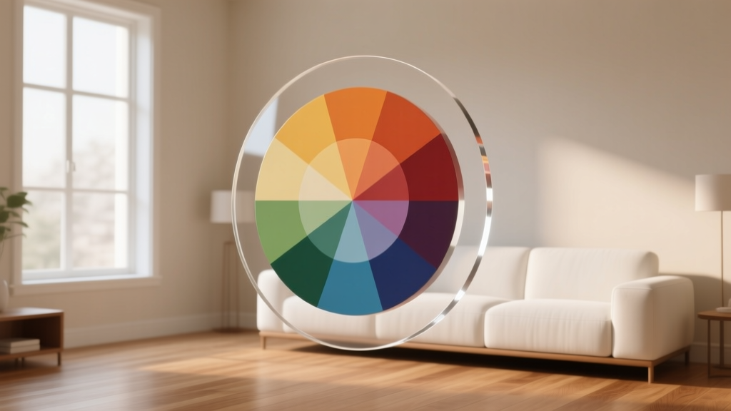 Color Wheel Basics for Home Decorating - The Decor Mag
 Best Pistachio Paint Colors - The Decor Mag
 How to Use Color to Create Depth - The Decor Mag
 Paint Colors That Work With Flooring (2026)
 How to Choose Colors for a Basement - The Decor Mag
 Best Fire Engine Red Paint Colors - The Decor Mag
 How to Create a Timeless Color Palette - The Decor Mag
 Best Aqua Paint Colors - The Decor Mag