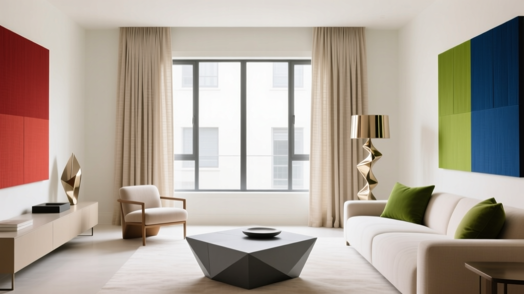
Triadic Color Scheme Applications - The Decor Mag
A home feels “designed” when color choices look intentional—balanced, energizing, and connected from room to room. That’s exactly what a triadic color scheme delivers. It’s one of the most reliable ways to create interiors that feel lively without tipping into chaos, and it works across styles, from modern organic to traditional, coastal, and eclectic.
Triadic color schemes matter because they solve a common homeowner problem: how to add color confidently. Many people default to safe neutrals, then struggle to introduce personality through paint colors, textiles, and art. A triadic palette gives you a built-in framework for contrast and harmony, guided by color theory and color psychology—so your choices feel bold, but still “right.”
If you’ve ever loved a room that feels vibrant yet cohesive, there’s a good chance it was built on a triadic (or near-triadic) approach. The key is knowing how to choose the right shades, assign roles to each color, and apply them thoughtfully across walls, trim, furniture, and decor.
What Is a Triadic Color Scheme?
A triadic color scheme uses three hues that are evenly spaced around the color wheel. Classic examples include:
- Red + yellow + blue
- Orange + green + violet
- Teal (blue-green) + coral (red-orange) + mustard (yellow-orange)
In interior color design, you’re rarely using pure primary hues straight from a box of crayons. Instead, you’ll choose tints (lighter), tones (muted with gray), or shades (darker) of those three hues to match your home’s lighting and style.
Why Triadic Palettes Work (Design Principles + Color Psychology)
- Balanced contrast: Because the hues are evenly spaced, none naturally dominates the wheel. The result is dynamic but stable.
- Visual energy: Triadic schemes feel lively and social—great for kitchens, living rooms, family spaces, and creative studios.
- Emotional range: You get a mix of warm and cool notes, which helps a room feel both welcoming and fresh.
- Easy repetition: With three colors, you can repeat them across textiles, art, and accessories for cohesive interior color design.
How to Build a Triadic Color Palette That Looks Designer
Step 1: Choose Your “Lead” Color
Pick one color to anchor the room—often the wall paint color or a large furniture piece (sofa, rug, cabinetry). This is typically the most muted or livable hue of the three.
Tip: If you’re nervous about bold paint colors, make your lead color a softened version (a tone) of one hue, then use the other two as accents.
Step 2: Use the 60–30–10 Rule (with a Triadic Twist)
A practical way to apply a triadic color scheme:
- 60%: Lead color (walls, large rug, major upholstery)
- 30%: Supporting color (curtains, secondary upholstery, cabinetry, bedding)
- 10%: Accent color (pillows, art, vases, lampshades, small furniture)
Designer move: Keep two colors slightly muted and let only one color go bold. This prevents a “playroom” feel and supports a more elevated look.
Step 3: Control Saturation and Undertones
The biggest difference between a polished triadic palette and a chaotic one is saturation control. Three highly saturated colors can feel loud, especially in bright daylight.
- For calm rooms: Choose dusty, complex versions (sage instead of pure green; terracotta instead of orange; plum instead of violet).
- For energetic rooms: Use one saturated pop with two softened partners.
- Undertone check: Keep undertones aligned (warm-leaning or cool-leaning) across the three colors.
Triadic Color Scheme Ideas (with Paint Color Recommendations)
Below are triadic-inspired combinations you can apply as whole-room paint plans or as room + decor palettes. Paint colors vary by lighting and finish, so sample first and view at different times of day.
1) Modern Coastal Triadic: Teal + Coral + Sand
Why it works: Teal reads fresh and calming (water association), coral brings warmth and sociability, and sand keeps the palette grounded.
- Lead (walls): Benjamin Moore Palladian Blue (HC-144) — a soft blue-green that’s airy without feeling icy
- Supporting: Sherwin-Williams Coral Reef (SW 6606) — better as an accent wall, art, or textiles than four full walls
- Neutral bridge: Sherwin-Williams Accessible Beige (SW 7036) or Benjamin Moore Edgecomb Gray (HC-173)
Room scenario: In a living room, paint walls in Palladian Blue, choose a warm neutral sofa, then add coral via pillows and artwork. Finish with natural textures (jute rug, oak coffee table, woven shades) to keep the triadic energy sophisticated.
2) Classic Triadic Made Livable: Navy + Terracotta + Soft Gold
Why it works: Navy adds stability and depth, terracotta feels earthy and welcoming, and soft gold lifts the scheme with optimism.
- Lead (walls or built-ins): Benjamin Moore Hale Navy (HC-154)
- Supporting (textiles/feature): Farrow & Ball Red Earth (No. 64) for a rich terracotta note
- Accent (metal/painted decor): Sherwin-Williams Compatible Cream (SW 6387) or a brushed brass finish
Room scenario: In a dining room, consider Hale Navy on lower paneling or built-ins, warm white above, terracotta in curtains or dining chair upholstery, and gold through lighting (a brass chandelier) plus framed art. The result feels timeless, not trendy.
3) Fresh Garden Triadic: Sage + Plum + Ochre
Why it works: Sage is restorative, plum adds drama and creativity, ochre brings warmth and “sunlight.” Great for bedrooms, libraries, and reading nooks.
- Lead (walls): Sherwin-Williams Clary Sage (SW 6178)
- Supporting: Benjamin Moore Inspired Violet (2070-20) used sparingly (pillows, art, a painted side table)
- Accent: Farrow & Ball India Yellow (No. 66) as a lamp base, throw, or small piece of furniture
Room scenario: For a bedroom, keep walls Clary Sage, choose bedding in warm ivory, then layer plum in a lumbar pillow and art print. Add ochre with a throw at the foot of the bed and a warm-toned bedside lamp. This triadic scheme feels calm but far from bland.
4) High-Impact Contemporary: Charcoal + Cobalt + Warm Rust
Why it works: Charcoal acts like a modern neutral, cobalt energizes, and rust adds grounded warmth. Ideal for a home office or media room.
- Lead (walls): Benjamin Moore Kendall Charcoal (HC-166)
- Supporting: Sherwin-Williams Loyal Blue (SW 6510) in art, rug pattern, or a single statement chair
- Accent: Benjamin Moore Terra Cotta Tile (2090-30) in pillows, ceramics, or a painted niche
Room scenario: In a home office, use Kendall Charcoal on walls for focus and coziness. Bring cobalt in a large abstract canvas and rug accents, then warm the room with rust leather (desk chair) or rust-toned accessories. Add layered lighting to prevent the dark paint color from feeling heavy.
Real Room Applications: Where Triadic Color Schemes Shine
Living Room: Balanced Energy Without Overwhelm
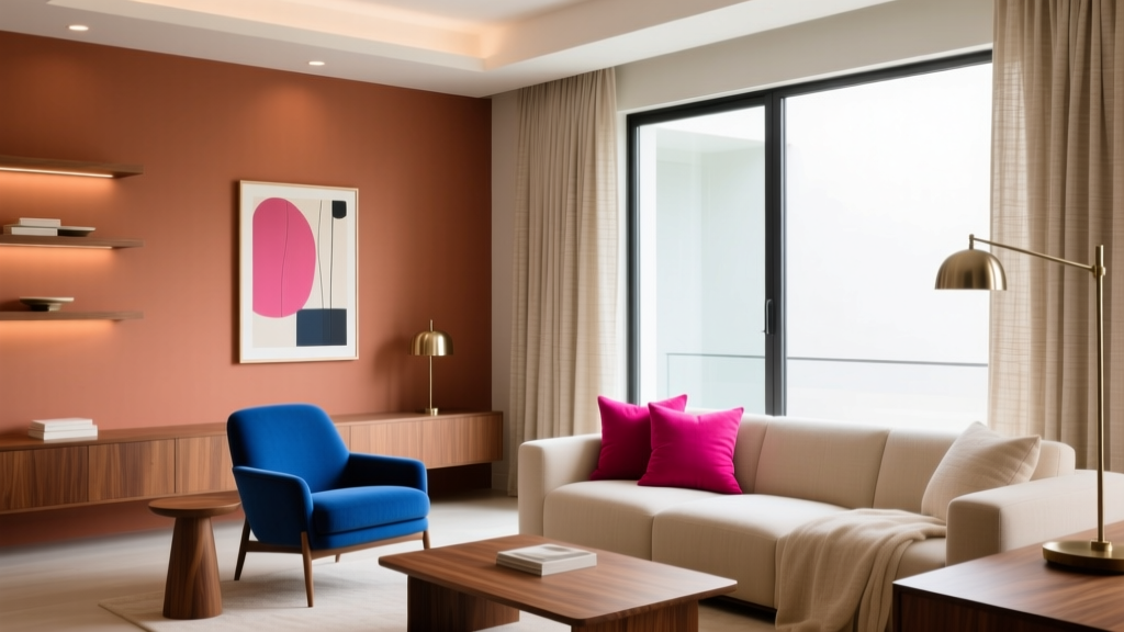
Use your lead color on walls or a large rug, your second color in upholstery or curtains, and your accent color in repeatable decor.
- Choose a neutral sofa to give the triadic palette breathing room.
- Repeat the accent color at least three times (pillow, art, object) for cohesion.
- Anchor the scheme with one unifying metal finish (brass, black, nickel).
Kitchen: Triadic Through Cabinetry, Tile, and Decor
Kitchens don’t need three paint colors on walls to feel triadic. You can build a triadic color scheme with:
- Cabinet color (lead): muted green, navy, or warm white
- Tile or runner (supporting): patterned with your second hue
- Stools, art, small appliances (accent): your third hue
Example: Sage cabinets + creamy walls + terracotta runner + small blue accents (vase, bowl, art). This feels curated and friendly—perfect for the social heart of the home.
Bedroom: Softer Triadic for Restful Color Psychology
Bedrooms benefit from lower saturation. Keep the boldest hue to 10% or less.
- Lead color: soft blue-green, warm greige, or muted lavender
- Supporting color: earthy clay or dusty rose
- Accent color: golden ochre or deep navy in small doses
Pro tip: Use the accent color in a single high-impact element (a lumbar pillow, bedside lampshade, or framed print) to maintain calm.
Bathroom: A Small Space That Can Handle More Color
Bathrooms are ideal for experimenting with a triadic palette because the footprint is small and the materials do a lot of the work.
- Try a colored vanity (lead) + tile (supporting) + towels/art (accent).
- Use warm metals to connect the palette: brushed brass pairs beautifully with teal/coral/sand or navy/terracotta/cream.
Common Triadic Color Mistakes to Avoid
- Using three equally bold colors at equal amounts: This often reads busy. Assign clear roles (60–30–10).
- Ignoring undertones: A cool teal, a warm coral, and a greenish beige can clash if their undertones fight. Compare paint chips directly and test on the wall.
- Forgetting neutrals: Triadic schemes need “rest stops.” Add warm whites, wood tones, black accents, or stone textures.
- Over-coloring open concept spaces: If rooms flow together, keep the lead color consistent and vary the supporting/accent colors by zone.
- Not sampling paint in your lighting: North light cools colors; warm bulbs can yellow them. Always test samples morning, afternoon, and evening.
Practical Tips for Applying Triadic Color Schemes Like a Pro
- Start with one “hero” item: A patterned rug, artwork, or pillow that already includes three hues. Pull your wall paint color from the most muted shade in that item.
- Use finish to control intensity: Matte walls soften saturation; satin/semigloss amplifies it (great for trim or a statement door).
- Repeat colors across the room: Spread each color through high/low placements—curtains (high), furniture (mid), accessories (low).
- Let wood and natural fibers do bridging work: Oak, walnut, rattan, jute, and linen connect disparate hues and add warmth.
- Choose a consistent white paint for trim: For many triadic palettes, Benjamin Moore Simply White (OC-117) or Sherwin-Williams Pure White (SW 7005) keeps things crisp and flexible.
FAQ: Triadic Color Schemes in Interior Design
What is the difference between a triadic and complementary color scheme?
A complementary color scheme uses two colors opposite each other on the color wheel (high contrast, bold). A triadic color scheme uses three evenly spaced colors, which creates contrast but with more balance and versatility for whole-home interior color design.
Can I use a triadic color scheme if I prefer neutral interiors?
Yes. Keep your lead color neutral (warm white, greige, soft taupe), then bring the other two hues in through accessories, artwork, and textiles. Muted versions—sage, dusty blue, terracotta—feel sophisticated and subtle.
How do I choose triadic paint colors that won’t feel too bright?
Look for toned-down paint colors with gray or earthy undertones. Use one stronger accent and keep the other two softer. Sampling is key: paint large swatches and check them in your room’s natural and artificial light.
Do triadic color schemes work in open floor plans?
They can, with restraint. Use one consistent lead color throughout the connected space (often a wall color or a continuous neutral), then shift the supporting and accent colors by area—living zone, dining zone, kitchen zone—to maintain flow.
How many paint colors should I use on walls in a triadic scheme?
Often just one wall paint color plus a trim color is enough. The other hues can appear in furniture, rugs, curtains, and decor. If you want more color on walls, limit it to one accent wall, built-ins, or a powder room.
Next Steps: Turn Triadic Theory into a Room Plan
Pick one room, identify your lead color (usually the wall paint color), then choose two supporting hues based on a true triadic relationship. Apply the 60–30–10 rule, keep saturation under control, and use neutrals and natural textures to give your palette breathing room. Start with samples—Benjamin Moore, Sherwin-Williams, and Farrow & Ball all offer excellent options—and test them in your home’s lighting before committing.
If you’re ready for more paint color ideas, color scheme guides, and room-by-room interior color design strategies, explore the latest color articles on thedecormag.com.
More Articles
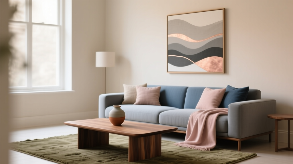 How to Use Undertones to Match Colors - The Decor Mag
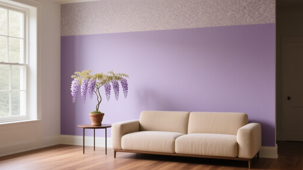 Best Wisteria Paint Colors - The Decor Mag
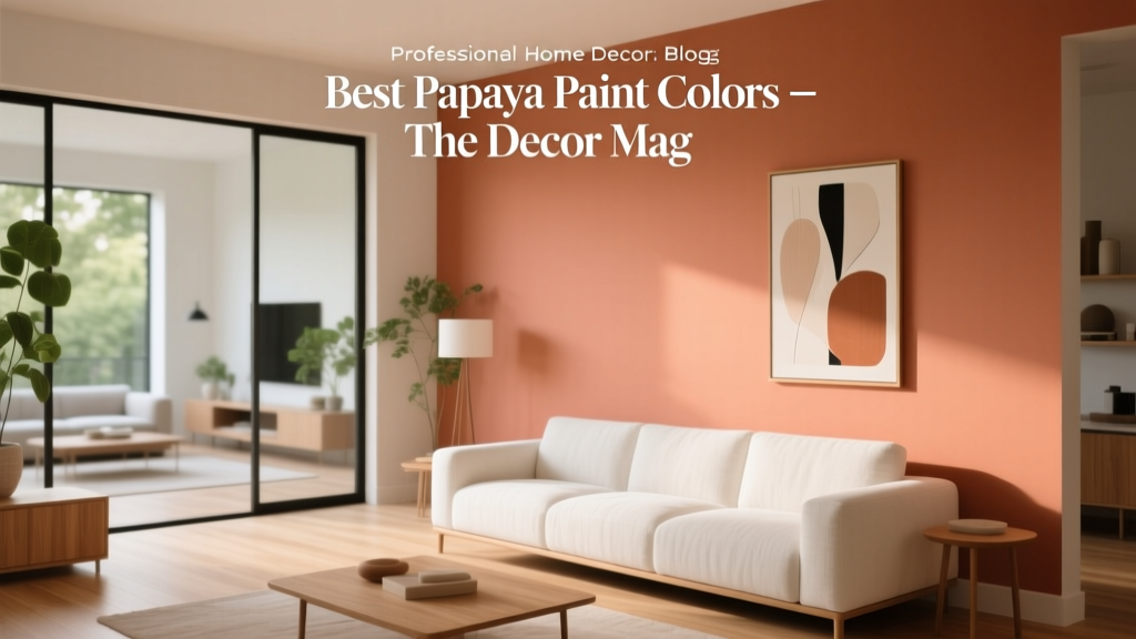 Best Papaya Paint Colors - The Decor Mag
 How to Create a Contemporary Color Palette - The Decor Mag
 How to Use Color to Change Room Perception - The Decor Mag
 Best Lavender Paint Colors for Relaxation - The Decor Mag
 Setup Trends 2026: Modular Workspaces, AI-Integrated Ergonomics, and Sustainable Hardware Standards
 Open Floor Plan Color Transitions (2026)
 Saturated Colors in Decor: Use Without Overwhelming
 How to Choose Colors for a Laundry Room - The Decor Mag