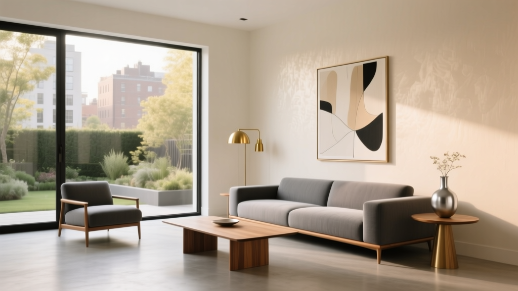
Best Champagne Paint Colors - The Decor Mag
Champagne paint colors sit in that sweet spot between warm neutrals and soft metallic-inspired hues—never quite beige, never quite gold, and almost always more flattering than plain white. They bring the glow of candlelight into everyday spaces, reflecting light with a gentle warmth that makes rooms feel finished, elevated, and welcoming.
For homeowners and design enthusiasts, champagne matters because it’s both forgiving and transformative. It can soften harsh daylight, warm up north-facing rooms, and add quiet luxury to builder-basic finishes. When chosen well, champagne creates a cohesive backdrop for a wide range of interior color schemes—from airy modern to traditional, transitional, and even contemporary glam.
This guide breaks down what champagne paint really looks like on walls, how to choose the best undertone for your home, and the most reliable champagne paint colors from top brands—plus practical color combinations, real-room applications, and common mistakes to avoid.
What Is a Champagne Paint Color?
In interior color design, “champagne” typically describes a light neutral with warm undertones—often a blend of beige, creamy off-white, and a hint of golden or peachy warmth. Some champagne paint colors lean slightly taupe, while others carry a delicate pink-beige cast. A few include a subtle pearlescent quality (more common in specialty finishes), but most champagne wall paints are matte or eggshell and read as “glowy” rather than sparkly.
Champagne vs. Beige vs. Greige vs. Cream
- Champagne vs. beige: Champagne is usually lighter and more luminous, often with a gentle golden or peach undertone.
- Champagne vs. greige: Greige has gray influence; champagne is warmer and less “cement-like.”
- Champagne vs. cream: Cream can skew buttery-yellow; champagne tends to be more balanced, sometimes with a soft blush warmth.
Why Champagne Works: Color Psychology and Design Benefits
Warm neutrals like champagne are popular for good reason: they create emotional comfort without feeling heavy. From a color psychology standpoint, champagne reads as:
- Inviting: Warm undertones help spaces feel hospitable and lived-in.
- Optimistic: A hint of golden warmth can subtly lift the mood, especially in darker seasons.
- Polished: Champagne adds an “edited” look—like a soft filter that makes furnishings feel more cohesive.
From a design principles perspective, champagne shines as a background color. It supports contrast (dark woods, black accents), harmony (other warm neutrals), and gentle emphasis (metal finishes, art, and textiles).
How to Choose the Best Champagne Paint Color for Your Home
1) Identify the Undertone You Need
Champagne is all about undertone. Look for clues in existing finishes you can’t easily change: flooring, countertops, tile, and upholstery.
- Golden champagne: Complements honey oak, warm woods, brass, travertine, and creamy whites.
- Peachy or pink-beige champagne: Beautiful with warm gray floors, rosy woods, and soft whites; can flatter skin tones in bedrooms and baths.
- Taupe-champagne: Great when you want warmth without yellow; pairs well with stone, aged bronze, and charcoal accents.
2) Consider Light Direction and Time of Day
- North-facing rooms: Cooler, bluer light can dull champagne; choose a slightly richer, warmer option to prevent it from looking flat.
- South-facing rooms: Abundant warm light can amplify yellow undertones; opt for a balanced champagne to avoid a buttery look.
- East-facing rooms: Bright in the morning, cooler later; champagne can look crisp early and more neutral by afternoon.
- West-facing rooms: Warm late-day glow; champagne looks luxe and cozy, but avoid overly gold-leaning shades if you dislike warmth.
3) Pick the Right Sheen
- Matte: Soft, velvety, sophisticated; best for living rooms and bedrooms (and for hiding wall texture).
- Eggshell: A classic for hallways and family rooms; subtle washability.
- Satin: Higher durability; consider for kids’ spaces or mudrooms (can highlight imperfections).
Best Champagne Paint Colors (Designer-Approved Picks)
Below are standout champagne paint colors that consistently perform well in real homes. Because lighting and adjacent finishes change everything, treat these as strong starting points and always sample.
Benjamin Moore Champagne Paint Colors
Benjamin Moore Muslin (OC-12)
A soft, warm off-white that reads like linen with a gentle champagne glow. Great when you want a light, airy neutral that won’t feel stark.
- Best for: Open-concept spaces, trim-friendly walls, low-contrast palettes
- Pairs well with: White Dove (trim), natural oak, warm grays, woven textures
Benjamin Moore Ballet White (OC-9)
A beloved warm neutral that often reads as a creamy champagne—especially in rooms with warm light. It’s soft, flattering, and remarkably versatile.
- Best for: Bedrooms, living rooms, whole-home color schemes
- Watch for: In very warm light, it can lean creamier; keep trim a clean warm white for balance.
Benjamin Moore Natural Cream (OC-14)
More golden than Ballet White, Natural Cream gives a true champagne warmth—excellent for cozy spaces and traditional interiors.
- Best for: Dining rooms, dens, north-facing rooms needing warmth
- Pairs well with: Brass accents, espresso woods, creamy tile
Sherwin-Williams Champagne Paint Colors
Sherwin-Williams Alabaster (SW 7008)
Often categorized as an off-white, Alabaster can read champagne in warm interiors. It’s soft, lightly creamy, and extremely popular for a reason: it flatters most finishes without looking yellow.
- Best for: Walls and trim in a cohesive, warm-neutral home
- Pairs well with: Accessible Beige (adjacent rooms), natural stone, warm metals
Sherwin-Williams Shoji White (SW 7042)
A warmer, deeper off-white that can feel like a refined champagne beige. Great for homeowners who want more body than Alabaster.
- Best for: Hallways, open layouts, rooms with bright daylight
- Design tip: Use a slightly brighter white on trim to keep the look crisp.
Sherwin-Williams Natural Linen (SW 9109)
A nuanced warm neutral with a subtle golden-beige cast. It reads “champagne” when paired with creamy whites and warm metals.
- Best for: Living rooms, home offices, transitional interiors
- Pairs well with: Black accents, walnut, warm white drapery
Behr Champagne Paint Colors
Behr Swiss Coffee
A creamy off-white with warmth that can lean champagne depending on light. A reliable choice for softening a space without going too tan.
- Best for: Whole-house neutrals, rental-friendly refreshes
- Pairs well with: Matte black hardware, oak floors, warm grays
Behr Almond Wisp
A gentle beige with a delicate golden undertone. If you want champagne that reads clearly warm (not gray), this is a strong candidate.
- Best for: Traditional spaces, cozy bedrooms, family rooms
Farrow & Ball (Champagne-Like Neutrals)
Farrow & Ball School House White
A warm, classic neutral that can read champagne in the right light—subtle, grounded, and timeless.
- Best for: Older homes, plaster walls, heritage details
- Pairs well with: Soft grays, aged brass, warm wood tones
Real Room Examples: Where Champagne Paint Looks Best
Living Room: Soft Luxury Without the Commitment of Beige
Champagne walls in a living room create an elegant canvas for layered texture. Picture a space with:
- Champagne walls (eggshell)
- Crisp warm-white trim
- A linen sofa in ivory
- Walnut or oak coffee table
- Accents in brass and black for contrast
Design move: Add depth with a darker “anchor” color—charcoal pillows, a deep olive throw, or a black metal floor lamp.
Bedroom: Flattering, Calm, and Cozy
Champagne is a bedroom favorite because it’s gentle on the eyes and flattering to skin tones. Try pairing champagne walls with:
- Warm white bedding (layered textures: matelassé, linen, quilted cotton)
- Wood nightstands (oak, walnut, or painted taupe)
- Muted accent colors: dusty rose, clay, soft sage, or warm gray
Best sheen: Matte for a cocooning effect.
Kitchen & Cabinets: Warm Neutrals That Feel Clean
Champagne wall color can make kitchens feel brighter and more welcoming—especially with white or cream cabinets. In a kitchen with quartz counters and warm metal hardware, champagne adds warmth without making the space look “tan.”
- Try: Champagne walls + warm white cabinets + brushed brass pulls
- Backsplash idea: Cream zellige tile or warm white subway tile with light grout
Application tip: If cabinets are very creamy, choose a champagne that’s slightly lighter on the walls to avoid a muddy, low-contrast look.
Bathroom: Spa Warmth That Still Feels Fresh
Bathrooms can skew cold with porcelain and chrome. Champagne paint introduces softness—especially paired with warm lighting (2700K–3000K).
- Champagne walls
- Off-white trim
- Natural stone or warm marble
- Brass or champagne-bronze fixtures
Pro detail: If your tile has pink-beige veining, choose a champagne with a subtle rosy undertone to make it feel intentional.
Hallways & Open Concept Homes: A Seamless Neutral Backdrop
Champagne is excellent for connecting rooms because it adapts to shifting light. It keeps flow while allowing accent rooms (a navy office, a green dining room) to shine.
Color Schemes That Pair Beautifully with Champagne
Use champagne as your base and build a palette using contrast, temperature, and repetition.
Classic Champagne + White + Black
- Walls: Champagne
- Trim: Warm white
- Accents: Matte black (lighting, frames, hardware)
Creates a clean, tailored look—perfect for modern and transitional interiors.
Champagne + Soft Sage + Natural Wood
- Walls: Champagne
- Accent color: Sage or olive (pillows, drapery, an accent wall)
- Materials: Oak, rattan, linen
Relaxed and organic; ideal for living rooms and bedrooms.
Champagne + Navy + Brass
- Walls: Champagne
- Statement color: Navy (built-ins, island, dining chairs)
- Metals: Brass for warmth and glow
High contrast with a luxe edge—great for dining rooms and offices.
Champagne + Warm Grays + Cream
- Walls: Champagne
- Upholstery: Warm gray
- Textiles: Cream and oatmeal
A soft, layered neutral scheme that feels sophisticated rather than flat.
Practical Application Tips for a Professional Finish
- Sample large, not small: Paint a 2' x 2' (or larger) sample on multiple walls. Champagne shifts dramatically from morning to night.
- Check it against fixed finishes: Hold samples next to flooring, tile, countertops, and upholstery. Undertones reveal themselves fastest here.
- Use the right lighting: Warm bulbs (2700K–3000K) enhance champagne’s glow; cool bulbs can make it look dull or slightly gray-green.
- Choose a trim color with intention: A crisp warm white trim makes champagne feel elevated. If trim is too creamy, walls can look muddy by comparison.
- Unify with sheen strategy: Keep ceilings flat matte; use eggshell on walls; reserve satin for trim and doors if you like a subtle contrast.
Common Champagne Paint Mistakes to Avoid
- Picking champagne in a store and calling it done: Retail lighting distorts undertones. Always test in your home.
- Ignoring undertones in tile and countertops: Champagne can turn pink, yellow, or dull if it fights a cool gray stone or stark white tile.
- Going too yellow in sunny rooms: South- and west-facing spaces can amplify warmth. Choose a more balanced champagne to avoid a buttery cast.
- Using the same warm color everywhere without contrast: Champagne looks best with anchors—black, charcoal, espresso wood, or a deep accent color.
- Mismatching metals: Champagne walls adore warm metals (brass, antique gold, champagne bronze). Cool chrome can work, but the room needs other cool elements to feel cohesive.
FAQ: Best Champagne Paint Colors
Is champagne paint color warm or cool?
Most champagne paint colors are warm, with undertones that lean golden, creamy, peachy, or pink-beige. Some read more neutral-taupe, especially in cooler light.
Will champagne paint make my room look yellow?
It can if the shade is very golden and the room has strong warm sunlight or warm artificial lighting. To avoid yellow, choose a balanced champagne (less gold, more beige/taupe) and pair it with a clean warm white trim.
What trim color goes best with champagne walls?
A warm white trim is usually the best match. Popular pairings include Benjamin Moore White Dove and Sherwin-Williams Alabaster (either on trim or walls depending on your main color). The goal is a trim that looks crisp, not dingy, next to the champagne.
Do champagne paint colors work with gray floors?
Yes—choose a champagne with a slightly taupe or pink-beige undertone so it harmonizes with the gray rather than fighting it. Avoid overly golden champagne if the floor reads icy or blue-gray.
Is champagne a good whole-house paint color?
Absolutely, especially for open concept homes. It creates flow while staying warmer and more inviting than many popular greiges. The key is picking a champagne that behaves well in your home’s lighting and complements your fixed finishes.
What are the best accent colors with champagne paint?
Reliable accent colors include navy, sage, olive, charcoal, black, and terracotta. Add contrast through textiles, art, and one or two statement pieces rather than trying to “match” everything.
Next Steps: How to Land on Your Perfect Champagne
To choose the best champagne paint color for your home, start with two or three contenders (one balanced, one slightly warmer, one slightly taupe-leaning). Sample them on multiple walls, view them through the day and night, and compare them directly to your flooring, countertops, and trim. Once the undertone clicks, champagne becomes one of the easiest colors to decorate around—warm, timeless, and quietly luxurious.
For more paint color ideas, coordinated color schemes, and room-by-room guidance, explore the latest color guides on thedecormag.com.
More Articles
 How to Create a Restraint Color Palette - The Decor Mag
 Best Yellow Paint Colors for Cheerful Rooms - The Decor Mag
 The Ultimate Reading Guide: Science-Backed Strategies for Faster Comprehension, Retention, and Lifelong Engagement
 How to Choose Colors for a Breakfast Nook - The Decor Mag
 How to Create a Contemporary Color Palette - The Decor Mag
 Best Seaweed Green Paint Colors - The Decor Mag
 Placement Safety Tips: Preventing Falls, Injuries, and Equipment Failure in Industrial and Residential Settings
 How to Choose Colors for a Garage Conversion - The Decor Mag
 How to Choose Colors for a Courtyard - The Decor Mag
 How to Choose Accent Wall Colors - The Decor Mag