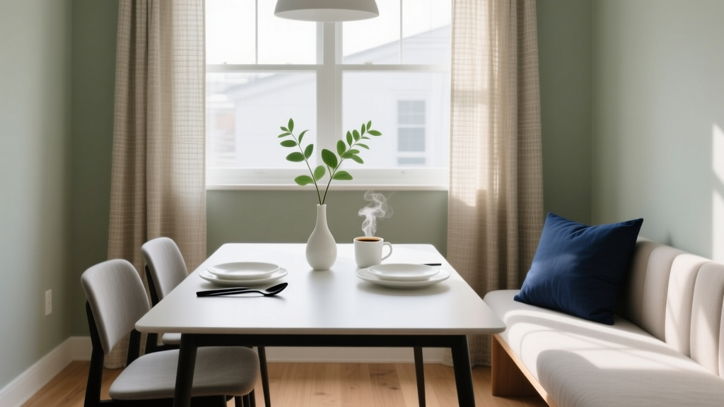
How to Choose Colors for a Breakfast Nook - The Decor Mag
A breakfast nook is one of the most deceptively powerful spaces in a home. It’s where mornings begin, where homework spreads out after school, where friends linger over coffee. Because it’s often smaller than a dining room and closer to the kitchen’s daily activity, the colors you choose have an outsized effect on mood, appetite, and how “pulled together” the entire kitchen area feels.
Color decisions in a breakfast nook aren’t just about finding a pretty paint swatch. You’re balancing sunlight (often strong in the morning), food and drink (warm tones and natural textures), and the visual relationship to nearby rooms. Done well, the right paint colors and color scheme can make a nook feel brighter, calmer, cozier, or more energetic—without a renovation.
Use this guide to choose breakfast nook colors with confidence, using design principles, color psychology, and practical application tips that work in real homes.
Start With the Nook’s Light: The “True Color” Test
Lighting is the biggest variable in interior color design. Breakfast nooks frequently get morning sun, which can make paint colors appear warmer and brighter early in the day—and flatter, cooler, or even slightly gray by evening.
Identify your light exposure
- North-facing: Cooler, consistent light. Warm paint colors often look better; cool colors can feel icy.
- East-facing: Bright, warm morning light; cooler later. Most colors look lively at breakfast time.
- South-facing: Strong, warm light most of the day. Can handle deeper or cooler hues without feeling dark.
- West-facing: Dimmer mornings, warmer afternoons. Choose colors that won’t look dull early in the day.
Practical tip: test like a designer
- Buy sample pots or peel-and-stick samples in 3–5 candidate paint colors.
- Paint large swatches (at least 12" x 12") on multiple walls, especially near windows and in corners.
- Check the colors at breakfast time, mid-day, and evening under your actual light bulbs.
If your nook shares space with the kitchen, also compare your samples next to cabinets, countertops, and flooring. A paint color can be “right” on its own and still clash with a warm oak floor or a cool marble-look countertop.
Pick the Mood First: Color Psychology for a Breakfast Nook
Before you choose a specific shade, decide how you want the nook to feel. Color psychology isn’t about rigid rules; it’s about stacking the odds in favor of the experience you want.
- Warm whites and creams: Welcoming, clean, and food-friendly. Great for everyday comfort.
- Soft greens: Restful and fresh—often the easiest “color” for people who fear color.
- Blues: Calm and airy, but very cool blues can suppress appetite. Choose softened, gray-leaning blues for balance.
- Yellows: Optimistic and energizing; best when muted to avoid harshness in bright light.
- Terracotta and clay tones: Cozy, grounding, and flattering with wood and natural fibers.
- Deep hues (navy, forest, charcoal): Intimate and tailored; ideal for a nook with good light or strong contrast.
Choose a Color Scheme That Connects to the Kitchen
Most breakfast nooks are visually linked to a kitchen, so your paint colors should feel intentional with nearby finishes. A simple interior color design trick: build your nook palette from what’s already there.
Three dependable color scheme frameworks
- Monochromatic: Variations of one hue (light to dark). Calm, cohesive, and easy to execute.
- Analogous: Neighboring hues (e.g., blue-green, green, yellow-green). Soft and nature-inspired.
- Complementary (softened): Opposites on the color wheel (e.g., blue + warm wood/orange tones). Best when one side is muted or used as an accent.
Quick harmony check
Look at the undertones:
- If your cabinets/counters read warm (cream, beige, honey oak, gold hardware), choose paint colors with warm undertones (creamy whites, olive greens, clay beiges).
- If your finishes read cool (bright white cabinets, gray stone, chrome hardware), choose paint colors that are cool or balanced (soft blue-grays, crisp whites, blue-leaning greens).
Specific Color Recommendations (With Paint Names You Can Ask For)
These tried-and-true paint colors work especially well in breakfast nooks because they’re livable, flattering in natural light, and easy to pair with wood, tile, and textiles. Always sample first—your light and surrounding materials will shift how a color reads.
Warm whites and creamy neutrals (bright, inviting, timeless)
- Benjamin Moore White Dove (OC-17): A balanced warm white that softens kitchens and feels welcoming in a nook.
- Sherwin-Williams Alabaster (SW 7008): Creamy without going yellow; great for cozy cottage or modern farmhouse nooks.
- Farrow & Ball School House White (No. 291): A gentle, chalky neutral that pairs beautifully with wood furniture.
Best pairings: natural oak table, matte black or aged brass lighting, linen cushions, warm stoneware.
Soft greens (fresh, calming, universally flattering)
- Benjamin Moore Saybrook Sage (HC-114): A classic sage that adds warmth and depth without feeling dark.
- Sherwin-Williams Sea Salt (SW 6204): A light green-blue that reads airy; ideal for smaller nooks.
- Farrow & Ball Mizzle (No. 266): Sophisticated green-gray that shifts beautifully with daylight.
Best pairings: white or cream upholstery, woven shades, walnut or oak, greenery on the sill.
Gentle blues (clean, airy, and classic—choose softened shades)
- Benjamin Moore Smoke (2122-40): A moody blue-green-gray that feels calm and architectural.
- Sherwin-Williams Misty (SW 6232): A pale blue-gray that reads clean and light in morning sun.
- Farrow & Ball Light Blue (No. 22): A heritage-feeling blue that’s cheerful without being loud.
Best pairings: crisp white trim, brushed nickel, marble-look counters, blue-and-white textiles.
Sunny but sophisticated yellows (energizing without glare)
- Benjamin Moore Hawthorne Yellow (HC-4): A warm, muted historic yellow that flatters wood tones.
- Sherwin-Williams Friendly Yellow (SW 6680): A soft, approachable yellow that reads happy but not neon.
Best pairings: warm white trim, cane or rattan chairs, natural jute rug, simple white dishes on open shelving.
Clay, terracotta, and warm taupes (cozy, appetite-friendly, design-forward)
- Benjamin Moore Pale Oak (OC-20): A warm greige that makes a nook feel serene and elevated.
- Sherwin-Williams Accessible Beige (SW 7036): A reliable warm neutral that works with many kitchen finishes.
- Farrow & Ball Red Earth (No. 64): Earthy and rich—beautiful for an accent wall or banquette backing.
Best pairings: terracotta pottery, warm metals, butcher block, caramel leather or cognac cushions.
Deep, dramatic hues (intimate, high contrast, surprisingly cozy)
- Benjamin Moore Hale Navy (HC-154): Classic navy that looks tailored and sharp; great with white trim.
- Sherwin-Williams Evergreen Fog (SW 9130): A modern green-gray that reads grounded and upscale.
- Farrow & Ball Railings (No. 31): Inky blue-black for a sophisticated nook with strong natural light.
Best pairings: bright white wainscoting, brass pendant, light wood table, patterned seat cushions.
Real Room Scenarios: What Works Where
Scenario 1: Small nook with one window (make it feel bigger)
Goal: Keep it bright, avoid harsh contrast.
- Walls: Sherwin-Williams Alabaster (SW 7008)
- Trim: a clean white (use the same color in a higher sheen for a seamless look)
- Accents: sage cushions, light oak table, woven pendant
Why it works: A warm white reflects light and makes corners recede, while soft green accents add life without visual clutter.
Scenario 2: Built-in banquette (add depth without shrinking the room)
Goal: Make the banquette look custom and intentional.
- Banquette: Benjamin Moore Hale Navy (HC-154) in a durable satin finish
- Walls: Benjamin Moore White Dove (OC-17)
- Textiles: navy + cream stripe, warm wood table, brass sconce
Why it works: High contrast defines architecture and hides everyday scuffs on the seating base.
Scenario 3: Open-plan kitchen + nook (create a zone)
Goal: Subtly define the nook without closing it off.
- Nook walls: Farrow & Ball Mizzle (No. 266)
- Kitchen walls/cabinet backdrop: a warm white like White Dove
- Bridge element: repeat Mizzle in curtains, dishware, or art
Why it works: An analogous, nature-inspired palette creates separation while staying cohesive with the kitchen.
Scenario 4: Low natural light (avoid dreary “gray”)
Goal: Warmth and clarity, especially early in the day.
- Walls: Benjamin Moore Pale Oak (OC-20)
- Ceiling: same color, lighter sheen to reduce contrast lines
- Lighting: warm bulbs (2700K), dimmable
Why it works: Warm greige keeps the nook from feeling cold and helps food and skin tones look natural.
Where to Use Color: Walls, Trim, Ceiling, and Furniture
A breakfast nook gives you multiple “canvases.” You don’t have to paint every surface to make color feel intentional.
Smart ways to apply color
- All-over color (walls + trim): Creates a cocoon effect; great for deep greens, navies, and moody blue-grays.
- Two-tone walls: Try a painted wainscot with lighter walls above for classic structure.
- Accent wall: Useful if the nook is visible from the entry and you want a focal point behind the table.
- Painted furniture: A painted table base or chairs can add color without committing to wall paint.
- Ceiling color: Soft blue or warm white on the ceiling can make the nook feel taller and more finished.
Finish and sheen guidance (practical + pretty)
- Walls: eggshell or matte (matte hides imperfections; eggshell wipes easier)
- Trim and built-ins: satin or semi-gloss for durability
- Banquette seating: satin for cleanability and a refined glow
Common Color Mistakes to Avoid
- Choosing paint colors without sampling: A swatch can shift dramatically in morning sun and next to cabinets.
- Ignoring undertones: A “neutral” can still read pink, green, or purple next to stone or tile.
- Defaulting to cool gray: Many gray paints feel chilly in a breakfast nook, especially with warm wood or low light.
- Too much contrast in a tiny nook: Stark white trim against a saturated wall can create visual choppiness. Consider softer contrast or color-drenching.
- Forgetting the view into adjacent rooms: Your breakfast nook color scheme should connect to the kitchen and nearby living areas.
- Using very bright yellows in strong light: They can look sharp or glaring. Muted, creamy yellows are easier to live with.
A Simple Step-by-Step Method to Choose Your Breakfast Nook Colors
- Inventory fixed elements: flooring, cabinets, countertops, backsplash, and metal finishes.
- Decide the mood: airy and bright, cozy and grounded, fresh and natural, or bold and tailored.
- Select a scheme: monochromatic for calm, analogous for softness, complementary for energy.
- Pick 3 candidates: one lighter, one mid-tone, one deeper in your chosen direction.
- Sample in place: check morning and evening; compare next to upholstery and wood.
- Choose your “anchor”: wall color or banquette color first, then add accents through textiles and art.
FAQ: Breakfast Nook Paint Colors and Color Schemes
What are the best paint colors for a breakfast nook with lots of morning sun?
East-facing nooks can handle a wide range, but overly bright colors can feel intense. Try a warm white like Sherwin-Williams Alabaster, a soft green like Benjamin Moore Saybrook Sage, or a muted blue-gray like Sherwin-Williams Misty.
Should a breakfast nook match the kitchen?
It should relate, not necessarily match. A cohesive color scheme often means sharing undertones (warm with warm, cool with cool) and repeating one or two colors across spaces through paint, textiles, or accessories.
What colors make a breakfast nook look bigger?
Light-reflective paint colors with gentle undertones work best: Benjamin Moore White Dove, Sherwin-Williams Alabaster, or a pale green-blue like Sherwin-Williams Sea Salt. Keeping trim close to the wall color reduces hard edges and expands the feel.
Are dark colors a bad idea for a breakfast nook?
Not if the nook has decent light or if you balance it with lighter furniture and trim. Navy (Benjamin Moore Hale Navy) or green-gray (Sherwin-Williams Evergreen Fog) can look tailored and cozy—especially on a banquette or an accent wall.
What’s an easy, foolproof breakfast nook color palette?
Try warm white walls + natural wood + soft green accents. Example: White Dove on walls, oak table, and sage textiles. It’s timeless, flattering in most light, and works with many kitchen styles.
Which paint sheen is best for a breakfast nook?
Eggshell is a reliable choice for walls because it’s more wipeable than matte. Use satin on trim and built-ins for durability, especially around seating where scuffs happen.
Next Steps: Make Your Color Choice Feel Intentional
Pick a direction today: warm and creamy, fresh green, airy blue, sunny yellow, earthy clay, or bold and dramatic. Then narrow your options to three paint colors, sample them on the actual walls, and view them during breakfast hours as well as at night. Once your wall (or banquette) color is set, repeat it in small ways—cushions, a rug, or artwork—to make the nook feel designed rather than accidental.
For more paint color ideas, color schemes, and room-by-room interior color design guidance, explore the color guides here on thedecormag.com.
More Articles
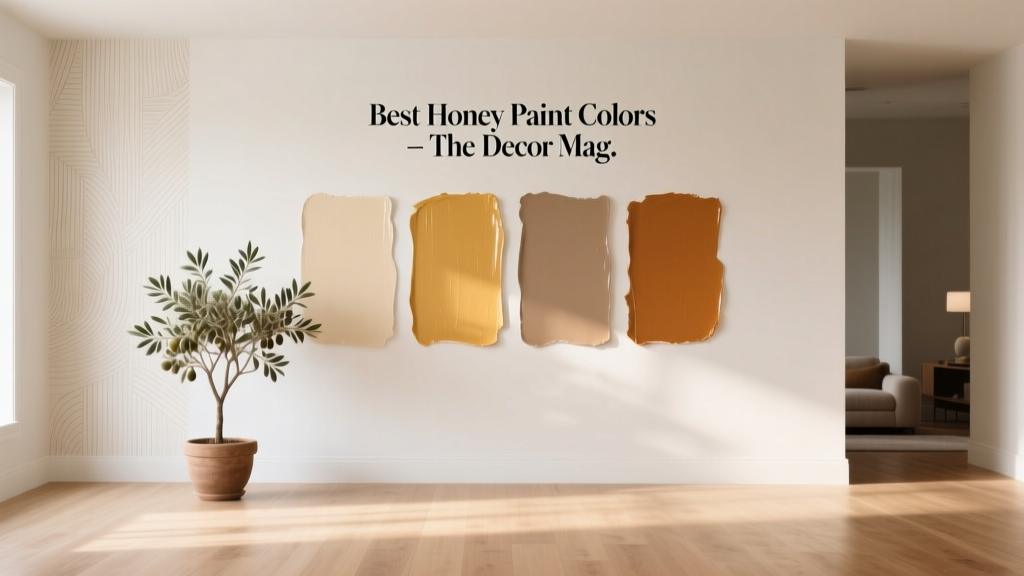 Best Honey Paint Colors - The Decor Mag
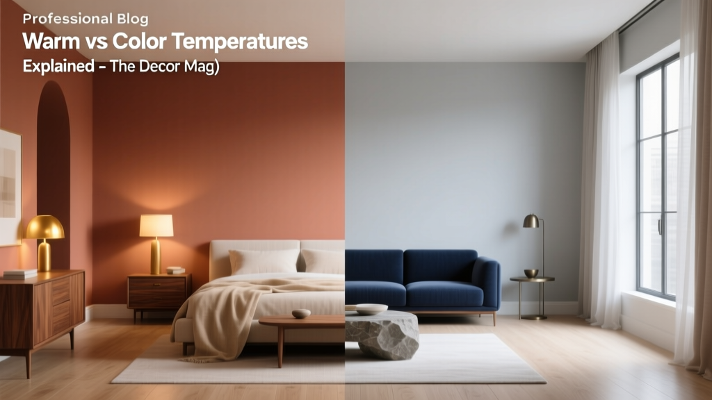 Warm vs Cool Color Temperatures Explained - The Decor Mag
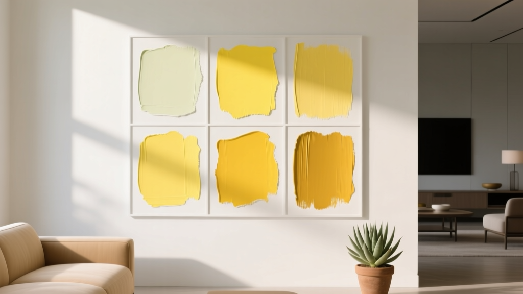 Best Citron Paint Colors - The Decor Mag
 Best Teal Paint Colors for Calm Spaces - The Decor Mag
 How to Use Color to Create Unity - The Decor Mag
 How to Create an Uplifting Color Palette - The Decor Mag
 How to Use Color to Change Room Perception - The Decor Mag
 Best Chartreuse Paint Colors - The Decor Mag
 How to Choose Colors for a Potting Shed - The Decor Mag
 Best Purple Paint Colors for Sophistication - The Decor Mag