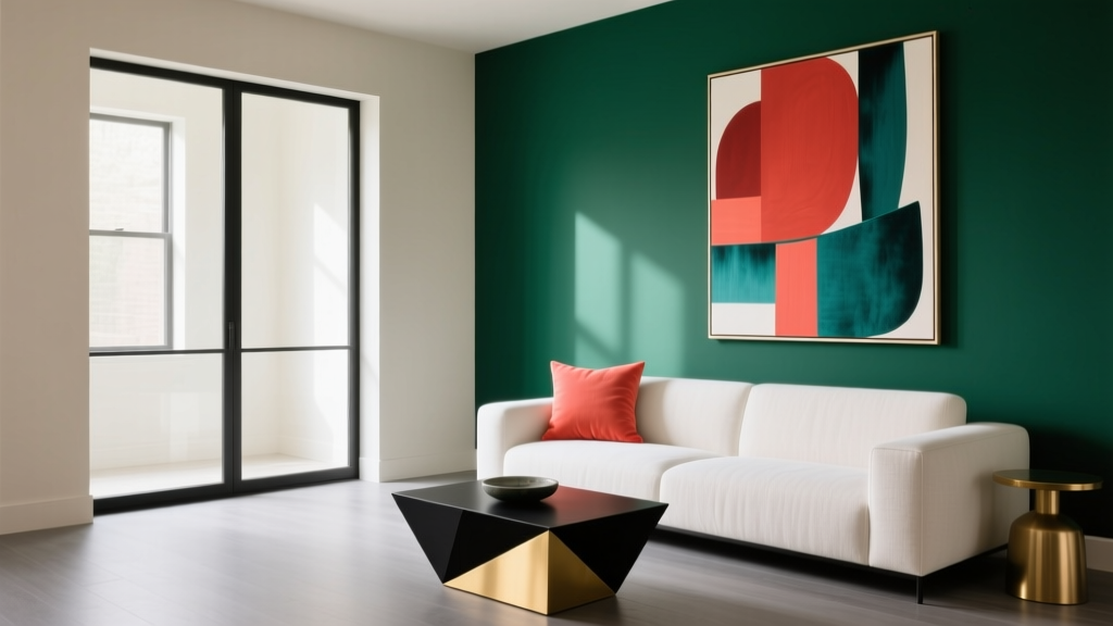
How to Use Color to Create Contrast - The Decor Mag
Contrast is the secret ingredient that keeps a room from feeling flat. It’s what makes your eye move—across a wall, toward a focal point, down to the floor, and back again. When contrast is done well, a space feels intentional and energized, even if the palette is simple. When it’s missing, even expensive furniture and beautiful finishes can look oddly “samey.”
Color contrast isn’t only about choosing black and white (though that can be stunning). It’s about controlling light and dark, warm and cool, bold and muted, and even glossy versus matte. Understanding how contrast works helps homeowners make confident paint color decisions, build stronger color schemes, and create rooms that feel balanced, layered, and personal.
This guide breaks down the most useful contrast types, shows how to apply them in real rooms, and offers specific paint color recommendations—so you can create a more dynamic home without guesswork.
What “Contrast” Really Means in Interior Color Design
In interior design, contrast is the difference between two or more elements—often colors—that creates visual hierarchy and clarity. It’s rooted in classic design principles (balance, emphasis, rhythm) and backed by color psychology: strong contrast can feel crisp and modern; gentle contrast can feel calm and restorative.
Four contrast types to know
- Value contrast (light vs. dark): The most impactful and easiest to control with paint.
- Temperature contrast (warm vs. cool): Adds depth and mood even when colors are similar in brightness.
- Saturation contrast (bright vs. muted): Creates sophistication and prevents bold colors from overwhelming a space.
- Sheen and texture contrast: Matte walls against glossy trim, soft textiles against hard surfaces—subtle but powerful.
A quick rule designers use: contrast needs a “job”
Before picking colors, decide what contrast should accomplish in the room:
- Define architecture (trim, built-ins, ceiling detail)
- Highlight a focal point (fireplace, headboard wall, art)
- Improve flow (open-plan zones)
- Change perception (make a room feel taller, wider, cozier)
Start With Value: The Most Reliable Way to Create Contrast
Value is how light or dark a color appears. Two colors can be different hues but similar value—resulting in low contrast that reads “blended.” If you want obvious contrast, separate the values.
Use the 70/20/10 approach (and adjust as needed)
This classic guideline helps build a balanced interior color scheme:
- 70% dominant: Walls (or major surfaces) in a light to mid value
- 20% secondary: Upholstery, rugs, large case goods in a deeper or contrasting value
- 10% accent: The punch—art, pillows, lampshades, a painted door
Light walls + dark trim: crisp contrast with architectural payoff
This is a high-impact paint move that can still feel timeless. It works especially well in homes with substantial trim, wainscoting, or classic millwork.
Color combinations to try:
- Benjamin Moore Chantilly Lace (OC-65) walls + Benjamin Moore Hale Navy (HC-154) trim for a tailored, coastal-classic look.
- Sherwin-Williams Alabaster (SW 7008) walls + Sherwin-Williams Tricorn Black (SW 6258) trim for modern contrast that still feels warm.
- Farrow & Ball Wimborne White (No. 239) walls + Railings (No. 31) trim for a heritage, slightly moody edge.
Application tip: If dark trim feels risky, start with one element—interior doors, a built-in bookshelf, or a single window wall—before committing to the entire room.
Dark walls + light trim: dramatic but livable
Deep wall colors can be cozy and sophisticated, especially in bedrooms, dining rooms, studies, and powder rooms. Light trim prevents the room from closing in and adds crisp definition.
Try these paint pairings:
- Benjamin Moore Kendall Charcoal (HC-166) walls + Simply White (OC-117) trim for a classic, gallery-like backdrop.
- Sherwin-Williams Iron Ore (SW 7069) walls + Pure White (SW 7005) trim for modern depth without looking flat.
- Farrow & Ball Hague Blue (No. 30) walls + All White (No. 2005) trim for a jewel-box feel with clean edges.
Lighting note: Dark paint colors respond dramatically to lighting temperature. Warm bulbs (2700K) make deep colors feel richer and cozier; cool bulbs can make them look sharper and sometimes harsher.
Temperature Contrast: Warm + Cool Makes a Room Feel Layered
Temperature contrast is the interplay of warm colors (reds, oranges, warm whites) and cool colors (blues, greens, cool grays). Even small temperature shifts can create depth that feels “designer” because it mimics how light behaves in nature.
Warm neutrals + cool accents (easy, timeless, welcoming)
This approach is homeowner-friendly: the room stays calm, and accents do the heavy lifting.
- Walls: Sherwin-Williams Accessible Beige (SW 7036) or Benjamin Moore Edgecomb Gray (HC-173)
- Contrast accents: Benjamin Moore Boothbay Gray (HC-165) on cabinetry, or a cool blue rug
- Metals: Brushed nickel or blackened steel to reinforce the cool side
Cool walls + warm woods (modern, balanced, not sterile)
Cool paint colors can feel clean and airy, but they need warmth to stay inviting. Wood tones—oak, walnut, rattan—are the most natural warm counterpoint.
Room-ready ideas:
- Benjamin Moore Gray Owl (OC-52) with white oak floors and camel leather accents
- Sherwin-Williams Sea Salt (SW 6204) with warm brass lighting and natural linen textiles
- Benjamin Moore Palladian Blue (HC-144) with honey-toned wood and creamy off-white trim
Saturation Contrast: Pair Bold Color With Soft Neutrals
Saturation is the intensity of a color. Highly saturated colors feel energetic and expressive; muted colors feel restful and refined. Using both creates contrast without relying solely on light and dark.
One bold color, one quiet partner
For a sophisticated palette, let one element be vivid and keep the others more restrained.
Examples that work in real homes:
- Accent wall: Benjamin Moore Caliente (AF-290) behind a bed; surround it with warm white walls like White Dove (OC-17).
- Kitchen island: Sherwin-Williams Smoky Blue (SW 7604); pair with soft white perimeter cabinets like Alabaster (SW 7008).
- Front door: Farrow & Ball Preference Red (No. 297) against a muted greige exterior like Benjamin Moore Revere Pewter (HC-172).
Use saturation contrast to protect your “forever” finishes
If you have fixed elements—stone countertops, tile, wood floors—saturation contrast helps you bring personality without clashing. Keep the large, expensive surfaces neutral; express color through paint, textiles, and art.
Contrast Through Placement: Where You Put Color Matters
Two homes can use the same paint colors and look completely different depending on placement. Strategic placement creates focal points and improves flow.
Paint the ceiling for unexpected contrast
- For height: Keep the ceiling lighter than walls (classic, airy).
- For coziness: Paint the ceiling the same color as walls in a matte finish (enveloping, modern).
- For a “fifth wall” statement: Try a pale blue ceiling like Benjamin Moore Breath of Fresh Air (806) with warm white walls.
Create contrast with built-ins and cabinetry
Built-ins are natural candidates for contrast because they’re architectural and functional.
- Living room built-in: Paint the back panel a deeper tone (e.g., Benjamin Moore Hale Navy) while keeping the frame white.
- Kitchen cabinets: Two-tone cabinetry—light uppers, darker lowers—adds contrast without shrinking the room.
- Bathroom vanity: A deep green like Farrow & Ball Studio Green (No. 93) against warm off-white walls creates instant boutique-hotel energy.
Use doors and trim as “graphic lines”
Painting interior doors a contrasting color adds rhythm through the home, especially in hallways. Consider:
- Soft contrast: Doors in Benjamin Moore Classic Gray (OC-23) with warm white walls.
- High contrast: Doors in Sherwin-Williams Tricorn Black with off-white walls.
Real Room Examples: Contrast That Works
1) A bright living room that still feels grounded
- Walls: Benjamin Moore White Dove (OC-17)
- Trim: Benjamin Moore Chantilly Lace (OC-65) in a semi-gloss for crisp edges
- Anchor pieces: Charcoal sofa, black coffee table, or a deep navy rug
- Accents: Warm wood side tables + brass lighting for temperature contrast
Why it works: High value contrast (white walls, darker furnishings) plus warm/cool balance keeps the room airy but not bland.
2) A calming bedroom with a strong focal point
- Main walls: Sherwin-Williams Alabaster (SW 7008)
- Headboard wall: Sherwin-Williams Evergreen Fog (SW 9130)
- Bedding: Creams and taupes with a few black accents (lamp bases, frames)
Why it works: Muted green offers saturation contrast against soft neutrals, while black details add crisp punctuation.
3) A small dining room made moodier and more elegant
- Walls: Benjamin Moore Kendall Charcoal (HC-166) in matte
- Ceiling and trim: Simply White (OC-117)
- Furniture: Medium-tone wood table + upholstered chairs in a warm neutral
Why it works: Strong value contrast creates intimacy; light trim prevents the space from feeling heavy.
4) A kitchen with contrast that won’t date quickly
- Perimeter cabinets: Sherwin-Williams Alabaster (SW 7008)
- Island: Benjamin Moore Hale Navy (HC-154) or Sherwin-Williams Smoky Blue (SW 7604)
- Hardware: Polished nickel (crisp) or aged brass (warm)
- Walls: A soft neutral like Benjamin Moore Pale Oak (OC-20)
Why it works: A darker island provides contrast and grounding; light cabinetry keeps the space bright and resale-friendly.
Common Color Mistakes That Kill Contrast (and How to Fix Them)
- Mistake: Choosing colors that are different but the same value.
Fix: Compare paint chips in grayscale (or squint). If they look similar in lightness, increase the value difference. - Mistake: Ignoring undertones.
Fix: Identify whether your neutral leans pink, yellow, green, or blue. Pair warm with warm or intentionally contrast warm/cool—don’t accidentally clash. - Mistake: Using too many competing accent colors.
Fix: Limit bold accents to 1–2 hues and repeat them at least three times in the room (art, pillows, vase) for cohesion. - Mistake: Forgetting that lighting changes everything.
Fix: Test large samples (at least 12x12) on multiple walls and view them morning, afternoon, and night. - Mistake: High contrast everywhere, no resting place.
Fix: Keep one major surface calmer—often the walls or the largest upholstery piece—so contrast reads as intentional rather than chaotic.
Practical Tips for Getting Contrast Right With Paint
- Pick your anchor first: flooring, countertops, large rug, or sofa. Then build the paint color scheme around it.
- Decide your contrast level: subtle (tone-on-tone), medium (light walls/darker accents), or high (dark + light pairing).
- Choose a trim white on purpose: Warm whites (like Alabaster) soften contrast; bright whites (like Chantilly Lace) sharpen it.
- Use sheen strategically: Matte walls reduce glare; satin or semi-gloss on trim adds a crisp “outline” effect.
- Repeat contrast cues: If you choose black window frames, echo black in lighting, frames, or furniture legs.
FAQ: Color Contrast in Interior Design
How do I create contrast if I only like neutral paint colors?
Use value and texture contrast: pair a warm off-white wall (Benjamin Moore White Dove) with deeper greige upholstery, black accents, and varied materials like wood, linen, and metal. Neutrals can have strong contrast when light and dark are clearly separated.
What’s the easiest high-contrast color combination that won’t feel harsh?
Soft white + deep navy is a classic for a reason. Try Benjamin Moore Chantilly Lace with Hale Navy, or Sherwin-Williams Pure White with Naval (SW 6244). Add warm wood to keep it inviting.
Should trim always be brighter than the walls?
No. Light trim on darker walls is traditional and crisp, but dark trim on light walls can look sophisticated and modern—especially in spaces with substantial millwork. The best choice depends on your home’s style and how much contrast you want.
How can I add contrast in an open-concept space without repainting everything?
Use contrast through placement: paint one focal area (like a kitchen island, a fireplace surround, or built-ins). Then reinforce it with repeated accents—pillows, art, and lighting—in the same color family.
Do small rooms need less contrast to feel bigger?
Not always. Small rooms can handle dramatic contrast beautifully (powder rooms are a perfect example). If you want it to feel larger, keep the value contrast lower (closer wall/trim values). If you want it to feel cozy and elevated, increase contrast with deeper walls and lighter trim.
How do I know if two colors have enough contrast?
Test them side-by-side on the wall in large samples. Step back and squint: if the boundary between the colors disappears, the values are too similar. Increase contrast by going lighter, darker, or less saturated on one side of the pairing.
Next Steps: Build Your Own Contrast Plan
Choose one room and define the role of contrast: architecture, focal point, or mood. Then select a dominant wall color, a secondary deeper (or cooler/warmer) partner, and a small accent that adds energy. Test paint samples in your home’s lighting, and use sheen and texture to sharpen the effect.
If you’re ready for more guidance on paint colors, color schemes, and interior color design, explore our latest color guides and room-by-room palettes on thedecormag.com.
More Articles
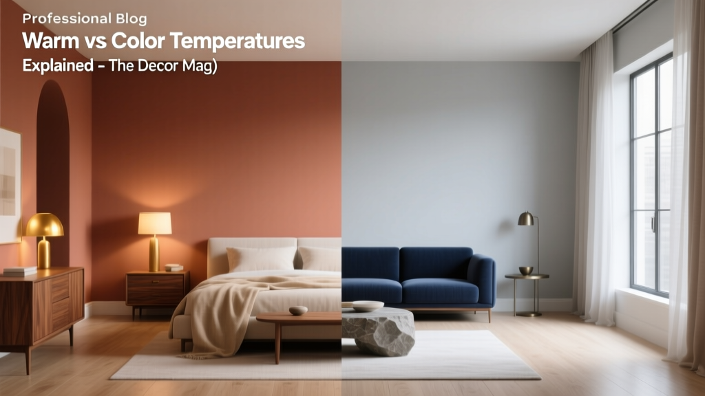 Warm vs Cool Color Temperatures Explained - The Decor Mag
 Best Seaweed Green Paint Colors - The Decor Mag
 How to Use Undertones to Match Colors - The Decor Mag
 Best Azure Blue Paint Colors - The Decor Mag
 Best Cerulean Blue Paint Colors - The Decor Mag
 Best Plum Paint Colors for Drama - The Decor Mag
 Color Psychology in Living Rooms: Mood & Function (2026)
 Best Oxblood Paint Colors - The Decor Mag
 How to Choose Colors for a Dining Room - The Decor Mag
 Best Scarlet Paint Colors - The Decor Mag