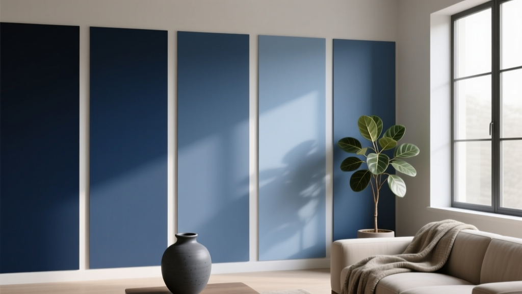
Best Indigo Paint Colors - The Decor Mag
Indigo sits in that sweet spot between blue and violet—deep enough to feel grounding, complex enough to feel elevated, and versatile enough to work in everything from classic colonial homes to modern lofts. When homeowners ask for a color that adds character without tipping into “too bold,” indigo is often the answer. It reads as sophisticated, calming, and quietly dramatic all at once.
From a color psychology standpoint, indigo carries the restorative calm of blue with the creative energy of purple. That combination makes it especially useful in spaces where you want focus, comfort, and a sense of depth—think bedrooms, libraries, dining rooms, and even moody powder rooms. Indigo paint colors also play beautifully with warm woods, natural fibers, brass accents, and crisp white trim, making them a reliable tool for building high-impact, livable color schemes.
This guide breaks down how to choose the right indigo, the best indigo paint colors from top brands, and how to apply them in real rooms with confidence—plus common mistakes that can make indigo look flat, too bright, or simply “off.”
What Makes a Paint Color “Indigo”?
Indigo isn’t a single shade—it’s a family of hues that typically sit between true navy and blue-violet. Some indigos lean inky and near-black; others lean brighter and more saturated; some show a smoky gray cast that feels softer and more modern.
Undertones to Watch
- Violet-leaning indigo: Richer, slightly jewel-toned; can feel more dramatic and luxe.
- Navy-leaning indigo: Classic, tailored, often more “neutral” in traditional interiors.
- Gray-leaning indigo: Muted and sophisticated; a strong option for open-concept spaces.
- Green-cast (teal) indigo: Can happen in certain lighting; great if intentional, surprising if not.
Why Indigo Works So Well in Interior Color Design
- Creates depth: Darker values visually “push back” walls, making rooms feel cocooned and refined.
- Anchors a palette: Indigo functions like a near-neutral that supports bolder art, rugs, and textiles.
- Pairs with warm and cool tones: It complements creamy whites, warm metals, earthy clays, and crisp grays.
How to Choose the Right Indigo for Your Home
Start With Lighting (North vs. South Exposure)
- North-facing rooms: Cooler, grayer light can make indigo feel more muted or slightly purple. Choose a cleaner, slightly brighter indigo to prevent a dull look.
- South-facing rooms: Warm light can bring out richness and sometimes a hint of green. You can go deeper (even near-black indigo) without losing vibrancy.
- East-facing rooms: Crisp morning light, softer later. Consider balanced indigos with a touch of gray.
- West-facing rooms: Warm afternoon light intensifies saturation. If you’re sensitive to bold color, choose a grayer indigo.
Pick a Finish That Matches the Job
- Matte/flat: Best for ceilings and low-traffic walls; looks velvety with indigo but can show marks.
- Eggshell: The most forgiving all-around finish for living spaces and bedrooms.
- Satin: Great for kitchens, kids’ rooms, and hallways; slightly more reflective.
- Semi-gloss: Ideal for trim, doors, and cabinetry; makes indigo look crisp and tailored.
Use Samples the Right Way
- Paint a sample area at least 12" x 12" (bigger is better).
- Test on multiple walls to see changes throughout the day.
- View next to fixed finishes: flooring, countertops, stone, and upholstery.
- Compare to your trim white—indigo is highly sensitive to what “white” you pair it with.
Best Indigo Paint Colors (Designer-Favorite Picks)
These indigo paint colors are widely used in interior design for their balance, depth, and versatility. Availability can vary by region, but most can be color-matched across lines if needed.
1) Benjamin Moore Hale Navy (HC-154)
Vibe: Deep navy that can read indigo in the right light—classic, confident, and timeless.
- Best for: Built-ins, kitchen islands, exterior shutters, dining rooms.
- Pairs well with: Benjamin Moore White Dove (OC-17), warm oak, brass, creamy linens.
- Room scenario: A dining room with Hale Navy walls, White Dove trim, and a walnut table creates a tailored, upscale look without feeling trendy.
2) Benjamin Moore Newburyport Blue (HC-155)
Vibe: A saturated, slightly brighter blue that can swing indigo—energetic yet polished.
- Best for: Accent walls, home offices, front doors, mudroom cabinetry.
- Pairs well with: Soft warm whites, natural jute, cognac leather.
- Room scenario: In a home office, Newburyport Blue behind open shelving elevates the space and makes artwork pop, especially with brass library lights.
3) Sherwin-Williams Indigo Batik (SW 7602)
Vibe: True indigo character—noticeable blue-violet richness that feels artistic and warm.
- Best for: Bedrooms, powder rooms, statement ceilings, accent cabinetry.
- Pairs well with: Creamy whites, pale blush, warm walnut, antique brass.
- Room scenario: A bedroom with Indigo Batik on the walls, crisp white bedding, and a warm wood headboard gives boutique-hotel mood without going fully dark.
4) Sherwin-Williams Naval (SW 6244)
Vibe: Deep, inky blue with a strong presence; can read indigo in warm lighting.
- Best for: Living rooms, built-in bookcases, kitchen lower cabinets.
- Pairs well with: Warm whites, light gray stone, medium-tone woods, matte black accents.
- Room scenario: Naval on lower kitchen cabinets with a light quartz countertop and brushed brass pulls creates a high-contrast, upscale kitchen that still feels classic.
5) Farrow & Ball Inchyra Blue (No. 289)
Vibe: A moody blue-black with an indigo sensibility—smoky, complex, and modern heritage.
- Best for: Libraries, snug rooms, exterior doors, dramatic trim.
- Pairs well with: Soft stone neutrals, warm tan leather, aged brass, off-white plaster.
- Room scenario: Use Inchyra Blue on a den’s walls and ceiling for a cocoon effect, then layer with a vintage rug and warm sconces for a relaxed, editorial look.
6) Farrow & Ball Hague Blue (No. 30)
Vibe: Deep blue-green that can lean indigo in low light; bold and historic-feeling.
- Best for: Dining rooms, kitchen cabinetry, statement hallways.
- Pairs well with: Warm white trim, terracotta, marble, antique woods.
- Room scenario: A hallway in Hague Blue with framed black-and-white photography feels gallery-like, especially with warm wood floors and soft white trim.
7) Behr Blueprint (S470-5)
Vibe: Approachable indigo-leaning blue—slightly softer, great for everyday living.
- Best for: Family rooms, kids’ rooms, accent walls, laundry rooms.
- Pairs well with: Bright whites, light maple, woven textures, sunny ochre accents.
- Room scenario: Blueprint on a playroom accent wall grounds colorful toys and artwork, keeping the room fun but not chaotic.
8) Valspar Sea Wonder (Indigo-Blue Family)
Vibe: A mid-to-deep blue that can read indigo depending on lighting and adjacent finishes.
- Best for: Guest rooms, bathrooms, furniture refinishes.
- Pairs well with: Crisp white tile, chrome fixtures, pale gray textiles.
- Room scenario: Paint a bathroom vanity in this tone, add white walls and polished nickel hardware for a fresh, tailored look.
Indigo Color Schemes That Always Work
Indigo is flexible, but a great color scheme makes it feel intentional rather than heavy. Use these combinations as a starting point for your interior color design plan.
Classic Contrast (Indigo + Crisp White)
- Indigo walls with bright white trim for a clean, architectural look.
- Add black accents sparingly (frames, hardware) to sharpen the palette.
Warm Modern (Indigo + Camel + Brass)
- Pair indigo with camel leather, warm woods, and brass lighting.
- Use creamy whites instead of stark whites for a softer feel.
Coastal, Not Themed (Indigo + Sand + Natural Texture)
- Layer indigo with linen, jute, rattan, and pale oak.
- Keep accents minimal: sea-glass green, soft gray-blue, or sun-bleached neutrals.
Jewel Box Drama (Indigo + Emerald + Plum)
- Use indigo as the anchor, then bring in emerald velvet or plum accessories.
- Best in small spaces: powder rooms, entryways, dining rooms.
Where Indigo Looks Best: Real-Room Application Scenarios
Living Rooms: Ground the Space Without Going Flat
- Use indigo on a single accent wall behind a sofa if you’re color-shy.
- For full-room color, choose an indigo with a slight gray softness and layer in light textiles.
- Add dimensional lighting: floor lamps, sconces, and warm bulbs (2700K–3000K).
Bedrooms: Calm, Cocooning, and Sleep-Friendly
- Try indigo on all four walls with matte or eggshell for a velvety feel.
- Balance with white bedding, warm wood nightstands, and a textured rug.
- If your room is small, paint trim the same indigo for a seamless, enveloping effect.
Kitchens: Indigo as a Cabinet Color
- Indigo lower cabinets + light uppers creates a grounded, airy composition.
- Brass pulls warm the blue; polished nickel keeps it crisp; black hardware makes it modern.
- Consider a durable finish (satin or semi-gloss) for wipeable surfaces.
Bathrooms & Powder Rooms: The “Jewel Box” Effect
- Indigo shines in small rooms with reflective surfaces—mirrors, polished tile, metallics.
- Pair with white subway tile for contrast, or go moody with dark stone for drama.
- Choose a humidity-appropriate paint line and ventilate well.
Exteriors: A Front Door That Feels Elevated
- Indigo doors look polished with white trim, red brick, gray stone, or natural cedar.
- Test in full sun and shade—exterior light can brighten and shift undertones.
Common Indigo Paint Mistakes (and How to Avoid Them)
- Choosing indigo without checking undertones: A violet-leaning indigo can look overly purple next to cool gray floors. Compare samples against your flooring and fixed finishes.
- Ignoring trim color: Bright “builder white” trim can make indigo look harsher. Creamy whites soften; crisp whites sharpen. Pick intentionally.
- Using the wrong sheen: High-gloss indigo on walls can show every patch and roller mark. Eggshell is usually the sweet spot for walls.
- Under-lighting the room: Indigo absorbs light. Add layered lighting and warm bulbs to keep it rich, not gloomy.
- Overcommitting in open concept: Indigo across connected spaces can feel heavy. Try it in a defined zone (a dining area) or as built-ins first.
- Forgetting adjacent colors: Indigo next to strong warm yellows can look muddy. If you want warmth, lean into camel, terracotta, or creamy whites instead.
FAQ: Indigo Paint Colors
Is indigo the same as navy?
Not exactly. Navy is typically a deep blue with minimal violet influence. Indigo usually sits closer to blue-violet and often feels more complex. Some navies can read indigo depending on lighting and surrounding finishes.
What white paint goes best with indigo?
It depends on the mood. Crisp whites create sharp contrast; creamy whites create a softer, more classic feel. Popular pairings include Benjamin Moore White Dove (OC-17) for warmth and Benjamin Moore Chantilly Lace (OC-65) for a cleaner look.
Will indigo make my room look smaller?
Dark colors can visually bring walls closer, but they can also make a room feel more intentional and cozy. If you add layered lighting and keep key elements lighter (rug, upholstery, art), indigo often feels expansive in a “designed” way rather than cramped.
Is indigo a good choice for kitchen cabinets?
Yes—indigo cabinet paint is a favorite for adding depth without the starkness of pure black. Pair with light countertops and warm metals for balance, and use a durable finish like satin or semi-gloss.
How do I keep indigo from looking purple?
Select an indigo that leans navy rather than violet, and test it in your room’s lighting. Cool LEDs can exaggerate purple undertones—warm bulbs (2700K–3000K) usually keep indigo looking truer and richer.
What colors look best with indigo in a whole-house palette?
Great companions include warm whites, greige, soft clay/tan, muted sage, and natural wood tones. Indigo also works as an accent with lighter blues for a layered, tonal color scheme.
Next Steps: Bring Indigo Home with Confidence
Choose two or three indigo paint samples that match your home’s lighting and fixed finishes, then test them on multiple walls. Decide whether you want indigo as a main wall color, a cabinet color, or an accent, and build a supporting color scheme with trim white, metals, and textiles that reinforce the mood—classic, coastal, modern, or dramatic.
For more guidance on paint colors, color schemes, and interior color design strategies, explore the latest color guides on thedecormag.com.
More Articles
 Best Kiwi Green Paint Colors - The Decor Mag
 Best Melon Paint Colors - The Decor Mag
 How to Choose Colors for a Craft Room - The Decor Mag
 Best Denim Blue Paint Colors - The Decor Mag
 How to Use Color to Create Rhythm - The Decor Mag
 Best Lemon Paint Colors - The Decor Mag
 Best Citron Paint Colors - The Decor Mag
 Best Plum Paint Colors for Drama - The Decor Mag
 Best Champagne Paint Colors - The Decor Mag
 Best Cherry Red Paint Colors - The Decor Mag