
How to Use Color to Create Flow - The Decor Mag
When a home feels “pulled together,” it’s rarely because every room matches. It’s because there’s flow: a visual rhythm that guides you from space to space without abrupt stops. Color is one of the fastest ways to create that continuity—more powerful than decor trends, more flexible than fixed finishes, and often more affordable than large renovations.
Flow matters for everyday living. It reduces visual stress, makes transitions feel intentional, and helps each room support the next—especially in open floor plans, older homes with many doorways, and apartments where rooms are small and closely connected. With a clear color scheme and a few design principles, you can build a whole-home palette that feels cohesive while still allowing each room its own personality.
This guide breaks down how to use interior color design to create flow using paint colors, undertones, value, and thoughtful transitions—along with real room scenarios, paint brand recommendations, and common mistakes that derail even “pretty” color choices.
What “Color Flow” Really Means
Color flow is the sense that your home’s paint colors and finishes belong to the same story. It doesn’t require identical walls everywhere. It does require consistency in the elements that the eye reads as “related,” such as undertone, temperature, and contrast level.
The design principles behind flow
- Undertone alignment: Colors can be warm, cool, or balanced—but undertones need to cooperate (for example, green-gray with violet-gray can clash if their undertones fight).
- Value progression: Value is how light or dark a color appears. Flow often comes from a gradual change in value rather than sharp jumps.
- Chroma control: Chroma is intensity/saturation. A home with mostly soft, muted colors will feel calmer and more connected than one where each room is a different bright statement.
- Repeated elements: Repeating one or two colors across rooms—through paint, textiles, art, or cabinetry—creates harmony without being matchy.
A simple way to think about it
Choose a “family” (warm neutrals, soft cools, earthy greens, coastal blues), then vary:
- Value (lighter in low-light spaces, deeper where you want intimacy)
- Sheen (matte/eggshell for walls, satin/semigloss for trim)
- Placement (accent wall, ceiling, built-ins, or a single room)
Start with a Whole-Home Color Palette (Even If You Paint One Room at a Time)
A whole-home palette is a short list of colors that work together across your rooms. You can build it before you paint or refine it as you go—either way, having a plan prevents the “one-off room” problem that breaks flow.
The 60-30-10 rule for a connected color scheme
- 60% dominant: Your main wall color family (often a neutral used in multiple areas).
- 30% secondary: Supporting colors (adjacent rooms, cabinetry, larger rugs, upholstery).
- 10% accent: Bold or high-contrast notes (pillows, art, a powder room, a front door).
Pick your anchor: a paint color you’ll repeat
Most homeowners get the best flow by repeating one reliable neutral through hallways and main living spaces. Popular, flexible anchors include:
- Benjamin Moore Classic Gray OC-23: A light greige that plays well with warm and cool finishes.
- Sherwin-Williams Alabaster SW 7008: Soft warm white; friendly with wood tones and black accents.
- Farrow & Ball Ammonite No. 274: A modern, clean neutral with a calm gray base.
- Behr Blank Canvas DC-003: Warm, bright neutral that suits open plans.
Use your anchor in the spaces you walk through the most (entry, hallways, kitchen/living area) and then branch into complementary colors for bedrooms, baths, and offices.
Use Undertones to Prevent “Almost Works” Clashes
Undertones are the quiet colors beneath the surface—yellow, pink, green, violet, blue. Two neutrals can look similar on a paint chip but feel completely different on the wall if their undertones are mismatched.
How to quickly identify undertone direction
- Compare to true white: Hold the sample next to a clean white like Benjamin Moore Chantilly Lace OC-65. Undertones become easier to see.
- Check next to a warm wood tone: If it suddenly looks pink or green, that’s the undertone revealing itself.
- Look in morning vs. evening light: Warm evening bulbs pull yellow/red; cool daylight pulls blue/gray.
Undertone “families” that create easy flow
- Warm neutrals + earthy hues: Cream, greige, terracotta, olive (cozy, welcoming).
- Soft cool neutrals + muted blues/greens: Pale gray, blue-gray, sage (calm, tailored).
- Balanced neutrals + nearly-black accents: Greige, stone, charcoal (modern, graphic, timeless).
Create Flow Room-to-Room: Practical Transition Strategies
Flow is built in the transitions—doorways, sightlines, and the “in-between” spaces like hallways and stairwells.
Strategy 1: Keep trim consistent
Consistent trim color is the unsung hero of cohesive interior color design. It creates a continuous outline that links rooms, even when wall colors change.
- Go-to trim whites: Sherwin-Williams Pure White SW 7005 (clean), Benjamin Moore Simply White OC-117 (warm and bright).
- Sheen tip: Use satin or semigloss on trim for durability and a subtle contrast to eggshell walls.
Strategy 2: Shift value, not undertone
Choose colors with similar undertones and move lighter to darker as you go. This feels intentional and avoids jarring changes.
Example progression: living room in Benjamin Moore Classic Gray OC-23 → hallway in a slightly deeper greige like Benjamin Moore Edgecomb Gray HC-173 → dining room in a richer taupe like Sherwin-Williams Accessible Beige SW 7036.
Strategy 3: Use “connective tissue” colors in sightlines
If you can see from the living room into the kitchen and entry at the same time, those spaces should share at least one repeating element:
- The same wall color
- Or the same cabinet color
- Or a repeated accent color (artwork, runner, bar stools)
Strategy 4: Treat hallways and stairwells as palette bridges
Hallways aren’t just pass-throughs; they’re the glue. A light, balanced neutral here helps adjacent rooms feel connected.
- Low-light hallway: Sherwin-Williams Alabaster SW 7008 or Benjamin Moore White Dove OC-17 to prevent gloom.
- Open stairwell: Keep it aligned with your anchor color, then bring in accents through art and runners.
Color Recommendations: Whole-Home Palettes That Flow
These paint color schemes are designed to mix across rooms without feeling chaotic. Use them as-is or as a starting point for your own interior color palette.
Palette A: Warm, inviting, modern classic
- Anchor walls: Sherwin-Williams Alabaster SW 7008
- Soft neutral support: Benjamin Moore Edgecomb Gray HC-173
- Earthy green accent: Sherwin-Williams Evergreen Fog SW 9130
- Deep contrast: Benjamin Moore Hale Navy HC-154 (powder room, office, or built-ins)
- Trim: Sherwin-Williams Pure White SW 7005
Why it flows: Warm whites and greiges keep the background consistent; green and navy act as grounded accents with classic appeal.
Palette B: Airy, coastal, and calm
- Anchor walls: Benjamin Moore Classic Gray OC-23
- Blue-gray bedroom: Benjamin Moore Palladian Blue HC-144
- Soft sea-glass accent: Sherwin-Williams Sea Salt SW 6204
- Clean depth: Farrow & Ball Hague Blue No. 30 (dining or built-ins)
- Trim: Benjamin Moore Chantilly Lace OC-65
Why it flows: Muted blue-greens share a serene undertone direction, supporting an easy, light-filled rhythm across rooms.
Palette C: Contemporary neutral with high-contrast accents
- Anchor walls: Farrow & Ball Ammonite No. 274
- Warm supporting neutral: Benjamin Moore Balboa Mist OC-27
- Moody charcoal: Sherwin-Williams Peppercorn SW 7674 (office, media room, or fireplace wall)
- Black accent (doors/metal): Benjamin Moore Black HC-190 or Sherwin-Williams Tricorn Black SW 6258
- Trim: A softer white like Benjamin Moore White Dove OC-17
Why it flows: The neutrals stay sophisticated and quiet; contrast is concentrated in intentional areas rather than scattered everywhere.
Real Room Examples: How Flow Looks in Practice
Open-plan living room + kitchen: cohesive without one-color monotony
Scenario: You can see the living area, kitchen, and dining space at once, and you want a connected color scheme that still defines zones.
- Walls throughout: Benjamin Moore Classic Gray OC-23 (continuous backdrop)
- Kitchen cabinets: Sherwin-Williams Evergreen Fog SW 9130 (adds identity without fighting the walls)
- Island or built-ins: Benjamin Moore Hale Navy HC-154 (a focal anchor)
- Accents: Brass hardware + natural oak stools to warm up the scheme
Flow tip: Keep the ceiling and trim consistent across the open plan to avoid visual “cuts.”
Entry + hallway + living room: the seamless welcome
Scenario: A narrow hallway opens into a brighter living room. You want it to feel airy, not choppy.
- Hallway walls: Sherwin-Williams Alabaster SW 7008 (light-reflective and warm)
- Living room walls: Stay in the same undertone family, slightly deeper: Benjamin Moore Edgecomb Gray HC-173
- Trim: Sherwin-Williams Pure White SW 7005
Flow tip: If the hallway is dim, avoid strong cool grays—they can read drab and break the welcoming mood.
Upstairs bedrooms: variety that still feels related
Scenario: You want each bedroom to have a different personality, but the upstairs should feel cohesive.
- Upstairs landing: Use your anchor neutral (for example, Benjamin Moore Balboa Mist OC-27)
- Main bedroom: A muted blue-gray like Benjamin Moore Palladian Blue HC-144
- Guest room: A soft warm neutral like Sherwin-Williams Accessible Beige SW 7036
- Kid’s room accent: A controlled pop on one wall or in textiles rather than full saturation on all walls
Flow tip: Keep bedding and curtains within a similar chroma level (mostly muted) so colors don’t compete from door to door.
Use Color Psychology to Support How Each Room Feels
Flow isn’t only visual—it’s emotional. Color psychology helps you choose paint colors that make sense for the way you live.
- Warm whites and soft greiges: welcoming, stabilizing (great for living rooms, hallways, open plans)
- Blues and blue-grays: restful, focused (bedrooms, offices)
- Greens and sages: balanced, restorative (kitchens, family rooms, mudrooms)
- Terracotta and clay tones: energizing and cozy (dining rooms, breakfast nooks)
- Charcoal and deep navy: grounding, dramatic (libraries, powder rooms, media rooms)
For flow, keep the emotional “volume” consistent: if most of your home is soft and calm, reserve high-drama dark colors for a few intentional moments.
Common Color Mistakes That Break Flow
- Choosing paint colors in isolation: A color that looks perfect in one room can look wrong next to adjacent finishes or flooring.
- Ignoring undertones in fixed elements: Tile, countertops, carpet, and wood floors have undertones that must coordinate with wall paint.
- Too many unrelated “statement” colors: One bold room is a feature; five bold rooms often feel chaotic.
- Using bright white trim with warm creamy walls (or vice versa) without intent: The contrast can feel accidental. Choose trim whites that harmonize.
- Over-contrasting adjacent rooms: A pale cool gray hallway next to a saturated warm orange room can feel like a visual whiplash.
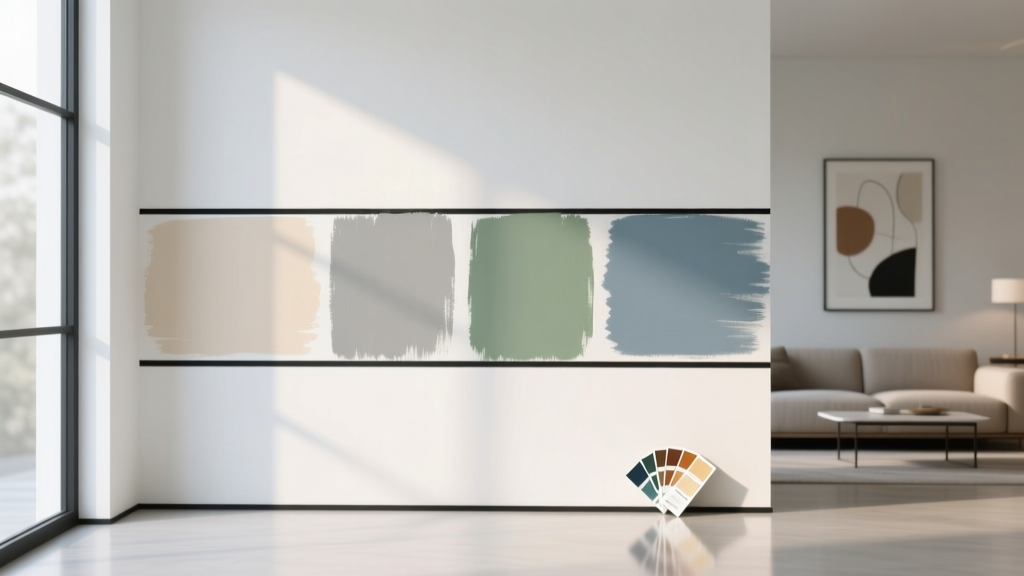
- Skipping sample testing: Paint shifts dramatically with light exposure, time of day, and sheen.
Practical Tips for Testing and Applying Paint Colors
- Sample large: Paint at least 2' x 2' swatches (or use peel-and-stick samples) on multiple walls.
- Check at transition points: Test where rooms meet—near doorways and in sightlines.
- Match sheen to function:
- Walls: eggshell or matte (matte hides texture; eggshell cleans easier)
- Trim/doors: satin or semigloss for durability
- Ceilings: flat to reduce glare
- Repeat one accent color at least 3 times: For example, navy in pillows, a rug detail, and an entry bench to make it feel intentional.
- Use a “bridge” color for tough transitions: If two rooms feel unrelated, a hallway or connecting space in a neutral that shares undertones can smooth it out.
FAQ: Using Color to Create Flow
Do all my rooms need to be the same color for a cohesive look?
No. Cohesion comes from consistent undertones, a controlled palette, and repeated elements (trim color, metals, wood tone, or a recurring accent color). You can absolutely use different paint colors in each room and still maintain flow.
What’s the easiest “whole-home” paint color strategy?
Use one anchor neutral in hallways and main living spaces, keep trim consistent, and choose 2–4 supporting colors (one soft color for bedrooms, one deeper accent, and one optional specialty color for a powder room or office).
How do I choose between warm and cool paint colors?
Look at your fixed finishes and natural light. Warm paint colors often flatter honey oak, warm tile, and north-facing rooms that feel cool. Cool paint colors can balance very warm southern light and pair well with gray stone or crisp modern finishes.
How many colors should a whole house have?
A strong starting point is 5–7 total: 1–2 neutrals, 2–3 supporting hues, 1–2 deeper accents, plus one trim color. Many homes feel best when the majority of surfaces stay within a cohesive neutral family.
What’s the biggest mistake people make with interior color schemes?
Mixing undertones unintentionally—like a green-gray next to a pink-beige—or choosing paint purely from a small swatch without testing in the room’s light. Both lead to “why does this look off?” frustration.
Can I create flow in a home with an open floor plan and still define spaces?
Yes. Keep wall color consistent for continuity, then define zones using cabinetry color, an accent wall, rugs, and textiles. You’ll get separation without breaking the visual connection.
Next Steps: Build Your Flow Plan This Week
To create a home that feels connected, start simple and build momentum:
- Choose your anchor neutral (one that works with your floors and major finishes).
- Select 2–4 supporting colors that share compatible undertones.
- Decide where contrast belongs (one or two rooms, not everywhere).
- Standardize trim and sheen to unify transitions.
- Test samples in sightlines before committing.
When color flow is working, your home feels calm, intentional, and effortlessly personal—room after room.
Explore more paint color ideas, color scheme guides, and interior color design tips on thedecormag.com.
More Articles
 How to Match Colors to Furniture and Fabrics - The Decor Mag
 How to Choose Colors for a Playroom - The Decor Mag
 Best Mustard Yellow Paint Colors - The Decor Mag
 Best Sky Blue Paint Colors - The Decor Mag
 Best Burgundy Paint Colors - The Decor Mag
 Best Living Rooms for STEP: Design, Layout, and Accessibility Standards for Seniors and Mobility Support
 How To Match Aging With Space: Designing Environments That Support Lifelong Well-Being
 Match Buying Guide: Safety, Performance, and Practical Selection Criteria
 How to Test Paint Colors Before Committing - The Decor Mag
 Best Banana Paint Colors - The Decor Mag