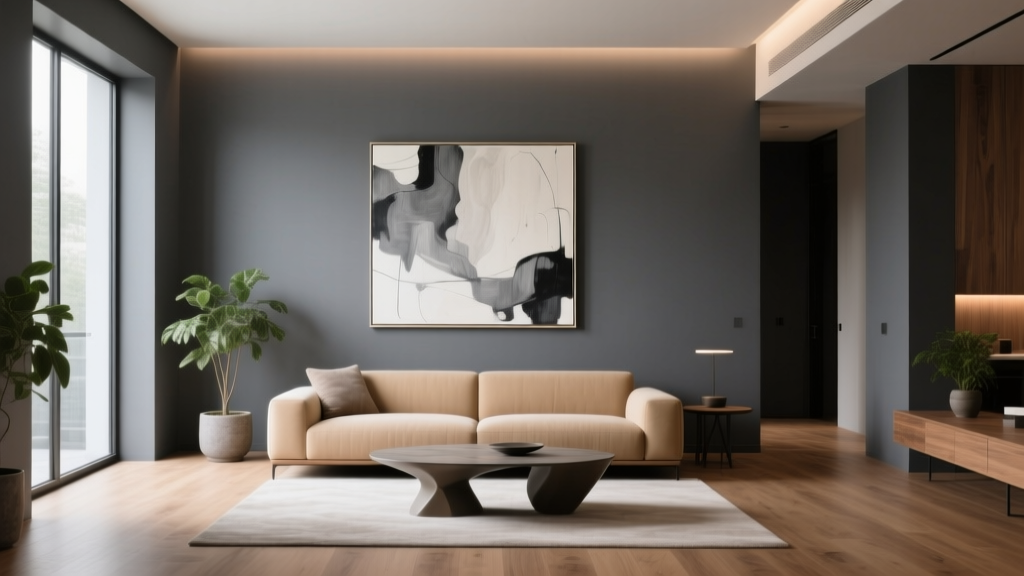
Best Charcoal Paint Colors for Modern Spaces - The Decor Mag
Charcoal paint colors have become a modern design staple for good reason: they offer the depth of black with more flexibility, warmth, and visual comfort. In contemporary homes—where clean lines, open layouts, and mixed materials are the norm—charcoal works like a tailored blazer. It grounds a space, elevates finishes, and makes everything around it look more intentional.
Beyond style, charcoal also solves a common decorating problem. Many homeowners want drama without the “cave effect” of true black or the starkness of bright white walls. Charcoal sits in the sweet spot—moody yet livable, bold yet nuanced. With the right undertone and placement, it can feel cozy, architectural, serene, or strikingly modern.
This guide breaks down the best charcoal paint colors for modern interiors, how to choose the right undertone, where charcoal works best, and the color schemes that make it look expensive. You’ll also find real-room application scenarios, mistakes to avoid, and practical tips for sampling and lighting.
What Makes a Paint Color “Charcoal”?
Charcoal is typically a very deep gray that may lean cool (blue/green undertones) or warm (brown/bronze undertones). Most charcoals sit in the lower Light Reflectance Value (LRV) range—often between 4 and 15—meaning they absorb a lot of light and read richer as daylight fades.
Charcoal vs. Black vs. Dark Gray
- Black: minimal undertone read, highest contrast, can feel harsh in some modern spaces.
- Dark gray: broader category that can include mid-tones and softer deep grays.
- Charcoal: deep gray with visible undertone complexity; tends to feel more interior-friendly than black.
Color Psychology: Why Charcoal Feels Modern
From a color psychology standpoint, charcoal communicates stability, sophistication, and calm authority. It creates a “visual anchor,” helping open-concept spaces feel structured. Paired with warm woods and soft textiles, charcoal can also feel protective and cocooning—ideal for bedrooms, dens, and media rooms.
How to Choose the Right Charcoal: Undertones, Lighting, and LRV
1) Identify the Undertone
Undertones determine whether charcoal reads as sleek and cool or warm and earthy.
- Cool charcoal (blue/green undertones): crisp, modern, pairs beautifully with marble, chrome, and bright whites.
- Warm charcoal (brown/bronze undertones): cozy, elevated, perfect with oak, brass, leather, and warm whites.
- Neutral charcoal: balanced, easiest to use across rooms and mixed finishes.
2) Match the Lighting
- North-facing rooms: light is cooler; warm charcoals prevent walls from feeling icy.
- South-facing rooms: strong warm light; cool charcoals hold their crispness.
- East-facing rooms: bright mornings, shadowy afternoons; neutral charcoals stay consistent.
- West-facing rooms: warm afternoon glow; charcoals can deepen dramatically—sample carefully.
3) Consider LRV and Sheen
Charcoal’s depth is part of the appeal, but low-LRV colors need strategy.
- Low LRV (4–8): very dramatic; best for accent walls, cabinetry, or rooms with ample light.
- Mid-low LRV (9–15): still rich, easier for full-room applications.
- Sheen tip: use matte or eggshell on walls for a velvety look; use satin or semi-gloss on trim/doors for durability and contrast.
Best Charcoal Paint Colors (Designer-Approved Picks)
These charcoal paint colors are widely used in interior color design because they behave predictably across lighting and complement modern materials.
1) Benjamin Moore Kendall Charcoal (HC-166)
Why it works: A classic, slightly warm charcoal with a grounded feel. It reads sophisticated rather than stark, making it a go-to for modern living rooms and built-ins.
- Best for: Accent walls, open shelving back panels, kitchen islands, offices.
- Pairs well with: Benjamin Moore Chantilly Lace (trim), natural oak, brass, creamy whites, camel leather.
2) Benjamin Moore Wrought Iron (2124-10)
Why it works: A near-black charcoal with a soft, slightly blue-green undertone. It delivers drama without feeling flat.
- Best for: Modern front doors, interior doors, metal railings, cabinetry, statement walls.
- Pairs well with: crisp whites, pale gray veining stone, matte black hardware, warm woods for balance.
3) Sherwin-Williams Iron Ore (SW 7069)
Why it works: A beloved modern charcoal that leans soft and smoky rather than aggressively dark. Great when you want depth with a welcoming vibe.
- Best for: Full-room applications (bedrooms, dens), exterior siding accents, kitchen islands.
- Pairs well with: Sherwin-Williams Pure White (trim), walnut, ivory textiles, muted sage accents.
4) Sherwin-Williams Peppercorn (SW 7674)
Why it works: A cooler, true charcoal that feels crisp and architectural. If you love a modern monochrome palette, Peppercorn plays well with concrete, steel, and bright white.
- Best for: Open-concept great rooms, feature fireplaces, modern stairwells.
- Pairs well with: cool whites, pale gray, black accents, blue-toned artwork.
5) Farrow & Ball Railings (No. 31)
Why it works: A refined deep charcoal with blue undertones that reads luxurious and tailored. It’s especially striking on cabinetry and millwork.
- Best for: Built-ins, kitchen cabinetry, library-style offices, powder rooms.
- Pairs well with: warm brass, off-white marble, soft blush or terracotta accents for contrast.
6) Farrow & Ball Down Pipe (No. 26)
Why it works: A deep gray with an elegant, slightly “sooty” quality. It creates a moody modern look that still feels classic.
- Best for: Dining rooms, bedrooms, dramatic entryways.
- Pairs well with: creamy whites, deep wood tones, linen upholstery, antique gold accents.
7) Behr Cracked Pepper (PPU18-1)
Why it works: Approaches black but keeps a softened charcoal feel—great for modern exteriors and interiors where you want high contrast with approachable depth.
- Best for: Accent walls, doors, exterior trim, statement furniture pieces.
- Pairs well with: warm whites, greige, cedar, black-framed windows.
Where Charcoal Looks Best: Real Room Examples and Application Scenarios
Modern Living Room: Charcoal Feature Wall + Warm Texture
Scenario: A white-walled living room with a low-profile sofa and minimal decor can feel unfinished. A charcoal accent wall behind the sofa adds depth and a “gallery” backdrop for art.
- Try: Sherwin-Williams Peppercorn or Benjamin Moore Kendall Charcoal.
- Style it with: boucle or linen upholstery, a wool rug, oak coffee table, and layered lighting (floor + table lamps).
- Pro tip: Add one warm element (wood, brass, tan leather) to keep the space from feeling cold.
Kitchen: Charcoal Island or Lower Cabinets
Scenario: Modern kitchens often lean bright and airy. Charcoal cabinetry adds contrast and makes stone and hardware look more premium.
- Try: Benjamin Moore Wrought Iron for a near-black statement, or Sherwin-Williams Iron Ore for softer depth.
- Color scheme: charcoal + warm white uppers + brushed brass + white/gray quartz.
- Finish tip: Cabinetry typically looks best in satin or a durable enamel for cleanability.
Bedroom: Charcoal Walls for a Restful, Boutique Feel
Scenario: A bedroom that feels too bright or visually busy can benefit from charcoal walls to reduce glare and promote calm.
- Try: Sherwin-Williams Iron Ore or Farrow & Ball Down Pipe.
- Pair with: warm white bedding, soft black accents, walnut nightstands, and dimmable lighting.
- Design principle: Dark walls “recede,” making the room feel more enveloping and serene.
Home Office: Charcoal Built-Ins That Mean Business
Scenario: Built-ins painted charcoal create a focused atmosphere and make books and decor pop.
- Try: Farrow & Ball Railings or Benjamin Moore Kendall Charcoal.
- Pair with: a warm wood desk, cream curtains, and a large piece of art with white matting.
Bathroom or Powder Room: Charcoal for High-End Contrast
Scenario: A small powder room is the perfect place to go bold. Charcoal walls with polished fixtures feel modern and editorial.
- Try: Benjamin Moore Wrought Iron or Behr Cracked Pepper.
- Pair with: bright white porcelain, a statement mirror, and warm metal (brass) to prevent a sterile look.
- Moisture tip: Use a bath-rated paint in an appropriate sheen (often satin) for durability.
Modern Charcoal Color Schemes (Winning Combinations)
Charcoal is a neutral, but it behaves like a “power neutral.” These combinations create balanced, designer-forward spaces.
Monochrome Modern
- Charcoal walls + soft white trim + black accents
- Add texture: ribbed textiles, plaster finishes, matte ceramics to avoid a flat look.
Warm Modern (Charcoal + Wood)
- Charcoal + oak/walnut + cream + brass
- Great for: living rooms, bedrooms, kitchens with warm-toned floors.
Charcoal + Earth Tones
- Charcoal + terracotta + sand + olive
- Creates a grounded, organic modern palette that feels current and inviting.
Charcoal + Cool Accents
- Charcoal + crisp white + slate blue + chrome
- Best in: south-facing rooms or spaces with abundant natural light.
Practical Tips for Using Charcoal Paint Like a Pro
- Sample in multiple locations: Paint large swatches (at least 12" x 12") on two walls and observe morning, afternoon, and night.
- Balance with reflectivity: Add mirrors, glass, light rugs, and layered lighting to keep the room from feeling heavy.
- Use contrast intentionally: Pair charcoal with clean trim color (a bright white or warm white) to keep edges crisp in modern spaces.
- Choose the right sheen: Matte for walls, satin for trim/doors, and durable finishes for cabinetry.
- Mind your floors: Cool charcoals can clash with very warm/orange wood floors—consider a warmer charcoal or add warm textiles to bridge the gap.
Common Charcoal Paint Mistakes to Avoid
- Picking charcoal without checking undertones: A blue-leaning charcoal can look steely next to warm wood; a brown-leaning charcoal can look muddy next to cool stone.
- Under-lighting the room: Charcoal absorbs light. Without layered lighting (ambient + task + accent), the room can feel dull rather than dramatic.
- Using the same charcoal everywhere: Repeating a deep color across multiple rooms can feel heavy. Break it up with lighter connecting spaces or varied depths of gray.
- Ignoring trim and ceiling color: The wrong white can make charcoal look purple, green, or flat. Select trim paint with a complementary undertone.
- Going too glossy on walls: High gloss highlights imperfections and can make charcoal feel harsh. Stick with matte/eggshell for most walls.
FAQ: Charcoal Paint Colors for Modern Interiors
Is charcoal a good paint color for small rooms?
Yes—when used thoughtfully. Charcoal can make a small room feel sophisticated and cozy, especially with good lighting and light-colored textiles. Powder rooms, offices, and bedrooms often look stunning in charcoal.
What white paint goes best with charcoal?
It depends on the charcoal’s undertone. Popular pairings include Benjamin Moore Chantilly Lace for a crisp look and Sherwin-Williams Pure White for a softer modern contrast. Test your white next to the charcoal sample in your room’s lighting.
Should I paint trim charcoal too?
For a modern, high-end look, charcoal trim can be beautiful—especially in a “color-drenched” room (walls + trim the same color) using a different sheen for definition. If you want a cleaner, more graphic style, use white trim instead.
Do charcoal walls make a room darker?
They can, since charcoal has low LRV and absorbs light. Counteract this with layered lighting, lighter rugs and upholstery, and reflective surfaces like mirrors or metallic accents.
What’s the best charcoal paint color for kitchen cabinets?
Benjamin Moore Wrought Iron and Sherwin-Williams Iron Ore are strong choices for modern cabinetry because they offer depth without looking flat. Pair with quality hardware and a durable cabinet-grade finish.
How do I keep charcoal from looking cold?
Add warmth through materials and color: oak or walnut furniture, brass or aged gold metals, cream textiles, and warm accent colors (camel, terracotta, muted olive). Choosing a warm charcoal undertone also helps.
Next Steps: Make Charcoal Work in Your Home
Start by choosing where charcoal will have the most impact—an accent wall, cabinetry, a bedroom, or a set of doors—then narrow your options by undertone and lighting. Pick 2–3 charcoal paint colors, sample them in large swatches, and evaluate them alongside your flooring, countertops, and trim color. Once you see the undertones in your own light, the “right” charcoal becomes obvious.
If you’re ready for more modern paint color ideas, coordinated color schemes, and room-by-room guidance, explore more color guides on thedecormag.com.
More Articles
 How to Choose Colors for a Nursery - The Decor Mag
 Best Neutral Paint Colors for Every Room - The Decor Mag
 How to Choose Colors Based on Room Lighting - The Decor Mag
 Whole-House Color Scheme: How to Choose (2026)
 How to Choose Colors for a Terrace - The Decor Mag
 Best Plum Paint Colors for Drama - The Decor Mag
 How to Choose Colors for a Craft Room - The Decor Mag
 Best Key Lime Paint Colors - The Decor Mag
 How to Create a Transitional Color Palette - The Decor Mag
 How to Match Colors to Furniture and Fabrics - The Decor Mag