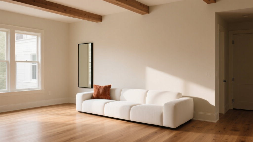
Paint Colors That Work With Flooring (2026)
Flooring quietly does the heavy lifting in a home. It spans the largest uninterrupted surface, sets the undertone temperature (warm or cool), and influences how every wall color reads from morning to night. Yet paint is often chosen first—then the floor “fights” it, and the room feels off even when all the individual pieces are beautiful.
Choosing paint colors that work with flooring is one of the fastest ways to make a home feel cohesive, elevated, and intentional. When the relationship between floor and wall color is right, spaces feel calmer, ceilings can feel taller, and furnishings look more “designed” without buying a single new item.
This guide breaks down how to read your flooring’s undertones, how to build balanced color schemes, and which paint colors consistently perform well with common floor types—hardwood, engineered wood, luxury vinyl plank (LVP), laminate, tile, and carpet. Expect practical tips, real room scenarios, and specific paint recommendations you can sample today.
Start With the Floor: Identify Undertone, Value, and Finish
1) Find the undertone (warm, cool, or neutral)
Most flooring has an undertone that leans warm (yellow, red, orange), cool (gray, blue, green), or neutral (a balanced mix). Undertone matters more than whether the floor is “light” or “dark.” A warm oak floor paired with a cool icy gray wall can look slightly green or dingy because the colors disagree.
Quick ways to spot undertone:
- Compare to true white paper in daylight. Warm floors look more golden; cool floors look ashier or grayer.
- Look at the darkest areas (knots, edges, plank variation). Undertones show up strongest there.
- Check with a neutral sample like Benjamin Moore Classic Gray OC-23 or Sherwin-Williams Alabaster SW 7008. If it suddenly looks pink, green, or yellow, your floor is driving the shift.
2) Note the value (how light or dark it is)
Value controls contrast. Light floors can handle both light and dark walls, but the “mood” changes dramatically. Dark floors can make dark walls feel enveloping and luxe—or heavy if the room lacks light.
3) Consider the sheen and texture
High-gloss tile reflects color and can amplify contrast. Matte wood absorbs more light, making paint colors appear richer. Textured carpet can soften transitions, while sleek polished concrete makes colors look cleaner and sharper.
Build a Floor-Friendly Color Scheme (Without Overthinking)
The three-part formula: temperature + contrast + continuity
- Temperature: Keep wall paint and flooring in the same general undertone family (warm with warm, cool with cool) or use a true neutral to bridge.
- Contrast: Decide whether you want low contrast (calm, airy) or high contrast (graphic, modern).
- Continuity: Repetition creates harmony. Echo one color from the floor in textiles, art, or cabinetry so the room feels connected.
Use the 60-30-10 guideline
This classic interior color design principle helps homeowners avoid “everything matches” monotony:
- 60%: Dominant surface (often walls)
- 30%: Secondary color (upholstery, rugs, drapery)
- 10%: Accent (art, pillows, décor, a statement chair)
Your flooring is a powerful “silent” percentage in the mix—so your wall paint should either complement it gently or intentionally contrast it.
Best Paint Colors for Common Flooring Types
Warm honey oak floors (yellow/golden undertones)
Honey oak is famously reactive; it can make cool grays turn green and stark whites feel harsh. The most flattering paint colors tend to be warm whites, soft greiges, and gentle earth tones.
Color recommendations:
- Benjamin Moore White Dove OC-17 (warm white): softens oak’s gold without looking yellow.
- Sherwin-Williams Alabaster SW 7008 (creamy off-white): cozy, timeless with oak trim and floors.
- Benjamin Moore Edgecomb Gray HC-173 (warm greige): a go-to for oak that reads calm, not muddy.
- Farrow & Ball Skimming Stone No. 241 (warm neutral): pairs beautifully with warm wood and natural textiles.
Real room scenario: A 1990s open-plan living room with honey oak floors and a warm beige sofa. Choose White Dove on walls, use a linen-colored rug to quiet the floor’s saturation, then add accents in muted navy (pillows) and black (metal fixtures) for updated contrast.
Red oak floors (pink/red undertones)
Red oak can pull pink, especially next to cool whites. To balance it, look for neutrals with subtle green or taupe notes—these counteract excess pink (color psychology: green feels restorative and natural, helping the wood read grounded rather than rosy).
Color recommendations:
- Benjamin Moore Balboa Mist OC-27 (soft greige): calms red oak without turning cold.
- Sherwin-Williams Accessible Beige SW 7036 (warm greige): steady and forgiving in changing light.
- Benjamin Moore Revere Pewter HC-172 (classic greige): a reliable bridge for red oak and warm furnishings.
- Sherwin-Williams Sea Salt SW 6204 (soft green-blue): airy, spa-like; best when the room gets good natural light.
Application tip: If your red oak is very saturated, keep trim a warm white (Alabaster or White Dove) rather than a crisp bright white. Crisp whites can exaggerate pink tones.
Cool-toned gray wood floors (or gray LVP)
Gray floors can look modern and clean, but they’re also notorious for making walls feel sterile if you choose a cold gray paint. Bring in warmth through creamy whites, greiges, or muted color with depth.
Color recommendations:
- Benjamin Moore Classic Gray OC-23 (near-neutral): brightens without turning icy.
- Sherwin-Williams Agreeable Gray SW 7029 (balanced greige): softens cool floors and suits many décor styles.
- Benjamin Moore Pale Oak OC-20 (warm greige): gentle, upscale, great for open floor plans.
- Sherwin-Williams Iron Ore SW 7069 (charcoal): a striking accent wall color that looks intentional against gray floors.
Real room scenario: A condo with gray LVP and white kitchen cabinets. Paint the main space Classic Gray for a bright backdrop, then use Iron Ore on the interior doors or a dining nook wall for architecture and contrast. Add wood tones (oak table, rattan) to restore warmth.
Dark walnut or espresso floors
Dark floors read dramatic and sophisticated. They also absorb light, so wall color selection should support the mood you want: airy and high contrast, or moody and cocooning.
Color recommendations for an airy look:
- Benjamin Moore Simply White OC-117 (clean warm white): crisp contrast without feeling stark.
- Sherwin-Williams Alabaster SW 7008 (soft warm white): warm, flattering in most lighting.
Color recommendations for a moody look:
- Benjamin Moore Hale Navy HC-154 (deep navy): classic and grounding; pairs beautifully with brass and walnut.
- Sherwin-Williams Evergreen Fog SW 9130 (soft green-gray): calming, contemporary; excellent for bedrooms and studies.
- Farrow & Ball Railings No. 31 (inky blue-black): dramatic without pure black harshness.
Design principle: Strong contrast (dark floor + light wall) feels energetic and crisp. Low contrast (dark floor + deep wall) feels enveloping and intimate—great for a library, dining room, or primary bedroom.
Light maple, birch, or blonde floors
Blonde floors often lean slightly warm, sometimes creamy. They amplify daylight and make colors appear a touch brighter. This is a great base for Scandinavian-inspired neutrals and soft color schemes.
Color recommendations:
- Benjamin Moore Chantilly Lace OC-65 (bright clean white): modern and gallery-like, best in rooms with lots of natural light.
- Sherwin-Williams Snowbound SW 7004 (soft white): slightly warmer and more forgiving than a crisp white.
- Benjamin Moore Calm OC-22 (pale neutral): serene, minimal, and refined.
- Sherwin-Williams Silver Strand SW 7057 (soft blue-green-gray): subtle color that still feels airy.
Beige/tan tile, travertine, or warm stone floors
Warm stone floors can skew yellow or orange. Lean into warm neutrals and sun-washed colors rather than cool grays, which can make stone look more orange by comparison.
Color recommendations:
- Benjamin Moore Swiss Coffee OC-45 (creamy off-white): warm and welcoming with stone.
- Sherwin-Williams Natural Linen SW 9109 (soft beige): relaxed, organic feel.
- Benjamin Moore Muslin OC-12 (gentle warm neutral): lovely in Mediterranean or transitional homes.
- Sherwin-Williams Cavern Clay SW 7701 (earthy terracotta): a stunning accent for powder rooms or dining rooms with warm tile.
Cool marble, slate, or blue-gray tile
Cool stone likes clean whites, cool-leaning neutrals, and sophisticated colors like blue-grays and blue-greens.
Color recommendations:
- Benjamin Moore Decorator’s White OC-149 (cool white): crisp with cool tile and modern finishes.
- Sherwin-Williams Pure White SW 7005 (versatile white): reads clean without feeling icy.
- Benjamin Moore Boothbay Gray HC-165 (blue-gray): classic for bathrooms and kitchens.
- Sherwin-Williams Rainwashed SW 6211 (blue-green): spa-like and flattering with cool stone.
Carpet: warm beige, cool gray, or patterned
Carpet acts like a giant textile—soft, light-absorbing, and often undertone-heavy. For carpeted rooms, choose wall colors that look good against both carpet and upholstery.
- Warm beige carpet: Sherwin-Williams Accessible Beige SW 7036, Benjamin Moore White Dove OC-17
- Cool gray carpet: Benjamin Moore Classic Gray OC-23, Sherwin-Williams Agreeable Gray SW 7029
- Patterned carpet: pull the quietest background color from the pattern and use it on walls; keep trim a soft white
Real-World Color Pairings (Room-by-Room Scenarios)
Open concept with mixed flooring
Many homes have wood in the living area and tile in the kitchen. Instead of trying to “match” both floors, choose a wall color that bridges undertones.
- Bridge paint idea: Benjamin Moore Pale Oak OC-20 or Sherwin-Williams Agreeable Gray SW 7029
- Unifying strategy: repeat one warm wood tone (stools, shelves) and one cool element (hardware, lighting) so transitions feel intentional
Small hallway with dark floors
Hallways often lack natural light; dark floors can make them feel cave-like. Use a light-reflective, warm-leaning neutral to keep it welcoming.
- Try: Sherwin-Williams Alabaster SW 7008 on walls, with a slightly brighter trim like Sherwin-Williams Pure White SW 7005
- Extra lift: satin finish on walls for a subtle glow; matte can feel too flat in low light
Bedroom with light floors and a calming mood
Color psychology matters here: soft greens and blue-greens reduce visual stress and support relaxation.
- Try: Sherwin-Williams Evergreen Fog SW 9130 with blonde floors, or Benjamin Moore Sea Salt 2137-60 (note: BM has a different Sea Salt than SW; confirm brand) for a gentle coastal feel
- Pair with: warm white bedding, natural wood nightstands, and matte black accents for balance
How to Test Paint With Flooring (So You Don’t Get Surprised)
- Sample at least 3 colors from the same family (one lighter, one “middle,” one deeper).
- Place samples vertically on multiple walls and also directly next to the floor (baseboard area).
- Check in 3 lighting conditions: morning, afternoon, and after dark with your lamps on.
- Compare to fixed finishes you’re not changing (countertops, cabinets, large rugs).
- Watch for undertone flips: if a paint suddenly looks green/pink/purple, your flooring undertone is pushing it.
Common Color Mistakes to Avoid
- Choosing paint from a tiny chip only: undertones don’t reveal themselves until the color is on a larger surface.
- Matching the floor exactly: overly matched neutrals can feel flat and builder-basic. Aim to coordinate, not duplicate.
- Going too cool with warm floors: cool grays can make oak look orange and can turn your walls slightly green.
- Ignoring sheen and lighting: a “perfect” greige can look dull in a north-facing room or too warm under incandescent bulbs.
- Forgetting transition spaces: if adjacent rooms share sightlines, keep undertones consistent for a smooth flow.
FAQ: Paint Colors That Work With Flooring
What’s the easiest wall color to pair with most floors?
A balanced greige is the most forgiving for mixed undertones. Popular options include Sherwin-Williams Agreeable Gray SW 7029 and Benjamin Moore Pale Oak OC-20. They tend to bridge warm and cool elements better than a true gray.
Should wall paint be warmer or cooler than the floor?
Typically, keep wall paint in the same undertone direction as the flooring, then adjust lighter/darker for contrast. If your floor is warm, a warm white or warm greige will look more natural. If your floor is cool, use a clean white or cool-leaning neutral to stay cohesive.
Why does my “neutral” paint look green next to my wood floors?
Many neutrals contain hidden green or gray undertones. Warm wood (especially oak) can amplify those undertones, making the paint read greener. Try a warmer neutral like Benjamin Moore White Dove OC-17 or Edgecomb Gray HC-173 to reduce the green cast.
Can I use gray walls with warm wood floors?
Yes—choose a warm gray/greige, not a blue-gray. Look for options such as Benjamin Moore Balboa Mist OC-27 or Sherwin-Williams Accessible Beige SW 7036. Sample first; warm floors can shift grays dramatically.
How do I choose trim color when coordinating paint with flooring?
Trim works best when it’s slightly cleaner or brighter than the wall color but not in a conflicting undertone. Safe, widely compatible choices include Sherwin-Williams Pure White SW 7005 and Benjamin Moore White Dove OC-17.
What if my flooring has multiple tones (high variation wood or patterned tile)?
Pull your wall paint from the quietest midtone in the floor, not the lightest or darkest piece. This reduces visual noise and makes the space feel calmer. Then add contrast through décor rather than competing paint undertones.
Next Steps: A Simple Plan for Getting It Right
Use your flooring as the anchor, then choose paint that matches its undertone story. Start by identifying whether your floors read warm, cool, or neutral. Decide on the level of contrast you want, then sample 3–5 paint colors directly against the floor and view them across the day.
Action checklist:
- Photograph your floor in natural light and note its undertone
- Select one warm white and one greige to test (plus one color option if you want mood)
- Test samples near baseboards and in the darkest corner of the room
- Confirm trim white and lighting temperature before committing
For more paint color ideas, color schemes, and interior color design tips that work in real homes, explore the color guides on thedecormag.com.
More Articles
 How to Choose Colors for a Playroom - The Decor Mag
 How to Match Colors to Furniture and Fabrics - The Decor Mag
 How to Choose Colors for South-Facing Rooms - The Decor Mag
 Reading FAQ Answered: Evidence-Based Answers to 27 Common Questions About Vision, Eye Health, and Reading Performance
 How to Use Desaturated Colors for Elegance - The Decor Mag
 Best Taupe Paint Colors Compared - The Decor Mag
 How to Choose Colors for a Dining Room - The Decor Mag
 Best Palette Reading: Science, Standards, and Real-World Accuracy for Designers and Brand Managers
 Step On A Budget: How to Buy High-Performance Ski Boots Without Breaking the Bank
 Best Lime Green Paint Colors - The Decor Mag