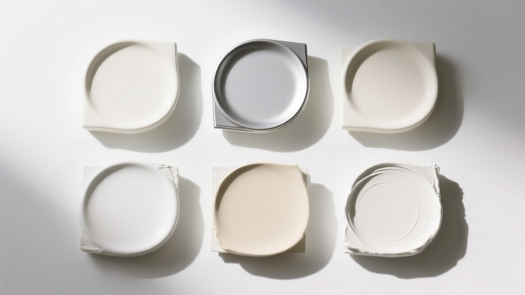
Best White Paint Colors Compared - The Decor Mag
White paint looks simple on a swatch, yet it’s one of the most influential choices you’ll make in a home. The right white can make ceilings feel taller, daylight feel brighter, and artwork or cabinetry look intentional and crisp. The wrong white can read gray, blue, yellow, or even slightly pink—leaving a room feeling “off” even when everything else is beautifully styled.
White also sets the emotional temperature of a space. In color psychology, whites tend to signal clarity, calm, cleanliness, and openness—yet undertones change the mood. A soft warm white feels welcoming and lived-in, while a high-contrast bright white feels modern and energized. Understanding undertones and light is the difference between a white that simply fills space and a white that elevates it.
This guide compares the best white paint colors across popular brands, with practical guidance for real rooms, common mistakes to avoid, and easy ways to choose a white that supports your home’s style, lighting, and color scheme.
How to Compare White Paint Colors (Without Guessing)
1) Undertone: the “hidden color” that shows up on walls
Every white has an undertone—often warm (yellow, cream, pink), cool (blue, violet), or balanced/neutral (a subtle mix). Undertones become most visible:
- Next to bright trim, tile, stone, or cabinetry
- In shadowed corners and hallways
- On large wall expanses (where color intensifies)
2) LRV: why brightness matters for real rooms
LRV (Light Reflectance Value) describes how much light a paint reflects. Most whites sit high on the scale, but small differences matter:
- Higher LRV (brighter whites): Feel crisp, modern, airy; can look stark in low light
- Mid-to-high LRV (soft whites): More forgiving; better for cozy spaces and open plans
- Lower “white-adjacent” LRVs: Off-whites that read creamy or greige; great for warmth and depth
3) Lighting direction and bulb temperature
- North-facing light: Cooler and grayer; warm whites often look best
- South-facing light: Bright and warm; many whites work, but very warm whites can skew creamy
- East-facing light: Warm morning, cool afternoon; balanced whites are easiest
- West-facing light: Cool morning, warm afternoon; whites can shift dramatically—sample carefully
For bulbs, 2700K–3000K typically flatters warm whites; 3000K–3500K suits neutral whites; 3500K+ can make some whites look icy.
Best White Paint Colors, Compared by “Type”
Rather than ranking one “best white,” designers choose based on undertone, the room’s purpose, and what the white must coordinate with (floors, counters, trim, textiles). Use these categories to narrow fast.
Best Warm Whites (Welcoming, Soft, Timeless)
Benjamin Moore White Dove (OC-17)
A favorite for good reason: White Dove is a soft warm white that reads creamy without looking yellow. It’s forgiving in open-concept homes and plays well with both warm and cool finishes.
- Best for: Walls, trim, cabinets; whole-house whites
- Pairs well with: Natural oak, warm marble, black hardware, linen textiles
- Room example: In a family room with medium-toned wood floors and a greige sectional, White Dove keeps the palette warm and relaxed while still feeling “clean.”
Sherwin-Williams Alabaster (SW 7008)
Alabaster is a warm, creamy white with a calm, comforting feel—excellent for bedrooms and living spaces where you want softness rather than sharp contrast.
- Best for: Walls and trim in traditional, modern farmhouse, transitional homes
- Pairs well with: Warm grays, taupes, aged brass, terracotta accents
- Room example: In a west-facing bedroom, Alabaster balances golden afternoon light and keeps bedding looking plush rather than stark.
Farrow & Ball Wimborne White (No. 239)
Wimborne White feels classic and slightly creamy, with a refined softness that suits older homes and detailed millwork.
- Best for: Trim, paneling, cabinetry; heritage interiors
- Pairs well with: Muted blues and greens, warm neutrals, antique woods
Best Neutral Whites (Balanced Undertones, Easy to Match)
Benjamin Moore Simply White (OC-117)
Bright and lively with a subtle warmth, Simply White often reads “fresh” rather than creamy. It can look more energetic than White Dove, making it great when you want a cleaner white without going icy.
- Best for: Kitchens, trim, ceilings in brighter homes
- Pairs well with: Navy, charcoal, crisp black, white quartz, light oak
- Room example: In a kitchen with matte black pendants and white quartz counters, Simply White keeps the space bright while avoiding a cold, sterile look.
Sherwin-Williams Pure White (SW 7005)
Pure White sits in the sweet spot: not too warm, not too cool. It creates a clean backdrop and is a dependable trim color when your wall color changes from room to room.
- Best for: Trim, doors, ceilings; modern and transitional interiors
- Pairs well with: Most grays and greiges, soft greens, mixed metals
- Room example: In an open plan with a greige living room and a sage kitchen, Pure White trim ties the palette together without clashing.
Behr Swiss Coffee (12)
Swiss Coffee is a cozy, approachable off-white that leans warm. It’s popular for softening spaces with intense sun or for pairing with earthy materials.
- Best for: Living rooms, hallways, rentals where you need a crowd-pleaser
- Pairs well with: Warm wood, cream textiles, clay and sand tones
Best Cool Whites (Crisp, Modern, Gallery-Like)
Benjamin Moore Chantilly Lace (OC-65)
Chantilly Lace is a crisp, clean white often used for modern trim and cabinetry. It tends to feel “true white” in many homes, but it will reveal surrounding colors quickly—great for a polished look, less forgiving in tricky light.
- Best for: Trim, ceilings, modern kitchens, minimalist spaces
- Pairs well with: Cool marbles, stainless steel, black-and-white color schemes
- Room example: In a contemporary bathroom with cool marble tile and chrome fixtures, Chantilly Lace keeps everything sharp and spa-like.
Sherwin-Williams Extra White (SW 7006)
Extra White reads bright and cool. It’s excellent for high-contrast looks, especially with modern architecture and cooler finishes.
- Best for: Trim, doors, ceilings in contemporary homes
- Pairs well with: Charcoal, crisp blues, cool grays, polished concrete
- Watch for: Can feel stark in low-light rooms or alongside warm creams
Farrow & Ball All White (No. 2005)
All White is clean and bright, designed to feel uncomplicated. In practice, it reads best in spaces with good natural light and a minimal palette.
- Best for: Sunlit rooms, modern interiors, art-forward spaces
- Pairs well with: Bold color blocks, black accents, pale woods
Choosing the Right White for Each Room
Living rooms: softness wins (most of the time)
Living rooms benefit from whites that support comfort. A slightly warm or neutral white helps upholstery, rugs, and skin tones look better—especially at night under lamps.
- Try: Benjamin Moore White Dove, Sherwin-Williams Alabaster, Behr Swiss Coffee
- Great color schemes:
- Warm white + oatmeal linen + olive green accents
- Neutral white + charcoal + walnut wood + brass
Kitchens: coordinate with countertops and cabinets first
Kitchens are full of hard finishes that “grade” your paint: quartz, marble, tile, stainless, cabinet color, and backsplash grout. Decide whether you want your kitchen to feel creamy and classic or crisp and modern.
- For warm stone or creamy cabinets: White Dove, Alabaster, Swiss Coffee
- For bright white cabinetry or cool quartz: Pure White, Chantilly Lace, Extra White
Real scenario: If you have a white quartz with subtle gray veining, a too-warm wall white can make the quartz look dingy. A neutral white like Sherwin-Williams Pure White often keeps the quartz looking cleaner and more intentional.
Bedrooms: use white to shape the mood
White walls can still feel cozy when the undertone is warm and the sheen is soft. Bedrooms also tend to have more fabric (curtains, bedding), which amplifies warmth.
- Try: Alabaster for a cocooning feel; White Dove for quiet warmth; Simply White for a brighter, morning-friendly vibe
- Color psychology tip: Warmer whites reduce visual “buzz,” supporting rest and calm.
Bathrooms: decide between spa-cool or hotel-warm
- Spa-cool (crisp, polished): Chantilly Lace or Extra White with cool marble and chrome
- Hotel-warm (soft, flattering): White Dove or Alabaster with brass, warm mirrors, ivory towels
Real scenario: If your bathroom tile has a pink-beige cast (common in some travertines), cool whites can emphasize that undertone. A warm white typically harmonizes better.
Trim, doors, and ceilings: create intentional contrast
Many homeowners default to “the same white everywhere,” but trim strategy is a powerful design tool. You can:
- Match trim to walls for a modern, seamless look (great in small rooms)
- Go 1–2 steps brighter on trim for classic definition
- Use a crisp white trim (like Chantilly Lace or Pure White) to sharpen warm wall whites
Practical sheen guidance:
- Walls: Matte or eggshell (for most homes)
- Trim/doors: Satin or semi-gloss (cleanable and crisp)
- Ceilings: Flat (to reduce glare)
White Paint Color Pairings That Always Work
When a white feels “right,” it’s usually because it supports the undertones in the rest of your palette. These combinations are designer staples:
- Warm white + soft black accents: White Dove + matte black hardware + warm oak
- Neutral white + sage green: Pure White + muted sage cabinets + creamy tile
- Bright white + navy: Simply White + deep navy built-ins + brass lighting
- Crisp cool white + gray stone: Chantilly Lace + cool marble + chrome
- Creamy white + terracotta: Alabaster + clay pottery + camel leather
Common White Paint Mistakes (and How to Avoid Them)
- Sampling too small. A tiny chip won’t reveal undertones. Paint a large sample (at least 12x12, bigger is better) or use peel-and-stick samples.
- Ignoring fixed finishes. Countertops, floors, and tile don’t change—your paint should coordinate with them, not fight them.
- Forgetting nighttime lighting. A white that looks perfect at noon can turn dull or yellow at night. Check it under your actual bulbs.
- Choosing “brightest white” for low-light rooms. In dim spaces, ultra-bright whites can look cold or flat. A softer warm white often reads brighter because it feels more inviting.
- Mixing clashing whites. Putting a creamy white next to a crisp cool white can make both look wrong. Keep whites in the same undertone family for adjacent spaces.
- Wrong sheen in the wrong place. High sheen on imperfect walls highlights texture; matte on trim scuffs easily. Match sheen to function.
How to Test White Paint Colors Like a Designer
- Pick 3–5 contenders from the same undertone family (warm, neutral, or cool).
- Test on multiple walls (at least one bright wall and one shadow wall).
- Hold samples next to your “white” items (trim, sink, toilet, countertop, bedding) to spot undertones.
- View at 3 times of day: morning, midday, evening.
- Decide on contrast: Do you want trim brighter than walls, or a softer monochrome look?
FAQ: Best White Paint Colors
What is the most popular white paint color for walls?
Benjamin Moore White Dove (OC-17) and Sherwin-Williams Alabaster (SW 7008) are two of the most specified whites for walls because they’re warm, flattering, and forgiving across many lighting conditions.
What white paint color is best for trim?
For trim, homeowners often prefer a cleaner white with a crisp finish. Sherwin-Williams Pure White (SW 7005) is a reliable neutral choice, while Benjamin Moore Chantilly Lace (OC-65) creates a brighter, sharper contrast in modern spaces.
Why does my white paint look gray or blue?
Cool northern light, LED bulbs with higher Kelvin temperatures, and nearby gray finishes can pull blue/gray undertones forward. Switching to a warmer white (like Alabaster or White Dove) and using 2700K–3000K bulbs usually helps.
Can I use the same white paint on walls, trim, and ceiling?
Yes—this “color-drench lite” approach looks modern and cohesive, especially in smaller rooms. Use different sheens (matte/eggshell on walls, satin on trim) so the architecture still reads.
What’s the best white for a kitchen with warm cabinets or wood floors?
Warm woods often look best with warm or neutral whites. Benjamin Moore White Dove and Sherwin-Williams Alabaster are strong starting points. If the wood is very orange, test a neutral white like Sherwin-Williams Pure White to prevent the room from feeling too yellow.
How do I choose between Simply White and White Dove?
Choose Simply White when you want a brighter, fresher look with a bit of warmth. Choose White Dove when you want softer warmth and a more muted, classic feel—especially in open plans or rooms with warm materials.
Next Steps: Find Your Best White and Build a Cohesive Color Scheme
Start by identifying your home’s immovable elements—floors, countertops, tile, and cabinetry—then choose a white that harmonizes with those undertones. Narrow to three finalists, test large samples on multiple walls, and confirm the look under both daylight and evening lighting. Once your white is chosen, it becomes the foundation for a confident interior color design: layered neutrals, tonal textures, and accent colors that feel intentional rather than accidental.
For more guidance on paint colors, undertones, and room-by-room color schemes, explore our latest color guides on thedecormag.com.
More Articles
 Best Candy Apple Red Paint Colors - The Decor Mag
 Best Mustard Yellow Paint Colors - The Decor Mag
 How to Create a Timeless Color Palette - The Decor Mag
 Best Blush Pink Paint Colors - The Decor Mag
 Best Orange Paint Colors for Energy & Warmth (2026)
 How to Choose Bedroom Colors for Sleep - The Decor Mag
 Best Emerald Green Paint Colors - The Decor Mag
 How to Create a Low Contrast Color Palette - The Decor Mag
 Small vs Step: Decoding the Critical Difference in Color Management for Print and Digital Workflows
 2026 Color Trends: Earth Tones Making a Comeback