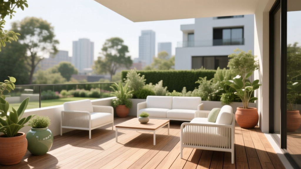
How to Choose Colors for a Terrace - The Decor Mag
A terrace is the most “in-between” space in a home: part interior, part landscape, and fully exposed to changing light. That’s exactly why terrace color choices matter more than many homeowners expect. The same paint color can read crisp at 10 a.m., chalky at noon, and moody at dusk—especially when it’s surrounded by greenery, brick, stone, or city skyline reflections.
The right terrace color scheme does more than look pretty in photos. It shapes how you feel outside: calm and restored, energized and social, or comfortably cocooned. Smart color planning also helps outdoor materials last longer (by minimizing heat absorption and glare) and creates a visual bridge between your indoor palette and the outdoors.
This guide breaks down how to choose terrace paint colors and finishes using color psychology, practical design principles, and real-life application scenarios—so you can build an outdoor space that feels intentional, inviting, and uniquely yours.
Start With What You Can’t Change
Before choosing outdoor paint colors, inventory the “fixed” elements. These set the undertones your terrace must harmonize with, whether you go tonal and serene or high-contrast and modern.
- Flooring: tile, composite decking, concrete, natural stone, wood stains
- Exterior walls: brick, stucco, siding color, neighboring building hues (for balconies)
- Metalwork: railings, window frames, pergola structure (black, bronze, aluminum)
- Hardscape accents: planters, built-in benches, outdoor kitchen counters
- Greenery: lots of plants push colors cooler; dry landscaping pulls warm
Quick Undertone Check
Match your finishes to one of these undertone families to avoid “almost-right” clashes:
- Warm: terracotta, honey wood, beige stone, bronze metal
- Cool: bluish-gray tile, charcoal concrete, stainless steel, slate
- Neutral-balanced: medium oak, true gray, crisp white, black steel
Understand Terrace Light: The Most Powerful Color Filter
Light outdoors is stronger and more reflective than indoor light. That means many paint colors look lighter and brighter on a terrace than they do on a small swatch.
How Direction Changes Color
- South-facing terraces: high, warm light can make warm paints feel yellower. Consider balanced neutrals or cooler undertones.
- North-facing terraces: cooler light can flatten colors; warm whites, greiges, and warm greens feel more welcoming.
- East-facing terraces: bright, cool morning light; colors look fresh early and softer later—great for gentle pastels and warm neutrals.
- West-facing terraces: intense golden afternoon light; avoid overly warm beiges that can skew orange.
Practical Tip: Sample Like a Pro
- Test three large samples (at least 12x12 inches) on the wall or a foam board.
- View them at morning, midday, and evening.
- Place samples near the flooring and beside any fixed stone/brick.
- Check from indoors too—your terrace should relate to your interior color design.
Choose a Color Scheme That Matches How You Use the Terrace
Great terrace color schemes begin with lifestyle. Color psychology helps here: certain hues encourage rest, conversation, appetite, or focus.
1) Relaxation Terrace: Soft, Nature-Based Neutrals
For reading, lounging, and quiet mornings, aim for low-contrast palettes that echo sand, stone, and foliage.
- Wall color: Benjamin Moore White Dove OC-17 (warm white) or Sherwin-Williams Alabaster SW 7008
- Accent/trim: Benjamin Moore Simply White OC-117 (crisp but not icy)
- Furniture: light teak, linen-look cushions, woven textures
- Textile accents: oatmeal, sage, dusty blue
Why it works: warm whites and greiges reduce glare, feel calm, and let plants and natural materials star.
2) Entertaining Terrace: Warm Contrast + Appetite-Friendly Color
For dining and socializing, warmer hues and deeper accents create a welcoming “glow,” especially after sunset.
- Main neutral: Farrow & Ball School House White No. 291 or Sherwin-Williams Accessible Beige SW 7036
- Statement accent: Benjamin Moore Hale Navy HC-154 on a feature wall, door, or built-in bench
- Metal accents: matte black or aged brass lighting
- Food-forward pops: terracotta, paprika, olive (table linens, planters)
Why it works: warm neutrals support conversation, and deeper blues/greens add sophistication without feeling loud.
3) Urban Modern Terrace: Monochrome Grays + Clean Lines
If your terrace overlooks a cityscape or you prefer a contemporary vibe, a monochrome scheme feels intentional and architectural.
- Wall color: Sherwin-Williams Repose Gray SW 7015 (soft, adaptable gray)
- Trim/railings: Sherwin-Williams Tricorn Black SW 6258 (a true, modern black)
- Floor accents: charcoal outdoor rug, concrete planters
- Greenery: sculptural plants like snake plant, olive tree, or boxwood
Why it works: neutrals emphasize form and texture; black anchors the space and hides exterior grime.
4) Coastal or Airy Terrace: Whites + Blue-Greens
This palette is made for breezy climates, bright light, and casual lounging. Think salt-washed surfaces and watery accents.
- Walls: Benjamin Moore Seapearl OC-19 (a soft, nuanced off-white)
- Accent: Benjamin Moore Palladian Blue HC-144 (blue-green with gray softness)
- Alternative accent: Sherwin-Williams Sea Salt SW 6204 (muted green-blue, spa-like)
- Pair with: weathered wood, rope textures, striped cushions
Why it works: blue-greens soothe the nervous system and visually “cool” sunny terraces.
Build Your Terrace Palette: A Simple 60-30-10 Formula
The 60-30-10 guideline keeps outdoor color schemes from feeling chaotic—especially when plants and sky add extra color.
- 60% Base: wall color or the largest surface (often a warm white or greige)
- 30% Secondary: flooring tone, large furniture upholstery, or a major accent wall
- 10% Accent: cushions, planters, lanterns, outdoor rug pattern
Easy, Reliable Color Combinations
- Warm white + sage + black: SW Alabaster + SW Evergreen Fog SW 9130 + SW Tricorn Black
- Greige + navy + brass: SW Accessible Beige + BM Hale Navy + warm metals
- Soft white + terracotta + olive: BM White Dove + terracotta planters + olive textiles
- Light gray + charcoal + crisp white: SW Repose Gray + charcoal accents + BM Simply White
Real Terrace Scenarios: What to Paint and Where
Scenario A: Small Balcony Terrace (Apartment or Condo)
Goal: make it feel larger and brighter without glare.
- Walls: Benjamin Moore White Dove OC-17 (softly reflective)
- Railings/metal: Sherwin-Williams Tricorn Black SW 6258 for a crisp outline
- Color accents: two cushion colors max (e.g., sand + deep green) to avoid visual clutter
- Pro tip: Use one pattern (striped rug or pillows), keep everything else solid.
Scenario B: Rooftop Terrace With Full Sun
Goal: reduce heat and brightness while staying modern.
- Walls/pergola: Sherwin-Williams Snowbound SW 7004 (crisp, contemporary white)
- Built-ins: Benjamin Moore Classic Gray OC-23 (a barely-there greige that won’t feel yellow)
- Accents: charcoal planters, muted rust textiles
- Pro tip: choose lighter tones for large surfaces to lower perceived temperature and reduce fading.
Scenario C: Covered Terrace or Veranda
Goal: avoid a cave-like feel; keep it cozy at night.
- Ceiling: a lighter shade than the walls to lift the space (try BM Simply White)
- Walls: Farrow & Ball Skimming Stone No. 241 for warmth under shade
- Accent color: SW Evergreen Fog on shutters, a bench, or an outdoor cabinet
- Lighting: warm bulbs (2700K) amplify warm neutrals and make greens look lush.
Scenario D: Terrace That Connects to the Living Room
Goal: seamless indoor-outdoor color flow.
- Pull a secondary color from your living room (e.g., the sofa color) into terrace textiles.
- Keep terrace wall color within the same undertone family as your interior paint.
- Example pairing: If your living room is painted BM Edgecomb Gray HC-173, use a terrace white like BM White Dove plus accents in flax and olive.
Finish and Durability: The Unseen Part of Great Color
Outdoor paint colors need the right finish to hold up to UV exposure, rain, and cleaning. Finish also changes how a color looks.
- Flat/matte: hides wall imperfections, looks elegant, but can show marks. Best for sheltered terraces.
- Eggshell/satin: a favorite for exterior walls—cleanable, softly reflective, balanced.
- Semi-gloss: ideal for trim, railings, doors; makes colors appear deeper and more saturated.
Application guidance: If painting masonry or stucco, use a breathable exterior system recommended by your paint brand and climate. For metal railings, prioritize rust-inhibiting primers and durable exterior enamels.
Common Terrace Color Mistakes (and How to Fix Them)
- Choosing colors only from a screen: outdoor light will shift the hue. Fix: test large samples and view across the day.
- Too much bright white in full sun: glare can be uncomfortable. Fix: use warm whites (BM White Dove, SW Alabaster) or soft off-whites (BM Seapearl).
- Ignoring undertones: a “simple beige” can turn pink, green, or yellow next to stone. Fix: match undertones to flooring and fixed materials.
- Overusing trendy dark colors: deep hues can fade faster and amplify heat. Fix: use dark colors in smaller doses (railings, planters, a single accent wall).
- Too many accent colors: plants already add complexity. Fix: limit to 1–2 accent hues plus a neutral base.
- Forgetting nighttime: the terrace should look good under artificial lighting. Fix: choose warm light bulbs and preview colors after sunset.
FAQ: Choosing Terrace Paint Colors and Color Schemes
What are the best paint colors for a small terrace?
Soft whites and pale greiges tend to expand a small terrace visually. Try Benjamin Moore White Dove OC-17, Benjamin Moore Classic Gray OC-23, or Sherwin-Williams Alabaster SW 7008. Keep contrast controlled: one darker anchor (like Tricorn Black) is often enough.
Should terrace colors match the interior?
They don’t need to match exactly, but they should relate. Aim for consistent undertones and repeat one or two interior colors outdoors through textiles, planters, or accent paint. This creates a cohesive indoor-outdoor color design.
How do I pick a terrace color scheme with lots of plants?
Let green be your hero color and choose a quiet backdrop: warm white, stone, or soft gray. Then add one accent that plays well with foliage—navy, terracotta, charcoal, or muted blush. Avoid overly cool grays if your plants are warm, yellow-green.
Are dark exterior paint colors a bad idea for terraces?
Not automatically, but use them strategically. Dark colors absorb heat and can fade faster in direct sun. They’re excellent for railings, trim, and furniture, or for covered terraces where UV exposure is lower.
What’s the easiest foolproof color palette for a terrace?
A warm white base, black accents, and natural wood is the most reliable. Add one soft color (sage, dusty blue, or terracotta) through cushions and pots. This palette works across modern, coastal, and classic styles.
Next Steps: Your Terrace Color Plan in One Afternoon
- Photograph your terrace in morning and late afternoon light.
- Identify fixed undertones (flooring, railings, brick/stone).
- Choose one base neutral (warm white/greige) and one accent color.
- Sample at scale and check the colors at multiple times of day.
- Finalize finishes (eggshell/satin for walls, semi-gloss for trim/metal).
A terrace with a thoughtful color scheme feels like a true extension of your home—one that supports your routines, flatters your materials, and makes everyday outdoor moments feel designed.
Explore more paint color guides, color schemes, and interior color design inspiration on thedecormag.com.
More Articles
 Best Sage Green Paint Colors for Serenity - The Decor Mag
 How to Choose Colors for East-Facing Rooms - The Decor Mag
 How to Choose Colors for a Home Office - The Decor Mag
 Best Jade Green Paint Colors - The Decor Mag
 2026 Color Trends: Earth Tones Making a Comeback
 Best Rose Red Paint Colors - The Decor Mag
 Best Moss Green Paint Colors - The Decor Mag
 Best Plum Paint Colors for Drama - The Decor Mag
 Best Blue Paint Colors for Every Mood - The Decor Mag
 How to Mix Warm and Cool Tones Successfully - The Decor Mag