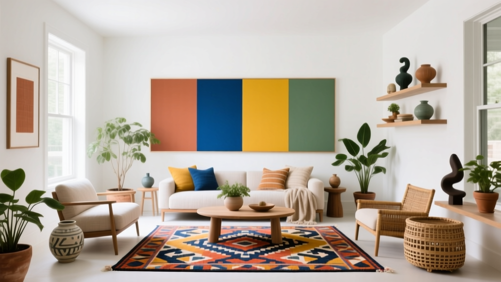
How to Create a Vibrant Color Palette - The Decor Mag
A vibrant color palette can change the entire mood of a home—turning flat rooms into energizing spaces, highlighting architectural details, and giving everyday routines a sense of intention. Color is also one of the most flexible design tools: you can create impact with paint alone, or layer it through textiles, art, and accessories without a full renovation.
Many homeowners want more color but worry it will feel chaotic, too trendy, or visually “loud.” The truth is that vibrant interior color design is less about choosing the brightest paint on the fan deck and more about building a balanced color scheme. When you understand a few color theory fundamentals—undertones, contrast, saturation, and proportion—you can use bold hues confidently and make them feel tailored to your space.
This guide breaks down how to create a vibrant color palette with practical steps, paint color recommendations, real room scenarios, and common mistakes to avoid—so your home feels expressive, cohesive, and livable.
What Makes a Color Palette “Vibrant” (Without Feeling Overwhelming)?
“Vibrant” often gets confused with “bright.” A vibrant palette can include deep jewel tones, saturated mid-tones, and even grounded neutrals—what matters is energy and clarity. Vibrancy comes from:
- Saturation: Colors with more pigment read stronger and more lively.
- Contrast: Pairing light/dark or warm/cool tones makes each color pop.
- Clean undertones: When hues share compatible undertones, the room feels intentional rather than messy.
- Strong accents: A few high-impact moments (a door, ceiling, built-ins, or bold rug) create excitement without covering every wall.
Color Psychology: Why Vibrant Rooms Feel Good
Color psychology isn’t about rigid rules—it’s about how we tend to experience color. Vibrant palettes can support the way you want to live in a room:
- Warm colors (red, orange, yellow) often feel social, lively, and cozy—great for dining rooms and kitchens.
- Cool colors (blue, green, violet) tend to feel calming, focused, and restorative—ideal for bedrooms and offices.
- Jewel tones (emerald, sapphire, amethyst) bring drama and depth, making spaces feel elevated.
- High-contrast palettes create clarity and modern edge, while analogous palettes (neighboring hues on the color wheel) feel rich and cohesive.
The Foundation: Start With Lighting, Undertones, and Existing Finishes
Before you commit to paint colors, take stock of what’s already in the room. Vibrant color schemes are easiest when they harmonize with fixed elements:
- Flooring: Warm oak vs. cool gray tile will steer your undertones.
- Countertops and stone: Look for veining colors (blue-gray, cream, rust, green).
- Upholstery and rugs: These often contain multiple hues you can pull from.
- Metal finishes: Brass warms up color; chrome and nickel sharpen and cool it.
Quick Undertone Check (That Prevents Costly Mistakes)
- Compare paint chips to pure white paper. You’ll see whether a “neutral” leans pink, green, blue, or yellow.
- Test at multiple times of day. Morning cool light and evening warm light can change saturation dramatically.
- Use larger swatches. Paint a 2' x 2' sample or use peel-and-stick samples so you can judge the true intensity.
Choose a Color Scheme That Creates Energy and Balance
Color schemes are the backbone of cohesive interior color design. Here are reliable frameworks for building a vibrant palette.
1) Complementary Color Schemes (High Impact, Modern)
Complementary colors sit opposite each other on the color wheel (blue/orange, red/green, yellow/violet). They create the most contrast—useful when you want boldness that still feels structured.
- Navy + Burnt Orange: Try Benjamin Moore Hale Navy (HC-154) with Sherwin-Williams Cavern Clay (SW 7701).
- Emerald + Blush: Try Sherwin-Williams Evergreen Fog (SW 9130) paired with Farrow & Ball Setting Plaster (No. 231).
Application tip: Let one color dominate (walls or large furniture) and use the complement as an accent (pillows, art, lampshades, a single painted door).
2) Analogous Color Schemes (Rich, Layered, Easy to Live With)
Analogous palettes use neighboring colors like blue/teal/green or red/coral/pink. They feel vibrant because the hues relate naturally, making layering simple.
- Teal + Green + Blue: Benjamin Moore Aegean Teal (2136-40) with Sherwin-Williams Rainwashed (SW 6211) and accents of Naval (SW 6244).
- Terracotta + Coral + Warm Pink: Farrow & Ball Red Earth (No. 64) with Benjamin Moore Coral Gables (2010-40) and a softened neutral like BM White Dove (OC-17).
Application tip: Use value changes (light/medium/dark) to keep the scheme from becoming flat.
3) Triadic Color Schemes (Playful, Collected, Creative)
Triadic palettes use three colors evenly spaced on the wheel (like teal, magenta, and mustard). They’re vibrant by nature, so success depends on restraint and repetition.
- Mustard + Teal + Berry: Benjamin Moore Golden Straw (2152-50), BM Caribbean Teal (2123-20), and Sherwin-Williams Rhapsody Lilac (SW 6828) as an accent.
Application tip: Choose one “anchor” color, one supporting color, and one accent color that appears in small doses across the room (art, books, ceramics).
Pick a “Hero” Color, Then Build Supporting Players
A vibrant palette feels controlled when you assign roles to colors. Use this simple hierarchy:
- Hero color: The bold hue with the most visual weight (often walls, cabinetry, or a large rug).
- Secondary color: Reinforces the hero and adds dimension (upholstery, drapery, adjacent room color).
- Accent color: Small but punchy (pillows, vases, framed prints, a painted stool).
- Neutral “breather”: A soft white, warm beige, greige, or pale gray that lets saturated colors shine.
Reliable Neutral “Breathers” for Vibrant Schemes
- Benjamin Moore White Dove (OC-17): warm, flexible, smooth backdrop
- Sherwin-Williams Alabaster (SW 7008): creamy without feeling yellow
- Farrow & Ball School House White (No. 291): softly muted, classic
Real Room Examples: Vibrant Palettes You Can Copy
Living Room: Jewel-Tone Comfort That Still Feels Bright
Goal: Create a cozy, elevated space with color that reads intentional, not heavy.
- Walls: Benjamin Moore Aegean Teal (2136-40) in eggshell
- Trim/Ceiling: BM White Dove (OC-17) in semi-gloss for trim, flat for ceiling
- Accent: Sherwin-Williams Tricorn Black (SW 6258) on a fireplace surround or built-ins
- Textiles: Add rust velvet pillows, a cream-and-black patterned rug, and brass lighting
Why it works: The teal is saturated but grounded; warm rust accents add vibrancy through warm/cool contrast, while white trim keeps the edges crisp.
Kitchen: Colorful Cabinets Without a Full Remodel
Goal: Add personality and a designer feel with a paint-forward update.
- Lower cabinets: Sherwin-Williams Evergreen Fog (SW 9130)
- Upper cabinets: Sherwin-Williams Alabaster (SW 7008)
- Island (optional punch): Benjamin Moore Hale Navy (HC-154)
- Hardware: Aged brass or satin brass to warm the green
Why it works: Two-tone cabinetry delivers vibrancy at eye level while keeping the room airy. The navy island acts as a “hero” moment without overwhelming the space.
Bedroom: Vibrant but Restful Using Muted Saturation
Goal: Bring color into a bedroom while keeping it calming.
- Walls: Farrow & Ball Setting Plaster (No. 231) or Benjamin Moore First Light (2102-70)
- Headboard wall (optional): Sherwin-Williams Naval (SW 6244) for depth
- Accents: Olive throw, indigo bedding, walnut nightstands
Why it works: Warm pinks feel flattering and cozy; a deep blue grounds the palette and supports sleep-friendly calm.
Bathroom: Small Space, Big Color, High Style
Goal: Use high saturation strategically in a compact room.
- Walls: Benjamin Moore Caribbean Teal (2123-20) in satin
- Vanity: Sherwin-Williams Cavern Clay (SW 7701) or a warm wood finish
- Trim: BM White Dove (OC-17)
Why it works: Bathrooms can handle bold color because the footprint is small. Crisp white trim and reflective surfaces (mirror, lighting) keep it fresh.
How to Distribute Color: The 60-30-10 Rule (and Better Variations)
If you like guidelines, the classic 60-30-10 approach is a great start:
- 60% dominant color: walls or large rugs
- 30% secondary color: furniture, curtains, bedding
- 10% accent color: accessories, art, florals
For more vibrant paint colors, try these variations:
- 50-30-15-5: Adds a second accent for a layered, collected look.
- 70-20-10: Best for beginners—lets a single hero color shine with fewer moving parts.
Finish and Sheen Tips for Vibrant Color
- Matte/flat: Sophisticated and velvety; can make bold colors feel more “designed.”
- Eggshell: Most forgiving for living spaces; good balance of washability and softness.
- Satin: Works well for kitchens, baths, and kids’ rooms; can intensify color slightly due to sheen.
- Semi-gloss: Great for trim and doors; use sparingly on large walls unless you want drama and reflection.
Common Color Mistakes to Avoid
- Choosing colors in isolation: A paint chip that looks perfect in-store can clash with your flooring or stone. Always compare to existing finishes.
- Ignoring undertones: Mixing a blue-based white with a yellow-based beige can make the room feel “off.” Keep undertones compatible.
- Overusing bright accents: Too many competing accent colors creates visual noise. Repeat one or two accents throughout instead.
- Skipping contrast: Vibrant palettes need light/dark relief. Add crisp trim, dark anchors, or neutral breathing room.
- Testing too small: Small swatches lie. Color intensifies across a full wall and shifts under different lighting.
- Forgetting transition spaces: Hallways and adjoining rooms should echo at least one color (or undertone) so the whole home feels cohesive.
Practical Steps: Build Your Vibrant Palette in One Afternoon
- Choose a starting point: A rug, artwork, or fabric you love—something with 3+ colors already working together.
- Pull 1 hero color and 1 neutral: Use the artwork/rug as your guide for undertones.
- Add a secondary and an accent: Keep the accent small but bold for maximum vibrancy.
- Test paint colors properly: Paint large samples and view them morning/day/night.
- Plan repetition: Repeat each color at least 2–3 times in the room (pillows, art, books, ceramics) for a cohesive color scheme.
- Decide where bold goes: If full walls feel like too much, try a ceiling, built-ins, interior doors, or a color-drenched powder room.
FAQ: Vibrant Color Palettes at Home
What are the best paint colors for a vibrant but timeless look?
Look for saturated, slightly muted classics: Benjamin Moore Hale Navy, Sherwin-Williams Evergreen Fog, and Farrow & Ball Setting Plaster. These shades feel current but not overly trendy, and they pair well with warm woods and clean whites.
How do I make bright colors look sophisticated, not childish?
Balance bright hues with grounding elements: add black accents, warm wood tones, and tailored neutrals. Also consider a matte or eggshell finish for walls—high gloss can push color into a more playful, reflective direction.
Can I use a vibrant color palette in an open-concept home?
Yes—use a consistent neutral for trim and ceilings (like BM White Dove or SW Alabaster), then assign each zone a related color family. Repeat one accent color across the entire space to connect the rooms visually.
What’s the easiest way to add vibrancy without painting every wall?
Choose one high-impact surface: an interior door, a built-in, a kitchen island, or even a painted ceiling. Layer additional color through pillows, art, and a patterned rug so the palette feels complete.
How do I choose paint colors that work with warm wood floors?
Warm woods love colors with warm or balanced undertones: earthy greens, clay tones, warm whites, and rich navies. Try SW Cavern Clay, SW Evergreen Fog, BM Aegean Teal, and BM White Dove as a starting mix.
Should trim be white in a vibrant room?
Not always. White trim creates crisp contrast and is the easiest route to a polished look. For a more immersive feel, try color-drenching (walls + trim in the same shade) in smaller rooms like powder rooms, offices, or snug living spaces.
Next Steps: Bring Vibrant Color Into Your Home With Confidence
Start with one room, one hero color, and one reliable neutral. Build your color scheme using undertones and contrast, then distribute color intentionally—walls, large textiles, and a few bold accents repeated throughout. If you’re torn between two vibrant paint colors, test both at full scale and let your lighting make the decision.
For more paint color ideas, curated color palettes, and room-by-room guidance, explore our color guides at thedecormag.com.
More Articles
 How to Create an Energizing Color Palette - The Decor Mag
 Best Cobalt Blue Paint Colors - The Decor Mag
 Cohesive Color Flow Between Rooms | The Decor Mag
 Best Mango Paint Colors - The Decor Mag
 Best Crimson Paint Colors - The Decor Mag
 Best Apricot Paint Colors - The Decor Mag
 Best Rust Red Paint Colors - The Decor Mag
 Best Cream Paint Colors for Warm Neutrals - The Decor Mag
 Best Chartreuse Paint Colors - The Decor Mag
 Best Palette Reading: Science, Standards, and Real-World Accuracy for Designers and Brand Managers