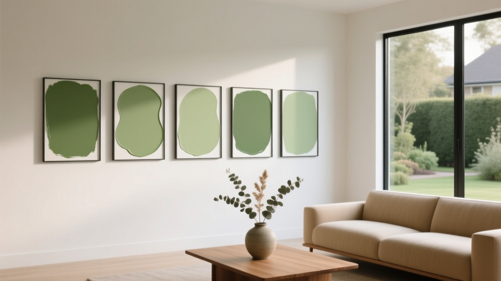
Best Pear Green Paint Colors - The Decor Mag
Pear green sits in that rare sweet spot between cheerful and sophisticated. It’s a yellow-leaning green that feels fresh and optimistic, yet grounded enough to work as a “new neutral” in many homes. When homeowners want more personality than beige but less commitment than a saturated emerald, pear green paint colors often deliver the perfect balance.
This topic matters because pear green is highly sensitive to light and surrounding finishes. In bright north-facing rooms it can read crisp and airy; in warm afternoon sun it can glow almost chartreuse. Understanding how undertone, sheen, and adjacent materials influence pear green helps you choose a shade that looks intentional—rather than accidentally neon or muddy.
Whether you’re updating kitchen cabinets, searching for a welcoming front door color, or trying to calm an open-concept living space with a nature-inspired color scheme, pear green can be a surprisingly versatile tool in interior color design.
What Is Pear Green, Exactly?
Pear green is a yellow-forward green that typically sits between soft apple green and light chartreuse. Compared to sage (which is grayer and cooler) or olive (which is browner and deeper), pear green feels brighter, cleaner, and more spring-like.
Pear Green Undertones to Watch
- Yellow undertone: Creates warmth and energy; can look sunnier in warm light.
- Soft gray undertone: Tames brightness and reads more sophisticated; better for large walls.
- White/clean base: Makes the color feel crisp and modern; can skew “zesty” if over-lit.
Color Psychology: Why Pear Green Works
Green is associated with balance, restoration, and ease—qualities rooted in nature. Add a pear-like yellow lift and the mood becomes more social and optimistic. Pear green often supports:
- Well-being: A gentle, garden-inspired calm that still feels lively.
- Appetite and hospitality: Great for kitchens and dining spaces where you want warmth.
- Motivation: An energizing backdrop for home offices and creative studios.
How to Choose the Right Pear Green for Your Home
1) Start With Your Fixed Elements
Pear green responds dramatically to finishes you can’t easily change. Before choosing paint, look at:
- Countertops: Warm stone (cream, beige, gold veining) pairs best with yellow-leaning pear greens.
- Flooring: Honey oak and warm walnut love pear green; cool gray LVP can push it neon.
- Tile and grout: Bright white tile sharpens pear green; cream tile softens it.
- Metal finishes: Brass and aged bronze amplify warmth; chrome and nickel make it feel crisper.
2) Consider Light Direction
- North-facing rooms: Light is cooler and can make pear green feel slightly sharper. Choose a shade with a touch of gray to keep it relaxed.
- South-facing rooms: Bright, warm light can make pear green glow. A slightly softer or deeper pear green reads more refined.
- East-facing rooms: Morning light enhances freshness; afternoons can flatten the color. Mid-tone pear greens hold up well.
- West-facing rooms: Golden evening light intensifies warmth. Avoid overly yellow-leaning options if you’re sensitive to “highlighter” effects.
3) Pick the Right Sheen
- Matte/flat: Best for walls and ceilings where you want a soft, painterly pear green.
- Eggshell: A practical wall finish for living rooms, hallways, and kids’ spaces.
- Satin: Ideal for kitchens, baths, trim, and cabinetry when you want durability and wipeability.
- Semi-gloss: Great for doors and trim; makes pear green feel more “jewel-like.”
Best Pear Green Paint Colors (Designer-Approved Picks)
These recommendations span soft pear tints through richer, ripe-pear greens. Always test samples: pear green paint colors can shift more than you expect from morning to evening.
Benjamin Moore Pear Green Paint Colors
- Benjamin Moore Fresh Lime (2029-30): A bright, crisp pear green with modern energy. Best as an accent wall, door color, or playful powder room.
- Benjamin Moore Spring Green (2030-10): A clean yellow-green that feels botanical and upbeat. Works beautifully in kitchens with white cabinets and warm brass.
- Benjamin Moore Soft Fern (2144-40): A softened yellow-green that reads more livable on large walls. Great for bedrooms, nurseries, and relaxed living rooms.
Sherwin-Williams Pear Green Paint Colors
- Sherwin-Williams Lime Granita (SW 6715): A bright, juicy pear green that pops in sunlit rooms. Excellent for a statement island, pantry door, or creative studio.
- Sherwin-Williams Eco Green (SW 6739): A lively yellow-green with a fresh, youthful vibe. Try it as a modern front door color with crisp white trim.
- Sherwin-Williams Liveable Green (SW 6176): Not a true “lime,” but a smart choice if you want a muted pear-adjacent green that behaves like a neutral in open-concept spaces.
Farrow & Ball Pear-Leaning Greens
- Farrow & Ball Yeabridge Green (No. 287): A classic yellow-green that feels historic and sun-warmed. Perfect with aged brass, natural linen, and warm wood floors.
- Farrow & Ball Sap Green (No. 199): Deeper and earthier; think “pear tree leaves” rather than fruit. Strong for libraries, dining rooms, and cabinetry.
Behr Pear Green Paint Colors
- Behr Jojoba (MQ6-10): A grounded yellow-green that plays nicely with creamy whites and tan textiles. A good pick if you want pear green without the neon risk.
- Behr Soft Focus (T18-11): A lighter, airier option that can read as a gentle pear tint—lovely for bathrooms and small bedrooms.
Where Pear Green Looks Best: Real Room Ideas
Pear Green Kitchens: Fresh, Friendly, Not Fussy
Pear green can make a kitchen feel cleaner and happier without leaning clinical. It’s especially effective when you want a color scheme that complements plants, wood, and everyday life.
- Cabinetry: Use a muted pear green on lower cabinets and keep uppers white for an airy, modern balance.
- Island moment: Paint just the island pear green for a designer look that’s easier to update later.
- Backsplash pairing: White zellige tile or creamy subway tile keeps the look timeless.
Try this palette: Pear green cabinets + warm white walls (creamy, not icy) + unlacquered brass + light oak stools + off-white quartz.
Living Rooms: A Nature-Inspired Alternative to Beige
In living spaces, softer pear greens can replace greige as a background color that still feels warm and welcoming.
- Best approach: Choose a pear green with a hint of gray, then layer textures (linen, wool, rattan) to keep it elevated.
- Trim color: Warm white trim prevents the green from looking too acidic.
- Artwork: Pear green loves black frames, warm woods, and botanical prints.
Bedrooms: Unexpectedly Restful When Softened
For bedrooms, avoid the brightest pear greens unless you’re using them in small doses. A softened pear green can feel restorative while still upbeat—great for people who find blues too cool or grays too flat.
- Best placement: Use pear green on the walls with warm white bedding and natural wood nightstands.
- Accent option: Pear green on a headboard wall with the remaining walls in a creamy off-white.
Bathrooms and Powder Rooms: Small Space, Big Personality
Pear green thrives in compact rooms where you can embrace a bolder look.
- Pair with: White tile, black accents, and brass lighting for a crisp, boutique feel.
- Wallpaper strategy: Use pear green paint below a chair rail with a botanical wallpaper above.
- Vanity upgrade: Paint the vanity pear green for color without committing to full walls.
Front Doors and Exteriors: A Welcoming Pop
As a front door color, pear green reads friendly and memorable—especially against white, cream, or pale gray siding. It also pairs beautifully with brick (red brick and pear green create a charming complementary contrast).
- Hardware: Aged brass or matte black looks sharp against yellow-green.
- Surrounding trim: Keep it clean and warm to avoid making the green look too electric.
Pear Green Color Combinations That Always Work
Use these designer-approved pairings to build a cohesive interior color scheme.
Best Whites for Pear Green
- Warm whites: Creamy off-whites soften pear green and feel more timeless.
- Crisp whites: High-contrast whites make pear green feel more modern and graphic—best with controlled lighting.
Complementary Accents and Supporting Colors
- Soft blush or clay: Adds warmth and a subtle, sophisticated contrast.
- Navy and inky blues: Grounds pear green and makes it feel tailored.
- Terracotta and warm rust: Earthy, sunbaked balance that feels collected and natural.
- Chocolate brown and walnut: Creates a rich, organic look—excellent with woven textures.
- Charcoal and matte black: Sharpens pear green for a modern edge (great in kitchens and baths).
Metals and Materials
- Brass: Enhances pear’s warmth; a go-to for traditional or transitional interiors.
- Polished nickel: Makes pear green feel cleaner and brighter; great for contemporary spaces.
- Natural stone: Creamy marbles and warm quartzites keep pear green from feeling too “primary.”
- Wood: White oak, maple, and walnut all pair well; choose based on how warm your pear green reads.
Common Pear Green Paint Mistakes (and How to Avoid Them)
- Choosing a shade that’s too bright for the room’s light.
Fix: In very sunny rooms, step one or two notches softer or deeper than your first instinct. - Pairing pear green with cool gray floors and icy whites.
Fix: Add warmth through trim, rugs, and textiles—or select a pear green with a grayer, calmer base. - Ignoring nighttime lighting.
Fix: Test your paint sample under the bulbs you actually use. Warm LEDs (2700K–3000K) usually flatter pear green more than cool daylight bulbs. - Using high sheen on large walls.
Fix: Keep walls matte or eggshell for a softer effect; use satin/semi-gloss on trim, doors, or cabinets. - Not sampling next to your countertops and tile.
Fix: Move a large sample board around the room and view it beside the fixed finishes at multiple times of day.
Practical Tips for Sampling Pear Green Paint Colors
- Use large samples: Paint at least two 12"x12" areas or, better, a movable foam board for each candidate color.
- Check corners and shadow lines: Pear green can deepen and turn murkier in low light; see it where shadows fall.
- Compare against a true white sheet of paper: This helps you see whether your “white” trim is actually cream, and whether the green is reading too yellow.
- Plan transitions: In open layouts, choose a related neutral for adjacent rooms so pear green doesn’t feel abrupt.
FAQ: Pear Green Paint Colors
Is pear green the same as chartreuse?
They’re related, but not identical. Chartreuse is often brighter and more yellow-forward, sometimes bordering on neon. Pear green typically has a softer, slightly greener or more muted character—especially in interior-friendly versions.
What rooms are best for pear green walls?
Kitchens, breakfast nooks, powder rooms, mudrooms, and cheerful home offices are top choices. For living rooms and bedrooms, select a softened pear green with a hint of gray so it reads calm on large surfaces.
What trim color looks best with pear green?
Warm whites and creamy off-whites are the easiest match. Crisp whites can work for a modern look, but they increase contrast and can make pear green feel more intense—so test first.
Does pear green work with oak cabinets or floors?
Yes—especially honey oak and warm oak tones. Pear green and oak share warm undertones, creating a cohesive, natural look. If your oak is very orange, choose a pear green that’s slightly softened to avoid an overly golden effect.
How do I keep pear green from looking too bright?
Choose a version with a muted base, use a lower sheen on walls, and balance it with warm neutrals (creamy whites, flax, tan). Also check it under your evening lighting—cool bulbs can make it feel sharper.
Can pear green work in an open-concept home?
It can, especially if you use it strategically—like on cabinetry, an island, a built-in, or a single focal wall. For whole-room coverage in open layouts, pick a quieter pear green and coordinate neighboring rooms with warm whites and wood tones.
Next Steps: Bring Pear Green Home With Confidence
Start by identifying your room’s light direction and the fixed finishes you’re working with, then narrow your shortlist to three pear green paint colors—one brighter, one muted, and one slightly deeper. Sample them on large boards, view them from morning through evening, and decide where pear green will shine most: full walls, cabinetry, an accent, or a welcoming front door.
For more paint color ideas, coordinated color schemes, and room-by-room guidance, explore the color guides here on thedecormag.com.
More Articles
 How to Create a Vibrant Color Palette - The Decor Mag
 Best Midnight Blue Paint Colors - The Decor Mag
 Best Wine Red Paint Colors - The Decor Mag
 Best Purple Paint Colors for Sophistication - The Decor Mag
 Best Blue Paint Colors for Every Mood - The Decor Mag
 How to Create a Soothing Color Palette - The Decor Mag
 Best Cream Paint Colors for Warm Neutrals - The Decor Mag
 How to Create a Timeless Color Palette - The Decor Mag
 Best Papaya Paint Colors - The Decor Mag
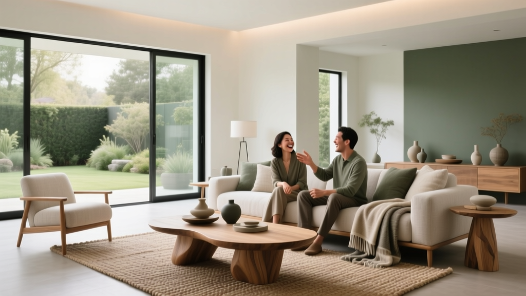 Living Room Colors for Entertaining (2026)