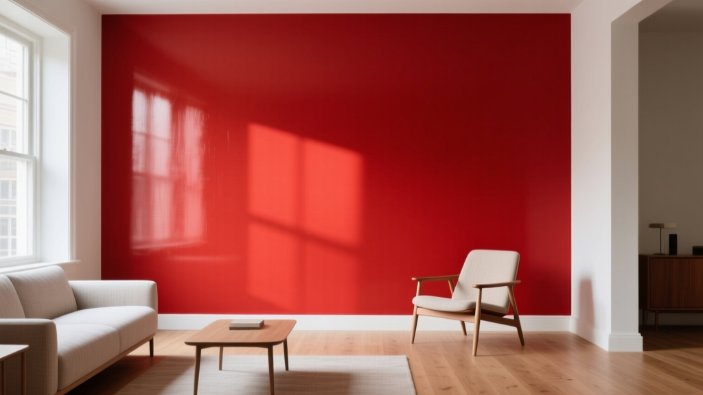
Best Fire Engine Red Paint Colors - The Decor Mag
Fire engine red is one of those rare paint colors that feels instantly alive. It signals energy, confidence, celebration, and warmth—yet it can also read classic and tailored when used with the right finishes and surrounding colors. If you’ve ever walked into a room and felt your mood lift, there’s a good chance a bold red (or a red accent) was part of the equation.
Homeowners often love fire engine red in theory but hesitate in practice: Will it overwhelm the space? Will it clash with wood tones? Will it feel too “sports car” or too “holiday”? The truth is, fire engine red can be surprisingly versatile when you understand undertones, light, sheen, and proportion. This guide breaks down the best fire engine red paint colors, where they work best, and how to build foolproof color schemes around them.
What “Fire Engine Red” Really Means in Paint
In everyday language, fire engine red describes a saturated, high-impact red that sits close to a true red—strong, clear, and attention-grabbing. In paint, reds can lean:
- Orange-red (warm): lively, sunny, energetic
- Blue-red (cool): crisp, modern, slightly dramatic
- Neutral red: balanced, classic, versatile
A “best” fire engine red for your home depends on undertone and lighting. North-facing rooms (cool light) can make some reds feel deeper or slightly muted; south-facing rooms (warm light) can push warm reds even more vibrant. The goal is a red that looks intentionally bold—not accidentally loud.
Color Psychology: Why Red Works (and When It Doesn’t)
Red is associated with appetite, warmth, vitality, and action. That’s why it shines in:
- Dining rooms: energizes conversation and enhances coziness
- Kitchens: adds a cheerful, culinary vibe (especially on islands or doors)
- Entryways: creates a memorable first impression
- Home gyms or creative studios: boosts intensity and motivation
In bedrooms or meditation spaces, fire engine red can feel overstimulating unless used as a small accent or paired with calming neutrals.
How to Choose the Right Fire Engine Red: Undertone, Light, and Finish
1) Check undertone against fixed finishes
Before committing, compare your red sample to what won’t change:
- Wood tone (oak, walnut, cherry)
- Flooring (warm stain vs. cool gray)
- Stone and tile (beige, cream, charcoal, white)
- Metal finishes (brass, chrome, matte black)
2) Understand how light shifts red
- Bright daylight: reds look cleaner and more intense
- Warm evening bulbs (2700K): warm reds glow; cooler reds may feel richer
- LEDs with poor color rendering: can make reds look flat—choose high CRI bulbs when possible
3) Pick the right sheen for the job
- Matte: sophisticated, velvety, hides wall imperfections (great for dining rooms)
- Eggshell/Satin: durable and wipeable (good for hallways, kitchens)
- Semi-gloss/High-gloss: punchy, reflective, modern (perfect for doors, trim, cabinetry)
Best Fire Engine Red Paint Colors (Designer-Approved Picks)
These options hit that vivid “fire engine” sweet spot while offering slightly different undertones for better matching.
Benjamin Moore: Caliente AF-290
Why it works: A bold, modern red with a subtle warmth that reads vibrant without turning orange. Caliente is popular for front doors and statement walls because it looks purposeful and high-end.
- Best for: front doors, dining rooms, powder rooms, built-ins
- Pairs well with: crisp whites (BM Chantilly Lace), charcoal grays, warm brass
Benjamin Moore: Classic Red 2090-10
Why it works: A true, festive red that lands close to the iconic “engine red” expectation. It’s saturated and clean—excellent when you want unmistakable red.
- Best for: accent walls, doors, furniture pieces, playful kitchens
- Pairs well with: bright whites, black accents, stainless steel
Sherwin-Williams: Real Red SW 6868
Why it works: A straightforward, confident primary red. It’s punchy and graphic—great for contemporary homes, color-blocking, and high-gloss moments.
- Best for: front doors, modern entryways, accent cabinetry, kid-friendly spaces
- Pairs well with: SW Pure White, SW Tricorn Black, cool grays
Sherwin-Williams: Heartthrob SW 6866
Why it works: Slightly warm and ultra-saturated. Heartthrob feels energetic and glamorous—ideal for a statement room where you want drama with warmth.
- Best for: powder rooms, dramatic dining rooms, accent niches
- Pairs well with: creamy whites, warm woods, gold/brass
Farrow & Ball: Incarnadine No. 248
Why it works: A deep, rich red with historic elegance. It can read “tailored fire engine red” when used in high-gloss on trim or cabinetry, and it becomes more enveloping on walls.
- Best for: libraries, dining rooms, paneled spaces, classic homes
- Pairs well with: off-whites, inky blues, dark woods
Farrow & Ball: Rectory Red No. 217
Why it works: Earthier than a true engine red, but still bold. If you love the idea of fire engine red and want a slightly softened, heritage take, this is a beautiful bridge.
- Best for: exteriors, kitchens, cozy dining rooms
- Pairs well with: warm stone, muted greens, creamy trim
Behr: Fire Engine Red (check current formula/label at retailer)
Why it works: Many Behr collections include a “Fire Engine Red” name or similar bright true red. It’s a practical choice for DIY projects, furniture refreshes, and accent moments where you want that classic bright red.
- Best for: accent doors, craft rooms, playrooms, statement furniture
- Pairs well with: bright white, black, medium gray, natural wood
Real Room Examples: Where Fire Engine Red Looks Intentional
Front Door: Instant curb appeal
A fire engine red front door is a design move that feels cheerful and confident. It works across styles—farmhouse, colonial, mid-century, contemporary—when the surrounding palette is simplified.
- Great combos: red door + white siding + black hardware
- More modern: red door + charcoal exterior + warm wood accents
- Tip: use semi-gloss or high-gloss for a crisp, durable finish
Dining Room Accent Wall: Warmth without overwhelm
If you want to experiment with bold red paint colors without painting every wall, start with one focal wall behind a sideboard or dining banquette. Pair with warm lighting and textured neutrals.
- Try: BM Caliente or SW Heartthrob in matte
- Balance with: natural linen drapes, oak table, black metal chandelier
Kitchen Island or Lower Cabinets: The “pop” that still feels livable
Fire engine red is excellent on cabinetry because the color is naturally contained by edges and hardware. A red island can become the heart of an open-plan home.
- Paint suggestion: SW Real Red for a clean modern look
- Countertop pairings: white quartz, honed black granite, stainless
- Hardware: brushed brass warms the red; matte black sharpens it
Powder Room: Small space, big personality
Because powder rooms are transitional spaces, you can go bolder without long-term fatigue. Fire engine red + wallpaper or red + dramatic art feels curated, not chaotic.
- Use: high-gloss red on trim or vanity for a lacquered look
- Pair with: white pedestal sink, vintage mirror, black sconce
Kids’ Room or Playroom: Happy, graphic energy
Red is playful and pairs well with primary palettes. Keep it structured with color blocking: red on a lower wall (or closet doors), white above, and navy accents.
Color Schemes That Make Fire Engine Red Look Designer-Level
Fire engine red thrives when it’s given strong supporting players. These are reliable interior color design pairings:
1) Red + crisp white + black
- Vibe: timeless, graphic, slightly Parisian
- Where it works: kitchens, entryways, modern living spaces
2) Red + navy + warm brass
- Vibe: sophisticated, classic, tailored
- Where it works: dining rooms, libraries, home offices
3) Red + charcoal + natural wood
- Vibe: contemporary, grounded, architectural
- Where it works: open plans, lofts, modern exteriors
4) Red + blush/soft pink + cream
- Vibe: fresh, fashion-forward, less “sports” and more “editorial”
- Where it works: bedrooms (as accents), dressing areas, creative studios
5) Red + olive green + tan leather
- Vibe: rich, earthy, collected
- Where it works: living rooms, studies, rustic-modern homes
Practical Tips for Painting with Fire Engine Red
- Sample first—always. Paint a large swatch (at least 12x12) or use peel-and-stick samples. View morning, afternoon, and evening.
- Expect extra coats. Reds often need 2–4 coats for full coverage. A tinted primer can save time and improve richness.
- Control the edges. Use clean lines and intentional boundaries (trim, paneling, wainscoting) so the red feels architectural.
- Choose the right white. Bright whites make red pop; creamy whites soften it. Matching undertones prevents a “clashy” look.
- Repeat the color. Add small red echoes (art, textiles, a bowl, a stripe) to make the red feel integrated, not random.
Common Fire Engine Red Mistakes to Avoid
- Painting every wall in an open concept without a plan. Fire engine red can dominate sightlines. Use it on a defined feature (island, dining nook, entry) instead.
- Ignoring undertones in surrounding materials. A cool blue-red can fight orange-toned wood; a warm orange-red can clash with cool gray floors.
- Using the wrong sheen. High-gloss on a flawed wall highlights texture; matte on doors can scuff easily. Match sheen to surface and traffic.
- Skipping primer. Reds are notorious for uneven coverage and flashing. Primer (often tinted) helps achieve a deeper, more even finish.
- Forgetting lighting temperature. Low-quality LEDs can dull reds. If the room feels “flat,” upgrade to higher CRI bulbs before changing paint.
FAQ: Fire Engine Red Paint Colors
Is fire engine red too bright for interior walls?
It can be intense on four walls, especially in rooms with lots of daylight. Many homeowners get the best result using fire engine red as an accent wall, on cabinetry, or in a smaller space like a powder room where bold color feels intentional.
What trim color works best with fire engine red?
Crisp whites create a clean, high-contrast look (great for modern styles). Soft, creamy whites make the red feel warmer and more traditional. Black trim is striking but best used carefully for a graphic, contemporary feel.
Which is better for a front door: Caliente or Real Red?
Benjamin Moore Caliente AF-290 reads slightly warm and modern-luxe; Sherwin-Williams Real Red SW 6868 reads clean and primary. Choose based on your exterior materials: warm brick and wood often love Caliente; stark modern palettes often love Real Red.
How do I keep a red room from feeling “theme-y” or like a restaurant?
Use higher-end, calming counterbalances: textured neutrals, art-forward styling, warm woods, and layered lighting. Also limit red to one main surface and repeat it subtly in smaller decor pieces.
Do reds fade faster than other exterior paint colors?
Bright reds can be more prone to noticeable fading over time, especially in intense sun. Choose a high-quality exterior paint line, consider a slightly deeper red if your home gets strong exposure, and keep up with gentle cleaning to prevent dulling.
What colors look bad next to fire engine red?
Mismatched undertones cause most issues: icy blue-grays can look harsh next to warm reds, and very warm beiges can make cool reds feel discordant. When in doubt, pair red with clean whites, charcoal, navy, and natural wood.
Next Steps: Make Fire Engine Red Work in Your Home
Start by deciding where you want the impact: a front door, a dining room feature wall, a kitchen island, or a powder room moment. Then narrow your choice by undertone (warm vs. cool), test large samples in your lighting, and build a supporting color scheme with whites, woods, and metals that feel consistent.
For more paint color ideas, coordinating palettes, and room-by-room guidance, explore additional color guides on thedecormag.com.
More Articles
 How to Create an Uplifting Color Palette - The Decor Mag
 Best Apple Green Paint Colors - The Decor Mag
 How to Use Color to Create Intimacy - The Decor Mag
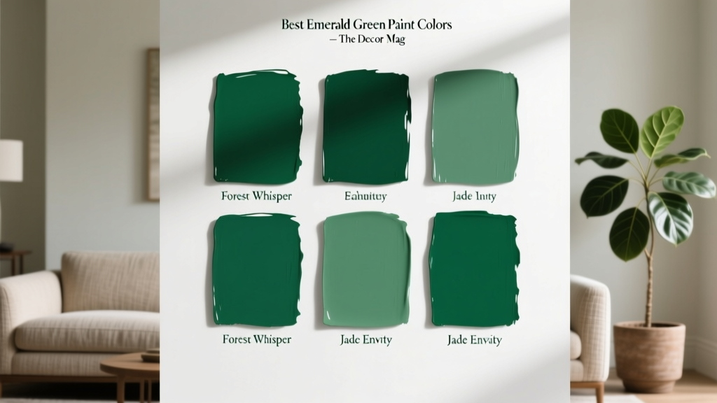 Best Emerald Green Paint Colors - The Decor Mag
 Best Teal Paint Colors for Calm Spaces - The Decor Mag
 Cheap vs Premium Reading: What the Data Says About Eye Strain, Comprehension, and Long-Term Value
 Color Psychology in Home Design Guide - The Decor Mag
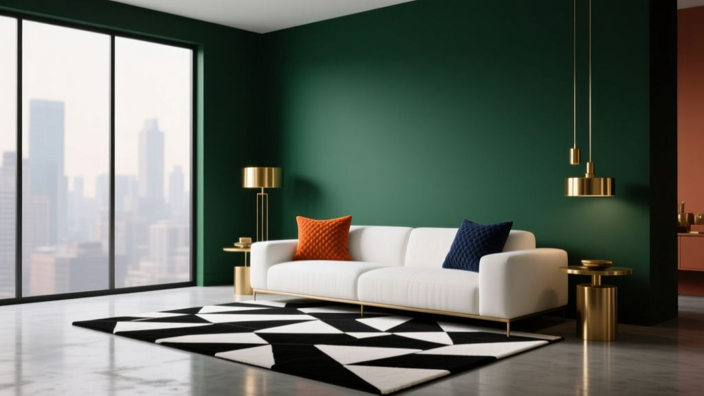 How to Create a Dramatic Color Palette - The Decor Mag
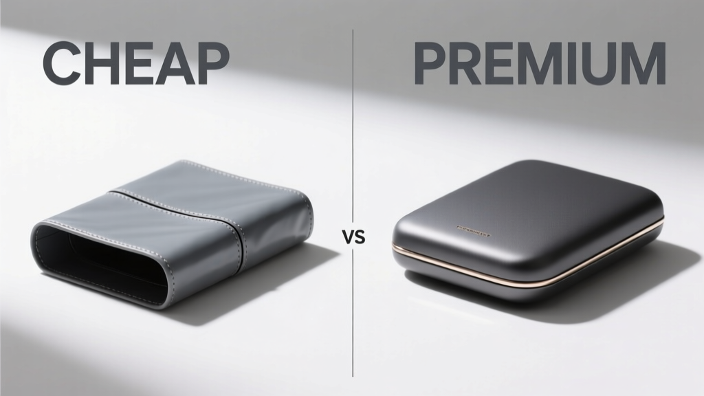 Cheap vs Premium: Why 'Premium' Isn’t Just Marketing—It’s Measurable Performance
 How to Use Color to Create Warmth - The Decor Mag