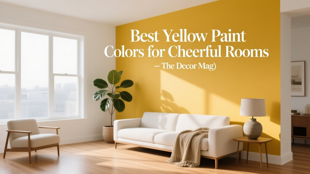
Best Yellow Paint Colors for Cheerful Rooms - The Decor Mag
Yellow paint has a reputation for bringing instant optimism to a home—and for good reason. In color psychology, yellow is linked to sunlight, clarity, sociability, and creative energy. Used thoughtfully, it can make a room feel warmer, brighter, and more welcoming, especially in spaces that struggle with natural light or feel a little flat.
At the same time, yellow can be tricky. The wrong undertone can turn “buttery and inviting” into “acidic and overwhelming,” and lighting can shift a yellow from soft to sharp faster than many homeowners expect. This guide breaks down the best yellow paint colors for cheerful rooms, how to choose the right shade for your space, and how to pair yellow with other colors to create stylish, livable color schemes.
Whether you’re planning a sunny kitchen, a happy hallway, or a glow-up for a guest room, you’ll find practical, real-room guidance here—plus common mistakes to avoid and a short FAQ for quick decision-making.
Why Yellow Works: Color Psychology Meets Interior Design
Yellow sits in the warm family of the color wheel, which is why it reads as energetic and cozy at the same time. In interior color design, yellow is often used to:
- Lift mood: Soft yellows can feel encouraging and comforting; brighter yellows feel playful and bold.
- Enhance light: Yellow reflects warm wavelengths, helping rooms feel sunnier—especially with warm artificial lighting.
- Create a welcoming “hello”: Entryways, breakfast nooks, and family spaces benefit from yellow’s friendly character.
- Support focus and creativity: Yellow is frequently recommended for studios, craft rooms, and home offices when balanced with calm neutrals.
Design principle to keep in mind: the more saturated the yellow, the more visual “noise” it creates. That’s not bad—it just means saturation needs to match the room’s function and how long you linger there.
How to Choose the Right Yellow Paint Color (Without Guesswork)
1) Read the undertone: creamy, golden, green-leaning, or orange-leaning
Most yellow paint colors fall into a few undertone families. Knowing the family helps you predict how the color will behave with your floors, counters, and furnishings.
- Creamy/buttery yellows: Softer, more livable; great for walls in everyday rooms.
- Golden yellows: Rich, slightly deeper; ideal for cozy dining rooms and south-facing spaces.
- Green-leaning yellows: Fresh, zesty; can read modern but may go chartreuse in some lighting.
- Orange-leaning yellows: Marigold and honey tones; warm and nostalgic, especially with wood.
2) Match yellow intensity to the room’s job
- Bedrooms: Choose pale, creamy yellows or yellow-tinted off-whites for calm cheer.
- Kitchens: Mid-tone buttery yellows feel clean and appetizing; brighter yellows work as accents.
- Living rooms: Soft-to-medium yellows pair beautifully with neutrals and natural textures.
- Bathrooms: Light yellows can mimic morning sun; watch undertones near cool tile.
- Hallways/entryways: Yellow can counteract shadows and create a welcoming glow.
3) Factor in light direction and bulbs
- North-facing rooms: Light tends to be cool/gray. Choose warmer, creamier yellows to avoid a dull cast.
- South-facing rooms: Bright light can intensify yellow. Consider a softer shade or a slightly muted golden tone.
- East-facing rooms: Warm morning light, cooler afternoons. A balanced buttery yellow holds up well all day.
- West-facing rooms: Intense late-day warmth can push yellow toward orange. Choose a more restrained yellow if you want consistency.
Tip: Use 2700K–3000K warm-white bulbs for most yellow paint colors. Cooler LEDs (4000K+) can make yellows look sharp or slightly green.
Best Yellow Paint Colors: Designer-Approved Picks
Below are specific yellow paint color recommendations from popular brands. Always sample first—yellow is famously sensitive to surrounding colors and light.
Soft, Creamy Yellows (Easy to Live With)
- Sherwin-Williams Butter Up (SW 6681): A friendly, buttery yellow that reads warm without feeling loud. Great for kitchens, breakfast nooks, and family rooms.
- Benjamin Moore Hawthorne Yellow (HC-4): A classic historic yellow with depth. Works beautifully with white trim and traditional millwork.
- Farrow & Ball Dorset Cream (No. 68): Creamy and sophisticated; ideal for older homes, cozy hallways, and rooms with warm wood floors.
Sunlit Pastels (Light-Reflecting and Airy)
- Benjamin Moore Pale Moon (OC-108): A soft off-white with a gentle yellow glow. Perfect for open-plan spaces where you want warmth without committing to “yellow walls.”
- Sherwin-Williams Friendly Yellow (SW 6680): Cheerful and light; a great choice for kids’ rooms, laundry rooms, and small bathrooms.
- Behr Vanilla Cake (a soft creamy yellow): A subtle, sweet-toned yellow that pairs well with white cabinets and brushed nickel fixtures.
Golden Yellows (Warm, Cozy, and Rich)
- Benjamin Moore Weston Flax (HC-5): A deeper golden yellow that feels grounded and classic. Lovely in dining rooms or libraries with warm neutrals.
- Sherwin-Williams Nugget (SW 6697): A strong, golden yellow that suits accent walls, doors, or a cheerful mudroom with sturdy finishes.
- Farrow & Ball Sudbury Yellow (No. 51): Sun-warmed and traditional, especially stunning with deep greens, aged brass, and natural linen textiles.
Modern, Clear Yellows (Best as Accents or Small Rooms)
- Benjamin Moore Yellow Flash (a bold, high-energy yellow): Great for a front door, a piece of built-in cabinetry, or a studio corner where you want punch.
- Sherwin-Williams Decisive Yellow (SW 6902): Bright and confident; use on a statement wall, inside a bookshelf, or paired with crisp white and black details.
Real Room Examples: Where Yellow Paint Shines
1) A welcoming entryway that feels sunny year-round
Try: Benjamin Moore Hawthorne Yellow (HC-4) on walls with crisp white trim.
Why it works: This yellow has enough depth to stand up to shadowy corners and still look warm.
Style it with:
- White trim and ceiling for a clean frame
- Natural fiber runner (jute or sisal)
- Black metal or aged brass lighting for contrast
2) A kitchen that feels bright but not busy
Try: Sherwin-Williams Butter Up (SW 6681) with white cabinets.
Color scheme ideas:
- Yellow + warm white + light oak: cozy, Scandinavian-leaning warmth
- Yellow + soft gray + brushed nickel: balanced and transitional
- Yellow + sage green accents: fresh, garden-inspired
Application scenario: Yellow walls, warm white cabinetry (creamy rather than stark), and a simple tile backsplash to keep the look airy.
3) A dining room that glows at night
Try: Benjamin Moore Weston Flax (HC-5) or Farrow & Ball Sudbury Yellow (No. 51).
Why it works: Golden yellows look especially rich under warm evening light, making dinner feel intimate and welcoming.
Best pairings:
- Deep olive or forest green (chairs, curtains, art)
- Warm wood tones (walnut, oak, antique pine)
- Aged brass or bronze lighting
4) A calm bedroom with a “morning light” feel
Try: Benjamin Moore Pale Moon (OC-108) for walls, paired with creamy white bedding.
Design tip: If you want yellow in a bedroom but fear it may feel too energetic, stay close to off-white and bring stronger color in through textiles.
5) A bathroom that feels clean and upbeat
Try: Sherwin-Williams Friendly Yellow (SW 6680) with white tile and warm metal finishes.
Avoid: Very cool lighting and icy gray floors that may push yellow toward green.
Yellow Color Combinations That Always Look Intentional
Yellow becomes much easier to use when it has the right supporting cast. These color schemes help create harmony and keep “cheerful” from becoming “chaotic.”
- Yellow + warm white: Timeless, clean, and bright. Great for trim, cabinetry, and ceilings.
- Yellow + greige (warm gray-beige): Calms yellow and adds sophistication in living rooms and open plans.
- Yellow + navy: Classic complementary contrast with depth. Try navy accents in rugs, art, or cabinetry.
- Yellow + sage green: Fresh and nature-inspired, perfect for kitchens and mudrooms.
- Yellow + terracotta: Warm, earthy, and relaxed—especially with plaster textures and natural linens.
- Yellow + black: Modern, graphic, and bold. Best for accents (hardware, frames, lighting), not large competing surfaces.
Application Guidance: Where to Put Yellow for the Best Effect
Use yellow strategically (even if you love it)
If you’re nervous about full yellow walls, try these high-impact, low-commitment approaches:
- Ceiling wash: A pale yellow ceiling can make a room feel sunlit without overwhelming walls.
- Built-ins and shelves: Paint the back of bookcases a warm yellow for depth and cheer.
- Doors: A yellow interior door adds a happy moment and looks great with white trim.
- Wainscoting: Yellow above, warm white below creates structure and balance.
Pick the right sheen
- Matte/eggshell: Best for most walls; softens yellow and hides imperfections.
- Satin: Good for kitchens and baths where you need wipeability.
- Semi-gloss: Ideal for trim and doors; adds crisp contrast with yellow walls.
Common Yellow Paint Mistakes (and How to Avoid Them)
- Choosing yellow from a tiny swatch under store lighting: Yellow shifts dramatically. Sample at least two shades and view morning, afternoon, and evening.
- Ignoring undertones in fixed finishes: Check your countertops, tile, and flooring. A yellow that fights the undertone of your stone or wood will never feel settled.
- Pairing yellow with stark, cool whites: Bright “builder white” can make yellow look dirty or neon by comparison. Try warmer whites for trim and ceilings.
- Overusing saturated yellow in large rooms: High-chroma yellow across four walls can feel tiring. Use bold yellow as an accent or choose a muted, creamy version for full coverage.
- Forgetting about lighting temperature: Cool LEDs can turn yellow harsh. Swap bulbs before you blame the paint.
FAQ: Yellow Paint Colors for Cheerful Rooms
What is the most versatile yellow paint color?
Soft, creamy yellows are the most versatile because they read warm without feeling loud. Popular choices include Benjamin Moore Hawthorne Yellow (HC-4) and Sherwin-Williams Butter Up (SW 6681), depending on your room’s light and surrounding finishes.
Will yellow paint make a small room look bigger?
Light yellows and yellow-tinted off-whites can make a small room feel more open by reflecting warm light. Choose a pale, slightly muted yellow (rather than a saturated one) and keep trim and ceiling in a warm white to maintain an airy boundary.
What colors go with yellow walls in a living room?
For a balanced living room color scheme, pair yellow with warm whites, greige, navy, sage green, and natural textures like linen, oak, and woven materials. These combinations keep the room cheerful but grounded.
How do I keep yellow from looking too bright?
Select a yellow with a creamy or muted base, use matte or eggshell on walls, and add grounding elements (wood, black accents, deeper textiles). Also check your bulbs—warm light makes yellow feel softer.
Is yellow a good choice for bedrooms?
Yes—when it’s the right yellow. For bedrooms, stick to pale, buttery tones or off-whites with a yellow undertone, such as Benjamin Moore Pale Moon (OC-108). Reserve bright yellows for small accents like a headboard wall niche, lamp, or artwork.
Next Steps: Choose, Sample, and Style with Confidence
Start by deciding what kind of cheer you want: gentle and creamy, sunlit and pastel, or bold and modern. Then narrow down two to three yellow paint colors, test large samples on multiple walls, and view them across the full day under your actual lighting. Build your color scheme with warm whites, grounding neutrals, and a contrasting partner color (navy, sage, or black) to keep the look polished.
If you’re ready for more paint color ideas and room-by-room color schemes, explore more color guides and designer-tested recommendations on thedecormag.com.
More Articles
 Best Mint Green Paint Colors - The Decor Mag
 Best Eucalyptus Paint Colors - The Decor Mag
 How to Choose Colors for a Breakfast Nook - The Decor Mag
 Whole-House Color Scheme: How to Choose (2026)
 Best Cherry Red Paint Colors - The Decor Mag
 Best Bathroom Floor Solutions: Performance, Safety, and Style Compared
 Color Psychology in Home Design Guide - The Decor Mag
 Best Cobalt Blue Paint Colors - The Decor Mag
 How to Choose Colors for a Wine Cellar - The Decor Mag
 Pastel Color Palette Design Guide - The Decor Mag