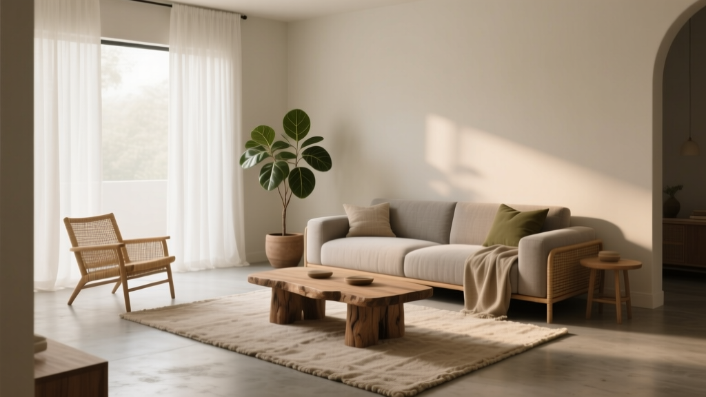
How to Create a Grounded Color Palette - The Decor Mag
A grounded color palette is the design equivalent of a deep exhale. It’s the difference between a home that feels visually “busy” and one that feels calm, cohesive, and naturally pulled together—no matter your style. Grounded palettes are especially valuable in real life: they flatter changing daylight, make rooms feel more comfortable to live in, and create a consistent backdrop for art, textiles, and the things you collect over time.
“Grounded” doesn’t mean dark or boring. It means anchored. These palettes rely on nature-based neutrals, softened hues, and thoughtful contrast so your spaces feel stable and welcoming. If you’ve ever painted a room only to discover the color looks harsh at night, too bright at noon, or disconnected from the rest of your home, a grounded approach solves that problem by prioritizing undertones, balance, and flow.
This guide breaks down the principles behind grounded interior color design—plus specific paint colors, room-by-room scenarios, and the most common mistakes homeowners make. You’ll finish with a simple plan you can apply right away.
What Makes a Color Palette Feel “Grounded”?
Grounded palettes are rooted in the visual cues we associate with safety and comfort: earth, stone, bark, clay, linen, and weathered materials. Color psychology supports this—natural, muted hues tend to feel restorative and steady because they resemble the environments humans evolved in.
The 5 traits of a grounded palette
- Muted intensity: Colors are softened with gray, brown, or black (think “dusty,” “smoky,” “weathered”).
- Warmth or balanced neutrality: Undertones lean warm (beige, greige, taupe) or truly balanced—rarely icy.
- Mid-tone presence: A grounded palette isn’t all light. It includes mid tones (and often one deeper anchor).
- Natural contrast: Contrast comes from value (light vs. dark) and texture, not high-saturation color clashes.
- Consistency across rooms: The home reads as one story, even when individual rooms vary.
Grounded vs. “flat” or “muddy”
A grounded palette still has clarity and dimension. The difference is intentional contrast and clean undertones. “Muddy” happens when undertones fight each other (for example, a pink-beige next to a green-beige) or when everything sits in the same medium value with no highlight or shadow.
Start with the Three Pillars: Undertone, Value, and Temperature
1) Undertone: the hidden color driver
Undertone determines whether colors harmonize. Two colors can look similar on a swatch, but clash on a wall if undertones differ.
- Warm undertones: yellow, red, orange (often reads cozy, inviting)
- Cool undertones: blue, violet (often reads crisp, airy)
- Green undertones: can read organic, earthy, or slightly “grayed” depending on intensity
Quick test: Place the paint sample next to a pure white sheet of paper. Undertones become easier to see.
2) Value: lightness vs. darkness
Value is what creates depth. A grounded color scheme typically uses:
- Light value for ceilings, trim, and brightening walls
- Mid value for most walls and cabinetry
- Deep value as an anchor (accent wall, built-ins, interior doors)
3) Temperature: the room’s emotional read
Warm-leaning neutrals tend to feel more grounded than cool-leaning ones, especially in homes with warm woods, brass, or cream textiles. Cool palettes can still be grounded, but they usually need softening (think blue-gray, not icy blue).
A Simple Formula: 60–30–10, Updated for Grounded Homes
The classic 60–30–10 rule works beautifully for grounded interior color design when you define the “60” as your calm, nature-based neutral.
- 60% Base: wall color (or the dominant open-plan color)
- 30% Support: upholstery, rugs, cabinetry, large furniture
- 10% Accent: art, pillows, lampshades, ceramics, small décor
Grounded tweak: Keep your accent colors muted or “dirty” (slightly grayed), and rely on texture—linen, wool, wood grain, stone—to add richness.
Grounded Paint Color Recommendations (with Brand References)
These paint colors are widely used in professional interiors because they behave well in different light and play nicely with natural materials. Always test samples in your home—daylight, lamp light, and evening light can shift a color dramatically.
Warm whites and creamy neutrals (soft, welcoming base)
- Benjamin Moore White Dove (OC-17): a versatile warm white for walls or trim; pairs well with oak, walnut, and brass.
- Sherwin-Williams Alabaster (SW 7008): creamy without feeling yellow; beautiful in bedrooms and living rooms.
- Farrow & Ball Wimborne White (No. 239): a gentle off-white that reads classic and architectural.
Greige, taupe, and mushroom (the backbone of grounded color schemes)
- Benjamin Moore Edgecomb Gray (HC-173): warm greige that feels soft and lived-in.
- Sherwin-Williams Accessible Beige (SW 7036): dependable, balanced neutral for open plans.
- Farrow & Ball Skimming Stone (No. 241): refined warm neutral that pairs beautifully with stone and linen.
Earthy greens (organic calm, great for “rest” rooms)
- Benjamin Moore Saybrook Sage (HC-114): a classic muted green that feels grounded and timeless.
- Sherwin-Williams Evergreen Fog (SW 9130): green-gray with a soft, modern haze; excellent in bedrooms and bathrooms.
- Farrow & Ball Pigeon (No. 25): a blue-green gray that reads sophisticated and moody.
Clay, terracotta, and blush-browns (warmth without loudness)
- Benjamin Moore Terra Cotta Tile (2090-30): saturated but earthy; best as an accent or in a dining room.
- Sherwin-Williams Redend Point (SW 9081): a soft clay that feels modern and flattering.
- Farrow & Ball Setting Plaster (No. 231): gentle pink-beige that reads warm, not sweet.
Grounding deep anchors (adds structure and contrast)
- Benjamin Moore Hale Navy (HC-154): a deep, classic navy for built-ins, doors, or a library vibe.
- Sherwin-Williams Urbane Bronze (SW 7048): a brown-leaning charcoal that looks incredible with warm whites and natural wood.
- Farrow & Ball Railings (No. 31): a soft black with blue undertones; elegant for trim or cabinetry.
How to Build a Grounded Palette Step-by-Step
Step 1: Choose your fixed elements first
Work from what won’t change easily:
- flooring (oak, walnut, tile, carpet)
- countertops and backsplash
- large upholstered pieces
- existing wood tones and trim
Tip: Pull your base wall color from the undertone of these materials. If your floors are warm (golden oak), avoid icy grays; they often look bluish and disconnected.
Step 2: Pick one “through-line” neutral for connected spaces
For open-plan homes, select a primary wall color you can repeat. Strong options include Benjamin Moore White Dove, Sherwin-Williams Accessible Beige, or Farrow & Ball Skimming Stone.
Step 3: Add a mid-tone that feels like nature
Mid-tones are what make a home feel grounded rather than stark. Great mid-tone directions:
- sage green
- mushroom taupe
- clay beige
- smoky blue-gray
Step 4: Choose one deep anchor and repeat it 2–3 times
An anchor color creates structure. Repeat it strategically so it feels intentional:
- interior doors + powder room vanity
- kitchen island + built-in bookcase
- mudroom cabinets + stair railing
Step 5: Use accents for personality, not chaos
In grounded color schemes, accents work best when they’re muted and textural:
- ochre and camel (pillows, throws)
- rust and terracotta (art, ceramics)
- smoky teal (vases, patterned rug details)
- aged brass or blackened metal (lighting and hardware)
Real Room Examples and Application Scenarios
1) A grounded living room that still feels bright
Goal: airy, calm, and welcoming—without looking all-white.
- Walls: Sherwin-Williams Alabaster (SW 7008)
- Trim: same color in a higher sheen for subtle definition
- Anchor: Sherwin-Williams Urbane Bronze (SW 7048) on a fireplace surround or built-ins
- Support tones: oatmeal sofa, warm wood coffee table, woven rug
- Accents: muted olive pillows, black metal floor lamp, warm terracotta pottery
Why it works: The warm white base keeps the room luminous, while the bronze anchor adds weight and sophistication. Textiles do the heavy lifting for coziness.
2) A bedroom palette that supports rest
Goal: reduce visual stimulation; encourage sleep and calm.
- Walls: Sherwin-Williams Evergreen Fog (SW 9130)
- Ceiling: a soft warm white (SW Alabaster or BM White Dove)
- Bedding: flax linen, warm white duvet, olive or clay throw
- Wood tones: walnut or medium oak nightstands
Why it works: Green-gray hues are associated with balance and restoration in color psychology, and the muted value keeps the room from feeling busy.
3) A kitchen that feels grounded, not trendy
Goal: timeless, warm, and connected to adjacent rooms.
- Perimeter cabinets: Benjamin Moore White Dove (OC-17)
- Island: Benjamin Moore Hale Navy (HC-154) for a classic anchor
- Walls: Benjamin Moore Edgecomb Gray (HC-173) or a similar warm greige
- Hardware: aged brass or unlacquered brass for warmth
- Countertops: veined quartz with warm undertones or natural stone
Why it works: Navy adds structure without feeling harsh, and warm whites/greiges keep the kitchen inviting under both daylight and evening lighting.
4) A small bathroom that feels like a spa
Goal: soothing, elevated, and clean—without sterile whiteness.
- Walls: Farrow & Ball Pigeon (No. 25) or a similar muted blue-green
- Trim: warm white
- Vanity: deep charcoal or bronze (SW Urbane Bronze works well)
- Finishes: brushed nickel or aged brass; warm stone or ivory tile
Why it works: Blue-green hues psychologically suggest water and calm; the vanity anchor prevents the space from floating visually.
Common Color Mistakes That Undermine a Grounded Palette
- Choosing paint from a tiny swatch only: Always test large samples. Colors intensify on big surfaces.
- Ignoring undertones between fixed materials and paint: A gray with blue undertones can clash with warm tile or oak floors.
- Using too many unrelated “favorite” colors: Grounded homes repeat tones. Aim for 3–5 core colors and variations.
- Going too light everywhere: All light neutrals can feel unfinished. Add a mid-tone or deep anchor for depth.
- High-contrast black-and-white without warmth: This often reads stark at night. Swap bright white for warm white and black for bronze or soft charcoal.
- Forgetting lighting temperature: Warm LEDs (2700K–3000K) flatter earthy palettes. Cool LEDs can turn warm neutrals flat or greenish.
Practical Tips for Choosing and Using Paint Colors
- Sample correctly: Paint two coats on a large poster board and move it around the room.
- Check three times: morning, afternoon, and after sunset with lamps on.
- Use sheen strategically:
- matte/flat for ceilings and low-traffic walls
- eggshell for most walls (durable, soft look)
- satin/semigloss for trim, doors, and cabinets
- Create continuity: Repeat your trim color throughout the home for a calmer, more professional result.
- Let texture add richness: Layer wood, leather, wool, linen, stone, and woven materials so the palette feels dimensional.
FAQ: Grounded Color Palettes
What are the best grounded neutral paint colors for an open floor plan?
Look for warm whites and greiges that bridge rooms easily: Benjamin Moore White Dove (OC-17), Sherwin-Williams Alabaster (SW 7008), or Sherwin-Williams Accessible Beige (SW 7036). They tend to stay calm across varied daylight conditions.
Can a grounded palette include cool colors?
Yes. Choose softened cool tones—blue-gray, slate, or muted blue-green—rather than icy pastels. Pair them with warm woods, creams, and natural textiles to keep the overall feel grounded.
How do I keep my home from looking “too beige”?
Use contrast and texture. Add one deep anchor (navy, bronze, charcoal), bring in varied materials (oak, linen, blackened metal), and use a muted accent like terracotta or olive in art and textiles.
What’s the easiest way to pick an accent color?
Start with your rug or a piece of art you love. Pull one muted color from it (rust, sage, smoky blue), then repeat that accent 2–3 times in smaller items like pillows, vases, or a throw.
Do grounded color schemes work with modern interiors?
They’re a perfect match. Modern design benefits from grounded neutrals because clean lines can feel stark without warmth. Try a warm white base with an Urbane Bronze accent and light oak for a modern, inviting balance.
How many paint colors should I use in one room?
A reliable approach is 2–4: one wall color, one trim/ceiling color, and optionally one anchor color (built-ins, doors, or an accent wall). Additional “colors” can come from décor rather than more paint.
Next Steps: Build Your Grounded Palette with Confidence
To create a grounded color palette, start by matching undertones to your fixed finishes, choose a dependable neutral for flow, then add a mid-tone and a deep anchor for structure. Keep accents muted and rely on texture to bring the palette to life. If you’re painting multiple rooms, map your colors on a simple home layout and repeat key tones so the whole house feels intentional.
Ready to refine your choices? Explore more color guides, paint color roundups, and interior color design tips on thedecormag.com.
More Articles
 How to Choose Colors for a Playroom - The Decor Mag
 Best White Paint Colors Compared - The Decor Mag
 How to Match Colors to Furniture and Fabrics - The Decor Mag
 Sage Green Paint: Most Versatile Neutral (2026)
 Best Sky Blue Paint Colors - The Decor Mag
 Best Kitchen Design for Studio Apartments: Smart, Stylish & Space-Saving Solutions
 How to Choose Colors for a Loggia - The Decor Mag
 How to Create a Harmonious Color Palette - The Decor Mag
 How to Use Color to Create Balance - The Decor Mag
 How to Use Color to Create Flow - The Decor Mag