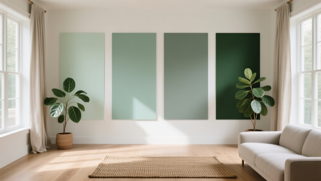
Best Eucalyptus Paint Colors - The Decor Mag
Eucalyptus paint colors have become a go-to for homeowners who want a room to feel calm, modern, and connected to nature—without defaulting to predictable gray or stark white. Sitting in that sweet spot between green and gray (often with a whisper of blue), eucalyptus tones deliver a soothing, spa-like mood while still reading as sophisticated and livable in everyday spaces.
This topic matters because eucalyptus shades are famously “chameleon.” The same paint can look airy and silvery in one room, then deeper and moodier in another depending on light direction, time of day, and surrounding finishes. Understanding how undertones and lighting interact helps you choose a eucalyptus wall color that stays beautiful from morning to evening—no surprises.
If you’re building an interior color scheme that feels fresh but not trendy, eucalyptus is a workhorse: it pairs with warm woods, crisp whites, natural stone, brass, and even black accents. It also supports color psychology goals—reducing visual stress, encouraging rest, and making a home feel grounded.
What Counts as a “Eucalyptus” Paint Color?
In interior color design, “eucalyptus” typically refers to muted greens that are softened with gray and sometimes cooled with blue. They’re less yellow than olive and less saturated than emerald. Most eucalyptus paint colors land in these families:
- Soft sage-eucalyptus: gentle green-gray that reads airy and organic
- Blue-green eucalyptus: cooler, spa-like tones with a misty cast
- Deeper eucalyptus: moody green-gray for accent walls, cabinetry, and exteriors
Color Psychology: Why Eucalyptus Feels So Good
Green is associated with balance and restoration. When green is muted with gray (as eucalyptus is), it becomes less energizing and more stabilizing—ideal for bedrooms, bathrooms, and open-concept living areas where you want visual comfort. Eucalyptus tones also tend to be forgiving: they hide minor wall imperfections better than bright whites and highly saturated colors.
How to Choose the Right Eucalyptus Shade for Your Home
Start with Lighting Direction
- North-facing rooms: light is cooler and can make eucalyptus look more gray or blue. Choose a slightly warmer eucalyptus (more green, less blue) to avoid a chilly feel.
- South-facing rooms: warm, strong light can make eucalyptus look greener and brighter. You can handle cooler, grayer eucalyptus shades beautifully here.
- East-facing rooms: morning light is warm; afternoons are cooler. Pick a balanced eucalyptus that won’t flip dramatically.
- West-facing rooms: afternoon light is golden and intense; eucalyptus can look richer later in the day. Test samples from 3–7 p.m.
Check Undertones Against Fixed Finishes
Eucalyptus paint colors can lean:
- Gray-green: pairs well with modern tile, concrete, black accents
- Blue-green: complements marble, chrome, cool whites
- Yellow-green (warmer sage): best with oak, travertine, cream fabrics
Hold your paint sample next to countertops, flooring, and large upholstery pieces. The “best” eucalyptus is the one that harmonizes with what you can’t easily change.
Best Eucalyptus Paint Colors (Designer-Approved Picks)
These eucalyptus paint color recommendations are popular for a reason: they’re versatile, nuanced, and easy to build into cohesive color schemes. Always sample first, but consider this your curated starting lineup.
1) Sherwin-Williams Sea Salt (SW 6204)
Why it works: A classic light blue-green with gray softness—often reads like eucalyptus mist. It’s brightening without feeling minty.
- Best for: bathrooms, bedrooms, laundry rooms, open-concept spaces
- Looks great with: Sherwin-Williams Alabaster (SW 7008) trim, brushed nickel, white oak
- Finish tip: Use eggshell on walls; semi-gloss for trim
2) Benjamin Moore Healing Aloe (1562)
Why it works: A soft, spa-like eucalyptus that leans blue-green but stays calm and muted. Airy and elegant.
- Best for: primary bedrooms, nurseries, serene living rooms
- Looks great with: warm white trim (Benjamin Moore White Dove OC-17), natural linen, pale woods
3) Benjamin Moore Saybrook Sage (HC-114)
Why it works: Warmer and earthier, perfect when you want eucalyptus energy but your room has warm finishes. This is a “friendly” green that still feels refined.
- Best for: kitchens, breakfast nooks, family rooms, historic homes
- Looks great with: creamy whites, unlacquered brass, warm oak cabinetry
4) Sherwin-Williams Evergreen Fog (SW 9130)
Why it works: A modern green-gray with depth—arguably the poster child for contemporary eucalyptus. It reads sophisticated in both bright and medium light.
- Best for: living rooms, offices, dining rooms, cabinets
- Looks great with: matte black hardware, ivory upholstery, walnut tones
- Pro move: Try it on built-ins or a fireplace surround for an architectural moment
5) Farrow & Ball Green Smoke (No. 47)
Why it works: A deeper, smokier eucalyptus green with a velvety presence. It has heritage character and plays beautifully with warm metals.
- Best for: libraries, dining rooms, moody bedrooms, cabinetry
- Looks great with: brass, aged wood, crisp off-whites
6) Behr Light French Gray (PPU18-08) with a Eucalyptus Twist
Why it works: If you love eucalyptus but fear “too green,” this gray can read slightly green in certain lights and with the right pairings. It’s a subtle gateway shade.
- Best for: open-concept main floors, hallways, rental-friendly refreshes
- Looks great with: eucalyptus decor accents (plants, textiles), warm white trim, pale stone
7) Sherwin-Williams Clary Sage (SW 6178)
Why it works: A warmer sage-eucalyptus that feels grounded and classic, especially in rooms with honey oak or warm tile.
- Best for: kitchens, mudrooms, built-ins, vintage-inspired interiors
- Looks great with: cream paint, terracotta accents, woven textures
Real Room Examples: Where Eucalyptus Paint Colors Shine
Bathroom: Spa Calm Without Looking Cold
Scenario: A small bathroom with white tile and chrome fixtures can feel stark. A light eucalyptus wall color softens the edges.
- Paint: Sherwin-Williams Sea Salt or Benjamin Moore Healing Aloe
- Pair with: warm white trim, fluffy white towels, pale oak vanity
- Design tip: Add one warm element (brass mirror, wood stool) to keep the palette from skewing icy
Kitchen Cabinets: Soft Color That Still Feels Like a “Neutral”
Scenario: You want colored cabinets but worry about resale or trend fatigue. Eucalyptus reads current yet timeless.
- Paint: Sherwin-Williams Evergreen Fog or Farrow & Ball Green Smoke
- Pair with: white quartz, zellige-style backsplash, brushed brass pulls
- Finish tip: Choose satin for cabinetry for durability and easy cleaning
Bedroom: Restful Color Psychology in Action
Scenario: If your bedroom feels overstimulating, eucalyptus supports a calmer nervous system by reducing harsh contrast.
- Paint: Benjamin Moore Healing Aloe for light and airy, or Evergreen Fog for cozy
- Pair with: oatmeal linen bedding, warm wood nightstands, soft black accents
- Lighting tip: Use 2700K bulbs to keep the green from turning steely at night
Living Room: A Nature-Based Neutral for Open Concept
Scenario: You need a wall color that connects multiple zones (living, dining, kitchen) without clashing. Eucalyptus can unify varied materials.
- Paint: Clary Sage (warmer homes) or Sea Salt (cooler, coastal homes)
- Pair with: creamy trim, jute rug, warm leather, natural greenery
- Styling tip: Repeat the green subtly in art or pillows so it feels intentional
Winning Color Schemes with Eucalyptus Paint
Eucalyptus is flexible, but it looks best when supported by a clear palette. Try these designer-friendly interior color schemes:
1) Eucalyptus + Warm White + Natural Wood
- Wall: Sherwin-Williams Sea Salt
- Trim: Sherwin-Williams Alabaster
- Accents: oak, rattan, linen
2) Eucalyptus + Cream + Brass
- Wall/Cabinets: Benjamin Moore Saybrook Sage
- Trim: Benjamin Moore White Dove
- Accents: brass hardware, warm stone, camel leather
3) Eucalyptus + Charcoal + Crisp White
- Wall: Sherwin-Williams Evergreen Fog
- Secondary: charcoal textiles or matte black details
- Trim/Ceiling: clean, soft white
4) Eucalyptus + Terracotta + Soft Beige
- Wall: Sherwin-Williams Clary Sage
- Accents: terracotta planters, clay-toned art
- Foundation: warm beige rug, creamy upholstery
Practical Application Tips for a Professional Result
- Sample large: Paint a 2’x2’ area (or use large peel-and-stick samples) on multiple walls. Eucalyptus shifts dramatically.
- Observe for 24 hours: Check morning, midday, and evening. Pay attention to how it looks with lamps on.
- Coordinate sheen: Flat/matte hides wall texture; eggshell is practical for busy rooms; satin works well for cabinets and trim.
- Mind the ceiling: If the room feels dim, choose a brighter white ceiling to lift the eucalyptus walls.
- Use repetition: Repeat the eucalyptus color 2–3 times (art, textiles, decor) so it feels designed, not accidental.
Common Color Mistakes to Avoid with Eucalyptus Shades
- Ignoring undertones: A blue-green eucalyptus can clash with warm, orange-toned wood or beige tile. Match temperature (warm with warm, cool with cool) or add intentional bridging tones.
- Pairing with a “too stark” white: Bright, icy whites can make eucalyptus look dingy. Try softer whites like Alabaster or White Dove for a more natural transition.
- Going too light in a dark room: In low light, pale eucalyptus can turn gray and flat. Consider a mid-tone like Evergreen Fog to maintain richness.
- Forgetting about metal finishes: Chrome amplifies coolness; brass warms things up. Choose metals that support your eucalyptus undertone.
- Overloading the room with green: Eucalyptus works best with breathing room. Balance it with neutrals, wood, and a contrasting anchor (black, charcoal, or deep navy).
FAQ: Best Eucalyptus Paint Colors
Is eucalyptus paint color more green or gray?
Most eucalyptus paint colors are green softened with gray, but the ratio varies. Some (like Evergreen Fog) read more green-gray, while others (like Sea Salt) lean blue-green with a stronger gray presence in certain light.
What trim color looks best with eucalyptus walls?
Soft warm whites are the most reliable: Sherwin-Williams Alabaster and Benjamin Moore White Dove are top choices. They keep eucalyptus looking clean and organic rather than cold.
Do eucalyptus colors work with oak cabinets and floors?
Yes—choose warmer eucalyptus shades (think Clary Sage or Saybrook Sage) and avoid eucalyptus paints with strong blue undertones unless you’re intentionally creating contrast.
What’s the best eucalyptus paint color for a small room?
Light, muted options like Benjamin Moore Healing Aloe or Sherwin-Williams Sea Salt can visually expand a small space while still adding personality. Pair with a warm white ceiling and trim for lift.
Can eucalyptus paint look gray or washed out?
Yes, especially in north-facing rooms or low light. If you’re worried about it going flat, choose a mid-tone eucalyptus (such as Evergreen Fog) and layer in warm lighting (2700K) plus natural textures to bring it to life.
What accent colors pair well with eucalyptus?
Top pairings include warm whites, beige and greige, terracotta, charcoal, matte black, navy, brass, and natural wood tones. For a fresher feel, add small doses of pale blush or creamy ivory.
Next Steps: Find Your Eucalyptus Match
Choose 2–3 eucalyptus paint colors from the list, sample them on multiple walls, and evaluate them under both daylight and lamplight. Then build a simple, repeatable palette: eucalyptus + a soft white + one warm natural (wood, leather, brass) + one grounding accent (black, charcoal, or navy). That formula delivers a cohesive interior color scheme that feels calm, stylish, and personal.
For more paint color ideas, undertone guides, and room-by-room color schemes, explore our latest color guides on thedecormag.com.
More Articles
 Best Olive Green Paint Colors (2026) | The Decor Mag
 Best Cucumber Paint Colors - The Decor Mag
 Best Sage Green Paint Colors for Serenity - The Decor Mag
 How to Use Desaturated Colors for Elegance - The Decor Mag
 How to Choose Colors for a Scullery - The Decor Mag
 Best Charcoal Paint Colors for Modern Spaces - The Decor Mag
 How to Create a Low Contrast Color Palette - The Decor Mag
 How to Use Color to Create Coolness - The Decor Mag
 Best Lemon Paint Colors - The Decor Mag
 How to Choose Colors for South-Facing Rooms - The Decor Mag