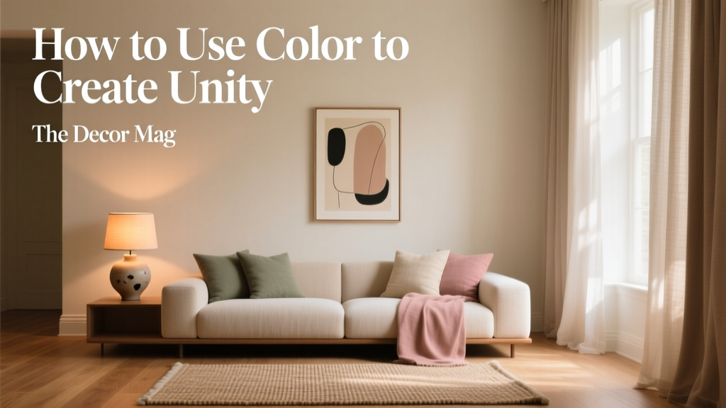
How to Use Color to Create Unity - The Decor Mag
Color is the quiet organizer of a home. It’s the difference between rooms that feel like a series of disconnected moments and a house that reads as one intentional, welcoming story. When color creates unity, spaces flow—your eye relaxes, transitions feel natural, and every room seems to “belong” to the next.
Unity doesn’t mean everything matches. The most compelling interior color design uses a thoughtful mix of repetition, variation, and contrast. A cohesive color scheme can support your lifestyle (calm, energized, grounded), flatter your architecture, and even make challenging layouts feel easier to navigate.
If you’ve ever painted a room you loved—only to realize it clashes with the hallway or makes the living room feel “off”—this guide will help. You’ll learn how to build a whole-home color palette, use undertones to your advantage, and apply practical paint color recommendations for a unified look.
What “Unity” Means in Interior Color Design
Unity is a design principle where separate elements feel related. In color terms, unity comes from repeated cues—shared undertones, consistent temperature, recurring neutrals, and a deliberate approach to contrast.
The 3 building blocks of a cohesive color scheme
- Consistency: A repeated neutral or undertone across multiple spaces.
- Controlled variety: A few accent colors that reappear in different forms (paint, textiles, art).
- Planned transitions: Hallways, sightlines, and doorways that connect colors gracefully.
Color psychology plays a role here, too. Unified palettes tend to feel calmer and more “finished” because the brain doesn’t have to constantly re-orient itself to a new set of visual rules.
Start with a Whole-Home Color Palette (Not Room by Room)
One of the most common reasons homes feel disjointed is choosing paint colors in isolation. A whole-home approach prevents the “pretty swatch, wrong house” problem.
A simple framework: 60–30–10 for the entire home
Instead of applying 60–30–10 within one room, think of it as a house-wide strategy:
- 60%: Your main wall neutral (used across many rooms/hallways)
- 30%: Supporting colors (adjacent rooms, cabinetry, built-ins, larger rugs)
- 10%: Accent colors (front door, powder room, art, pillows, small furniture)
Choose your anchor neutral first
Your anchor neutral does the heavy lifting—it’s the color that creates continuity through open layouts and hallways. Look for a neutral with an undertone you can repeat.
Reliable anchor neutrals (designer favorites):
- Benjamin Moore White Dove (OC-17): A soft, warm white that reads clean without feeling stark.
- Sherwin-Williams Alabaster (SW 7008): A creamy white with a relaxed, inviting feel—great for unity in warmer palettes.
- Benjamin Moore Classic Gray (OC-23): A light greige that connects warm and cool finishes gracefully.
- Sherwin-Williams Agreeable Gray (SW 7029): A versatile greige that works in many homes (test carefully in north light).
Undertones: The Secret to Color Unity
Undertones are the subtle color bias beneath a paint color—yellow, pink, green, violet, or blue. Two “beiges” can clash if one has a pink undertone and the other leans green. Unity happens when undertones align.
How to identify undertones quickly
- Compare to a true white (like Benjamin Moore Chantilly Lace OC-65 or Sherwin-Williams Extra White SW 7006). Undertones become easier to spot.
- Check fixed finishes you won’t change: countertops, flooring, tile, brick, cabinets.
- Test in multiple lights: morning, afternoon, and evening. Undertones shift dramatically under warm bulbs.
Undertone “families” that create a cohesive home
- Warm family: cream, beige, warm greige, terracotta, olive
- Cool family: crisp whites, cool grays, icy blues, blue-greens
- Complex neutral family: balanced greiges and taupes that flex between warm and cool
Use Repetition to Tie Rooms Together
Repetition is the most practical way to create unity with color. The trick is repeating the right things, in the right dose.
What to repeat for an effortlessly cohesive look
- One consistent trim color throughout most of the home (for example, Benjamin Moore Simply White OC-117 or Sherwin-Williams Pure White SW 7005).
- A recurring accent color in at least 3 places (a pillow in the living room, art in the hallway, towels in the bath).
- Metal finishes that relate (not necessarily identical): brushed nickel + polished chrome can work; brass + matte black can work if repeated.
- Wood tone direction: keep woods in the same temperature family (warm walnut + warm oak; cooler ash + blackened wood).
Try “color echoes” instead of exact matches
If your dining room is a muted green, you don’t need green in every room. Echo it with:
- Green-gray in a bedroom
- Olive pottery on kitchen shelves
- A botanical print with that same green in the entry
Create Smooth Transitions Between Rooms
Unity is often won or lost in the in-between spaces: hallways, stairwells, foyers, and open sightlines. These areas act like connectors—treat them as part of your color scheme, not leftover zones.
Best practices for connected spaces and open floor plans
- Keep the main living area walls in one color (or in very close values) to avoid visual chopping.
- Use a slightly deeper shade of the same color for adjacent rooms if you want variety without disconnect.
- Let flooring guide you: warm floors prefer warmer paint colors; cool tile often prefers cooler whites/greiges.
Real scenario: Open living + kitchen + hallway
Goal: A cohesive, airy palette that still has personality.
- Main walls: Benjamin Moore White Dove (OC-17)
- Trim/ceiling: Benjamin Moore Chantilly Lace (OC-65) for a crisp, clean outline
- Kitchen cabinets: Sherwin-Williams Accessible Beige (SW 7036) for warmth and depth
- Accent color: Sherwin-Williams Sea Salt (SW 6204) via bar stools, art, and a hallway runner (blue-green softness that bridges rooms)
This combination keeps the home feeling unified through shared warmth and gentle, nature-based accents—great for color psychology that supports calm and restoration.
Unifying with Neutrals (Without Feeling Boring)
Neutrals are powerful because they let your furnishings, art, and architecture do more of the talking. The key is choosing neutrals with enough complexity—then layering texture and contrast.
Go-to neutral palettes that feel cohesive
- Warm modern: Sherwin-Williams Alabaster (SW 7008) + Accessible Beige (SW 7036) + a black accent (Iron Ore SW 7069)
- Soft greige whole-home: Benjamin Moore Classic Gray (OC-23) + Edgecomb Gray (HC-173) + White Dove trim
- High-contrast crisp: Sherwin-Williams Pure White (SW 7005) + Light French Gray (SW 0055) + deep navy accents
Real room example: A unified neutral living room
Paint the walls Benjamin Moore Classic Gray (OC-23), choose trim in Simply White (OC-117), then add unity with repeated tones:
- Natural linen drapery (warm off-white)
- A rug mixing cream + taupe + charcoal
- Blackened metal in the lighting and frames
The room reads cohesive because the undertones harmonize, and contrast is controlled (light walls, deeper accents).
Unifying with Color: Accent Walls, Trim, and “Color Zoning”
Color doesn’t only belong on walls. For a cohesive home, you can use color in strategic placements that repeat across rooms.
3 high-impact ways to create unity with bolder color
- Paint interior doors the same color throughout (a sophisticated unifier in older homes with many doorways).
- Use one recurring “hero” color in small rooms (powder room, mudroom, laundry) and echo it in textiles elsewhere.
- Color-zone open spaces using related shades (not drastically different hues).
Real scenario: A cohesive home with a blue-green storyline
- Foyer: Benjamin Moore Wythe Blue (HC-143) (soft, historic blue-green)
- Living room walls: Benjamin Moore White Dove (OC-17)
- Kitchen island: Sherwin-Williams Retreat (SW 6207) (a deeper, grounded blue-green)
- Primary bedroom: Sherwin-Williams Evergreen Fog (SW 9130) (a muted green-gray that feels restful)
This approach is unified because every color sits in a similar muted, nature-inspired family—color psychology that reads as soothing and cohesive rather than chaotic.
Practical Paint Application Tips for Cohesive Results
- Use consistent sheen levels across similar surfaces: eggshell for walls, satin for trim (or semi-gloss if you prefer a crisper contrast).
- Sample properly: Paint large poster boards and move them around. Small swatches lie.
- Mind your bulbs: 2700K reads warm (enhances creams), 3000K is balanced, 4000K can make warm paints look dull and cool paints look sharper.
- Repeat your white: If you use a warm white on trim, keep it consistent to prevent the “multiple whites fighting” effect.
Common Color Mistakes That Break Unity
- Choosing colors by name instead of undertone: “Gray” can be blue, green, or purple underneath.
- Too many unrelated accent colors: One room is teal, another is cherry red, another is neon yellow—each may be nice alone, but together they feel scattered.
- Ignoring sightlines: If you can see three rooms from your entry, they need to relate in value and temperature.
- Forgetting fixed elements: A paint color that fights your stone fireplace or orange-toned flooring will never feel cohesive.
- Overusing high-contrast transitions: Dark hallway + bright white room + saturated room = visual whiplash (unless it’s a deliberate, well-styled concept).
FAQ: Using Color to Create Unity
How many paint colors should you use in a house for a cohesive look?
A practical guideline is 3–5 core colors (including your main neutral and trim color), plus a few accents repeated in decor. You can use more, but they should share undertones and feel like part of one family.
Should every room be the same color to feel unified?
No. Unity comes from relationships—similar undertones, consistent trim, and repeating accents. Different rooms can have different colors and still feel cohesive if transitions are planned.
What’s the easiest whole-home color scheme to get right?
A greige-based palette is often the most forgiving because it bridges warm and cool finishes. Consider Benjamin Moore Classic Gray (OC-23) or Sherwin-Williams Agreeable Gray (SW 7029) as starting points, then build supporting colors from there.
How do I make my open-concept space feel unified but not flat?
Use one main wall color, then add dimension with:
- Different textures (wood, linen, boucle, leather)
- A stronger island or built-in color
- Repeated accents (art, pillows, greenery) in a consistent palette
How do I unify rooms with different flooring (wood in one, tile in another)?
Choose a wall color that can bridge both undertones—often a balanced greige or soft white. Then repeat a shared element (trim color, runner color, metal finish) across both zones to visually connect them.
What paint finish helps a home look more consistent?
Consistency matters more than the “perfect” sheen. Many designers use eggshell for most walls, satin for trim/doors, and flat for ceilings. Keeping sheen consistent from room to room helps the palette read as intentional.
Next Steps: Build Your Home’s Color Unity Plan
If you want a cohesive color scheme you can actually execute, start here:
- Identify your fixed finishes (floors, counters, tile) and decide whether your palette should lean warm, cool, or balanced.
- Select an anchor neutral for most walls and a consistent trim color.
- Pick 2 supporting colors that share undertones with your anchor—one can be deeper for depth.
- Choose 1–2 accent colors and repeat them at least three times throughout the home.
- Test samples in multiple rooms and lighting conditions before committing.
Color unity is less about rules and more about relationships—undertones, repetition, and transitions that feel natural. For more paint color ideas, whole-home palettes, and interior color design tips, explore the color guides on thedecormag.com.
More Articles
 Best Oxblood Paint Colors - The Decor Mag
 How to Create a Traditional Color Palette - The Decor Mag
 Best Peach Paint Colors for Warmth - The Decor Mag
 Best Red Paint Colors for Drama and Warmth - The Decor Mag
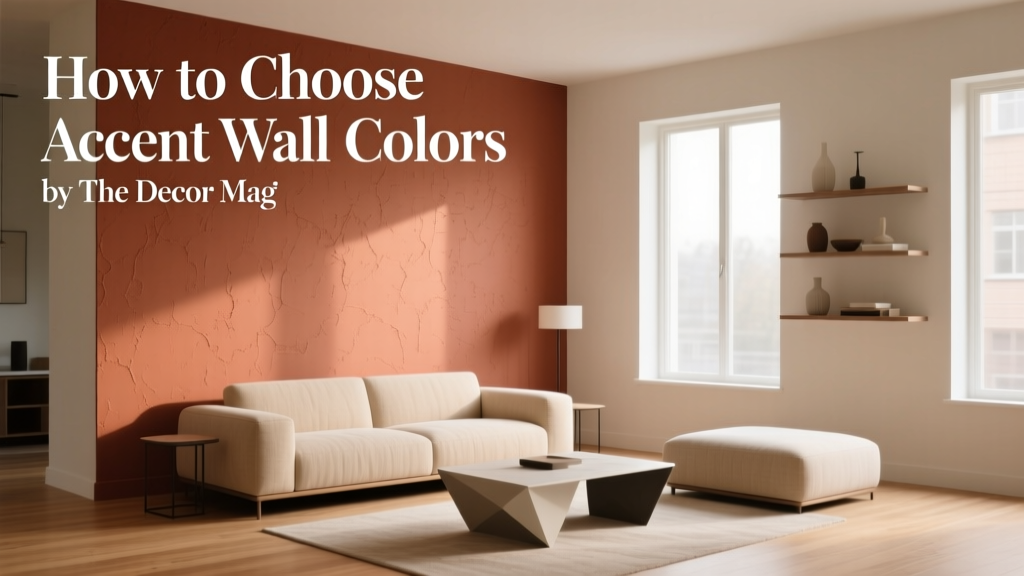 How to Choose Accent Wall Colors - The Decor Mag
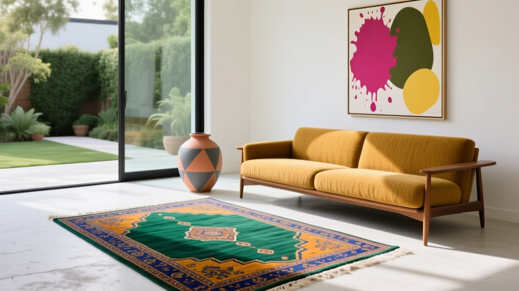 How to Create an Eclectic Color Palette - The Decor Mag
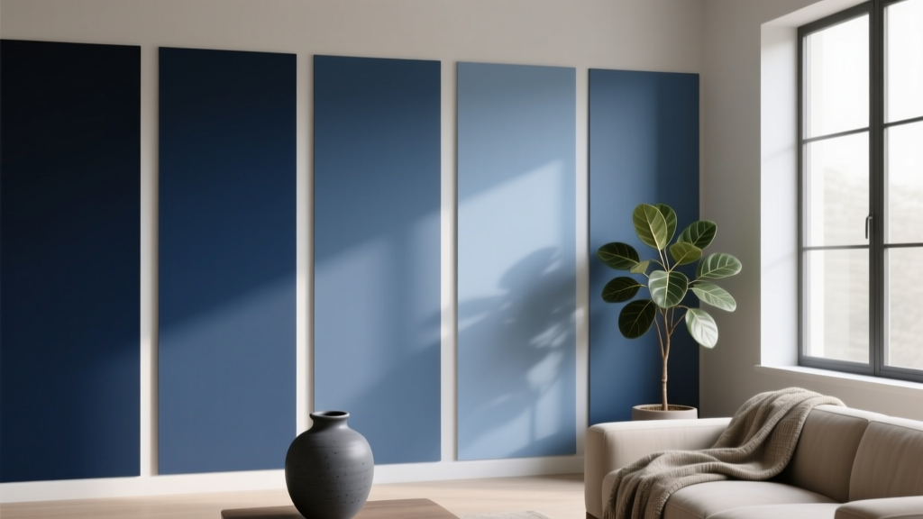 Best Indigo Paint Colors - The Decor Mag
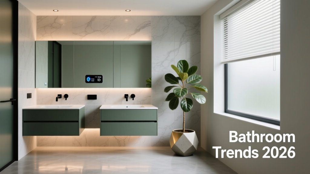 Bathroom Trends 2026: Wellness Integration, Material Innovation, and Smart Efficiency
 How to Use Color to Create Balance - The Decor Mag
 Best Cucumber Paint Colors - The Decor Mag