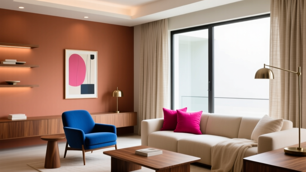
Saturated Colors in Decor: Use Without Overwhelming
Saturated color is having a moment—and for good reason. In a world of safe neutrals, richly pigmented blues, greens, reds, and yellows can make a home feel personal, energetic, and design-forward. Yet many homeowners hesitate to use bold paint colors because they’ve seen rooms that feel “too loud,” heavy, or visually chaotic. The goal isn’t to mute saturated hues into blandness; it’s to use them with intention so they feel elevated and livable.
Understanding a few color theory basics—value (lightness/darkness), saturation (intensity), temperature (warm/cool), and contrast—can turn intimidating color choices into a clear plan. With the right placement, finishes, and supporting palette, saturated colors create beautiful focal points, improve a room’s mood, and highlight architecture without overwhelming the senses.
This guide breaks down practical ways to work with bold paint colors, including brand-specific recommendations, real-room scenarios, and the most common mistakes that make saturated color feel stressful instead of stunning.
What “Saturated Color” Really Means (And Why It Feels So Strong)
Saturation describes a color’s intensity. A fully saturated hue looks vivid and pure—think cobalt blue, emerald green, marigold yellow. As you reduce saturation, the color becomes more muted, dusty, or “grayed.” Many popular “safe” paints are simply lower-saturation versions of more vibrant hues.
Color psychology: why saturated hues affect mood
- Saturated blues and greens can feel confident, calming, and restorative—especially when balanced with warm woods and soft whites.
- Saturated reds and oranges add warmth, appetite, and social energy, making them powerful for dining rooms and gathering spaces.
- Saturated yellows bring optimism and brightness, but can feel intense under certain lighting—best used strategically.
- Saturated purples can feel dramatic and luxurious, especially in bedrooms and powder rooms with reflective finishes.
When a saturated color overwhelms, it’s rarely the hue alone. More often, it’s the combination of high saturation + high contrast + too much surface area + the wrong undertone for the room’s lighting.
Start With These 5 Design Principles for Bold Paint Colors
1) Control surface area: “Where” matters more than “what”
If you love a strong color but fear commitment, change the ratio. You can absolutely use saturated color in a home—just not always on every wall.
- Low-risk placements: powder rooms, mudrooms, hallways, built-ins, interior doors, kitchen islands.
- Medium commitment: one accent wall, wainscoting, ceiling color, a defined nook (breakfast banquette, reading corner).
- High impact: full-room color drenching (walls + trim + ceiling) done carefully with the right value and finish.
2) Balance value, not just color
Two colors can both be saturated, but if their values are similar, the pairing feels calmer. If their values are far apart (deep navy next to crisp white), the contrast reads sharper and more energizing.
Design move: Pair saturated paint with mid-tone neutrals rather than only bright white. Try creamy off-whites, warm grays, pale taupes, or soft greiges to reduce visual “sting.”
3) Use undertones to keep the palette coherent
Undertones are the hidden bias in a color—blue-leaning green versus yellow-leaning green, for instance. Saturated paint colors make undertones more obvious, especially in daylight.
- Warm saturated hues look best with warm whites (creamy, ivory) and warm metals (brass, bronze).
- Cool saturated hues pair well with clean whites and cool metals (chrome, nickel).
4) Choose the right sheen (finish) for intensity control
Sheen changes how much light bounces off paint, which changes how intense the color feels.
- Matte/flat: softens saturated color; hides wall texture; feels sophisticated.
- Eggshell/satin: slightly more reflective; good for living spaces and kids’ rooms; makes bold color read crisper.
- Semi-gloss/high-gloss: high drama; best for trim, doors, cabinets; amplifies saturation and highlights imperfections.
5) Repeat the color at least twice
A single bold wall can feel random if the color doesn’t appear elsewhere. Repetition is what makes saturated colors look “designed.”
Easy repeats: a throw pillow, artwork, a lamp shade, a rug detail, books, a vase, or upholstered dining chairs.
Saturated Color Strategies That Always Work
Strategy A: Use saturated color as an anchor (one strong, many quiet)
This is the most foolproof method for homeowners. Pick one saturated paint color as the visual anchor, then support it with quieter companions.
Example palette:
- Anchor: Farrow & Ball Hague Blue (deep blue-green)
- Walls/trim companion: Farrow & Ball All White or a soft warm white like Benjamin Moore White Dove
- Supporting materials: white oak, warm brass, natural linen, black accents
Strategy B: Color drench with a deep saturated hue for a cozy, enveloping feel
Color drenching (painting walls, trim, and sometimes ceiling the same color) can make saturated paint feel more immersive and less choppy. It reduces harsh contrast lines, especially in rooms with lots of trim or awkward angles.
Best rooms: bedrooms, dens, libraries, TV rooms, powder rooms.
Paint ideas:
- Benjamin Moore Hale Navy for a tailored, classic look
- Sherwin-Williams Cascades for a moody teal-green
- Farrow & Ball Studio Green for a deep, historic green with richness
Application tip: Use matte on walls and satin on trim in the same color to add subtle definition without introducing a second color.
Strategy C: Put saturated color on the “background” planes (ceiling or trim)
If you’re used to white ceilings and white trim, flipping the script can look intentionally modern.
- Saturated ceiling + neutral walls: makes a room feel designed and can visually lower a too-tall ceiling for coziness.
- Saturated trim + light walls: highlights architecture and looks especially good in older homes with detailed casing.
Try: Sherwin-Williams Naval on built-in shelves or trim with Benjamin Moore Classic Gray on walls for a calm, elevated contrast.
Strategy D: Go bold in small, high-impact rooms
Smaller rooms are the perfect testing ground for saturated color. Because you spend less time in them, you can handle more intensity—and they become memorable design moments.
Great candidates:
- Powder room: jewel tones + high-gloss accents
- Mudroom: saturated color hides scuffs and feels cheerful
- Laundry room: bold paint makes utilitarian spaces feel cared for
Paint suggestion: Benjamin Moore Caliente (a vibrant red) in a powder room with warm brass, crisp white marble, and a framed mirror for a boutique-hotel vibe.
Real Room Examples: How to Apply Saturated Color With Confidence
Living Room: A saturated blue-green accent wall that feels grounded
Scenario: An open-plan living room with neutral furniture feels flat. You want a bold paint moment without repainting everything.
Plan:
- Paint the fireplace wall in Farrow & Ball Hague Blue or Sherwin-Williams Cascades.
- Keep remaining walls a soft neutral like Benjamin Moore White Dove (warm) or Sherwin-Williams Pure White (clean).
- Repeat the accent color in two places: a patterned rug with blue-green notes + a pair of pillows or art.
Why it works: One bold plane creates a focal point, while repeated touches help the saturated hue feel integrated.
Kitchen: A saturated island color that elevates without closing in
Scenario: You want color, but full saturated walls feel risky with cabinets, counters, and backsplash already in play.
Plan:
- Paint the island in Sherwin-Williams Naval or Benjamin Moore Hale Navy.
- Keep perimeter cabinets a warm white (e.g., Benjamin Moore White Dove).
- Add brass hardware, light oak stools, and simple white backsplash tile.
Why it works: The island becomes a saturated anchor while the rest of the kitchen stays airy and timeless—an ideal bold-but-balanced color scheme.
Bedroom: Color-drenched green for restorative calm
Scenario: You want a cocoon-like bedroom that feels calm, not gloomy.
Plan:
- Paint walls + trim in Farrow & Ball Studio Green or Benjamin Moore Essex Green.
- Use creamy bedding, warm wood nightstands, and soft brass or aged bronze lighting.
- Add texture (linen, wool, boucle) to keep the dark saturated color from feeling flat.
Why it works: Deep green supports rest (color psychology) while warm materials and soft whites prevent the room from feeling heavy.
Dining Room: Saturated terracotta for warmth and appetite
Scenario: Your dining room feels underused and cold.
Plan:
- Try a saturated clay/terracotta tone such as Farrow & Ball Red Earth or a similar warm earth shade from your preferred brand.
- Pair with natural wood furniture, off-white drapery, and black metal accents.
- Use warm lighting (2700K bulbs) to enhance the cozy glow.
Why it works: Warm saturated hues encourage conversation and comfort, making the room feel more inviting.
Color Combinations That Tame Saturation (Without Dulling It)
These pairings keep bold paint colors feeling intentional, not chaotic.
- Navy + soft ivory + walnut: Try Benjamin Moore Hale Navy with White Dove and warm wood.
- Emerald + blush + brass: Deep green (e.g., BM Essex Green) with dusty pink textiles and brass details.
- Cobalt + camel + crisp white: Saturated blue with warm tan leather and clean trim.
- Marigold + charcoal + natural linen: Saturated yellow works best when grounded by deep gray and softened by texture.
- Aubergine + greige + aged bronze: Purple looks luxe when paired with warm neutral walls and moody metals.
Common Mistakes That Make Saturated Colors Feel Overwhelming
- Using bright white everywhere. High-contrast white trim can make saturated wall colors feel sharper. Consider warmer whites or a lower-contrast trim color.
- Ignoring lighting direction. North-facing rooms (cool light) can make saturated colors feel colder or harsher; south-facing rooms can intensify warm hues. Always test in the actual room.
- Choosing a color that clashes with fixed finishes. Check undertones against flooring, countertops, tile, and large upholstery before committing.
- Overloading with multiple bold colors at once. Saturated color works best when there’s a clear hierarchy: one hero, a supporting cast, and neutrals.
- Skipping sampling and going straight to gallons. Saturated pigments shift dramatically from morning to night. Paint large swatches (or use peel-and-stick samples) on multiple walls.
- Forgetting texture. Bold paint needs tactile balance—rugs, curtains, wood grain, and woven materials keep the look livable.
Practical Tips for Choosing and Testing Saturated Paint Colors
- Test at least two saturations of the same hue. If you love a color family, compare a bold option with a slightly muted neighbor for flexibility.
- View samples in day and night lighting. Check the color with lamps on; that’s how many rooms are actually experienced.
- Decide your contrast level. If you want calm, keep trim closer in value to the walls. If you want crisp and graphic, choose higher contrast.
- Pick one “bridge” neutral. A greige, taupe, warm white, or soft gray that appears in multiple rooms helps saturated accents feel cohesive through the home.
- Use paint finish intentionally. Matte walls + satin trim often reads high-end with saturated hues.
FAQ: Using Saturated Colors at Home
What’s the difference between a bold color and a saturated color?
“Bold” is subjective—it can mean bright, dark, or high-contrast. “Saturated” specifically describes intensity and purity. A color can be bold because it’s very dark (deep charcoal) even if it isn’t highly saturated, and a color can be saturated without being neon.
Are saturated colors better for accent walls or whole rooms?
Both can work. Accent walls are easier for beginners and open-plan spaces. Whole-room saturated color (especially color drenching) can feel calmer than an accent wall because it reduces contrast and visual breaks—ideal for bedrooms, dens, and powder rooms.
How do I keep a saturated room from feeling smaller?
Use a cohesive palette and avoid stark contrast. Consider color drenching, choose matte finishes, and add layered lighting. Mirrors and lighter textiles (linen curtains, ivory rugs) also prevent heaviness.
What saturated paint colors are most “livable” for everyday spaces?
Deep blue-greens and navies are consistently livable because they act like near-neutrals. Popular options include Benjamin Moore Hale Navy, Sherwin-Williams Naval, and Farrow & Ball Hague Blue.
Should I match undertones between my paint and my flooring?
Yes—especially with saturated colors. If your floors are warm (honey oak, walnut), warm-leaning saturated colors often feel more harmonious. With cool-toned floors (gray stain), cooler saturated colors may look more seamless.
Can I mix multiple saturated colors in one room?
You can, but keep a clear structure: pick one dominant saturated hue, one secondary accent, and then use neutrals to give the eye a place to rest. Repeating each color at least twice (paint + textile + art) helps it feel cohesive.
Next Steps: A Simple Plan to Go Bold, Beautifully
If you’re ready to use saturated colors without overwhelming your space, start small and build confidence:
- Choose one saturated “hero” color for a focal point (island, built-ins, powder room, or a single wall).
- Select a coordinating neutral with the right undertone (warm vs. cool) to control contrast.
- Test samples in multiple lighting conditions and consider matte finishes to soften intensity.
- Repeat the saturated hue through decor so it looks intentional—then refine with texture and lighting.
For more paint color recommendations, color scheme ideas, and room-by-room guides to interior color design, explore our latest color stories on thedecormag.com.
More Articles
 Color Psychology in Home Design Guide - The Decor Mag
 How to Choose Colors for East-Facing Rooms - The Decor Mag
 How to Choose Colors for an Entryway - The Decor Mag
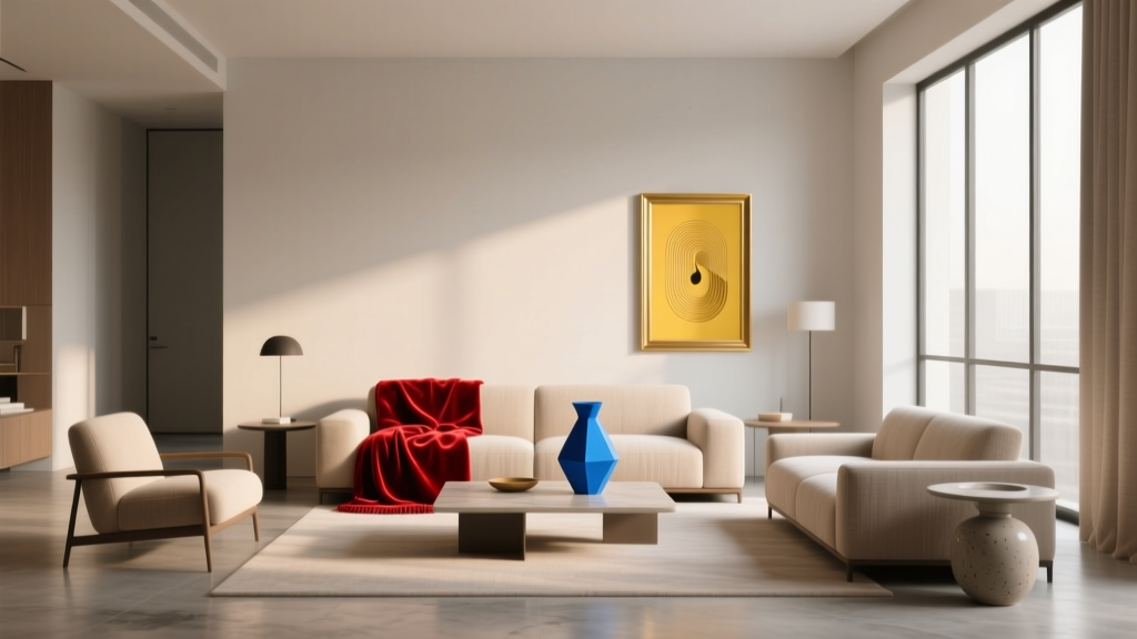 How to Use Color to Create Rhythm - The Decor Mag
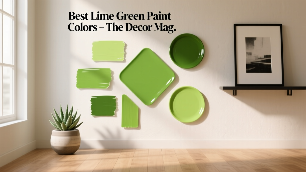 Best Lime Green Paint Colors - The Decor Mag
 Best Sustainable Solutions: Proven, Scalable, and Impact-Driven Approaches for 2024
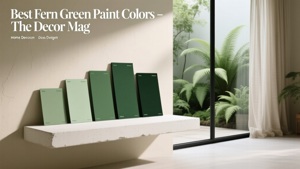 Best Fern Green Paint Colors - The Decor Mag
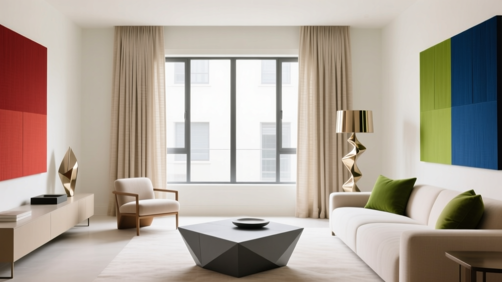 Triadic Color Scheme Applications - The Decor Mag
 Best Green Paint Colors for Nature Lovers - The Decor Mag
 Best Tomato Red Paint Colors - The Decor Mag