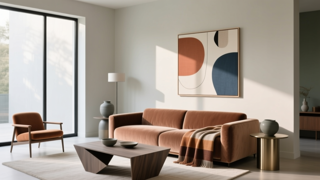
How to Create a Modern Color Palette - The Decor Mag
A modern color palette can make a home feel calmer, brighter, and more intentional—without looking cold or overly trendy. Color is one of the fastest ways to update a space because it shapes how we perceive light, scale, and even cleanliness. The right palette can visually “edit” a busy room, highlight architectural features, and help furniture and art feel curated rather than random.
Modern interiors aren’t limited to stark white walls and black accents. Today’s modern color schemes are layered and livable: warm neutrals, nuanced earth tones, softened greens and blues, and deep grounded shades used strategically. When color is chosen with a plan—undertone, contrast, and finish included—you get a home that photographs well, feels cohesive from room to room, and still has personality.
This guide breaks down modern color design principles, gives specific paint color recommendations (with trusted brand references), and shows you how to apply combinations in real rooms—so you can build an interior color palette that looks current and works long-term.
What “Modern” Means in Color (Beyond Trends)
Modern color palettes share a few consistent traits. They tend to be:
- Undertone-aware: Colors are chosen to harmonize (or intentionally contrast) based on warm vs. cool undertones.
- Balanced in value: A mix of light, mid-tone, and deep shades creates depth without clutter.
- Low to medium chroma: Many modern palettes lean slightly muted, which reads sophisticated and architectural.
- Grounded by a neutral: A clean white, warm off-white, greige, or soft taupe acts as the foundation.
Color psychology plays a role here, too. Modern palettes often aim for emotional “cleanliness”—spaces that feel restorative, focused, and welcoming. Soft greens and warm neutrals soothe. Deep charcoals add security and structure. Dusty blues can improve perceived calm and concentration (great for bedrooms and offices).
The Building Blocks: A Simple Formula for a Cohesive Modern Color Scheme
Use the 60-30-10 Rule (and Modernize It)
For homeowners, the 60-30-10 framework is the easiest way to build a whole-room color scheme:
- 60%: Main wall color (or dominant neutral)
- 30%: Secondary color (upholstery, large rugs, cabinets)
- 10%: Accent color (pillows, art, small furniture, trim details)
To make it feel modern, keep the accent color either:
- Tonally related (e.g., olive accents with a warm greige base), or
- High-contrast but controlled (e.g., blackened charcoal used sparingly against soft white).
Pick Your “Anchor Neutral” First
The anchor neutral is the shade you’ll see in multiple rooms—often on walls, trim, or key connecting spaces like hallways. Modern neutrals are rarely flat; they have subtle undertones that complement wood, stone, and metal finishes.
Modern anchor neutral paint colors to consider:
- Benjamin Moore White Dove (OC-17): Soft warm white; flexible with many floors.
- Sherwin-Williams Alabaster (SW 7008): Creamy white that stays calm, not yellow.
- Farrow & Ball School House White (No. 291): Warm, slightly chalky off-white; beautiful in matte finishes.
- Benjamin Moore Edgecomb Gray (HC-173): A warm greige that reads modern and cozy.
- Sherwin-Williams Agreeable Gray (SW 7029): A balanced greige that plays nicely with many fixed finishes.
Choose Contrast Intentionally: Soft vs. Sharp Modern
Modern interiors need contrast to avoid looking flat, but the type of contrast can vary:
- Soft modern: Low-contrast neutrals + muted color (calm, Scandinavian-leaning).
- Sharp modern: Crisp light walls + deep charcoals/blacks (graphic, architectural).
High-impact modern darks:
- Benjamin Moore Wrought Iron (2124-10): Deep charcoal with softness; a go-to for doors and built-ins.
- Sherwin-Williams Iron Ore (SW 7069): A warm-leaning charcoal; great for exteriors and accent walls.
- Farrow & Ball Railings (No. 31): Blue-black that feels elevated and moody.
Modern Color Palette Ideas (With Specific Combinations)
1) Warm Minimalist Neutrals (Calm, Bright, Timeless)
Best for: Open-concept living, homes with warm wood floors, north-facing rooms that need softness.
- Main wall: Sherwin-Williams Alabaster (SW 7008)
- Secondary: Benjamin Moore Edgecomb Gray (HC-173) on built-ins or a reading nook
- Accent: Matte black (hardware/lighting) + natural oak + warm linen textiles
Application scenario: In a living room, paint walls Alabaster in an eggshell finish, add an Edgecomb Gray media unit in satin, and use black accents only where they add structure (picture frames, sconces, coffee table base). This palette feels modern because it’s restrained and textural rather than stark.
2) Earthy Modern (Organic, Grounded, Designer-Looking)
Best for: Homes with stone, terracotta, walnut, or brass finishes; rooms you want to feel cozy and elevated.
- Main wall: Benjamin Moore White Dove (OC-17)
- Secondary: Sherwin-Williams Accessible Beige (SW 7036) or Agreeable Gray (SW 7029) for a larger upholstered piece or kitchen cabinetry
- Accent: Benjamin Moore Saybrook Sage (HC-114) for a statement wall, powder room, or built-in
Application scenario: In a dining room, White Dove walls keep things bright while Saybrook Sage on a built-in hutch or wainscoting adds earthy richness. Pair with warm brass and oak for that “modern organic” look.
3) Modern Coastal (Not Themed, Just Fresh)
Best for: Bedrooms, bathrooms, and any space where you want calm and clarity without going nautical.
- Main wall: Benjamin Moore Classic Gray (OC-23) (a very soft, modern off-white)
- Secondary: Sherwin-Williams Sea Salt (SW 6204) for a gentle blue-green
- Accent: Benjamin Moore Hale Navy (HC-154) in small doses (vanity, interior doors, or an accent chair)
Application scenario: In a bathroom, use Classic Gray on walls, a Sea Salt vanity, and polished nickel fixtures. Bring in Hale Navy through towels or a framed print rather than painting multiple surfaces—this keeps it modern and airy.
4) Urban Modern Monochrome (Graphic, Clean, Architectural)
Best for: Contemporary homes, lofts, and spaces with strong lines or minimal trim.
- Main wall: Benjamin Moore Chantilly Lace (OC-65) (crisp, bright white)
- Secondary: Benjamin Moore Balboa Mist (OC-27) for softness in textiles and rugs
- Accent: Sherwin-Williams Iron Ore (SW 7069) on a fireplace surround or interior doors
Application scenario: In a living room, keep walls Chantilly Lace, add Balboa Mist in a large rug and sofa, then ground the room with Iron Ore on a fireplace or window trim. The dark accent gives “modern edge” without shrinking the whole space.
How to Apply a Modern Color Palette Room by Room
Living Room: Layer Neutrals First, Then Add One Color
- Choose a neutral wall paint that complements your flooring.
- Introduce the “color” through one major item: a rug, a sofa, or built-ins.
- Use a deep tone (charcoal, navy, espresso) to anchor with contrast.
Real room example: Walls in White Dove, sofa in warm greige, and an accent chair in muted olive. Add contrast with a Wrought Iron painted console or black window frames.
Kitchen: Let Fixed Finishes Drive the Palette
Kitchens are modern when the palette is edited. Start with what you can’t easily change: countertops, backsplash, flooring.
- White cabinets: Try Sherwin-Williams Alabaster for warmth or Benjamin Moore Simply White (OC-117) for brightness (watch undertones with quartz).
- Color cabinets: Consider Benjamin Moore Hale Navy, Sherwin-Williams Evergreen Fog (SW 9130), or a charcoal like Iron Ore.
- Modern trim approach: Match trim to walls for a seamless look, especially in open layouts.
Real room example: Perimeter cabinets in Alabaster, island in Hale Navy, hardware in aged brass, and walls in a soft warm white. The contrast reads modern, while the undertones keep it inviting.
Bedroom: Use Color Psychology to Guide Mood
- For rest: Soft blue-gray, muted green, warm off-white.
- For cozy sophistication: Deep moody tones on a single wall or on all walls in matte.
Paint ideas:
- Green-gray calm: Sherwin-Williams Evergreen Fog (SW 9130)
- Dusty blue focus: Benjamin Moore Boothbay Gray (HC-165)
- Warm neutral cocoon: Farrow & Ball Ammonite (No. 274)
Bathroom: Keep It Clean, Add Depth with One Rich Shade
- Use a light neutral on walls for freshness.
- Add depth via vanity color or a single dramatic paint moment (door, mirror frame, beadboard).
- Choose finishes thoughtfully: satin on cabinets for durability; eggshell or satin on walls.
Paint Finish and Lighting: The Modern “Secret Weapons”
Pick Finishes That Look Current
- Walls: Matte or eggshell for a soft, modern feel (matte hides imperfections; eggshell is easier to clean).
- Trim: Satin or semi-gloss for crispness and durability.
- Ceilings: Flat white to reduce glare (or match wall color for a modern enveloping look).
Test Undertones in Your Actual Light
Modern palettes often hinge on subtle undertones, so sampling matters more than ever. Tape paint swatches on multiple walls and observe them:
- Morning vs. evening
- Lights on vs. off
- Next to your flooring, counters, and largest upholstery
Tip: If a “white” looks pink, green, or gray in your room, it’s reacting to your fixed finishes and natural light. Switch to a white with a different undertone rather than forcing it.
Common Color Mistakes to Avoid
- Choosing paint before checking undertones: A gray with blue undertones can clash with warm wood floors and read icy.
- Using too many competing “favorite colors”: Modern design relies on restraint. Pick one hero color per floor (or per sightline).
- Ignoring value contrast: If everything is mid-tone, the room feels muddy. Add a light and a dark element.
- Overdoing black: Black is powerful; too much can feel harsh. Swap in charcoal (Wrought Iron, Iron Ore) for a softer modern look.
- Forgetting transitions: Hallways and adjacent rooms should share at least one repeated color (wall, trim, or accent) for flow.
- Not coordinating with finishes: Paint must relate to flooring, countertops, tile, and metal finishes—especially in kitchens and baths.
FAQ: Modern Paint Colors and Color Schemes
What are the best modern neutral paint colors for a whole house?
Great whole-house modern neutrals include Benjamin Moore White Dove (OC-17), Sherwin-Williams Alabaster (SW 7008), and Benjamin Moore Edgecomb Gray (HC-173). They’re versatile, undertone-friendly, and easy to connect across rooms.
How do I choose between warm and cool modern color palettes?
Use your fixed finishes as the compass. Warm wood floors, beige stone, and brass usually look best with warm whites and greiges. Cool gray tile, bright white quartz, and chrome tend to pair well with cooler whites and blue-leaning grays. If you’re mixing finishes, choose a balanced neutral (like Agreeable Gray) and keep accent colors muted.
What’s a modern alternative to stark white walls?
Try a soft warm off-white such as White Dove or Alabaster, or a barely-there greige like Classic Gray (OC-23). These read bright but feel more forgiving and lived-in than ultra-crisp white.
Can I use bold colors and still look modern?
Yes—keep bold color strategic. Use it on a single surface (an island, built-ins, a powder room, interior doors) and balance it with calm neutrals. Deep shades like Hale Navy, Iron Ore, and Railings feel modern when paired with simple lines and uncluttered styling.
How many paint colors should I use in an open-concept space?
Often 1–2 wall colors plus a consistent trim color is enough. Open layouts look more modern when the main areas share an anchor neutral, then you add color through cabinetry, furniture, and textiles rather than multiple competing wall colors.
What’s the easiest way to make my palette look cohesive?
Repeat the same undertone family throughout the home and “echo” colors at least three times (for example: olive in a pillow, a vase, and a piece of art). Cohesion comes from repetition and restraint, not from matching everything exactly.
Next Steps: Build Your Modern Palette With Confidence
Start with an anchor neutral that suits your home’s light and fixed finishes, then add one secondary color and one deep grounding accent. Test undertones in your room, choose modern-leaning finishes (matte/eggshell on walls, satin on trim), and keep transitions smooth by repeating key colors from space to space.
If you want a quick action plan, follow this checklist:
- Photograph your rooms in daylight and identify warm vs. cool fixed finishes.
- Pick 2–3 anchor neutrals to sample (e.g., White Dove, Alabaster, Edgecomb Gray).
- Choose one “modern color” (sage, dusty blue, navy, charcoal) and decide where it will live.
- Lock in your contrast plan: soft modern or sharp modern.
- Sample, observe for 48 hours, then commit with the right finish.
For more paint color ideas, room-by-room color schemes, and expert guidance on interior color design, explore the color guides at thedecormag.com.
More Articles
 How to Choose Colors for a Nursery - The Decor Mag
 Best Living Rooms for STEP: Design, Layout, and Accessibility Standards for Seniors and Mobility Support
 How to Use Color to Create Rhythm - The Decor Mag
 Best Cardinal Red Paint Colors - The Decor Mag
 How to Choose Colors for a Laundry Room - The Decor Mag
 Where to Place Outdoor Essentials: Strategic Placement for Safety, Function, and Longevity
 Best Steel Blue Paint Colors - The Decor Mag
 How to Create a Soothing Color Palette - The Decor Mag
 Best Blush Pink Paint Colors - The Decor Mag
 Bedroom for Beginners: A Practical, Step-by-Step Setup Guide