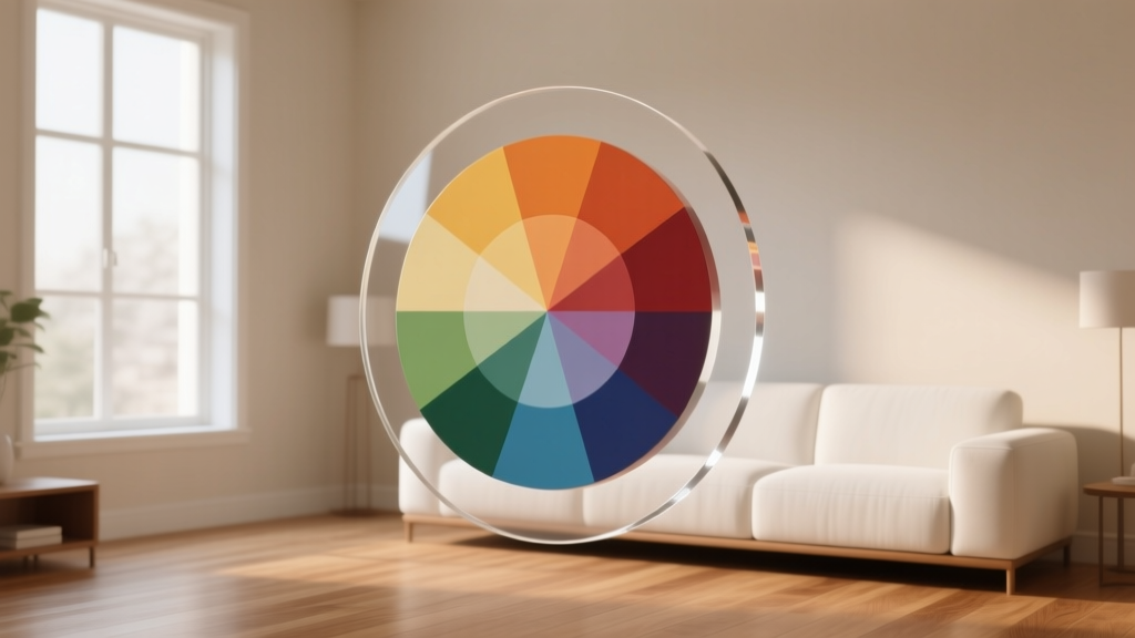
Color Wheel Basics for Home Decorating - The Decor Mag
Color is one of the fastest ways to change how a home feels. It can make a small room seem larger, a north-facing space feel warmer, and an open-concept layout look more cohesive. Yet many homeowners pick paint colors from tiny swatches under store lighting, then wonder why the result feels “off” once it hits their walls.
Understanding the color wheel gives you a reliable framework for choosing paint colors, building color schemes, and decorating with confidence. Instead of guessing, you’ll be able to predict how hues interact, how undertones affect your space, and which combinations create calm, energy, or balance—using the same design principles professionals rely on.
This guide breaks down color wheel basics for interior color design, with practical room examples, paint color recommendations, and common mistakes to avoid—so you can create a home that looks intentional and feels like you.
What the Color Wheel Really Does in Interior Design
The color wheel is a map of how colors relate to each other. In home decorating, it helps you:
- Build harmonious color schemes (so rooms feel coordinated, not chaotic)
- Choose accent colors that “pop” without clashing
- Understand undertones in paint colors (the secret behind why some whites look pink or gray)
- Balance warm and cool elements across an entire home
Primary, Secondary, and Tertiary Colors (Quick Refresher)
- Primary colors: Red, blue, yellow (the base hues)
- Secondary colors: Green, orange, violet (made by mixing two primaries)
- Tertiary colors: Blue-green, red-orange, yellow-green, etc. (the nuanced in-between hues)
Warm vs. Cool Colors: The Mood-Setting Shortcut
Warm colors (reds, oranges, yellows) tend to feel cozy, energetic, and welcoming. Cool colors (blues, greens, violets) often read as calm, airy, and restorative.
Design principle: Temperature shifts can “move” a room visually. Warm colors advance (feel closer), cool colors recede (feel farther away). That’s why a soft blue-gray can help a tight hallway feel more open, while a warm terracotta can make a large living room feel more intimate.
Color Psychology: How Color Affects the Way a Room Feels
Color psychology isn’t about rigid rules; it’s about patterns in how we experience color. Use these as guiding cues when choosing interior paint colors and décor.
- Blue: Calm, focused, clean. Great for bedrooms, baths, home offices.
- Green: Balanced, grounding, restorative. Works nearly anywhere, especially living rooms and kitchens.
- Yellow: Optimistic, sunny, social. Beautiful in breakfast nooks, entryways, kitchens (use softer tones to avoid harshness).
- Red: Energizing, dramatic, appetite-stimulating. Best as an accent or in dining rooms/powder rooms.
- Purple: Creative, luxurious, introspective. Try muted plums or lavender-grays for sophistication.
- Neutrals (white, gray, beige, greige): Versatile, calming, architecture-forward. Undertone choice is everything.
The 6 Core Color Schemes (and How to Use Them at Home)
1) Monochromatic: One Hue, Many Shades
Monochromatic color schemes use one color in different values (light to dark) and intensities (muted to saturated). This creates a polished, designer look—especially in modern and minimalist homes.
Where it shines: Bedrooms, serene living rooms, spa-like bathrooms.
Example scenario: A calming blue bedroom
- Walls: Benjamin Moore Silver Marlin (soft blue-gray)
- Ceiling/trim: Benjamin Moore Chantilly Lace (clean white)
- Textiles: Navy throw, dusty blue bedding, pale blue drapery
- Accents: Brushed brass lamps to warm up the cool palette
Pro tip: In monochrome rooms, vary texture (linen, velvet, wood grain, boucle) to keep the space from feeling flat.
2) Analogous: Neighboring Colors for Easy Harmony
Analogous schemes use colors next to each other on the wheel (like blue + blue-green + green). They feel cohesive and natural—great for open layouts.
Where it shines: Open-concept living areas, kitchens that flow into family rooms.
Example scenario: A relaxed coastal living room
- Main wall color: Sherwin-Williams Sea Salt (green-blue-gray that adapts to light)
- Supporting color: Sherwin-Williams Comfort Gray (deeper blue-green)
- Accent: Soft aqua ceramics, sage pillows, natural jute rug
Practical ratio: Keep one color dominant (about 60%), a second supporting (30%), and a third as accent (10%).
3) Complementary: Opposites that Energize
Complementary colors sit opposite each other on the wheel (blue/orange, red/green, yellow/purple). The contrast is lively and crisp. In interiors, the key is controlling intensity so it doesn’t feel like a sports logo.
Where it shines: Dining rooms, creative offices, kids’ playrooms, accent-heavy spaces.
Example scenario: Blue + warm terracotta in a dining room
- Walls: Farrow & Ball Hague Blue (rich blue-green)
- Counterbalance: Terracotta pottery, cognac leather chairs, warm oak table
- Finishes: Aged brass chandelier to bridge warm/cool
Pro tip: Let one color act as the “quiet” version (muted or deeper), and bring the complement in through accessories and art.
4) Split-Complementary: High Contrast, More Forgiving
Split-complementary uses one base color plus the two colors adjacent to its complement (for example, blue with yellow-orange and red-orange). You still get contrast, but it’s easier to balance.
Where it shines: Living rooms, family rooms, anywhere you want energy without harshness.
Example scenario: A blue living room with warm accents
- Walls: Sherwin-Williams Smoky Blue (muted blue with gray depth)
- Accents: Rust velvet pillow, honey-toned wood, warm camel throw
- Artwork: Add a touch of golden ochre to echo the split complement
5) Triadic: Balanced and Playful
Triadic schemes use three evenly spaced colors (like red/yellow/blue). They can feel bold, so many designers dial back saturation and rely on one color as the anchor.
Where it shines: Eclectic homes, mid-century modern spaces, creative studios.
Example scenario: A cheerful home office that still looks grown-up
- Anchor wall: Benjamin Moore October Mist (soft sage-green)
- Secondary: Muted navy rug or drapery
- Accent: Mustard desk chair or art print detail
Pro tip: Keep two of the three colors muted, and let just one show up as a brighter accent.
6) Tetradic (Double Complementary): Designer-Level Depth
Tetradic schemes use two complementary pairs (like blue/orange and green/red). This offers incredible richness, but it can get busy fast.
Where it shines: Larger homes, layered traditional interiors, rooms with lots of texture and antiques.
Easy way to make it work: Choose a neutral base, then distribute the four colors in smaller doses (art, textiles, books, ceramics) rather than on all the walls.
Undertones: The Detail that Makes or Breaks Paint Colors
Two paint colors can look identical on a sample card and wildly different on your wall because of undertones and lighting. Undertones are the subtle color “bias” beneath the main hue—pink, green, violet, blue, or yellow.
How to Spot Undertones at Home
- Compare to a true white: Hold your sample next to a clean white like Benjamin Moore Chantilly Lace to reveal warmth or coolness.
- Check near fixed finishes: Tile, countertops, flooring, and upholstery don’t change—your paint choice should harmonize with them.
- Test in multiple lights: Morning, afternoon, and nighttime with lamps on.
Real-world example: Sherwin-Williams Alabaster reads as a soft warm white in many rooms, but in a space with cool north light and blue-gray upholstery, it can feel creamier. Pair it with warm metals, oak, and warm textiles for a cohesive look.
Room-by-Room Color Wheel Guidance (With Real Application Scenarios)
Living Room: Build a Flexible Whole-Home Palette
Living rooms often connect to hallways, kitchens, or dining spaces—making them ideal for establishing your main color scheme.
Go-to combinations:
- Warm neutral + muted green (analogous feel): Benjamin Moore Edgecomb Gray with accents in Benjamin Moore Saybrook Sage
- Greige + navy (classic contrast): Sherwin-Williams Agreeable Gray with navy textiles and art
- Cream + terracotta + black accents (warm modern): Sherwin-Williams Alabaster, terracotta décor, matte black lighting
Tip: Use the 60-30-10 rule: 60% wall color, 30% upholstery/rugs, 10% accents.
Kitchen: Let Finishes Lead
Kitchens have “bossy” fixed elements—cabinets, counters, backsplash—so color wheel choices should support them.
- White cabinets + warm counters: Try a soft warm greige like Benjamin Moore Pale Oak.
- Wood cabinets + cool stone: Balance with a gentle green-gray like Sherwin-Williams Evergreen Fog.
- Want color without repainting cabinets? Bring it through an analogous palette: blue-green pottery, sage runners, soft teal bar stools.
Bedroom: Prioritize Restful Temperature and Value
Bedrooms typically feel best with lower contrast and softer values.
Paint color ideas:
- Soothing blue-gray: Benjamin Moore Boothbay Gray
- Soft green: Benjamin Moore October Mist
- Airy neutral with warmth: Sherwin-Williams Alabaster
Scenario: If your bedroom gets harsh afternoon sun, avoid very bright whites that can glare. Choose a slightly warmed white or greige, then layer in cool bedding for balance.
Bathroom: Clean Contrast or Spa Calm
- Spa-like analogous scheme: Sherwin-Williams Sea Salt with white tile and light wood
- Crisp complementary pop: White walls with navy vanity (try Benjamin Moore Hale Navy) and warm brass hardware
Tip: Bathrooms often have cooler lighting; test paint next to your vanity lights and mirror reflection.
Entryway and Hallway: Use Color to Connect Spaces
These transitional zones are perfect for color wheel strategy—either a neutral “bridge” or a bold moment that sets the tone.
- Whole-home connector: A soft greige like Sherwin-Williams Agreeable Gray
- Moody statement: Farrow & Ball Hague Blue with warm wood and brass
- Friendly warmth: Benjamin Moore Muslin (a gentle, inviting neutral)
Practical Tips for Choosing Paint Colors with Confidence
- Start with what you can’t change: Flooring, countertops, large sofa, brick fireplace.
- Pick a “hero” color from your inspiration: Artwork, rug, or upholstery you already love.
- Decide on warm or cool dominance: Mixed temperatures can work, but one should lead.
- Sample correctly: Paint large swatches (at least 12x12) or use peel-and-stick samples, and move them around the room.
- Mind sheen:
- Flat/matte for ceilings and many walls (hides imperfections)
- Eggshell/satin for high-traffic areas (wipeable)
- Semi-gloss for trim and doors (crisp, durable)
Common Color Mistakes to Avoid
- Choosing paint before textiles: It’s easier to match paint to a rug than match a rug to paint.
- Ignoring undertones: A “neutral” can skew pink, green, or violet next to tile and wood.
- Overusing bright saturated color: High-chroma colors can feel tiring on large surfaces. Consider using them as accents.
- Forgetting lighting direction: North light is cooler (colors look grayer), south light is warmer (colors look brighter).
- Too many competing focal points: If you have a bold sofa, dramatic art, and a patterned rug, keep wall color simpler.
- Painting an open floor plan with unrelated colors: Use a consistent neutral and shift accents room-to-room for flow.
FAQ: Color Wheel Basics for Home Decorating
What’s the easiest color scheme for beginners?
Analogous and monochromatic schemes are the most forgiving. They naturally feel harmonious, especially when you keep contrast moderate and repeat finishes (wood tones, metals) across the room.
How do I choose a whole-house paint color palette?
Pick one neutral for most connecting spaces (hallways, living room), then choose 2–3 supporting colors from the same temperature family. A simple approach is: one warm neutral + one cool muted color (blue/green) + one deeper anchor (navy/charcoal) for accents.
What’s the difference between “warm” and “cool” white paint?
Warm whites have yellow, cream, or red undertones (cozier). Cool whites have blue, green, or gray undertones (crisper). For examples: Sherwin-Williams Alabaster is warm; Benjamin Moore Chantilly Lace is cooler and cleaner.
How can I add color if I’m not ready to paint walls?
Use the color wheel for smaller moves: pillows, curtains, rugs, art, lampshades, and even books. Try a complementary accent (like rust + blue) in décor first, then decide if you want to commit to paint later.
How many colors should be in one room?
For most rooms, 3–5 colors works well: a wall color, a trim color, a major upholstery/rug color, plus 1–2 accents. The 60-30-10 guideline keeps it balanced.
Why does my paint look different at night?
Artificial lighting shifts color. Warm bulbs (2700K–3000K) enhance warmth and can make creams look richer; cooler LEDs (3500K–5000K) can make colors look sharper or slightly grayer. Always view samples under the bulbs you use most.
Next Steps: Turn Color Wheel Knowledge into a Home You Love
Choose one room to practice: identify a dominant color you already have (a rug, sofa, or countertop), then build a color scheme from the wheel—monochromatic for calm, analogous for easy flow, or split-complementary for a little spark. Order a few paint samples, test them in your actual lighting, and commit once you see how the undertones behave next to your finishes.
If you’re ready for more paint color ideas, color scheme formulas, and room-by-room guidance, explore the latest color guides on thedecormag.com.
More Articles
 How to Create a Sophisticated Color Palette - The Decor Mag
 Best Jade Green Paint Colors - The Decor Mag
 Best Melon Paint Colors - The Decor Mag
 Best Olive Green Paint Colors (2026) | The Decor Mag
 Best Cream Paint Colors for Warm Neutrals - The Decor Mag
 How to Choose Colors for a Library - The Decor Mag
 How to Choose Colors for a Patio - The Decor Mag
 Best Poppy Red Paint Colors - The Decor Mag
 Cohesive Color Flow Between Rooms | The Decor Mag
 How to Create a Vibrant Color Palette - The Decor Mag