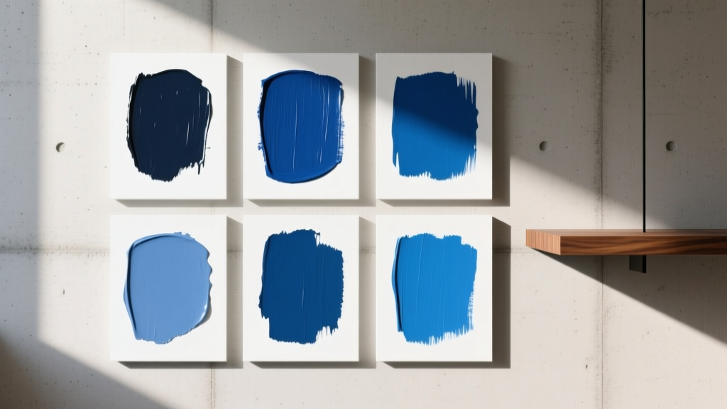
Best Lapis Blue Paint Colors - The Decor Mag
Lapis blue is one of those rare colors that feels both timeless and daring. Rooted in the deep ultramarine hues of the gemstone lapis lazuli, it carries a sense of history and artistry—yet it reads fresh in modern interiors when paired with the right undertones and finishes. If you love saturated color but don’t want a room that feels gloomy or overly trendy, lapis blue paint colors offer a confident middle ground: bold, elegant, and surprisingly versatile.
Homeowners often reach for “navy” when they want depth, but lapis blue is different. It’s typically a touch brighter, with a jewel-like clarity that can lean slightly violet or slightly green depending on the brand and lighting. That undertone shift matters. Lapis blue can look regal in a dining room, calming in a bedroom, dramatic on cabinetry, or crisp on an accent wall—if you choose the right formula and coordinate it with your home’s fixed finishes.
This guide breaks down the best lapis blue paint colors, how to use them room by room, what to pair them with, and the common mistakes that make this shade feel “off.”
What Makes a Paint Color “Lapis Blue”?
Lapis blue sits in the saturated blue family, often between royal blue and deep navy, with a mineral richness that reads more gemstone than “primary.” Think of it as a high-impact blue that still has sophistication—especially when it’s balanced with warm neutrals, natural materials, and thoughtful lighting.
Undertones to Watch
- Violet undertone: Feels luxe and moody; stunning with brass, burgundy, and soft white.
- Green undertone: Feels slightly teal-leaning; pairs beautifully with warm woods and creamy neutrals.
- Neutral/true blue: Clean and classic; a strong choice for cabinets and built-ins.
Color Psychology: Why Lapis Blue Works
Blue is associated with calm, clarity, and trust, which is why it’s used in everything from branding to wellness spaces. Lapis blue adds a layer of confidence and creativity because of its saturation. In interiors, it can:
- Make a room feel grounded and intentional
- Create a “cocoon” effect without turning gray or flat
- Highlight art and warm metals (brass, aged gold, copper)
Best Lapis Blue Paint Colors (Designer-Approved Picks)
Below are standout lapis blue paint colors from major brands, with guidance on undertones and best uses. Always test in your own lighting—lapis blue can shift dramatically from morning to evening.
Benjamin Moore Lapis Lazuli (CSP-690)
Why it works: A rich, gemstone blue that feels authentic to the lapis inspiration—saturated, refined, and artistic.
- Undertone: Slight violet-leaning jewel tone
- Best for: Dining rooms, libraries, accent walls, statement ceilings
- Pairs well with: Benjamin Moore White Dove (OC-17), warm walnut, antique brass
Benjamin Moore Newburyport Blue (HC-155)
Why it works: A classic deep blue that can read lapis in brighter rooms—less “inky navy,” more luminous and historic.
- Undertone: Slightly green-leaning (complex, not teal)
- Best for: Exterior doors, kitchen islands, built-ins, mudrooms
- Pairs well with: BM Simply White (OC-117), natural oak, crisp marble
Sherwin-Williams Naval (SW 6244)
Why it works: A deep, authoritative blue that can feel lapis when styled with bright whites and warm metallics. Ideal when you want drama without leaning purple.
- Undertone: Neutral-to-slightly cool
- Best for: Kitchen cabinets, office walls, modern accent spaces
- Pairs well with: SW Alabaster (SW 7008), light greige, black accents
Sherwin-Williams Blue Peacock (SW 0064)
Why it works: A bold, jewel-saturated blue with a hint of teal energy. If you want lapis with extra intensity, this is a showpiece.
- Undertone: Green-leaning jewel tone
- Best for: Powder rooms, bar areas, dramatic built-ins
- Pairs well with: creamy whites, cane/rattan, warm brass
Farrow & Ball Hague Blue (No. 30)
Why it works: A deep, complex blue that can read lapis in low light—heritage and depth with an elegant, slightly smoky finish.
- Undertone: Green-black depth (moody and layered)
- Best for: Bedrooms, studies, millwork, cabinetry
- Pairs well with: off-white trim, ochre accents, vintage rugs
Behr Starless Night (S530-7)
Why it works: A deep, saturated blue that’s approachable and widely available—great for accent walls and furniture flips.
- Undertone: Cool-leaning; can read slightly violet in some lighting
- Best for: Accent walls, bookcases, DIY projects, entryways
- Pairs well with: bright white, pale wood tones, brushed gold
How to Use Lapis Blue in Real Rooms
Living Room: A Jewel-Tone Accent Wall That Feels Collected
Scenario: You have a neutral sofa and want a focal point without going full dark room.
Try: Benjamin Moore Lapis Lazuli on the fireplace wall or behind the sofa.
- Keep trim a clean, warm white (White Dove is a favorite for a reason).
- Add texture to prevent a “flat” look: bouclé, linen, velvet, woven shades.
- Repeat the blue 2–3 times in the room (art, a pillow, a ceramic lamp) for balance.
Kitchen: Lapis Blue Cabinets Without Overwhelming the Space
Scenario: You want bold kitchen cabinets but worry about resale or darkness.
Try: Sherwin-Williams Naval or Benjamin Moore Newburyport Blue on lower cabinets or the island.
- Use lighter uppers (white or warm greige) to keep the room bright.
- Choose hardware that warms the blue: brushed brass, aged bronze, or even polished nickel for a crisp look.
- Pair with warm whites and creamy stone; stark cool whites can make the blue feel harsh.
Bedroom: A Deep Blue Cocoon That Still Feels Restful
Scenario: You want a calming bedroom that feels boutique-hotel polished.
Try: Farrow & Ball Hague Blue or Benjamin Moore Lapis Lazuli on all four walls (especially if you have good natural light).
- Use layered neutrals: ivory bedding, taupe throws, wood nightstands.
- Balance saturation with soft lighting: warm LED bulbs (2700K) and shaded lamps.
- Consider a matte finish for walls to reduce glare and create depth.
Bathroom/Powder Room: High Drama, Small Commitment
Scenario: You want a “wow” moment without painting an open-plan space.
Try: Sherwin-Williams Blue Peacock or Behr Starless Night.
- Pair with a warm white ceiling and crisp trim for a tailored look.
- Lean into glam materials: unlacquered brass, marble-look porcelain, framed mirror.
- Add a patterned wallpaper above wainscoting for extra dimension.
Home Office: Focus and Confidence Without Feeling Corporate
Scenario: You want a background that looks polished on video calls and supports concentration.
Try: Sherwin-Williams Naval on the main wall behind your desk or built-in shelving.
- Use a warm neutral on surrounding walls if the room is small.
- Choose wood tones (walnut, medium oak) for warmth and sophistication.
- Add art with warm accents—camel, terracotta, and gold energize lapis blue.
Best Color Schemes for Lapis Blue
Lapis blue shines in a structured color palette. Use design principles like contrast, temperature balance, and repetition to make it feel intentional.
1) Lapis Blue + Warm White (Classic Contrast)
- Best for: trim, ceilings, cabinetry pairings
- Look for: creamy whites rather than icy whites
- Try pairing with: SW Alabaster, BM White Dove
2) Lapis Blue + Soft Greige (Modern and Grounded)
- Best for: open plans and transitional homes
- Why it works: greige softens the saturation and adds warmth
3) Lapis Blue + Brass + Walnut (Jewel-Box Luxe)
- Best for: dining rooms, bars, bedrooms
- Design tip: repeat brass in at least two places (hardware + lighting) for cohesion
4) Lapis Blue + Terracotta/Clay (Artful and Inviting)
- Best for: boho, Mediterranean, eclectic interiors
- Design tip: use terracotta in textiles and decor, not necessarily large furniture
5) Lapis Blue + Emerald + Cream (Bold but Balanced)
- Best for: maximalist or vintage-inspired spaces
- Rule of thumb: keep one of the jewel tones as an accent to avoid visual overload
Paint Finish and Lighting Tips (Where Lapis Blue Wins or Fails)
- Matte/flat: Best for walls when you want a velvety, moody effect (great in bedrooms and dining rooms).
- Eggshell: A practical choice for living rooms and hallways—slightly more washable.
- Satin/pearl: Ideal for cabinetry and trim where durability matters.
- Semi-gloss: Use sparingly on doors and trim; too much shine can make deep blues show imperfections.
Lighting guidance:
- North-facing rooms can make lapis blue look cooler and darker—choose a slightly brighter lapis shade or increase warm lighting.
- South-facing rooms intensify the jewel quality—great for bold choices, but test to avoid an overly vibrant look.
- Always sample at least two walls and view it at morning, afternoon, and night.
Common Lapis Blue Paint Mistakes to Avoid
- Choosing the color without checking undertones against fixed finishes. Granite, tile, and flooring can pull lapis blue greener or purpler. Hold samples next to countertops and fabrics you’re keeping.
- Pairing lapis blue with a stark, icy white. This often reads “high contrast” in a harsh way. Softer whites make lapis blue look richer and more expensive.
- Using the wrong bulb temperature. Cool LEDs (4000K+) can make deep blues feel flat and clinical. Aim for warm white lighting around 2700K–3000K.
- Ignoring sheen differences. The same lapis blue looks deeper in matte and brighter in satin. Pick finish based on the surface and the mood you want.
- Not balancing saturation with texture. If everything is smooth (flat walls, flat rug, flat curtains), lapis blue can feel heavy. Add woven, nubby, or natural materials.
FAQ: Lapis Blue Paint Colors
Is lapis blue the same as navy?
No. Navy is typically darker and more muted (often “inkier”). Lapis blue tends to be more jewel-toned and luminous, sometimes with a subtle violet or green undertone.
What trim color works best with lapis blue walls?
Warm whites are the safest and most sophisticated pairing. Popular choices include Benjamin Moore White Dove (OC-17) and Sherwin-Williams Alabaster (SW 7008). If you want a sharper look, try a clean white, but avoid overly cool whites in rooms with warm lighting and wood tones.
Will lapis blue make a room look smaller?
Deep colors can visually “pull in” the walls, but that often feels cozy rather than cramped when you use consistent color on walls (and sometimes even the trim) and layer lighting. In small rooms like powder rooms, lapis blue can be especially striking.
What’s the best lapis blue paint color for kitchen cabinets?
Sherwin-Williams Naval (SW 6244) and Benjamin Moore Newburyport Blue (HC-155) are reliable, cabinet-friendly picks. They read classic, pair well with many countertop materials, and look elevated with brass or polished nickel hardware.
How do I test lapis blue paint correctly?
Use a large sample (at least 12x12, bigger is better) and test on multiple walls. View it next to your flooring, countertops, and upholstery. Check it in daylight and at night with your actual light bulbs to confirm undertones.
What accent colors make lapis blue feel warmer?
Brass, camel, cognac leather, terracotta, warm wood tones, and creamy whites all warm up lapis blue and keep it from feeling too cool or formal.
Next Steps: Bring Lapis Blue Home With Confidence
Start by deciding where you want lapis blue to live: a statement wall, cabinetry, a moody bedroom, or a small space with big impact. Pick 2–3 contenders from the list above, sample them in your room, and build a simple palette around warm white, natural textures, and one or two supporting accents (brass, walnut, terracotta, or soft greige). When lapis blue is balanced thoughtfully, it delivers that coveted mix of calm and charisma—polished, personal, and memorable.
For more paint color ideas, color schemes, and room-by-room guidance, explore our latest color guides on thedecormag.com.
More Articles
 Best Berry Red Paint Colors - The Decor Mag
 How to Use Muted Colors for Sophistication - The Decor Mag
 Best Honey Paint Colors - The Decor Mag
 How to Choose Colors for a Nursery - The Decor Mag
 Best Indigo Paint Colors - The Decor Mag
 How to Create a High Contrast Color Scheme - The Decor Mag
 How to Choose Colors for a Reading Room - The Decor Mag
 Best Champagne Paint Colors - The Decor Mag
 Best Red Paint Colors for Drama and Warmth - The Decor Mag
 How to Create a Restraint Color Palette - The Decor Mag