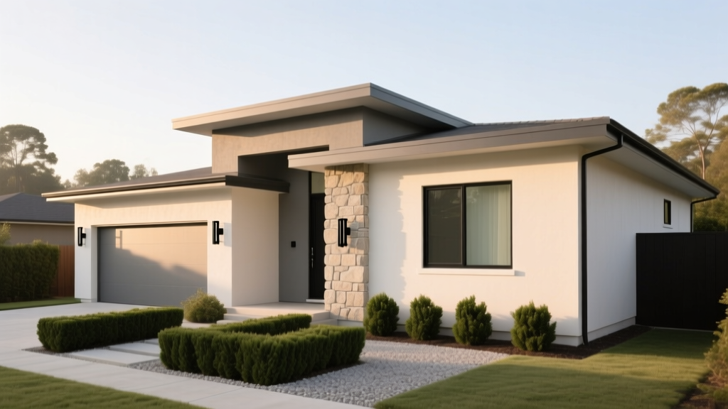
How to Choose Exterior House Colors - The Decor Mag
Your home’s exterior color is the first design decision everyone sees—neighbors, guests, potential buyers, and even you every time you pull into the driveway. It communicates personality, sets expectations for what’s inside, and can make a house feel welcoming, elevated, modern, classic, or quietly tucked into its landscape. The right exterior paint colors also work hard: they visually correct awkward proportions, highlight architectural details, and connect your home to the roof, stonework, hardscaping, and surrounding greenery.
Exterior color choice matters for practical reasons, too. Sun exposure changes how paint colors read, shadows shift throughout the day, and weather can punish underperforming finishes. A smart color scheme can reduce heat gain, hide dirt, and help materials look intentional rather than mismatched. With a clear process and a few design principles, choosing exterior house colors becomes far less intimidating—and far more creative.
This guide breaks down how to build a cohesive exterior color palette using color theory, color psychology, and real-world application scenarios, with specific exterior paint color recommendations to help you confidently move from inspiration to a front door you love coming home to.
Start with What You Can’t (or Won’t) Change
Before you fall in love with a paint chip, inventory the fixed elements. A successful exterior color scheme aligns with these “non-negotiables,” because they have their own undertones and visual weight.
Fixed elements to match
- Roof color: shingles, metal roofing, tile (often the biggest color driver)
- Stone/brick: undertones vary widely—orange-red, purple-red, tan, gray, buff
- Hardscape: pavers, concrete, retaining walls, steps
- Windows: white, black, bronze, wood-clad, vinyl beige
- Gutters and downspouts: they stand out if not coordinated
- Landscaping: evergreens add cool depth; warm plantings can shift perception
Quick undertone check
Hold a true white sample (like Benjamin Moore Chantilly Lace OC-65) next to brick, roof shingles, or stone. If the material looks pink, peach, green, or blue by comparison, that’s your undertone clue. Matching undertones is the fastest path to an exterior palette that looks “meant to be.”
Understand Exterior Color Theory: Hue, Value, and Undertone
Most exterior color disappointments aren’t about the “wrong” color; they’re about choosing the wrong value (lightness/darkness) or undertone for the conditions.
Hue: the family
Exterior house colors typically live in these families: whites and off-whites, greiges, beiges, taupes, grays, sages, blues, and charcoals. Choose your primary hue based on architecture and context (more on that below).
Value: how light or dark it reads
- Light exteriors feel open, classic, and tend to show shadows and trim detail well.
- Mid-tone exteriors are forgiving with landscaping and roof color, often the safest choice.
- Dark exteriors feel modern and dramatic but can fade faster in strong sun and may emphasize dust/pollen.
Undertone: the secret ingredient
A “gray” can read blue, green, purple, or warm taupe depending on undertone. Exterior light is cooler and brighter than interior light, so subtle undertones become more noticeable outdoors. When in doubt, pick colors that share undertones across body, trim, and accents.
Choose a Color Scheme That Fits Your Home’s Architecture
Exterior paint colors should reinforce the home’s style rather than fight it. Use your architecture as a filter for what will look timeless.
Traditional and Colonial homes
These homes shine with balanced, classic exterior color schemes: warm whites, historic grays, navy doors, and crisp trim.
- Body: Benjamin Moore White Dove OC-17 (soft warm white)
- Trim: Benjamin Moore Simply White OC-117 (cleaner, slightly brighter)
- Front door: Sherwin-Williams Naval SW 6244 or Benjamin Moore Hale Navy HC-154
Craftsman and bungalow exteriors
Craftsman homes love earth-based palettes: olives, warm grays, mushrooms, and deep accent colors that highlight brackets and trim.
- Body: Sherwin-Williams Urbane Bronze SW 7048 (warm, grounded)
- Trim: Sherwin-Williams Alabaster SW 7008 (creamy, classic)
- Accent (shakes/rafters): Sherwin-Williams Iron Ore SW 7069
Modern and contemporary homes
Modern architecture benefits from fewer colors with stronger contrast—think crisp whites, charcoal grays, black trim, and warm wood tones.
- Body: Benjamin Moore Chantilly Lace OC-65 (bright modern white)
- Trim/windows (if painting): Sherwin-Williams Tricorn Black SW 6258
- Alternate body: Benjamin Moore Wrought Iron 2124-10 (soft black)
Farmhouse and cottage styles
Farmhouse palettes are approachable and high-contrast, with black accents and nature-forward colors (whites, sages, dusty blues).
- Body: Sherwin-Williams Alabaster SW 7008
- Trim: Sherwin-Williams Pure White SW 7005
- Front door: Sherwin-Williams Evergreen Fog SW 9130 or Benjamin Moore Black Forest Green 2130-20
Build a 3-Part Exterior Palette (Body, Trim, Accent)
A reliable method for choosing exterior paint colors is the “60-30-10” concept adapted for facades:
- Body color (majority): siding, stucco, main walls
- Trim color (secondary): fascia, window trim, corner boards, railings
- Accent color (small but mighty): front door, shutters, porch ceiling, garage door, window sash
Where to use contrast
- Want the house to feel larger? Keep body and trim close in value (low contrast).
- Want to highlight details? Increase contrast at trim and gables.
- Want a modern look? Choose a limited palette with bold accents (black trim, wood door, single body color).
How Sunlight and Surroundings Change Exterior Paint Colors
Exterior light can make a paint color look 1–2 shades lighter, especially on large surfaces. Direction also matters:
- North-facing: cooler, shadow-heavy; warm whites and warm greiges prevent a chilly look.
- South-facing: bright and warm; many colors wash out—consider deeper mid-tones.
- East-facing: bright morning, cooler afternoon; colors shift throughout the day.
- West-facing: intense warm light late day; can amplify yellow/red undertones.
Practical tip: Choose three contenders, then sample them in 2’x2’ swatches on multiple sides of the house. View morning, midday, and dusk. This beats judging from a tiny paint chip every time.
Specific Exterior Color Combinations You Can Trust
These curated exterior color schemes balance design principles, color psychology, and broad curb appeal. Use them as-is or as a starting template.
1) Warm white + soft black + natural wood (modern classic)
- Body: Benjamin Moore White Dove OC-17
- Trim: Benjamin Moore Chantilly Lace OC-65 (crisper edge)
- Accent: Sherwin-Williams Tricorn Black SW 6258 (door or window sash)
Application scenario: A 1990s two-story with white vinyl windows and a medium-gray roof. White Dove warms up the facade, while a black front door and black lighting instantly modernize without fighting the roof.
2) Greige body + bright white trim + navy door (timeless curb appeal)
- Body: Sherwin-Williams Agreeable Gray SW 7029
- Trim: Sherwin-Williams Pure White SW 7005
- Accent: Benjamin Moore Hale Navy HC-154
Color psychology: Greige reads calm and balanced; navy signals stability and polish. This is a go-to exterior paint color scheme for resale-friendly updates.
3) Sage green + creamy trim + black accents (nature-forward and welcoming)
- Body: Sherwin-Williams Evergreen Fog SW 9130
- Trim: Sherwin-Williams Alabaster SW 7008
- Accent: Sherwin-Williams Iron Ore SW 7069
Application scenario: A cottage with a garden-heavy front yard. Sage green harmonizes with foliage, while creamy trim keeps the home bright in shade.
4) Mid-tone blue-gray + white trim + warm wood door (coastal without feeling themed)
- Body: Benjamin Moore Boothbay Gray HC-165
- Trim: Benjamin Moore Simply White OC-117
- Accent: Natural stained wood or Benjamin Moore Kendall Charcoal HC-166 for shutters
Real-home example: A Cape Cod with a charcoal roof and fieldstone walkway. Boothbay Gray bridges cool stone and dark roof, while a wood door adds warmth and character.
5) Deep charcoal body + soft white trim + muted green door (dramatic, still livable)
- Body: Benjamin Moore Wrought Iron 2124-10
- Trim: Benjamin Moore White Dove OC-17
- Accent: Benjamin Moore Essex Green HC-188 (a classic, almost-black green)
Best for: Homes with strong lines, large windows, or lush landscaping that can “hold” a darker exterior.
Real-World Application Scenarios (What to Do With Common Challenges)
Scenario A: You have red brick you’re not painting
Red brick often carries orange or purple undertones. Avoid icy grays that make brick look overly orange.
- Try: Benjamin Moore Edgecomb Gray HC-173 (warm greige) or Sherwin-Williams Accessible Beige SW 7036
- Trim: warm white like White Dove OC-17
- Accent: deep bronze (Urbane Bronze SW 7048) or a nearly-black green
Scenario B: Your house sits in heavy shade
Shaded exteriors can make cool colors look flat and somber. Use warmer whites and avoid grays with blue undertones.
- Body: Sherwin-Williams Alabaster SW 7008 or Benjamin Moore Swiss Coffee OC-45
- Trim: slightly brighter warm white for definition
- Door: classic color with depth like Hale Navy HC-154 or Iron Ore SW 7069
Scenario C: You want a white house but fear it will look glaring
Choose an off-white with a soft undertone rather than a stark builder white. Pair with a trim that’s either slightly crisper or slightly creamier—just don’t make them identical unless you want a minimal look.
- Body: Benjamin Moore White Dove OC-17
- Trim: Benjamin Moore Simply White OC-117
- Accent: Sherwin-Williams Tricorn Black SW 6258 or a stained wood door
Scenario D: Your roof is a strong color (brown, red, or green)
Let the roof lead. Your exterior wall color should support it, not compete.
- Brown roof: warm greiges and beiges (e.g., Edgecomb Gray HC-173)
- Red roof: warm neutrals, creamy whites, earthy greens (e.g., Evergreen Fog SW 9130)
- Green roof: softer warm whites and muted taupes (avoid crisp blue-grays)
Common Exterior Color Mistakes to Avoid
- Choosing by paint chip alone: Exterior scale and sunlight change everything—always test large samples.
- Ignoring undertones in stone/brick: The “wrong” gray can make brick look neon orange or muddy.
- Overusing high contrast on busy architecture: Too many contrasting details can make a home feel fragmented.
- Painting trim too bright on a warm body: A stark cool white trim can look harsh next to a warm beige or greige.
- Picking trendy dark colors without considering fading: Deep charcoals and blacks can fade faster in intense sun; use high-quality exterior paint and expect maintenance.
- Forgetting the garage door: Painting the garage door to match the body color often looks more seamless than highlighting it.
Practical Tips for Sampling and Execution
- Test on multiple sides: Paint sample boards and move them—don’t commit based on one wall.
- View from the curb: Exterior color is experienced at a distance; step back 20–40 feet.
- Coordinate sheen by surface:
- Body: satin or low-luster for durability and evenness
- Trim: satin or semi-gloss for crisp lines and wipeability
- Front door: semi-gloss or gloss for impact
- Limit the palette: For most homes, three colors are enough; four can work if one is brick/stone.
- Use color repetition: Repeat the accent color in house numbers, lighting, or a mailbox for a designed look.
FAQ: Choosing Exterior House Colors
What exterior paint colors help resale value?
Resale-friendly exterior color schemes tend to be classic and broadly appealing: warm whites, greiges, soft grays (not icy), and deep accents like navy or charcoal. Pairing a neutral body with a confident front door color (navy, black, deep green) often reads polished without feeling risky.
Should trim be lighter or darker than the body color?
Most traditional homes use lighter trim to emphasize windows and architectural lines. Darker trim can look striking on modern homes but increases contrast and visual activity. If your home has lots of trim detail, lighter trim usually looks cleaner and more cohesive.
How do I choose a front door color that works?
Pick a door color that relates to something already present—roof undertone, stone flecks, or metal finishes. Popular choices include Sherwin-Williams Naval SW 6244, Benjamin Moore Hale Navy HC-154, Sherwin-Williams Tricorn Black SW 6258, and Benjamin Moore Essex Green HC-188. A door color should feel intentional, not random.
Are dark exterior paint colors a bad idea?
Not at all, but they require planning. Dark colors can fade faster in high sun and show dust and pollen more readily. Choose premium exterior paint, confirm HOA rules, and test large swatches. Dark exteriors look best when balanced with warm materials (wood, stone) and thoughtfully placed lighting.
How many colors should an exterior have?
Three is the sweet spot for most homes: body, trim, and accent. If you have unpainted brick or stone, treat that as one of your “colors” and keep the painted choices simple so the facade doesn’t feel busy.
What’s the best white exterior paint color?
“Best” depends on your fixed elements and exposure, but top performers include Benjamin Moore White Dove OC-17 (soft warm), Sherwin-Williams Alabaster SW 7008 (creamy and forgiving), and Benjamin Moore Chantilly Lace OC-65 (bright and modern). Always sample outside—white is especially sensitive to undertones.
Your Next Steps: A Simple Plan to Pick the Right Exterior Paint Colors
- Photograph your home and note roof, brick/stone, and window colors.
- Choose a body color family that matches those undertones (warm vs cool).
- Select trim and accent colors using a 3-part palette: body, trim, door/shutters.
- Sample three options in large swatches on multiple sides and view at different times of day.
- Commit to quality materials and cohesive finishes for long-lasting curb appeal.
Exterior color design blends psychology (how a color makes you feel), principles (contrast, balance, harmony), and practical conditions (sun, scale, materials). When those pieces align, the result is an exterior that feels intentional, elevated, and unmistakably yours.
Ready for more? Explore more color guides, paint color roundups, and designer-tested color schemes on thedecormag.com.
More Articles
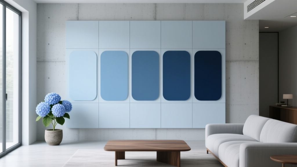 Best Hydrangea Blue Paint Colors - The Decor Mag
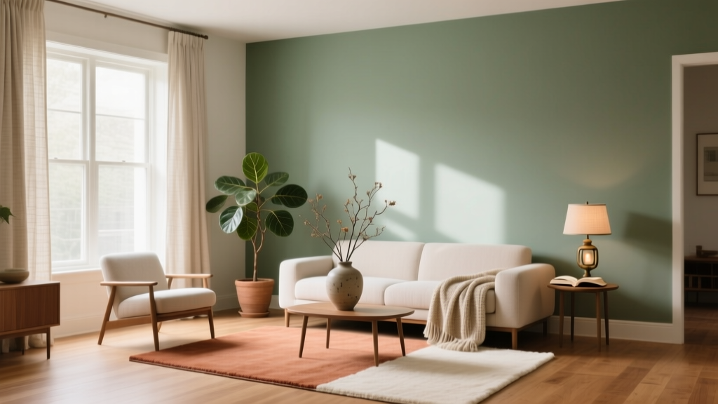 Color Psychology in Home Design Guide - The Decor Mag
 How to Use Color to Create Warmth - The Decor Mag
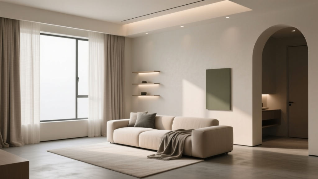 How to Create a Low Contrast Color Palette - The Decor Mag
 Best Charcoal Paint Colors for Modern Spaces - The Decor Mag
 How to Choose Colors Based on Room Lighting - The Decor Mag
 Reading FAQ Answered: Evidence-Based Answers to 27 Common Questions About Vision, Eye Health, and Reading Performance
 Best Lapis Blue Paint Colors - The Decor Mag
 How to Choose Colors for a Deck - The Decor Mag
 How to Choose Colors for a Nursery - The Decor Mag