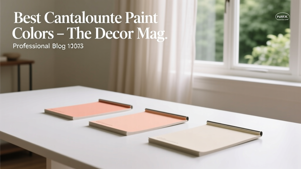
Best Cantaloupe Paint Colors - The Decor Mag
Cantaloupe is the sweet spot between peach and orange—warm, optimistic, and surprisingly sophisticated when used with intention. As a paint color, it brings the glow of late-afternoon sunlight into a room without the intensity of a true orange, making it a favorite for homeowners who want more personality than beige but less commitment than red.
This shade family matters because it solves a common design problem: how to make a space feel welcoming and energized while still looking polished. Cantaloupe paint colors can read coastal, retro, modern, Mediterranean, or classic depending on the undertones you pair them with. When you understand those undertones (and the lighting in your home), cantaloupe becomes one of the most versatile “happy colors” in interior color design.
Below you’ll find the best cantaloupe paint color options, how to use them in real rooms, foolproof color schemes, and the most common mistakes to avoid—so you can get the warmth you want with a finished, designer-worthy result.
What Is a Cantaloupe Paint Color?
Cantaloupe sits in the orange family, softened by peach and apricot notes. It typically has:
- Warm undertones (yellow, peach, coral)
- Medium lightness (not pastel, not neon)
- A “sunlit” feel that can brighten shadowy spaces
Color psychology: why cantaloupe works
Orange-leaning hues are associated with warmth, sociability, appetite, and creativity. Cantaloupe specifically tends to feel:
- Inviting in entryways and living rooms
- Appetite-friendly in kitchens and dining rooms
- Motivating in studios, craft rooms, and home gyms
- Comforting when balanced with calm neutrals
How to Choose the Right Cantaloupe Shade for Your Home
Before picking a specific paint color, narrow your direction with these design principles.
1) Consider undertones and adjacent finishes
Cantaloupe can lean more peachy (pink-red undertone) or more apricot (yellow undertone). Check it against the fixed elements in your home:
- Warm woods (oak, maple, walnut): look for apricot-leaning cantaloupes to avoid a pink clash.
- Cool marbles (Carrara, white quartz with gray veining): choose a slightly coral cantaloupe to bridge warm and cool.
- Terracotta tile: pick a lighter cantaloupe so the room doesn’t become too saturated.
- Brass and gold metals: most cantaloupes look fantastic; avoid overly pink shades if brass already reads rosy.
2) Match the color to the room’s natural light
- North-facing rooms: cantaloupe can look muted or slightly muddy—choose a clearer, brighter shade and pair with warm white trim.
- South-facing rooms: cantaloupe glows; you can go deeper or more saturated without it feeling heavy.
- East-facing rooms: mornings look warm and sunny; afternoons can flatten the color—test it in both conditions.
- West-facing rooms: late-day light can intensify orange; select a softer cantaloupe to prevent a too-hot look.
3) Pick the right paint sheen for the effect you want
- Flat/Matte: best for walls where you want a soft, modern look (and where wall texture is forgiving).
- Eggshell/Satin: ideal for high-traffic rooms (kitchens, halls) and makes cantaloupe feel slightly more luminous.
- Semigloss: great for trim, doors, and cabinetry; cantaloupe semigloss can look punchy and retro in the best way.
Best Cantaloupe Paint Colors (Designer-Approved Picks)
These cantaloupe and cantaloupe-adjacent paint colors are widely loved because they’re balanced—warm without looking fluorescent, and cheerful without looking juvenile. Always sample on the wall; lighting can shift orange tones dramatically.
1) Sherwin-Williams Navel (SW 6887)
Best for: statement walls, playful powder rooms, bold front doors
Navel is a juicy orange that can read “cantaloupe” in brighter spaces. Use it when you want energy and clarity. Pair it with creamy whites and natural textures to keep it grounded.
- Pairs well with: SW Alabaster (SW 7008), warm oak, rattan, matte black accents
- Try it in: an entryway with a sisal runner and brass hooks
2) Sherwin-Williams Persimmon (SW 6339)
Best for: kitchens, dining rooms, creative studios
Persimmon is a rich, warm orange that can skew deeper than cantaloupe, but it’s a strong pick if you want a cozy, appetite-friendly room. It looks especially good against white tile and wood shelves.
- Pairs well with: SW Pure White (SW 7005), warm grays, walnut, aged brass
- Try it in: a breakfast nook with white beadboard and a round wood table
3) Benjamin Moore Coral Gables (2010-40)
Best for: accent walls, bohemian living rooms, sunset-inspired bedrooms
Coral Gables leans coral-cantaloupe: warm, tropical, and lively. It’s ideal when you want orange with a soft pink lift, especially in rooms that feel a bit flat.
- Pairs well with: BM White Dove (OC-17), cane furniture, creamy linens, deep teal accents
- Try it in: a living room with layered neutral textiles and a vintage rug
4) Benjamin Moore Orange Blossom (2168-20)
Best for: front doors, mudrooms, furniture flips, kids’ play spaces
This is a brighter, more saturated orange that reads fresh and modern when paired with crisp whites. Use it in controlled doses for maximum impact.
- Pairs well with: BM Chantilly Lace (OC-65), charcoal accents, light woods
- Try it in: a painted bench or built-in cubbies in a mudroom
5) Farrow & Ball India Yellow (No. 66)
Best for: traditional homes, libraries, dining rooms, curated vintage spaces
India Yellow is a sophisticated golden-orange that can land in the cantaloupe realm when the light is warm. It delivers depth and a historic feel, especially with darker woods.
- Pairs well with: inky blues, olive greens, warm whites, antique brass
- Try it in: a dining room with a vintage sideboard and linen drapes
6) Behr Apricot Light (M180-2) or similar soft apricot options
Best for: low-commitment cantaloupe, open-concept spaces, nurseries
Soft apricot shades are the “gateway” cantaloupes: warm, flattering, and easy to live with. Look for apricot-light tones when you want a gentle glow rather than a bold orange statement.
- Pairs well with: warm whites, greige, pale sage, blond woods
- Try it in: a hallway to make the transition spaces feel sunny
Cantaloupe Color Schemes That Always Look Intentional
Great interior color design relies on balance. Use these color combinations to make cantaloupe feel elevated rather than loud.
Warm neutral + cantaloupe (cozy and timeless)
- Cantaloupe walls + creamy white trim
- Add camel leather, warm oak, and linen
- Best for: living rooms, family rooms, transitional homes
Cantaloupe + teal or deep blue (high contrast, designer energy)
- Cantaloupe accent wall + deep teal sofa or navy cabinetry
- Anchor with white and natural fiber textures
- Best for: offices, eclectic living rooms, dining rooms
Cantaloupe + sage green (soft, fresh, nature-inspired)
- Cantaloupe accessories or a painted vanity + sage walls
- Use brushed brass and ivory tile
- Best for: bathrooms, kitchens, sunrooms
Monochromatic warm palette (cantaloupe + terracotta + blush)
- Layer warm tones in varying depths
- Keep large elements neutral (rug, sofa) so it doesn’t overwhelm
- Best for: bedrooms and relaxed, Mediterranean-inspired spaces
Real Room Examples: Where Cantaloupe Paint Shines
1) Cantaloupe in the living room
Use cantaloupe as an accent wall behind a sofa or fireplace to create a focal point that feels welcoming. Keep the rest of the room light to avoid visual heaviness.
- Best approach: One accent wall in SW Navel or BM Coral Gables
- Style it with: ivory curtains, a textured neutral rug, walnut or oak coffee table
2) Cantaloupe in a kitchen or breakfast nook
Orange-adjacent hues are known to stimulate appetite and conversation—perfect for eating spaces. If full walls feel bold, paint a pantry door, island base, or open shelving backing.
- Best approach: SW Persimmon on a built-in banquette or lower cabinets
- Finishes that help: white zellige tile, warm white walls, aged brass pulls
3) Cantaloupe in a bedroom (yes, it can be relaxing)
Cantaloupe works in bedrooms when it’s softened with calming companions: warm whites, blush, and muted greens. The trick is choosing a slightly muted cantaloupe and using it strategically—behind the bed or on a ceiling for a sunset effect.
- Best approach: a soft apricot-cantaloupe for all walls, or one statement wall
- Style it with: oatmeal bedding, light wood nightstands, olive or sage throw pillows
4) Cantaloupe in a bathroom or powder room
Smaller spaces love confident color. Cantaloupe brings flattering warmth to skin tones and looks stunning with tile and metal finishes.
- Best approach: semi-gloss or satin walls in BM Orange Blossom for a crisp, clean look
- Pair with: white tile, black fixtures for contrast, or brushed brass for warmth
5) A cantaloupe front door or statement trim
If you want the charm of cantaloupe without repainting a whole room, use it on a door, trim, or built-ins. This is also a smart option for open-concept homes where a strong wall color might dominate.
- Best approach: F&B India Yellow or SW Navel on the front door
- Instant curb appeal: pair with warm white exterior paint and matte black hardware
Practical Tips for Sampling Cantaloupe Paint Colors
- Sample large: paint at least a 2' x 2' area (or use peel-and-stick samples) on multiple walls.
- Check at 3 times: morning, afternoon, and evening under lamplight.
- Compare to a true white: hold a sheet of bright white paper next to the sample to reveal undertones.
- Match your bulbs: 2700K lighting makes cantaloupe warmer; 3000K is cleaner; 4000K can make it look harsher.
- Confirm with textiles: test beside your sofa fabric, countertop sample, flooring, and key wood tones.
Common Cantaloupe Color Mistakes (and How to Avoid Them)
- Choosing too bright for the room’s light: West-facing rooms can turn cantaloupe into traffic-cone orange. Fix: pick a softer, more muted cantaloupe or use it as an accent only.
- Pairing with the wrong white: Cool, blue-white trim can make cantaloupe look garish. Fix: use warm whites like SW Alabaster or BM White Dove.
- Ignoring undertones in stone and tile: Gray-veined quartz can fight a yellow-leaning cantaloupe. Fix: choose a cantaloupe with a subtle coral undertone to bridge the gap.
- Overusing warm tones without contrast: Too much orange, red, and brown can feel heavy. Fix: add contrast with deep blue, charcoal, crisp white, or muted green.
- Not considering sheen: High gloss can exaggerate saturation and highlight wall imperfections. Fix: use matte/eggshell for walls and reserve semigloss for doors/trim.
FAQ: Best Cantaloupe Paint Colors
Is cantaloupe a good whole-house paint color?
Usually not for every room, especially in open-concept layouts. Cantaloupe shines as an accent color, a single-room statement, or a “feature element” (door, island, built-ins). For whole-house flow, use a warm neutral throughout and bring cantaloupe in selectively.
What trim color looks best with cantaloupe walls?
Warm white trim is the safest and most refined choice. Popular options include Sherwin-Williams Alabaster (SW 7008) and Benjamin Moore White Dove (OC-17).
What colors go well with cantaloupe paint?
Top pairings include:
- Warm neutrals: cream, ivory, greige
- Cool contrast: teal, navy, charcoal
- Earthy partners: sage, olive, terracotta, camel
Will cantaloupe paint make a room feel smaller?
Deep, saturated cantaloupes can visually advance and feel more enclosing, especially in low light. If you want openness, choose a softer apricot-cantaloupe, keep ceilings light, and use plenty of warm white and reflective surfaces.
Is cantaloupe paint outdated?
Not when styled with today’s finishes. Cantaloupe looks current with warm whites, light woods, limewashed textures, curved furniture, and mixed metals. It can feel dated when paired with stark cool grays or overly matching orange décor.
Next Steps: Bring Cantaloupe Home with Confidence
Start by choosing your “role” for cantaloupe—accent wall, cabinetry, door, or an all-over glow—then test 2–3 candidates in your actual lighting. Build a color scheme around warm whites and one contrasting anchor (deep blue, sage green, or charcoal) to keep the look intentional. With the right undertone and balance, cantaloupe paint colors deliver warmth, personality, and a welcoming mood that makes everyday spaces feel more alive.
Looking for more paint color ideas and color scheme guides? Explore more color inspiration and expert tips on thedecormag.com.
More Articles
 Best Jade Green Paint Colors - The Decor Mag
 How to Choose Exterior House Colors - The Decor Mag
 How to Use Color to Create Intimacy - The Decor Mag
 How to Choose Colors for a Craft Room - The Decor Mag
 The Ultimate Reading Guide: Science-Backed Strategies for Faster Comprehension, Retention, and Lifelong Engagement
 Best Poppy Red Paint Colors - The Decor Mag
 How to Create a High Contrast Color Scheme - The Decor Mag
 Best Apricot Paint Colors - The Decor Mag
 Warm vs Cool Color Temperatures Explained - The Decor Mag
 How to Choose Colors for Small Spaces - The Decor Mag