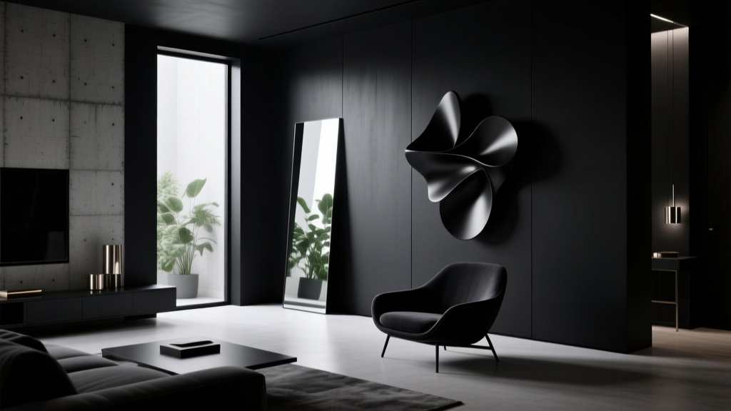
Best Black Paint Colors for Dramatic Spaces - The Decor Mag
Black paint has a reputation for being “too bold,” but in interior design it’s one of the most practical tools for creating depth, contrast, and instant atmosphere. Used thoughtfully, black becomes a neutral with range: it can read velvety and intimate in low light, crisp and architectural in bright spaces, or quietly sophisticated when paired with warm woods and soft textiles.
For homeowners and design enthusiasts, black paint colors solve common design problems: awkward proportions, rooms that feel flat, or spaces that lack a focal point. The right black can visually “edit” clutter, make art look curated, and elevate everyday rooms—powder baths, hallways, bedrooms, even kitchens—into dramatic, magazine-worthy moments.
This guide breaks down the best black paint colors (with brand-specific recommendations), how undertones shift in different lighting, where black works best, and how to avoid the mistakes that make black feel harsh instead of high-end.
Why Black Works: Color Psychology and Design Principles
Black is associated with elegance, strength, and grounded calm. In color psychology, darker hues can reduce visual noise and encourage a sense of retreat—one reason black bedrooms and dining rooms often feel cozy rather than gloomy when balanced with the right lighting and finishes.
Design principles that make black feel intentional
- Contrast: Black sharpens adjacent colors. Whites look cleaner, woods look richer, and metals read more luminous.
- Depth: Dark walls can visually recede, making a room feel more expansive or “endless” at night.
- Hierarchy: Black helps define what matters: a fireplace, built-ins, trim, doors, or an accent wall behind a bed.
- Continuity: Black unifies mixed finishes—especially helpful in older homes with varied trim styles.
Understanding Black Paint: Undertones, LRV, and Finish
Not all blacks read the same. Undertones (blue, green, brown, purple, or red) can shift depending on daylight direction, bulbs, and surrounding materials. Many “black” paints also sit slightly above true black, landing in very deep charcoal territory—often the sweet spot for real homes.
Undertone cheat sheet
- Blue-black: Crisp, modern, slightly cool; great with white, marble, chrome, and bright daylight.
- Green-black: Organic and moody; pairs beautifully with brass, walnut, and plants.
- Brown-black: Softer and warmer; ideal for cozy rooms, traditional homes, and north-facing light.
- Neutral black: Balanced; works in open-concept spaces where the black must coordinate with multiple adjacent colors.
LRV (Light Reflectance Value) and what it means for black
LRV measures how much light a color reflects (0 = absorbs most light, 100 = reflects most). Black paints typically have very low LRV. The lower the LRV, the more the room relies on lighting design. If you want drama without a cave effect, choose a “soft black” or deep charcoal rather than a near-true black.
Finish matters as much as color
- Matte/flat: Most forgiving; absorbs light for a velvety look. Ideal for bedrooms, ceilings, and imperfect walls.
- Eggshell: Slight sheen; easier to clean. Great for living rooms and hallways.
- Satin: Reflective and durable. Works well on trim, doors, and cabinetry when you want definition.
- High-gloss: Dramatic and reflective; best for accents (front doors, a single ceiling, built-ins) and flawless surfaces.
The Best Black Paint Colors (Designer-Approved Picks)
Below are standout black paint colors known for rich undertones and reliable performance across real homes. Always sample first—black is especially sensitive to lighting, and a small undertone can become dominant on a full wall.
1) Benjamin Moore Black Beauty (2128-10): A rich, classic near-black
Black Beauty is a beloved deep black that feels saturated and luxurious. It reads classic rather than trendy, making it a strong choice for timeless interior color design.
- Best for: Dining rooms, libraries, statement walls, built-ins
- Pair with: Warm whites (Benjamin Moore White Dove OC-17), walnut, antique brass
- Style vibe: Traditional, transitional, elevated modern
2) Benjamin Moore Wrought Iron (2124-10): Soft black with charcoal depth
Wrought Iron often reads like an inky charcoal, offering drama without the starkness of true black. It’s a go-to for homeowners who want moody walls that still feel livable.
- Best for: Open-concept spaces, exteriors, cabinetry, accent walls
- Pair with: Pale grays, creamy whites, natural oak, leather
- Style vibe: Modern farmhouse, Scandinavian modern, contemporary
3) Sherwin-Williams Tricorn Black (SW 6258): Clean, confident, and neutral
Tricorn Black is one of the most-used black paint colors in interiors because it reads reliably “black” without looking overly blue or brown. It’s especially strong for trim, doors, and architectural details.
- Best for: Interior doors, window trim, stair railings, fireplace surrounds
- Pair with: Sherwin-Williams Alabaster (SW 7008), marble, blackened steel
- Style vibe: Modern, minimalist, graphic contrast
4) Sherwin-Williams Iron Ore (SW 7069): Deep charcoal-black that feels approachable
Iron Ore is ideal when you want dramatic spaces but prefer a softer edge. It plays well with warm woods and tan, which can make it feel especially welcoming.
- Best for: Bedrooms, living rooms, kitchen islands, moody hallways
- Pair with: Greige walls, linen textiles, brass, cognac leather
- Style vibe: Warm modern, organic contemporary
5) Farrow & Ball Railings (No. 31): A refined blue-black
Railings is a sophisticated black with a subtle blue undertone that feels tailored and slightly coastal in the right light. It looks stunning with crisp whites and polished metals.
- Best for: Built-ins, cabinetry, powder rooms, trim in bright spaces
- Pair with: Strong whites, navy accents, chrome or nickel
- Style vibe: European classic, modern heritage
6) Farrow & Ball Off-Black (No. 57): Soft, smoky, and forgiving
If you love the idea of black walls but worry about harshness, Off-Black is an excellent compromise. It reads like a deep charcoal in most rooms, bringing depth without swallowing light.
- Best for: Bedrooms, studios, living rooms, ceilings
- Pair with: Warm neutrals, natural fibers, light oak, muted greens
- Style vibe: Relaxed modern, collected eclectic
7) Behr Cracked Pepper (PPU18-1): Budget-friendly, modern charcoal-black
Cracked Pepper is a popular “almost black” that photographs beautifully and feels contemporary. It’s a smart option for feature walls and cabinetry when you want a bold look at an accessible price point.
- Best for: Accent walls, home offices, kitchen islands
- Pair with: White quartz, matte black hardware, pale taupes
- Style vibe: Modern, urban, high-contrast
Where Black Paint Looks Best: Real Room Scenarios
Moody bedroom: Black walls behind the headboard
For a dramatic bedroom, paint the wall behind the bed in a soft black like Wrought Iron or Off-Black. Keep bedding light (ivory, oatmeal, pale gray) to create contrast without visual clutter.
- Lighting tip: Use warm bulbs (2700K) and add bedside sconces to prevent the wall from feeling flat.
- Texture tip: Mix matte walls with velvet pillows, boucle throws, and wood nightstands.
Statement dining room: Full black walls for an intimate glow
Dining rooms thrive with darker paint colors because they’re typically used at night. Black Beauty or Tricorn Black creates an enveloping backdrop for art and candlelight.
- Best combo: Black walls + warm brass chandelier + oak table + creamy trim
- Upgrade move: Add a large mirror to bounce light and amplify the drama.
High-impact powder room: Black + wallpaper + metal finishes
Small spaces can handle bold color schemes. Use Railings or Iron Ore on walls or trim, then layer in patterned wallpaper, a statement sconce, and a marble or stone vanity top.
- Try: Black walls with a vintage-style brass faucet and a warm white ceiling
- Proportion trick: Paint the ceiling black too for a jewel-box feel (best in matte).
Modern living room: Black fireplace or built-ins as an anchor
If full black walls feel like too much, paint the fireplace surround, built-ins, or a media wall in Tricorn Black for crisp definition. This creates a focal point and makes the TV visually “disappear.”
- Color scheme: Warm white walls + black built-ins + camel leather + olive green accents
- Finish tip: Use satin for cabinetry; matte for surrounding walls.
Kitchen drama: Black island or lower cabinets
Black kitchens are a lasting trend because black reads as grounded and clean. Wrought Iron, Iron Ore, and Railings are popular for cabinetry. Pair with lighter counters and a backsplash that adds reflectivity.
- Great pairings: Black cabinets + white quartz + zellige tile + unlacquered brass
- Practical tip: Choose a durable cabinet enamel; add under-cabinet lighting to avoid shadowy work zones.
Black Paint Color Combinations That Always Work
Black is flexible, but a successful color scheme depends on balancing temperature (warm vs cool) and contrast (light vs dark). These combinations are reliable for dramatic spaces.
Go-to palettes
- Black + warm white + oak: Classic and inviting (great for modern farmhouse and Scandinavian interiors).
- Black + cream + brass: Soft contrast with a luxe glow (ideal for bedrooms and dining rooms).
- Black + deep green + cognac leather: Moody and earthy (perfect for offices and libraries).
- Black + navy + crisp white: Tailored, coastal, and traditional (great for built-ins and powder rooms).
- Black + blush + warm gray: Modern, softer drama (great for bedrooms and dressing rooms).
Quick rule for undertones
- Cool black (blue-black): Pair with crisp whites, marble, chrome, and cool grays.
- Warm black (brown/green-black): Pair with creamy whites, warm woods, brass, and earthy textiles.
How to Use Black Paint Like a Designer
1) Sample strategically
- Paint a large sample (at least 12" x 12", larger is better) on multiple walls.
- Check it in morning, afternoon, and evening light.
- Compare next to fixed elements: flooring, countertops, upholstery, and tile.
2) Build a lighting plan
- Use layered lighting: overhead + task + accent.
- For cozy drama, choose warm bulbs (2700K–3000K).
- Add dimmers—black rooms look best when you can control glow levels.
3) Choose sheen based on function
- Walls: Matte/eggshell for depth and minimal glare.
- Trim/doors: Satin or semi-gloss for crisp definition.
- Ceilings: Matte for a cocoon effect or to hide imperfections.
4) Balance with texture and reflectivity
Black absorbs light, so bring it back with materials that reflect or glow:
- Mirrors and glass
- Metal finishes (brass, chrome, blackened steel)
- Light rugs and curtains
- Natural wood tones
- Ceramics and stone with movement (veining, handmade tile)
Common Black Paint Mistakes to Avoid
- Ignoring undertones: A black with a blue undertone can feel icy next to warm oak floors; a green-black can look muddy under cool LEDs.
- Under-lighting the room: Black needs intentional lighting. One ceiling fixture rarely delivers a polished look.
- Choosing the wrong sheen: High-gloss on imperfect drywall highlights every flaw; flat paint on high-touch trim can scuff easily.
- Skipping contrast: Without lighter elements (trim, art mats, textiles), black can look heavy. Add relief through whites, creams, or mid-tones.
- Forgetting about transitions: In open-concept homes, make sure black relates to adjacent paint colors and finishes (hardware, flooring, counters).
FAQ: Black Paint Colors for Interiors
Is black paint a good choice for small rooms?
Yes. Small rooms like powder baths, offices, and hallways often look incredible in black because the color blurs edges and creates a cocoon effect. Use layered lighting and reflective finishes to keep it feeling intentional.
Which black paint is best for trim and doors?
Sherwin-Williams Tricorn Black is a favorite for trim and doors because it reads clean and neutral. For a slightly softer look, consider Sherwin-Williams Iron Ore or Benjamin Moore Wrought Iron.
Will black paint make my room look smaller?
It can, especially in low light with little contrast. When balanced with the right lighting, lighter textiles, and thoughtful focal points, black can also make walls feel like they recede—creating depth rather than shrinking the space.
What white paint goes best with black?
Warm whites like Benjamin Moore White Dove and Sherwin-Williams Alabaster pair beautifully with most black paint colors. For a sharper, modern contrast, use a cleaner bright white—just be sure it suits your home’s fixed finishes.
Should I paint the ceiling black too?
In bedrooms, powder rooms, and dining rooms, a black ceiling can look dramatic and designer-level—especially in matte. In rooms with low ceilings or limited light, consider keeping the ceiling a warm white for lift.
How do I keep black walls from looking streaky?
Use premium paint, a quality roller cover, and maintain a wet edge. Two coats are usually required; deep colors sometimes need a third. A tinted primer can improve coverage and uniformity.
Next Steps: Choose Your Black and Make It Work
Start by deciding where you want drama most—an accent wall, a powder room, built-ins, or a full-room color-drench. Pick 2–3 contenders (like Tricorn Black, Wrought Iron, and Railings), test them in your actual lighting, then plan your contrast: a warm white, a wood tone, and one metal finish to repeat throughout the space.
For more paint color ideas, room-by-room palettes, and expert guidance on building cohesive color schemes, explore the latest color guides on thedecormag.com.
More Articles
 How to Choose Colors for a Playroom - The Decor Mag
 Best Beige Paint Colors That Aren't Boring - The Decor Mag
 Where to Place Outdoor Essentials: Strategic Placement for Safety, Function, and Longevity
 How to Choose Colors That Complement Artwork - The Decor Mag
 How to Use Color to Create Coolness - The Decor Mag
 Best Wisteria Paint Colors - The Decor Mag
 Best Blue Paint Colors for Every Mood - The Decor Mag
 Best Chartreuse Paint Colors - The Decor Mag
 Best Slate Blue Paint Colors - The Decor Mag
 Best Prussian Blue Paint Colors - The Decor Mag