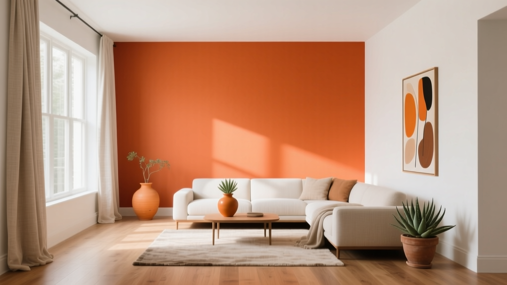
Best Orange Paint Colors for Energy & Warmth (2026)
Orange paint colors have a reputation for being bold, but the best oranges are surprisingly versatile. They can read as sunlit and cheerful, earthy and grounding, or softly peachy and flattering—depending on the undertone and how you use them. When homeowners want a space to feel more welcoming (without the heaviness of dark colors) or more energized (without the sharpness of neon brights), orange is often the missing link.
From a color psychology standpoint, orange sits between stimulating red and optimistic yellow, which is why it’s associated with warmth, sociability, appetite, and creativity. In interior design, it can make north-facing rooms feel less cool, help open-concept homes feel more convivial, and add a “designed” layer to neutral palettes that might otherwise feel flat. The key is choosing the right orange—and applying it with intention.
This guide breaks down the most livable orange paint colors, how to pair them into cohesive color schemes, and where they shine in real rooms—from kitchens and dining rooms to entryways and bedrooms.
Why Orange Works: Color Psychology + Design Principles
Orange brings energy, but not all orange paint colors feel the same. A terracotta can feel calm and architectural; a tangerine feels playful and modern; a peach can be serene and skin-flattering. Understanding undertones and light is what separates a sophisticated orange room from one that feels overwhelming.
What orange does to a room
- Makes spaces feel warmer: Especially helpful in rooms with cool northern exposure or lots of gray finishes.
- Creates a welcoming mood: Great for entryways, dining rooms, and family spaces where you want connection and conversation.
- Boosts creativity and appetite: A reason orange shows up often in studios, kitchens, and breakfast nooks.
- Advances visually: Orange tends to “come forward,” so it can make large rooms feel cozier and ceilings feel lower if used overhead.
Undertones: the real secret to picking the right orange
- Red-based oranges (terracotta, clay): grounded, earthy, mature.
- Yellow-based oranges (apricot, marigold): sunny, upbeat, high-energy.
- Browned oranges (spice, cinnamon): cozy, traditional, great with wood tones.
- Pink-leaning oranges (peach, coral): soft, flattering, romantic, often ideal for bedrooms and bathrooms.
How to Choose an Orange Paint Color That Looks Right at Home
Orange is sensitive to lighting, nearby materials, and sheen. Before committing, treat orange like you would a strong wallpaper: test it in context and in multiple lighting conditions.
Use this quick selection checklist
- Check exposure:
- North-facing: Choose warmer, clearer oranges (apricot, soft tangerine) to counteract cool light.
- South-facing: Earthy terracottas and deeper burnt oranges look rich without going too intense.
- East-facing: Morning light enhances yellow undertones; avoid overly yellow oranges if you want calm.
- West-facing: Late-day light makes orange glow; choose muted/clay tones if you’re color-sensitive.
- Match your fixed finishes: Orange pairs beautifully with warm woods, brass, cream stone, and many red bricks. It can clash with icy grays and blue-leaning white tile unless you bridge with a warm neutral.
- Pick the right sheen:
- Matte/flat: Best for saturated oranges—more forgiving and sophisticated.
- Eggshell/satin: Great for hallways and kitchens, but can make bright oranges feel more intense due to reflectivity.
- Sample correctly: Paint a 2' x 2' swatch on multiple walls (or use large sample sheets). Observe morning, afternoon, and night with your bulbs on.
Best Orange Paint Colors (With Brand References)
These orange paint color recommendations lean livable—designed to give energy and warmth without tipping into “Halloween” unless you want that high-contrast look. Always sample first; every orange shifts with lighting and adjacent materials.
Soft apricot and peach oranges (bright, gentle warmth)
- Sherwin-Williams Persimmon (SW 6339): A cheerful orange with a sunlit feel. Works beautifully as an accent wall in a breakfast nook or as a front door color with warm white trim.
- Benjamin Moore Audubon Russet (HC-51): A refined, heritage orange-russet that feels timeless rather than trendy. Excellent in dining rooms with wood furniture and brass lighting.
- Farrow & Ball Setting Plaster (No. 231): A peachy, plaster-like tone that reads soft and sophisticated. Ideal for bedrooms, bathrooms, and rooms where you want warmth without high saturation.
Terracotta and clay oranges (earthy, architectural, grounded)
- Benjamin Moore Terra Cotta Tile (2090-30): A classic terracotta that pairs effortlessly with natural textures—linen, oak, leather, jute. Great for an accent wall behind a sofa or bed.
- Sherwin-Williams Cavern Clay (SW 7701): A best-selling warm clay orange that’s modern and earthy. It’s a go-to for open plans when you want warmth that still feels designer-forward.
- Farrow & Ball Red Earth (No. 64): An earthy, mineral orange-red that looks stunning with cream trim and dark wood. Best in rooms with good natural light.
Burnt orange and spice tones (cozy, dramatic, grown-up)
- Sherwin-Williams Rooibos Tea (SW 9099): A deep, spicy orange-brown that feels cozy and enveloping. Perfect for libraries, dens, and moody dining rooms.
- Benjamin Moore Potters Clay (1221): Warm and muted, with a natural clay vibe. A strong choice for hallways, mudrooms, and cabinetry accents.
- Behr Pumpkin Patch (PPU2-03): A classic burnt orange that reads warm and familiar. Great for seasonal charm, but can be styled year-round with the right neutrals.
Modern tangerine and coral (high-energy, playful, statement-making)
- Benjamin Moore Orange Blossom (2168-30): A lively orange that’s bold without going neon. Best as an accent (powder room, bar area, built-ins).
- Sherwin-Williams Invigorate (SW 6886): Bright and sporty. Use sparingly—think a single focal wall, a painted niche, or furniture.
- Farrow & Ball Charlotte’s Locks (No. 268): A vivid, show-stopping orange. Best in small doses or in spaces designed to feel energetic (creative studio, kids’ playroom).
Real Room Examples: Where Orange Paint Looks Best
1) Entryway: warm welcome with instant personality
An entry is often small, transitional, and light-challenged—exactly where orange can shine. A warm clay or apricot creates a friendly “arrival” moment and makes the home feel inviting from the first step.
- Try: Sherwin-Williams Cavern Clay (SW 7701) on walls
- Pair with: warm white trim (creamy, not stark), natural fiber runner, aged brass hook rack
- Pro move: Paint the door in a deeper burnt orange for depth, keep walls lighter
2) Dining room: appetite, glow, and conversation
Orange is famously appetite-friendly and flattering in evening light. It enhances candlelight and makes wood furniture look richer.
- Try: Benjamin Moore Audubon Russet (HC-51)
- Color scheme idea: orange + cream + deep olive + walnut
- Style note: Use matte walls with a slightly higher sheen on trim for crisp definition
3) Kitchen: energize without overwhelming
If full orange walls feel like too much in a kitchen, consider orange on the island, lower cabinets, or a pantry door. Orange pairs beautifully with warm metals and natural stone.
- Try: Benjamin Moore Potters Clay (1221) on lower cabinets
- Pair with: creamy backsplash tile, unlacquered brass hardware, oak shelves
- Keep balanced: use a warm white on uppers and walls
4) Living room: cozy focal wall or fireplace moment
Orange can act like a “visual hearth,” especially on a fireplace wall or behind a sofa. Terracotta tones also play nicely with popular materials like boucle, leather, and black metal.
- Try: Benjamin Moore Terra Cotta Tile (2090-30) as an accent wall
- Pair with: warm greige, ivory, camel leather, and black accents
- Tip: Add texture to keep it elevated—linen drapes, woven shades, plaster lamps
5) Bedroom: peach and plaster tones for restful warmth
For bedrooms, softer peach or muted clay delivers warmth without the “buzz” of bright orange. These tones are also skin-flattering, which makes the room feel more comforting at night.
- Try: Farrow & Ball Setting Plaster (No. 231)
- Pair with: warm white bedding, light oak, muted terracotta textiles, soft olive accents
- Lighting tip: use warm bulbs (around 2700K) to avoid a harsh, yellow cast
6) Bathroom or powder room: small space, big impact
Orange is an excellent choice for powder rooms because you can embrace drama without committing to a large area. It also looks incredible with brass, mirror glow, and patterned tile.
- Try: Sherwin-Williams Persimmon (SW 6339) or Farrow & Ball Charlotte’s Locks (No. 268)
- Pair with: creamy trim, warm marble, or black-and-white tile for contrast
Orange Color Schemes That Always Look Intentional
Orange works best when it has a supporting cast. Use these designer-approved color schemes to keep your palette cohesive.
- Orange + warm white + natural wood: bright, modern, Scandinavian-friendly
- Orange + olive green + cream: earthy, Mediterranean, grounded
- Orange + navy + brass: high contrast, tailored, classic
- Orange + blush + taupe: soft, flattering, calming
- Orange + charcoal + tan leather: modern, moody, sophisticated
Trim and ceiling colors that complement orange walls
- Choose creamy whites (not icy bright white) for most oranges.
- For a seamless, modern look: use a warm off-white ceiling instead of stark white.
- If you want a bold, enveloping room: color-drench with one orange in multiple sheens (matte walls, satin trim).
Common Orange Paint Mistakes (and How to Avoid Them)
- Picking an orange without sampling in your lighting
Orange shifts dramatically. Sample on more than one wall and view it at night with lamps on. - Pairing orange with cool grays and icy whites
The room can feel disjointed. Bridge with warm neutrals (cream, warm greige) or add wood tones. - Using a super-saturated orange on all walls in a low-light room
It can feel heavy and muddy. Choose a softened terracotta or use orange as an accent. - Ignoring undertones in tile, countertops, and flooring
Orange can amplify pink, yellow, or red in nearby finishes. Match undertones intentionally. - Overdoing orange accessories on top of orange walls
If walls are orange, layer in neutrals and contrasting colors (olive, navy, cream) so orange feels curated—not loud.
Practical Application Tips for a Polished Orange Room
- Start small if you’re unsure: try a powder room, a painted door, built-ins, or an accent wall behind art.
- Use the 60-30-10 guideline:
- 60% dominant color (often a warm neutral)
- 30% secondary color (orange or a supporting hue like olive)
- 10% accent (brass, black, deep navy, or a patterned textile)
- Balance temperature: If your orange is very warm, add a grounding cooler note (navy, charcoal, deep green) in small doses.
- Choose art and textiles with orange already in them: It makes the wall color feel “connected” to the room rather than random.
- Be mindful of bulbs: Warm LEDs (2700K) flatter terracotta and peach; very cool bulbs can make orange look harsh or dull.
FAQ: Orange Paint Colors and Interior Color Design
What is the best orange paint color for a living room?
For most living rooms, a muted terracotta or clay is the easiest to live with. Sherwin-Williams Cavern Clay (SW 7701) and Benjamin Moore Terra Cotta Tile (2090-30) are strong choices because they feel warm and grounded rather than overly bright.
How do I keep orange walls from feeling too bright?
Choose a softened, brown-based orange (terracotta, spice) and use a matte finish. Balance the room with warm whites, natural wood, and deeper accents like olive or navy. If the orange still feels loud, use it on one focal wall instead of all four.
What colors go best with orange paint?
Orange pairs beautifully with warm whites, cream, tan, camel, olive green, navy, charcoal, and brass. For a softer look, pair orange with blush and taupe; for a tailored look, pair it with navy and crisp warm white trim.
Is orange a good choice for a bedroom?
Yes—when you choose the right undertone. Peachy plaster tones like Farrow & Ball Setting Plaster (No. 231) add warmth and glow without overstimulating the space. Avoid very bright tangerines for sleep-focused rooms unless used in small accents.
What’s the difference between terracotta and burnt orange?
Terracotta typically has an earthy, clay-like base and reads more natural and muted. Burnt orange is deeper and richer, often with more brown or red, creating a cozier, moodier feel—great for dens and dining rooms.
Should I use orange paint in an open-concept home?
You can, but it helps to be strategic. Use orange on a single zone (like the dining area) or on built-ins, then repeat the color in textiles and art across the space. Keep the connecting areas in a warm neutral to maintain flow.
Next Steps: Bring Orange Home with Confidence
Start by identifying the mood you want—sunny and uplifting, earthy and grounded, or cozy and dramatic—then choose an orange paint color with the right undertone for your light. Sample generously, pair it with warm whites and natural textures, and let orange act as either the star (accent wall, powder room) or the supporting glow (peachy bedroom, clay hallway).
For more curated paint color recommendations, color scheme ideas, and room-by-room guidance, explore the rest of our color guides on thedecormag.com.
More Articles
 Best Green Paint Colors for Nature Lovers - The Decor Mag
 How to Use Color to Create Rhythm - The Decor Mag
 Jewel Tone Color Scheme Ideas - The Decor Mag
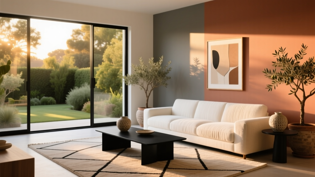 How to Choose Colors for West-Facing Rooms - The Decor Mag
 Best Avocado Green Paint Colors - The Decor Mag
 Best Coral Paint Colors for Vibrant Spaces - The Decor Mag
 How to Choose Colors for a Reading Room - The Decor Mag
 Best Pine Green Paint Colors - The Decor Mag
 Best Cobalt Blue Paint Colors - The Decor Mag
 Minimalist Color Palettes That Actually Feel Warm