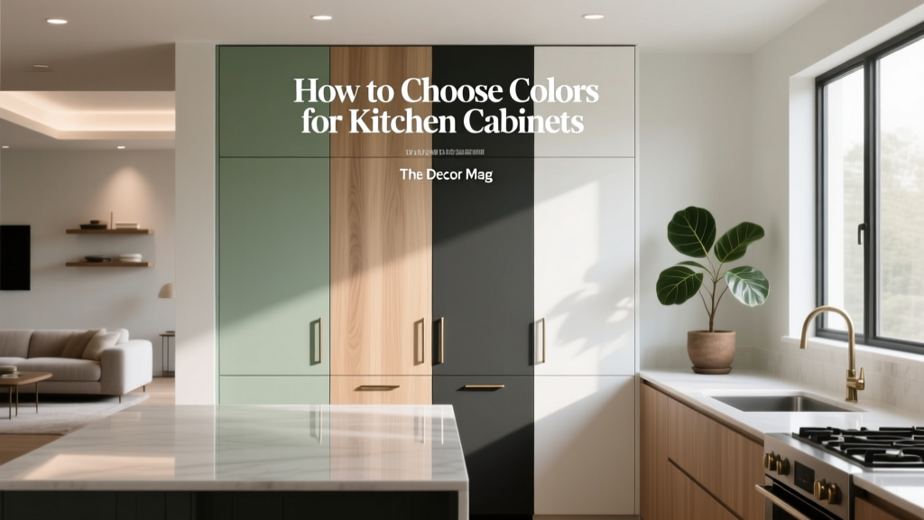
How to Choose Colors for Kitchen Cabinets - The Decor Mag
Kitchen cabinet color does more than “set the mood”—it changes how big the room feels, how clean and cohesive it reads, and even how appetizing the space appears. Cabinets are usually the largest uninterrupted surface in a kitchen, so their color becomes the anchor for your entire color scheme: countertops, backsplash tile, flooring, hardware, lighting, and wall paint all respond to it.
Choosing cabinet paint colors can feel high-stakes because cabinets are expensive to replace and time-consuming to repaint. The good news: once you understand a few interior color design principles—undertones, light reflectance, contrast, and color psychology—you can pick a cabinet color that looks intentional in morning light, flattering at night, and timeless through changing trends.
This guide breaks down how to choose paint colors for kitchen cabinets with practical steps, real-room scenarios, and specific paint color recommendations (including popular options from Benjamin Moore, Sherwin-Williams, and Farrow & Ball).
Start With the Kitchen You Have: Fixed Finishes and Lighting
Inventory your “non-negotiables” first
Before you fall in love with a cabinet color online, look at the materials you’re not changing soon. These finishes set the boundaries of your kitchen color palette.
- Countertops: Is the stone warm (creamy veining) or cool (blue-gray veining)? Busy or minimal?
- Backsplash tile: Bright white, ivory, greige, handmade/variegated, or patterned?
- Flooring: Honey oak, walnut, gray LVP, terracotta tile, slate?
- Appliances: Stainless leans cool; panel-ready disappears; black and brass read warmer.
- Hardware: Polished nickel reads cool; brass and bronze read warm; matte black can go either way depending on surroundings.
Evaluate light quality (not just brightness)
Light changes color—dramatically. The same cabinet paint can look creamy at noon and green at dusk. Consider:
- Natural light direction: North-facing light is cooler/blue; south-facing is warmer; east is crisp; west is warm and intense late day.
- Artificial lighting: 2700K bulbs warm paint; 3000K is balanced; 3500–4000K can make warm colors look flat or slightly dingy.
- Shadow zones: U-shaped kitchens and uppers can throw shadows that deepen colors by one to two “steps.”
Pro tip: Test cabinet colors on large poster boards or paintable sample panels and move them around the kitchen (near the window, by the range, under uppers). Observe them morning, afternoon, and evening.
Color Theory Basics That Make Cabinet Choices Easier
Undertones: the hidden color that makes or breaks a match
Most cabinet colors that “mysteriously look wrong” have an undertone clash. Whites can lean pink, yellow, green, or gray; grays can lean blue, violet, or green; beiges can lean peachy, taupe, or olive.
- Warm undertones (yellow, red, orange) pair naturally with warm woods, brass, travertine, and creamy stone.
- Cool undertones (blue, green, violet) complement stainless, marble with blue-gray veining, and cooler grays.
Light Reflectance Value (LRV): how “bright” the color feels
LRV indicates how much light a paint color reflects. Higher LRV (whiter/brighter) can make small kitchens feel more open, while lower LRV (darker) adds drama but demands good lighting.
- High LRV: best for small kitchens, low natural light, or heavy visual clutter.
- Mid LRV: forgiving, designer-friendly range for most kitchens.
- Low LRV: stunning in larger kitchens, open plans, or when paired with bright countertops and layered lighting.
Contrast and balance: keeping the room from feeling “top heavy”
A classic approach: keep uppers lighter and add depth on lowers or islands. If you go dark everywhere, balance with reflective surfaces (glossy backsplash, light counters) and ample lighting.
How to Choose a Cabinet Color Scheme (Simple Framework)
- Pick your anchor: countertops or backsplash usually lead.
- Decide the vibe: bright and airy, cozy and warm, modern and moody, classic and tailored.
- Choose a temperature: warm, cool, or intentionally mixed with a bridging neutral.
- Select contrast level: low-contrast (soft and seamless) or high-contrast (crisp and graphic).
- Test 3–5 finalists: in your actual lighting and next to your countertop sample.
Specific Cabinet Color Recommendations (With Paint Names)
1) Timeless white cabinets (but with the right undertone)
White cabinets remain popular because they reflect light, feel clean, and pair with nearly any countertop. The key is choosing a white that matches your fixed finishes.
- Benjamin Moore White Dove (OC-17): a warm, softly creamy white that works with warm woods, marble, and brass.
- Sherwin-Williams Alabaster (SW 7008): warm and approachable; excellent for farmhouse and transitional kitchens.
- Benjamin Moore Chantilly Lace (OC-65): a crisp, clean white that reads more “true” in cool kitchens; great with stainless and modern slabs.
- Farrow & Ball All White No. 2005: bright and simple, best when you want a gallery-like, minimal look.
Real-room scenario: A small galley kitchen with limited natural light, warm oak floors, and a simple white quartz countertop. Choose White Dove or Alabaster for warmth, add satin nickel hardware, and use a soft greige wall color to prevent the space from feeling stark.
2) Warm greige and beige cabinets for a softer neutral kitchen
Greige is the bridge between warm and cool, making it one of the most versatile cabinet color families. It’s also forgiving with busy countertops.
- Benjamin Moore Edgecomb Gray (HC-173): a warm greige that reads soft and tailored; great with brass and creamy stone.
- Sherwin-Williams Accessible Beige (SW 7036): neutral and flexible; works with many floors and stones.
- Farrow & Ball Skimming Stone No. 241: an elevated, classic neutral that pairs beautifully with natural textures.
Real-room scenario: Open-plan kitchen with a beige-and-gray veined quartz, medium-tone wood floors, and black windows. Use Edgecomb Gray on cabinets, matte black hardware for structure, and a creamy white backsplash to keep it bright.
3) Blue cabinets for calm, classic confidence
Blue is linked to calm and trust in color psychology, which is why it’s so popular for kitchens that need to feel grounded. Deep blues add sophistication; dusty blues feel relaxed.
- Benjamin Moore Hale Navy (HC-154): rich, classic navy; stunning on islands or lower cabinets.
- Sherwin-Williams Naval (SW 6244): deep and modern; pairs well with white quartz and brass.
- Benjamin Moore Boothbay Gray (HC-165): a softer blue-gray for coastal or transitional kitchens.
Application idea: Do a two-tone kitchen: white uppers (e.g., White Dove) + navy lowers (Hale Navy) with a simple white backsplash. Add warm accents (oak stools, brass pulls) to keep the palette from feeling cold.
4) Green cabinets for a fresh, nature-connected kitchen
Green supports a sense of balance and renewal, making it a favorite for homeowners who want a grounded, welcoming kitchen. The trick: choose the right green for your countertop undertones.
- Sherwin-Williams Evergreen Fog (SW 9130): a soft, gray-green that reads sophisticated and contemporary.
- Benjamin Moore Saybrook Sage (HC-114): warm sage; beautiful with cream, terracotta, and brass.
- Farrow & Ball Green Smoke No. 47: moody, heritage green with blue-gray depth.
Real-room scenario: Kitchen with butcher block counters and warm white zellige tile. Use Saybrook Sage on cabinets, add unlacquered brass hardware, and keep walls a creamy white for a soft, organic look.
5) Charcoal, black, and deep brown for modern drama
Dark cabinets can look sleek and architectural, and they hide scuffs better than pure white. They also make brass, marble, and wood tones pop.
- Benjamin Moore Wrought Iron (2124-10): a soft black with a charcoal-blue undertone; less harsh than true black.
- Sherwin-Williams Iron Ore (SW 7069): deep charcoal; a go-to for modern and transitional kitchens.
- Farrow & Ball Railings No. 31: a blue-black that feels refined, especially with warm metals.
Application idea: Use dark on the island only (e.g., Iron Ore) and keep perimeter cabinets a warm white. This creates a focal point without shrinking the room.
6) Wood-tone cabinets and “paint pairings” that work
If you’re not painting all the cabinets—or you’re mixing stained wood with paint—use color to create intention.
- Oak + warm white: Benjamin Moore White Dove or SW Alabaster
- Walnut + soft greige: BM Edgecomb Gray or F&B Skimming Stone
- Maple + dusty blue: BM Boothbay Gray
- Natural wood + charcoal: SW Iron Ore for contrast
Design-Led Color Combinations (Cabinets + Counters + Hardware)
Use these proven color schemes as a starting point, then tweak undertones to match your finishes.
- Classic contrast: White cabinets (BM Chantilly Lace) + black hardware + white marble-look quartz + soft gray walls
- Warm modern: Greige cabinets (SW Accessible Beige) + brushed brass + creamy quartz + warm white backsplash
- Coastal tailored: Blue-gray lowers (BM Boothbay Gray) + white uppers + polished nickel + simple subway tile
- Organic calm: Sage cabinets (SW Evergreen Fog) + warm wood shelves + aged brass + off-white handmade tile
- Moody luxe: Charcoal cabinets (BM Wrought Iron) + white counters + brass + statement pendants
Application Guidance: Samples, Sheen, and Strategy
Sampling tips that prevent expensive surprises
- Test cabinet colors vertically (on a door or panel), not just on a flat wall.
- View samples next to countertop and backsplash materials, not in isolation.
- Check color at three times: morning, afternoon, and under evening lights.
- Stand back: cabinets are seen from across the room, so color reads lighter and more unified at distance.
Best paint sheens for kitchen cabinets
- Satin: a popular balance—wipeable with a soft glow.
- Semigloss: more durable and reflective; highlights door profiles and imperfections more.
- Matte: trending, velvety look; choose cabinet-rated paint and be realistic about cleanability.
Finish note: For high-traffic kitchens, prioritize a cabinet-grade enamel and proper prep. Color choices look better when the finish is smooth and consistent.
Common Kitchen Cabinet Color Mistakes to Avoid
- Picking a color from a screen: lighting, camera filters, and white balance lie. Always sample.
- Ignoring undertones in stone and tile: a “neutral” countertop often has a strong undertone (green, pink, blue) that will fight the cabinet color.
- Choosing stark white in a warm kitchen: bright, cool whites can look icy next to honey oak or warm granite.
- Going too dark without enough light: dark cabinets in a dim kitchen can feel heavy unless you add under-cabinet lighting and reflective surfaces.
- Matching everything exactly: perfectly matching cabinets to counters can look flat. A little contrast adds depth and designer polish.
- Forgetting the adjacent spaces: in open-concept homes, cabinet color must harmonize with living room flooring, fireplace stone, and wall colors.
FAQ: Choosing Paint Colors for Kitchen Cabinets
What cabinet colors are most timeless?
Soft whites (BM White Dove, SW Alabaster), warm greiges (BM Edgecomb Gray), and deep navies (BM Hale Navy) tend to stay relevant because they work with many countertop and hardware styles.
Should kitchen cabinets match the walls?
Matching can work in minimalist designs, but most kitchens look better with gentle contrast. Try cabinets in a white/neutral and walls in a slightly deeper greige—or vice versa—to add dimension.
Are dark cabinets a bad idea in a small kitchen?
Not necessarily. Use dark on lowers or an island, keep uppers light, choose a light countertop, and add layered lighting (recessed + under-cabinet + pendants) to keep the space feeling open.
How do I choose between warm and cool cabinet colors?
Let your fixed finishes decide. Warm floors and creamy stone usually prefer warm whites, beiges, and warm greens. Cool marble veining and stainless appliances often look best with crisp whites, blue-grays, and charcoals.
What’s the best cabinet color with stainless steel appliances?
Crisp whites (BM Chantilly Lace), blue-grays (BM Boothbay Gray), and charcoals (SW Iron Ore) pair naturally with stainless. Warm cabinet colors can also work—add bridging elements like warm wood accents or brass hardware.
How many colors should I use in a kitchen color scheme?
A reliable formula is 3–5 elements: cabinet color, wall color, countertop, backsplash, and one metal finish. Two-tone cabinets count as two elements, so keep the rest calmer.
Next Steps: A Simple Plan for Choosing Your Cabinet Color
- Step 1: Collect samples of your countertop, backsplash, and flooring (or take clear photos in natural light).
- Step 2: Decide your direction: light and airy, warm neutral, moody modern, or color-forward.
- Step 3: Choose 3–5 cabinet paint colors and test them on large panels in multiple lighting conditions.
- Step 4: Build the full color scheme: confirm hardware metal, wall color, and backsplash alignment.
- Step 5: Commit with confidence—then repeat the same disciplined sampling process for adjacent spaces in open-concept layouts.
If you’re ready to refine your palette even further, explore more kitchen color schemes, paint color roundups, and room-by-room guides on thedecormag.com.
More Articles
 Best Teal Paint Colors for Calm Spaces - The Decor Mag
 How to Choose Colors for a Laundry Room - The Decor Mag
 How To Match Aging With Space: Designing Environments That Support Lifelong Well-Being
 How to Create a Low Contrast Color Palette - The Decor Mag
 How to Choose Colors for North-Facing Rooms - The Decor Mag
 Best Pistachio Paint Colors - The Decor Mag
 Best Honeydew Paint Colors - The Decor Mag
 Best Moss Green Paint Colors - The Decor Mag
 How to Create an Eclectic Color Palette - The Decor Mag
 How to Match Colors to Furniture and Fabrics - The Decor Mag