
How to Choose Bedroom Colors for Sleep - The Decor Mag
Your bedroom isn’t just where you end your day—it’s where your nervous system resets. The colors you surround yourself with can either support that unwind-and-recover cycle or quietly work against it. While the best mattress and blackout shades matter, bedroom paint colors and color schemes often set the emotional temperature of the entire space.
Color psychology gives us a helpful framework: certain hues tend to lower perceived stress and visual “noise,” while others stimulate alertness. Pair that with interior design principles—undertone harmony, light reflectance value (LRV), contrast control—and you can choose a bedroom palette that looks beautiful in daylight and feels restorative at night.
This guide breaks down how to choose bedroom colors for sleep with specific paint color recommendations, real-room scenarios, and practical application tips you can use right away.
What Makes a Bedroom Color Sleep-Friendly?
A sleep-supportive bedroom color palette does three things:
- Reduces visual stimulation (low-to-moderate saturation, softer contrast).
- Feels cohesive in your lighting (undertones that match your flooring, bedding, and exposure).
- Creates a sense of enclosure without feeling heavy (smart LRV choices and finish selection).
Color Psychology Basics: Calm vs. Activation
- Calming families: muted blues, blue-greens, soft greens, warm whites, gentle greiges, dusty lavenders.
- More activating families: high-chroma reds and oranges, very bright yellows, stark black-and-white contrast, neon-leaning colors.
Design Principle That Matters Most: Undertones
Two paints can look “beige” in the store and completely different at home. Undertones (pink, yellow, green, gray, violet) determine whether a bedroom feels serene or subtly “off.” The fastest way to pick bedroom paint colors wisely is to coordinate undertones with fixed finishes:
- Warm finishes: honey oak, brass, warm white bedding → choose warm whites, creamy greiges, soft clay-tinted neutrals.
- Cool finishes: gray flooring, chrome, crisp white trim → choose blue-grays, cool greiges, soft blue-greens.
- Mixed finishes: balance with a true neutral (neither too yellow nor too icy) and repeat metals/woods consistently.
Start Here: Assess Light, Room Size, and Existing Materials
Step 1: Identify Your Natural Light Direction
- North-facing bedrooms get cooler, grayer light. Choose warmer whites, warmer greiges, and green-leaning blues to avoid a cold feel.
- South-facing bedrooms get strong, warm light. Softer cool colors (blue-grays, muted greens) look balanced and clean.
- East-facing bedrooms are bright in the morning and cooler later. Mid-tone neutrals and gentle blue-greens perform well all day.
- West-facing bedrooms glow warm in late afternoon. Avoid overly warm beiges that can feel yellow at sunset; try balanced greiges or muted greens.
Step 2: Use LRV to Control Mood
LRV (Light Reflectance Value) measures how much light a paint reflects. For bedrooms, the sweet spot is often 45–70 depending on size and light.
- Small or dim rooms: LRV 60–75 to keep the space open and airy.
- Average rooms: LRV 50–65 for a restful, cocooned feel without gloom.
- Large, bright rooms: LRV 35–55 can look luxuriously calm and grounded.
Step 3: Match Paint to Fixed Elements
Before choosing wall color, pull cues from what isn’t changing:
- Flooring (wood tone, carpet color, tile undertone)
- Large furniture (upholstered headboard, dresser finish)
- Stone surfaces (quartz, marble, laminate patterns)
- Trim color (warm white vs. bright white)
Best Bedroom Paint Colors for Sleep (With Brand Recommendations)
These color families consistently perform well in bedrooms because they reduce glare, soften contrast, and support a calmer emotional tone. Use the suggested paint colors as starting points, then sample in your room.
1) Soft Blue-Greens: The Classic Sleep Palette
Blue-green sits in a calming zone: blue is associated with serenity, while green reads as balanced and natural. Keep it muted (gray- or dust-leaning) for a grown-up look.
- Sherwin-Williams Sea Salt (SW 6204) – airy blue-green that shifts with light; great for coastal, modern, or transitional bedrooms.
- Benjamin Moore Palladian Blue (HC-144) – a spa-like blue-green with gentle depth.
- Farrow & Ball Light Blue (No. 22) – soft and sophisticated with a heritage feel.
Best pairings: warm white trim, natural linen bedding, light oak nightstands, brushed brass accents.
2) Muted Greens: Grounding, Restorative, Nature-Inspired
Green is often linked to balance and restoration. In bedrooms, the most sleep-friendly greens are sage, eucalyptus, and olive-tinted neutrals—never too neon, never too sharp.
- Sherwin-Williams Clary Sage (SW 6178) – a timeless sage that feels cozy without going dark.
- Benjamin Moore October Mist (1495) – a soft, modern green with an airy, organic vibe.
- Farrow & Ball Green Smoke (No. 47) – a deeper, moody green perfect for a cocoon effect.
Best pairings: creamy white bedding, walnut or black-stained wood, antique brass, woven textures.
3) Blue-Grays: Calm Without Feeling Childish
If you love blue but want a more sophisticated result, look for blue-grays. The gray component reduces visual energy, which supports relaxation.
- Benjamin Moore Boothbay Gray (HC-165) – a classic blue-gray that reads calm and crisp.
- Sherwin-Williams Misty (SW 6232) – a soft, light gray with a cool whisper of blue.
- Behr Dolphin Fin (790C-3) – a versatile mid-tone that works well with many fabrics.
Best pairings: white or light gray bedding, matte black hardware, cool-toned artwork, soft wool rugs.
4) Warm Whites and Creamy Neutrals: Quiet, Flexible, Always Elegant
White doesn’t have to feel stark. In sleep spaces, warmer whites and soft creams create a gentle envelope—especially if you layer in textiles for depth.
- Benjamin Moore White Dove (OC-17) – a favorite warm white that’s soft on the eyes.
- Sherwin-Williams Alabaster (SW 7008) – creamy, calming, and flattering in most lights.
- Farrow & Ball School House White (No. 291) – warm and nuanced; beautiful with traditional millwork.
Best pairings: natural linen drapes, tonal bedding (ivory-on-ivory), light wood, subtle patterns.
5) Greige and Taupe: The “Can’t-Miss” Calm Neutral
Greige bridges warm and cool, which makes it especially useful if your bedroom has mixed finishes or you change decor seasonally.
- Benjamin Moore Edgecomb Gray (HC-173) – a soft, welcoming greige with classic appeal.
- Sherwin-Williams Agreeable Gray (SW 7029) – balanced and adaptable; great for whole-home continuity.
- Benjamin Moore Balboa Mist (OC-27) – a light greige that leans serene and airy.
Best pairings: warm white trim, textured throws, black-and-white photography, rattan or oak accents.
6) Dusty Lavender and Soft Mauve: Unexpectedly Soothing
Purple can be stimulating when bright, but dusty lavender and gray-mauve shades can feel hushed and dreamy—especially with warm lighting.
- Benjamin Moore Violet Hint (2114-60) – a barely-there lavender that reads calm, not candy.
- Sherwin-Williams Silver Peony (SW 6547) – soft and romantic, best in bedrooms with plenty of warm textiles.
Best pairings: ivory bedding, champagne metals, warm oak, soft abstract art.
Real Room Examples: How These Colors Work in Practice
Scenario 1: Small Bedroom, Low Light, You Want It Cozy (Not Dark)
Paint: Sherwin-Williams Sea Salt (SW 6204) on walls
Trim: warm white like SW Alabaster (SW 7008)
Textiles: ivory quilt, oatmeal linen curtains, light jute rug
Why it works: The higher LRV and soft saturation keep the room open, while blue-green undertones reduce visual stress.
Scenario 2: Modern Bedroom With Gray Floors That Feels Cold
Paint: Benjamin Moore Edgecomb Gray (HC-173)
Accent: matte black sconces, walnut nightstands
Bedding: cream + camel + a muted olive throw
Why it works: A warmer greige counteracts cool flooring, and the layered neutrals create a soothing, hotel-like palette.
Scenario 3: Large Primary Suite With Lots of Sunlight
Paint: Farrow & Ball Green Smoke (No. 47) on walls (or as an accent wall behind the bed)
Trim: soft white
Finishes: brass hardware, warm wood dresser, linen roman shades
Why it works: The deeper value adds calm “weight” to a bright room and creates a cocoon effect that feels especially restful at night.
Scenario 4: You Love White Bedrooms but Want More Dimension
Walls: Benjamin Moore White Dove (OC-17)
Ceiling: same color in a flat finish for seamless calm
Accent color: muted blue-gray pillows (try Benjamin Moore Boothbay Gray-inspired textiles)
Why it works: A warm white reduces glare, and tonal layering gives the room depth without adding busy contrast.
How to Build a Sleep-Friendly Bedroom Color Scheme
A color scheme succeeds when it controls contrast and repeats undertones. Use these formulas as reliable starting points.
Easy 60-30-10 Palette Rule for Bedrooms
- 60% walls (main paint color)
- 30% textiles (bedding, rug, curtains)
- 10% accents (art, pillows, lamps, decor)
Three Proven Color Combinations for Better Sleep
- Sage + Cream + Warm Wood: SW Clary Sage + ivory bedding + oak/walnut furniture
- Blue-Gray + White + Charcoal: BM Misty/Boothbay Gray family + soft white trim + charcoal accents for depth
- Greige + Linen + Dusty Blue: BM Edgecomb Gray + natural linen + muted denim-blue accent pieces
Paint Finish Choices That Feel Softer at Night
- Walls: matte or eggshell for a gentle, low-glare surface
- Trim: satin or semi-gloss for clean contrast and durability
- Ceilings: flat to minimize reflection from lamps
Application Tips: How to Test Bedroom Paint Colors Correctly
- Sample at least 3 colors in the same family (lighter, mid, and slightly deeper).
- Paint large swatches (at least 12" x 12", ideally larger) on multiple walls.
- Check morning, afternoon, and night with your actual lamps on. Bedroom lighting changes everything.
- Compare against bedding and flooring—not against a white sheet of paper alone.
- Decide based on how it feels at night, since that’s when the room’s purpose matters most.
Common Bedroom Color Mistakes That Disrupt Sleep
- Choosing a color that’s too bright or saturated (especially reds, oranges, intense jewel tones) which can feel energizing rather than calming.
- Ignoring undertones and ending up with a paint color that clashes with flooring or bedding, creating low-grade visual tension.
- Going too cool in a north-facing room and making the space feel chilly or uninviting.
- Overusing stark contrast (pure white walls with very dark trim or bold patterns) which can feel visually “loud.”
- Picking paint in store lighting only and skipping at-home testing—one of the most common reasons for repainting.
- Using high-sheen paint on bedroom walls which increases glare and highlights wall imperfections.
FAQ: Bedroom Colors for Sleep
What is the best bedroom color for sleep?
Muted blue-greens and soft greens are consistently sleep-friendly because they read calm and natural. Popular choices include Sherwin-Williams Sea Salt (SW 6204) and Benjamin Moore Palladian Blue (HC-144), depending on your light and undertones.
Are dark bedroom colors bad for sleep?
Not necessarily. Deep, muted colors can be very restful—especially in large or bright rooms—because they create a cocoon effect. The key is choosing a softened shade (not overly saturated) and balancing it with warm lighting and lighter textiles.
Is white a good bedroom color?
Yes, when it’s the right white. Warm whites and creamy neutrals tend to feel softer at night than stark, bright whites. Benjamin Moore White Dove (OC-17) and Sherwin-Williams Alabaster (SW 7008) are reliable starting points.
What bedroom colors should I avoid if I have trouble sleeping?
Avoid very bright, high-chroma colors—especially strong reds, vivid oranges, and sharp yellows—along with high-contrast schemes that feel visually busy. If you love warm colors, choose muted clay, blush-beige, or softened terracotta accents instead of full-strength walls.
How do I choose between blue, green, and greige?
Let your room’s fixed elements decide. If your flooring and fabrics lean warm, greige or muted green often looks more harmonious. If your finishes are cool (gray floors, chrome), blue-gray or blue-green tends to feel cleaner and more cohesive.
Should the ceiling match the walls in a bedroom?
Matching can look beautifully calming, especially in smaller rooms or if you want a wrapped, serene feel. Another option is using the same color one shade lighter on the ceiling to soften contrast without making the room feel enclosed.
Next Steps: Choose a Color That Helps You Exhale
Pick three sleep-friendly paint colors in the family you love, test them in your bedroom’s real light, and build a simple color scheme around undertone harmony and low-glare finishes. Start with walls, then layer in textiles—bedding, curtains, rugs—to reinforce a calm palette that feels good both day and night.
For more paint color ideas, color scheme formulas, and room-by-room guidance, explore the color guides and interior color design articles on thedecormag.com.
More Articles
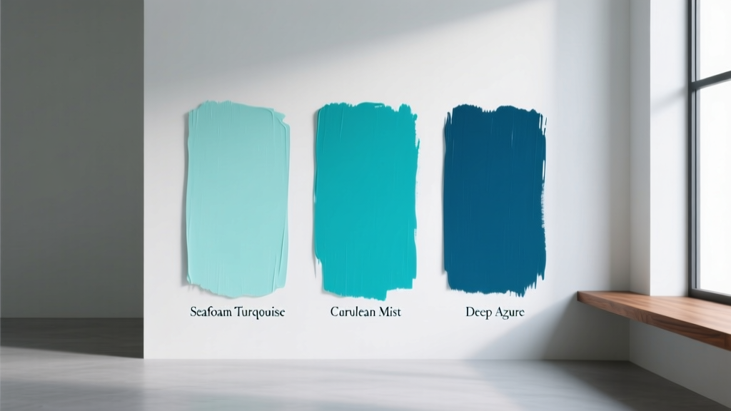 Best Turquoise Paint Colors - The Decor Mag
 How to Choose Colors for a Gym - The Decor Mag
 How to Mix Warm and Cool Tones Successfully - The Decor Mag
 Cheap vs Premium Placement: What $0.12 CPM Really Costs Your Brand
 Best Honeydew Paint Colors - The Decor Mag
 Living Room Colors for Entertaining (2026)
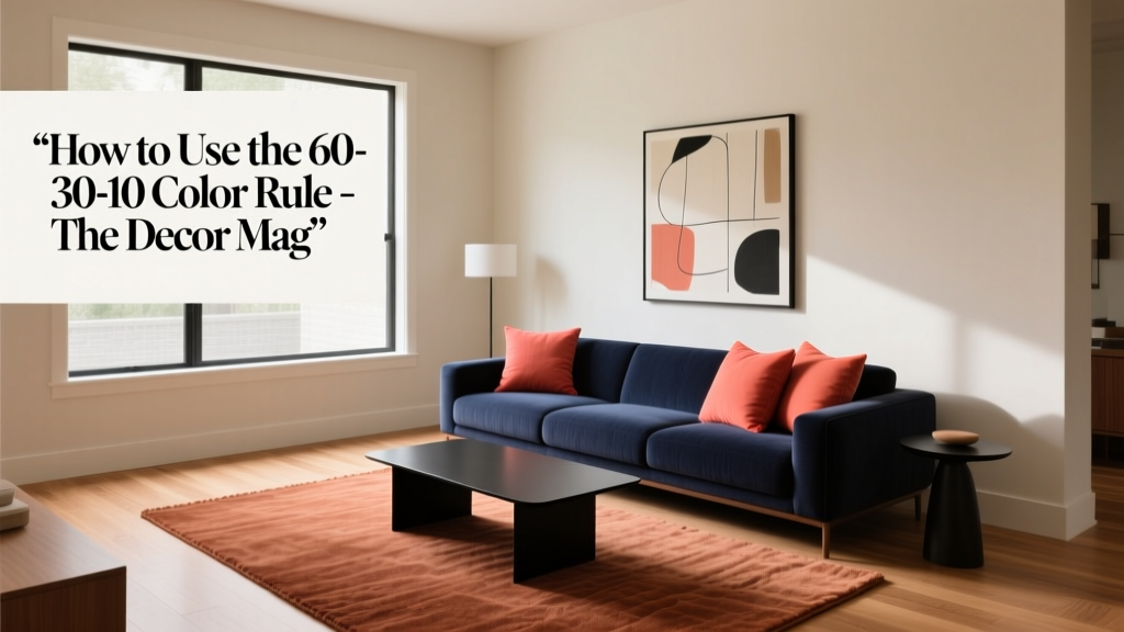 How to Use the 60-30-10 Color Rule - The Decor Mag
 Bedroom for Beginners: A Practical, Step-by-Step Setup Guide
 How to Use Color to Create Coolness - The Decor Mag
 Best Terracotta Paint Colors for Warmth - The Decor Mag