# Color Psychology in Living Rooms: Why Your Space Feels Off
After fifteen years of designing living rooms for clients across the country, I can tell you this with certainty: when a living room feels wrong, it is almost always a color problem. Not the furniture layout, not the lighting, not the architecture. Color is the silent force that either pulls a room together or tears it apart, and most homeowners never realize they are experiencing a color psychology issue when something just feels off.
I have walked into expensively furnished living rooms that felt cold and unwelcoming, and I have seen modestly decorated spaces that radiated warmth and comfort. The difference comes down to understanding how color interacts with human emotion, spatial perception, and the specific conditions of each room.
## The Science Behind Color and Emotion
Color psychology is backed by decades of research. When light hits your retina, signals travel not just to your visual cortex but directly to your hypothalamus, the part of your brain that regulates hormones, body temperature, and emotional state. The colors in your living room are literally affecting your nervous system in real time.
Research from the University of Texas and the Journal of Environmental Psychology has shown that warm colors like reds, oranges, and yellows increase heart rate and create feelings of energy and intimacy. Cool colors like blues, greens, and lavenders lower blood pressure, slow breathing, and promote calm. This distinction is fundamental because your living room serves as both a social gathering space and a relaxation zone.
## Warm Tones vs. Cool Tones: Your Emotional Foundation
The warm versus cool divide is the most important color decision for your living room.
**Warm tones** create intimacy, energy, and enclosure. I recommend them for entertainment spaces, family rooms, or north-facing rooms with limited light. Benjamin Moore's **Golden Retriever** (a rich golden ochre) or Farrow & Ball's **India Yellow** stimulate conversation and warmth. Sherwin Williams' **Cavern Clay**, a warm terracotta, feels both grounded and energizing. The key is restraint: use a 60-30-10 rule with warm neutrals as your base, complementary warm accents, and a touch of bold color.
**Cool tones** promote relaxation and spaciousness. They work beautifully in reading rooms, meditation spaces, or sun-drenched south-facing rooms. Farrow & Ball's **Light Blue** is calming without feeling clinical. Benjamin Moore's **Hale Navy** on a single accent wall creates depth without sacrificing serenity. Sherwin Williams' **Sea Salt**, a cool green-gray, works on all four walls when you need a room that feels both composed and restful.
## How Color Changes Room Size Perception
Color can alter spatial perception dramatically. Warm colors advance toward the viewer, making walls feel closer. Cool colors recede, making walls feel further away. Studies using virtual reality confirm that people overestimate distances in cool-colored rooms and underestimate them in warm-colored rooms by up to fifteen percent.
If your room feels cramped, use cool, light colors like Benjamin Moore's **Silver Satin** or Farrow & Ball's **Skylight** to push walls outward visually. If a large room feels like a drafty warehouse, warm tones like **Warm White** or soft **taupe** draw walls inward for coziness.
For ceilings, paint them a tone darker than the walls in rooms with tall ceilings to create intimacy. In low-ceiling rooms, a lighter, cooler ceiling color creates the impression of height.
## Lighting: The Hidden Variable in Color Perception
Most DIY color projects fail because people choose paints under store lighting and hate the result at home. Lighting does not just illuminate color, it transforms it.
Morning light is cool and blue. Midday light is neutral. Late afternoon is warm and golden. A balanced paint at noon might look completely different at 4 PM. Test samples on your actual walls across multiple days and times.
South-facing rooms amplify warm undertones. A warm beige here can tip into muddy orange. Use slightly cooler bases like Farrow & Ball's **Ammonite**, which reads warm in morning light but stays balanced in afternoon sun.
North-facing rooms receive cool, bluish light that flattens colors. Counter it with intentionally warm paints like Benjamin Moore's **Swiss Coffee** or Sherwin Williams' **Accessible Beige**.
Artificial lighting matters too. Incandescent bulbs add orange warmth. Warm white LEDs at 2700K add golden tones. Daylight LEDs at 5000K make colors harsher. I have seen sophisticated gray paint look purple under incandescent bulbs. The fix: either adjust your bulb temperature or choose a gray with green undertones like Sherwin Williams' **Repose Gray**.
## Trending Palettes That Actually Work
### The Grounded Neutral Palette
After years of bright whites and stark grays, there is a shift toward warmer, grounded neutrals. The pandemic changed how we use living rooms, and palettes have followed. I work extensively with Farrow & Ball's **Setting Plaster** (dusty pink-beige), Benjamin Moore's **Edgecomb Gray** (warm gray with green undertones), and Sherwin Williams' **Agreeable Gray**. These colors shift between warm and cool depending on light, creating visual interest without noise.
### The Biophilic Palette
Biophilic design reduces stress hormones and improves cognitive function. I build palettes around Farrow & Ball's **Green Smoke** (deep atmospheric green), Benjamin Moore's **October Mist** (soft sage), and Sherwin Williams' **Evergreen Fog** (muted green-gray). These bring nature's psychological benefits indoors.
### The Moody Accent Movement
Deep navy, charcoal, forest green, and near-black accents create grounded focal points. Farrow & Ball's **Hague Blue** on a bookshelf or fireplace surround is transformative, making a warm white room feel intentional and designed.
## Common Color Mistakes That Ruin Living Rooms
### The Too-White Problem
Pure white is the biggest reason living rooms feel cold and clinical. Unless you are designing a gallery, use a warm white like Benjamin Moore's **White Dove** or Sherwin Williams' **Alabaster**. The room transforms immediately.
### The Undertone Mismatch
Every color has an undertone. Warm grays have brown or purple undertones. Cool grays have blue or green undertones. When wall color, sofa, rug, and trim have competing undertones, the room feels wrong. Identify the dominant undertone in fixed elements and choose matching colors.
### Accent Color Overload
Five or six competing accent colors create visual noise and cognitive fatigue. The brain handles one dominant accent with two supporting colors. Pick your accent, commit, and edit ruthlessly.
## Creating Cohesive Color Flow Throughout Your Home
Your living room connects to other spaces. I use a color relay system: choose a base neutral for main living areas, then vary accent colors while keeping the base consistent. An entryway might use white with terracotta. The living room uses white with deep green. The dining room uses white with navy. The shared base creates cohesion while accents give each room identity.
## Your Action Plan
1. **Assess natural light** — Note window direction and daily light changes.
2. **Identify fixed undertones** — Check flooring, stone, and permanent furniture.
3. **Define the emotional purpose** — Social space, relaxation, or both?
4. **Test samples on walls** — Paint 12-inch squares and observe for three days.
5. **Start with walls first** — Choose wall color, then build accents around it.
6. **Layer your lighting** — Combine warm ambient with cooler task lighting.
7. **Edit ruthlessly** — Remove colors that don't serve your palette.
Color is the most powerful and affordable design tool available. Before buying furniture or renovating, look at your colors. They are most likely the reason your living room feels off, and they will be the key to making it feel exactly right.
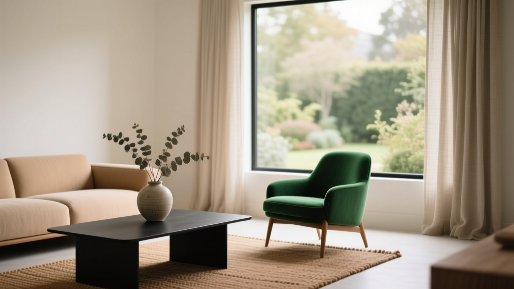
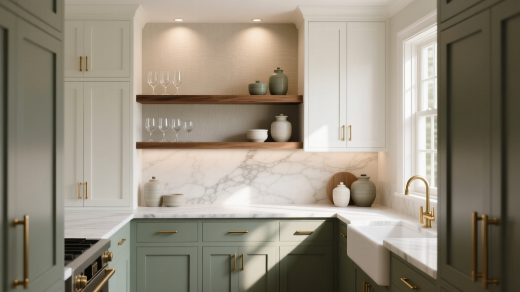 How to Choose Colors for a Butler Pantry - The Decor Mag
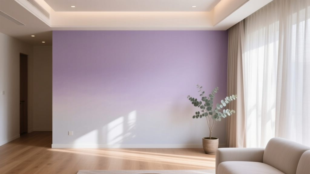 Best Lilac Paint Colors for Gentle Spaces - The Decor Mag
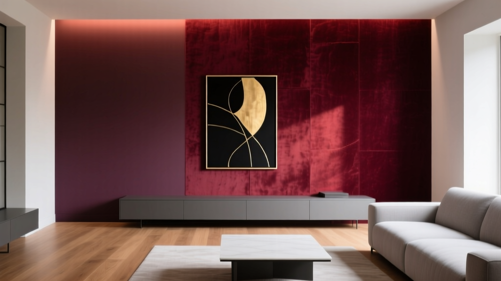 Best Wine Red Paint Colors - The Decor Mag
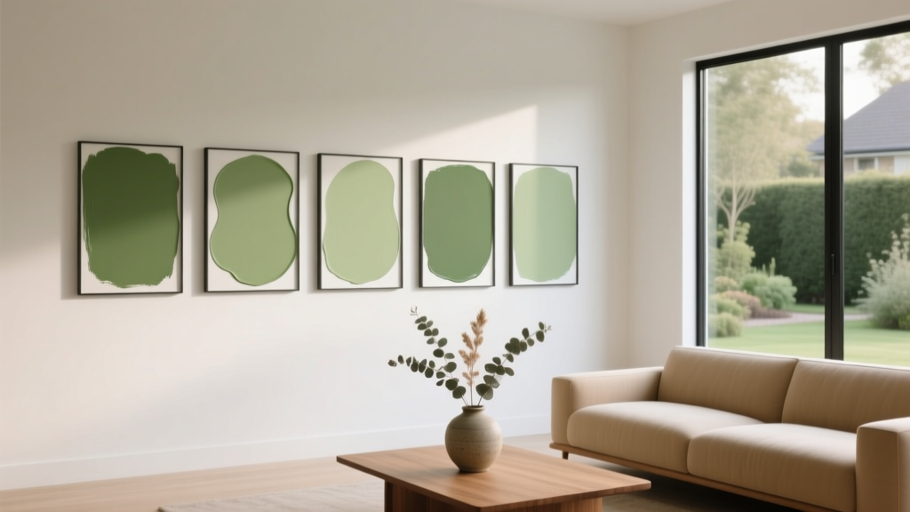 Best Pear Green Paint Colors - The Decor Mag
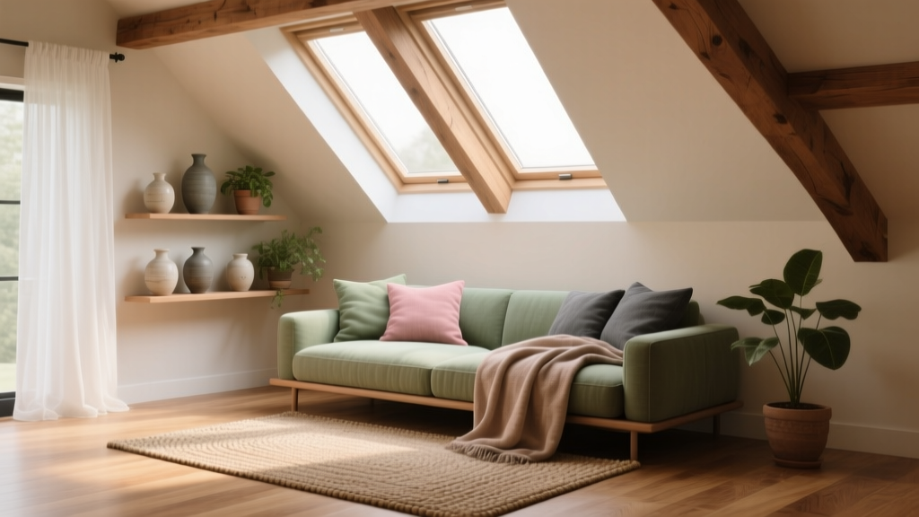 How to Choose Colors for an Attic Room - The Decor Mag
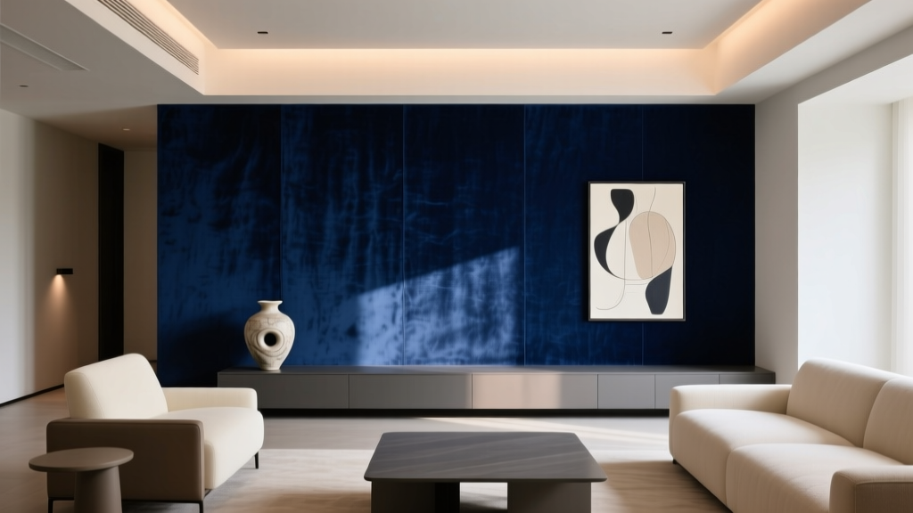 Best Midnight Blue Paint Colors - The Decor Mag
 How to Use Color to Create Flow - The Decor Mag
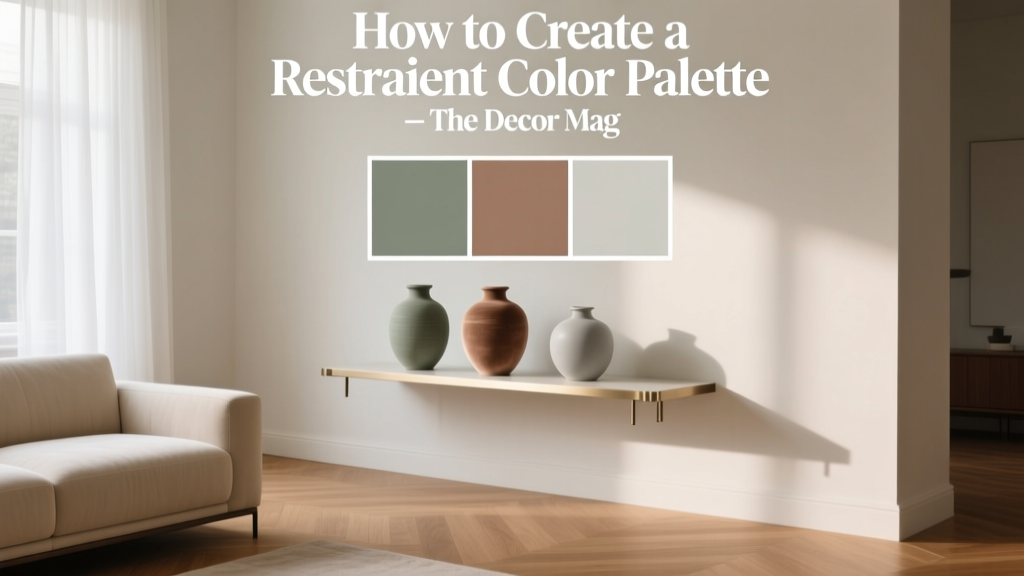 How to Create a Restraint Color Palette - The Decor Mag
 Best Lime Green Paint Colors - The Decor Mag
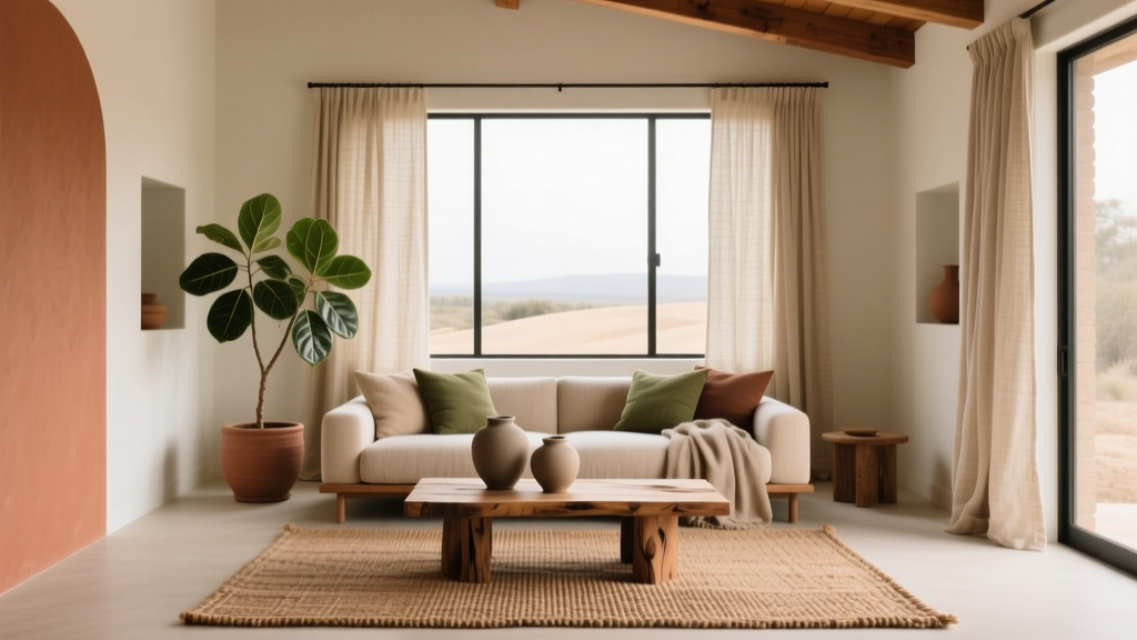 Earth Tone Color Palette Inspiration - The Decor Mag