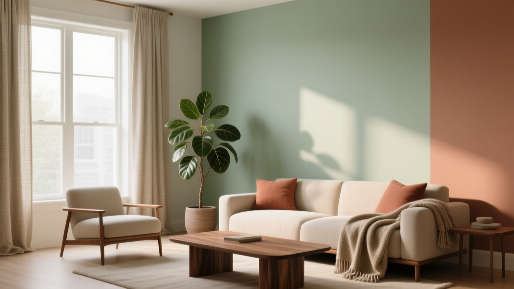
How to Use Analogous Colors in Decor - The Decor Mag
Color is one of the fastest ways to change how a room feels—calmer, brighter, warmer, more refined—without moving a single wall. Yet many homeowners freeze when it’s time to choose a paint color scheme because they’re torn between playing it safe and creating something that looks intentional. That’s where analogous colors shine: they offer harmony, depth, and sophistication with far less risk than high-contrast pairings.
An analogous color scheme uses colors that sit next to each other on the color wheel (think blue–blue-green–green, or red–red-orange–orange). Because these hues share underlying pigment families, they naturally “belong” together. The result is a layered interior color design that reads cohesive, curated, and easy on the eyes—ideal for whole-home palettes, open-concept spaces, and rooms where you want a soothing mood.
This guide breaks down exactly how to choose analogous paint colors, how to distribute them around a room, and how to avoid the common mistakes that can make an analogous palette feel flat or overly saturated. You’ll find specific paint color recommendations, room-by-room examples, and practical tips you can use this weekend.
What Are Analogous Colors (and Why They Work in Interiors)?
Analogous colors are groups of hues adjacent on the color wheel. A classic approach is choosing:
- One dominant color (the main wall color or largest surface)
- One supporting color (secondary walls, cabinetry, upholstery)
- One accent color (trim, textiles, art, or a standout furniture piece)
Design-wise, analogous palettes are beloved because they create low-contrast harmony. Psychologically, they tend to feel restful and continuous—your eye moves through the space without abrupt stops. That’s why analogous color schemes are a go-to in bedrooms, living rooms, and any area where you want comfort with polish.
Color Psychology: The Mood Behind Analogous Schemes
- Blues and blue-greens: calm, clarity, “exhale” energy; great for bedrooms, bathrooms, offices
- Greens and yellow-greens: balance, renewal, connection to nature; ideal for kitchens and family rooms
- Reds and red-oranges: warmth, appetite, sociability; strong in dining rooms and entertaining spaces
- Purples and blue-purples: creativity, softness, a boutique-hotel feel; lovely in primary suites and lounges
How to Build an Analogous Color Palette That Looks Designer
Step 1: Choose Your “Anchor” Color
Start with what you already have: a rug, artwork, countertop stone, or sofa. Pull one color you love as the anchor. Then select the two neighboring hues on the color wheel to create your analogous trio.
Quick shortcut: If you’re starting from scratch, choose the anchor based on the room’s purpose:
- Rest: blue, blue-green, soft green
- Gathering: warm green, gold, terracotta
- Focus: muted blue-green, gray-green, inky blue
Step 2: Use the 60–30–10 Rule (Yes, It Works Here)
This is a classic design principle that keeps analogous color schemes from feeling chaotic or overly matchy:
- 60% dominant color (usually walls)
- 30% secondary color (large furniture, drapery, an accent wall, cabinetry)
- 10% accent color (pillows, lamps, art, small decor)
Because analogous hues are naturally harmonious, this proportioning is what adds structure and “designer” intention.
Step 3: Control Saturation and Value for Depth
Two analogous colors can be next to each other on the wheel and still fight if they’re both equally saturated. For a sophisticated look, vary:
- Value (light vs. dark): pair a light wall with a deeper adjacent hue in textiles or cabinetry
- Saturation (bright vs. muted): keep one color cleaner and the others dustier/gray-shifted
- Temperature (warm vs. cool within the hue family): for example, a cool green with a warmer yellow-green accent
Analogous Color Combinations with Specific Paint Recommendations
Use these as ready-made analogous paint color schemes. Always test samples in your lighting—morning vs. evening can dramatically change undertones.
1) Blue–Blue-Green–Green (Airy and Spa-Like)
- Dominant (walls): Benjamin Moore Palladian Blue (HC-144) or Sherwin-Williams Sea Salt (SW 6204)
- Secondary (cabinetry/feature wall): Benjamin Moore Woodlawn Blue (HC-147) or Sherwin-Williams Rainwashed (SW 6211)
- Accent (decor/door): Benjamin Moore Saybrook Sage (HC-114) or Sherwin-Williams Evergreen Fog (SW 9130)
Best for: bathrooms, bedrooms, serene living rooms, coastal-inspired interiors.
2) Green–Yellow-Green–Yellow (Fresh, Sunlit, Inviting)
- Dominant (walls): Benjamin Moore October Mist (1495) or Sherwin-Williams Clary Sage (SW 6178)
- Secondary (upholstery/cabinetry): Benjamin Moore Guacamole (2144-10) for a bold punch, or Sherwin-Williams Olivine (SW 9679) for a modern green
- Accent (kitchen island, textiles, art): Benjamin Moore Hawthorne Yellow (HC-4) or Sherwin-Williams Napery (SW 6386)
Best for: kitchens, breakfast nooks, family rooms, mudrooms.
3) Red–Red-Orange–Orange (Warm, Social, Statement-Making)
- Dominant (walls): Farrow & Ball Setting Plaster (a pinked neutral that plays well with warm hues) or Benjamin Moore First Light (2102-70) for a gentle blush
- Secondary (dining room built-ins/feature wall): Sherwin-Williams Persimmon (SW 6339) or Benjamin Moore Terra Cotta Tile (2090-30)
- Accent (chairs, art, accessories): Benjamin Moore Caliente (AF-290) used sparingly, or Sherwin-Williams Rave Red (SW 6608) as a small, vibrant accent
Best for: dining rooms, entryways, creative studios—spaces where energy is welcome.
4) Purple–Blue-Purple–Blue (Boutique, Moody, Elegant)
- Dominant (walls): Benjamin Moore Boothbay Gray (HC-165) (a blue-gray that reads sophisticated) or Sherwin-Williams Dusty Heather (SW 9073)
- Secondary (accent wall/drapery): Benjamin Moore Shadow (2117-30) for a moody violet-gray or Sherwin-Williams Indigo Batik (SW 7602) for depth
- Accent (pillows, rugs, art): a rich cobalt or ink blue like Sherwin-Williams Naval (SW 6244) in small doses
Best for: primary bedrooms, libraries, powder rooms, media rooms.
Real Room Examples: How Analogous Schemes Look in Practice
Example 1: A Calm Bedroom Using Blue–Blue-Green–Green
Scenario: You want a bedroom that feels like a retreat, but not bland.
- Walls: Sherwin-Williams Sea Salt (SW 6204) in an eggshell finish
- Textiles: blue-green duvet, layered with soft sage throws
- Accent: a deeper green (like Evergreen Fog) on a painted dresser or nightstands
- Neutrals to add: warm white bedding, natural oak, woven textures to prevent the palette from skewing cold
Why it works: The close relationship between hues keeps the room quiet, while varied textures and one deeper value give it dimension.
Example 2: A Kitchen That Feels Fresh (Green–Yellow-Green–Yellow)
Scenario: You have a kitchen with medium wood floors and want it brighter.
- Walls: Benjamin Moore October Mist (1495)
- Cabinet option: perimeter cabinets in a soft warm white, island in a richer yellow-green for contrast without leaving the analogous family
- Accent color: a buttery yellow in bar stools, roman shades, or a vintage runner
- Metal finishes: brushed brass or warm nickel to complement the yellow notes
Why it works: Yellow-green is a natural bridge between green and yellow, helping the palette feel sunlit and welcoming—excellent for open-concept color design where rooms flow together.
Example 3: A Dining Room with a Warm Glow (Red–Red-Orange–Orange)
Scenario: You want a dining room that feels intimate and flattering at night.
- Walls: a softened warm blush like Benjamin Moore First Light
- Secondary color: terracotta or spiced orange on a feature wall or inside built-ins
- Accent: deep red in artwork, table linens, or a single statement chair
- Lighting tip: use 2700K bulbs and dimmers; warm analogous schemes become richer and more inviting under warmer light
Why it works: Warm analogous palettes support appetite and conversation—classic color psychology for entertaining spaces.
Where to Use Analogous Colors: Paint, Furniture, and Finishes
Analogous color schemes don’t require three bold paint colors. You can keep walls fairly neutral and still build an analogous interior color palette through textiles and finishes.
High-Impact Places to Apply Analogous Color
- Paint: walls + ceiling tint + trim (or trim in a neighboring hue for a modern look)
- Cabinetry: kitchen islands, bathroom vanities, built-ins
- Soft goods: drapery, rugs, pillows—easy to swap seasonally
- Art and accessories: ceramics, glass, framed prints in adjacent hues
- Tile and stone: look for veining that naturally contains your neighboring colors
Designer Tip: Add a Neutral “Breather”
Analogous palettes feel best when grounded with neutrals. Choose neutrals that match the temperature of your scheme:
- Cool analogous schemes (blue/green): crisp whites, soft grays, pale oak, matte black accents
- Warm analogous schemes (yellow/orange/red): creamy whites, warm taupes, walnut, antique brass
Common Analogous Color Mistakes (and How to Fix Them)
- Mistake: Using three colors at the same intensity.
Fix: Choose one muted dominant, one medium secondary, and one deeper or brighter accent. - Mistake: Ignoring undertones.
Fix: Compare paint swatches directly. A “green” can lean gray, blue, or yellow—those undertones decide whether the palette feels seamless or slightly off. - Mistake: Forgetting lighting.
Fix: Test samples on multiple walls. North-facing rooms cool colors down; south-facing rooms warm them up. Adjust with warmer/cooler whites and bulb temperature. - Mistake: Not enough contrast, resulting in a flat look.
Fix: Add contrast through value (a darker cabinet), texture (bouclé, linen, wood grain), or a grounding neutral (charcoal, warm white). - Mistake: Over-committing with paint everywhere.
Fix: Keep the dominant color on walls, then introduce the other two hues through decor. You’ll still achieve an analogous color scheme without visual overload.
Practical Tips for Choosing Analogous Paint Colors Confidently
- Start with one hero paint color you love, then select neighbors using fan decks or online color tools.
- Sample smart: paint 12x12 (or larger) swatches on foam boards so you can move them around the room.
- Match sheen to function: eggshell for walls, satin for trim/cabinets, matte for ceilings (generally).
- Repeat each color at least twice in a room (pillows + art, or rug + vase) to make the palette feel intentional.
- Use black or dark wood sparingly as a visual anchor—especially helpful in pale analogous palettes.
FAQ: Analogous Colors in Home Decor
What is an analogous color scheme in interior design?
An analogous color scheme uses hues that sit next to each other on the color wheel. In home decor, it creates a cohesive, harmonious look because the colors share similar undertones.
How many colors should I use in an analogous palette?
Three is a sweet spot: one dominant, one secondary, and one accent. You can expand to four or five by adding lighter/darker tints of the same hues, but keep the 60–30–10 balance so it doesn’t feel busy.
Do analogous colors work in open-concept homes?
Yes—analogous color schemes are excellent for open layouts because they allow rooms to flow. Keep one dominant wall color throughout and shift the secondary/accent colors by zone (kitchen vs. living area) for gentle definition.
What neutrals go best with analogous color schemes?
Choose neutrals that share the same temperature. Cool palettes pair well with crisp whites and soft grays; warm palettes pair well with creamy whites, warm taupes, and natural woods.
Can I mix analogous colors with a pop of complementary color?
You can, and it often looks more dynamic. Keep the complementary color as a small accent (art, a pillow, a vase) so the room still reads as an analogous color scheme with a controlled focal point.
What’s the easiest way to avoid getting the wrong undertone?
Compare paint samples side-by-side under your room’s lighting and near fixed finishes (flooring, countertops). If one sample suddenly looks “muddy” or “neon” next to the others, the undertone is likely fighting the palette.
Next Steps: Bring an Analogous Color Scheme to Your Home
Choose one room, pick a single anchor hue you already love, and build outward to its two neighbors. Use the 60–30–10 rule, vary light and dark values for depth, and let neutrals and texture do some of the heavy lifting. With a few well-chosen paint colors and thoughtful repetition, analogous color schemes can make your home feel more cohesive, elevated, and emotionally comfortable.
Want more help refining your paint color palette and interior color design? Explore more color guides, room palettes, and paint recommendations on thedecormag.com.
More Articles
 How to Use Color to Change Room Perception - The Decor Mag
 How to Choose Colors for a Playroom - The Decor Mag
 Color Wheel Basics for Home Decorating - The Decor Mag
 Best White Paint Colors Compared - The Decor Mag
 How to Choose Colors for a Reading Room - The Decor Mag
 Best Pink Paint Colors That Aren't Juvenile - The Decor Mag
 Trends vs Island: How Color Forecasting and Brand Identity Diverge in Commercial Design
 Best Coral Paint Colors for Vibrant Spaces - The Decor Mag
 Triadic Color Scheme Applications - The Decor Mag
 How to Create an Energizing Color Palette - The Decor Mag