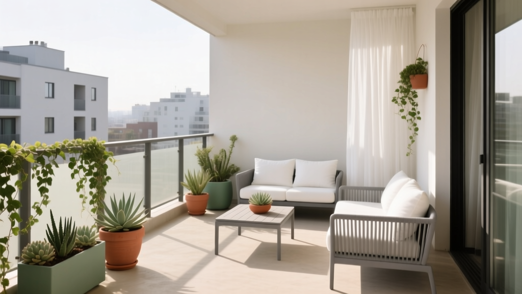
How to Choose Colors for a Balcony - The Decor Mag
A balcony may be small, but it has outsized influence on how your home feels. It’s often the first place you step for fresh air, morning coffee, or a quick reset between meetings. The right balcony paint colors and color scheme can make this space feel expansive, calm, and intentional—while the wrong palette can make it feel harsh, dated, or visually cluttered.
Balconies are also uniquely challenging: they sit between interior and exterior design, they’re affected by strong daylight shifts, and they’re made of materials that read color differently (tile, concrete, metal railings, outdoor fabrics). Choosing colors for a balcony isn’t just about picking a “pretty” paint swatch; it’s about building a durable, flattering palette that works in real-world lighting and elevates the way you use the space.
This guide breaks down balcony color design using color psychology, practical paint color recommendations, and proven design principles—plus real application scenarios you can copy at home.
Start With the Balcony’s Conditions: Light, Exposure, and Surroundings
1) Observe the direction and quality of light
Lighting changes how paint colors look more than any other factor. Before finalizing a balcony color scheme, note the direction:
- North-facing balcony: Cooler, softer light. Warm neutrals and creamy whites help prevent a flat, gray cast.
- South-facing balcony: Strong, warm light. Cooler whites, muted greens, and soft grays hold their color without turning too yellow.
- East-facing balcony: Bright morning light, softer afternoons. Balanced neutrals and gentle hues work well.
- West-facing balcony: Warm, intense afternoon light. Colors can look more saturated; choose slightly muted versions of what you love.
2) Consider what’s “permanent”
Most balconies have fixed elements that should guide your palette:
- Flooring (tile, concrete, composite decking)
- Railing color/material (black metal, white aluminum, glass)
- Exterior building color and neighboring balconies
- Large interior sightline (your living room wall color seen through the doors)
3) Plan for outdoor durability
Balcony paint colors need weather resistance. Look for exterior-rated paint and primers, and verify the surface type (metal vs. masonry vs. wood). If you rent or can’t paint, use the same color-planning steps with outdoor rugs, planters, and textiles.
Choose a Color Strategy: Calm Retreat, Lush Garden, or Modern Extension
The most successful balcony color schemes start with a goal. Color psychology can support the mood you want:
- Restorative and calm: soft whites, warm beiges, gentle greens, muted blues
- Social and energizing: terracotta, sun-baked peach, saffron accents, coral details
- Modern and clean: crisp whites, charcoal, mineral grays, black accents
- Nature-forward: olive, sage, clay, sand, off-black, natural wood tones
A simple formula that works almost every time
For an easy, balanced balcony color scheme, aim for:
- 1 base neutral (walls, large surfaces, backdrop)
- 1 supporting mid-tone (planters, outdoor rug, chair cushions)
- 1 accent color (small textiles, lanterns, ceramics)
- 1 “anchor” (matte black, dark bronze, or deep charcoal in small doses)
Paint Color Recommendations That Flatter Outdoor Light
Below are practical balcony paint color ideas with popular brand references. Always test with peel-and-stick samples or sample pots, and evaluate in morning, afternoon, and evening light.
Best whites and off-whites for balconies
White creates an airy backdrop and makes plants pop, but outdoor light can make some whites feel glaring or chalky. These options are widely used for interior color design and translate well outdoors when chosen thoughtfully:
- Benjamin Moore White Dove (OC-17): a warm, soft white that feels welcoming on shaded balconies.
- Sherwin-Williams Alabaster (SW 7008): creamy without being yellow; pairs beautifully with black railings and terracotta pots.
- Farrow & Ball Wimborne White (No. 239): classic, slightly warm; elegant with natural wood furniture.
Best pairing: Off-white walls + matte black metal accents + greenery + natural fibers (jute-look outdoor rug, woven lanterns).
Soft grays and greiges for a modern balcony
Gray can look sophisticated outdoors, but it can also turn icy on north-facing balconies. Opt for grays with warmth or “mineral” undertones.
- Benjamin Moore Classic Gray (OC-23): a light greige that reads clean, not cold; ideal if your interior is neutral.
- Sherwin-Williams Agreeable Gray (SW 7029): a balanced greige that plays well with wood and black accents.
- Farrow & Ball Cornforth White (No. 228): a mid-light gray that feels architectural and crisp.
Best pairing: Greige base + deep charcoal cushions + brushed brass lantern + a few clay planters.
Greens that make balconies feel like a garden
Green is one of the most flattering balcony color families because it harmonizes with plants and supports a restorative mood. Muted greens also hide outdoor dust better than bright whites.
- Sherwin-Williams Sea Salt (SW 6204): a soft blue-green that reads spa-like, especially with white trim.
- Benjamin Moore Saybrook Sage (HC-114): earthy and classic; works beautifully with terracotta and teak.
- Farrow & Ball Mizzle (No. 266): a refined gray-green that feels calm and grown-up.
Best pairing: Sage wall + warm white ceiling/trim + terracotta and olive-toned textiles + black accents.
Terracotta, clay, and sun-warmed hues for cozy balconies
Warm earthy colors make a balcony feel like an outdoor room—inviting, flattering at golden hour, and friendly with natural materials.
- Farrow & Ball Red Earth (No. 64): a grounded clay tone; stunning with olive plants and brass.
- Benjamin Moore Terra Cotta Tile (2090-30): rich and warm; best as an accent wall or on planters/furniture.
- Sherwin-Williams Cavern Clay (SW 7701): a popular earthy hue that reads sophisticated rather than boho when paired with black and linen.
Best pairing: Warm clay accent + creamy base + striped textiles in sand/black + natural wood.
Real Balcony Color Schemes You Can Copy
Scenario 1: Small apartment balcony that feels bigger
Goal: Make tight square footage feel open and bright.
Color scheme: Soft off-white + light greige + black accents
- Walls: Benjamin Moore White Dove (OC-17)
- Floor solution: Light-toned outdoor rug (oatmeal or stone)
- Furniture: Slim black metal bistro set (acts as an “anchor”)
- Textiles: Warm gray seat pads + a single accent pillow in muted olive
Why it works: High reflectance expands the perceived space, while black details add definition so the balcony doesn’t look washed out.
Scenario 2: North-facing balcony with flat, cool light
Goal: Add warmth and reduce the “cold gray” effect.
Color scheme: Creamy neutral + terracotta + deep green
- Walls: Sherwin-Williams Alabaster (SW 7008)
- Accent (planters or one wall if allowed): Sherwin-Williams Cavern Clay (SW 7701)
- Plants: Glossy-leaf greens (rubber plant, olive tree, herbs) to enrich the palette
- Textiles: Deep green cushion covers + natural linen throw
Why it works: Warm neutrals counterbalance cool light; earthy accents bring life without looking overly saturated.
Scenario 3: South-facing balcony with strong sun and glare
Goal: Keep the palette calm and avoid eye strain.
Color scheme: Mineral greige + soft green + natural wood
- Walls: Benjamin Moore Classic Gray (OC-23)
- Supporting color: Sherwin-Williams Sea Salt (SW 6204) in cushions or a painted planter set
- Anchor: Charcoal outdoor rug border or black lanterns
Why it works: Slightly muted hues hold steady in intense sun and feel cooler on hot days.
Scenario 4: Balcony as an extension of the living room
Goal: Create seamless indoor-outdoor color continuity.
Approach: Borrow one interior color and repeat it outside, then adjust the saturation.
- If your living room is warm neutral, mirror it outdoors with a slightly lighter off-white.
- If your interior uses blue accents, repeat blue outdoors in textiles (not on large painted surfaces) so it doesn’t overwhelm in daylight.
Example palette: Agreeable Gray (SW 7029) base + navy-striped outdoor pillows + teak furniture + white planters.
Application Guidance: Where to Use Color on a Balcony
Balcony design works best when color is distributed intentionally. A few smart placements have more impact than painting everything bold.
High-impact places for your “base” color
- Balcony wall (if paintable)
- Large planters grouped together (painted to match for a cohesive look)
- Outdoor rug background color
Best spots for accent color (small but powerful)
- Seat cushions and one or two pillows
- Lanterns or candleholders
- Herb pots, ceramics, small side table
Design tip: Repeat each color at least twice
Color feels intentional when it shows up in more than one place. For example, if your accent is terracotta, use it in:
- one planter
- one pillow or throw
- a small tabletop accessory
Common Color Mistakes to Avoid
- Choosing paint colors without testing in outdoor light: A beige that looks cozy indoors can look yellow or stark outside. Sample first.
- Using bright, high-chroma colors on large surfaces: Sunlight intensifies saturation. If you love bold color, use it in textiles or small painted accents.
- Ignoring the floor tone: Balconies often have strong floor colors (orange tile, cool concrete). Your palette should coordinate with the undertone, not fight it.
- Too many competing accents: Multiple saturated pillows, patterned rugs, and colorful planters can read chaotic in a compact space. Limit accents to one main hue.
- Forgetting contrast: An all-light palette can look unfinished. Add an anchor (matte black, charcoal, deep bronze) for definition.
- Not connecting to the interior color scheme: If your balcony is visible from inside, clashing hues will feel visually noisy every day.
Quick-Start Color Combinations (Designer-Approved)
Use these balcony color combinations as ready-made palettes:
- Classic + fresh: White Dove (BM) + matte black + olive green + natural wood
- Warm Mediterranean: Alabaster (SW) + Cavern Clay (SW) + sand beige textiles + dark green plants
- Modern calm: Classic Gray (BM) + charcoal accents + Sea Salt (SW) textiles + light oak tones
- Moody and lush: Mizzle (F&B) + black railing + brass lanterns + creamy cushions
FAQ: Choosing Balcony Paint Colors and Color Schemes
What colors make a small balcony look bigger?
Light neutrals with soft contrast tend to expand space visually: warm off-whites (Benjamin Moore White Dove, Sherwin-Williams Alabaster) paired with a defined anchor like matte black. Keep large surfaces light, then add depth with darker accents.
Should balcony colors match the interior?
They don’t need to match exactly, but they should coordinate. If the balcony is visible from your living room, repeat at least one interior color (or undertone) outdoors so the transition feels intentional.
What paint finish is best for a balcony wall or railing?
For most exterior balcony walls, an exterior-rated eggshell or satin finish balances cleanability and glare control. For railings and metal, use the recommended metal primer and a durable exterior enamel, often in satin or semi-gloss for wipeability (check building rules and manufacturer guidance).
How do I choose colors if I can’t paint my balcony?
Build your color scheme with movable elements:
- outdoor rug (acts like a “painted floor”)
- planters (choose 1–2 colors, repeated)
- cushions and textiles (your accent color lives here)
- lanterns and small decor (add the dark anchor)
What balcony colors work best with lots of plants?
Muted neutrals and greens are the easiest backdrop: greige, warm white, sage, and clay. They complement foliage and make blooms stand out without competing.
How can I avoid choosing the wrong undertone?
Compare your sample to fixed materials (tile, railing, exterior brick) and look for undertone harmony:
- Orange/terracotta tile pairs well with warm whites, clay, olive, and warm greige.
- Cool gray concrete pairs well with crisp whites, mineral grays, and blue-greens.
Next Steps: Your Balcony Color Plan in 30 Minutes
- Take two photos: one in the morning and one in late afternoon to capture lighting shifts.
- Identify undertones in the floor and railing (warm vs. cool).
- Pick one base neutral from the recommendations above.
- Add one supporting color (often a muted green or greige).
- Choose one accent (terracotta, navy, saffron, or black-and-white pattern).
- Test samples and confirm in real daylight before committing.
A thoughtful balcony color scheme turns even the smallest outdoor space into a true extension of your home—one that feels flattering in daylight, aligned with your interior color design, and genuinely enjoyable to use.
Want more paint color ideas and color scheme guides? Explore the latest color theory articles and room-by-room palettes on thedecormag.com.
More Articles
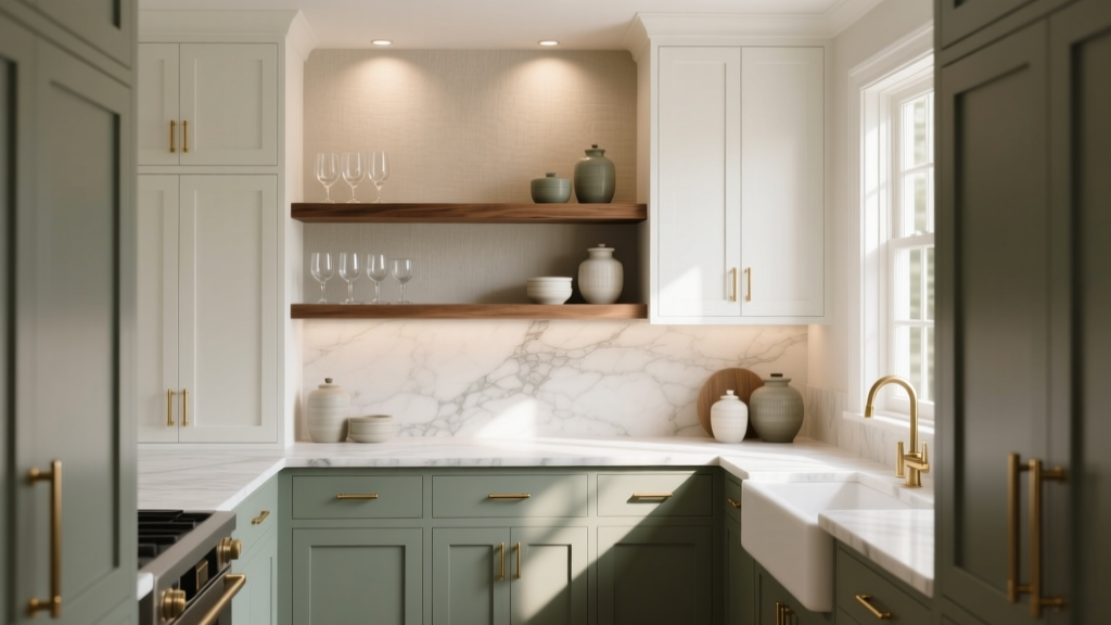 How to Choose Colors for a Butler Pantry - The Decor Mag
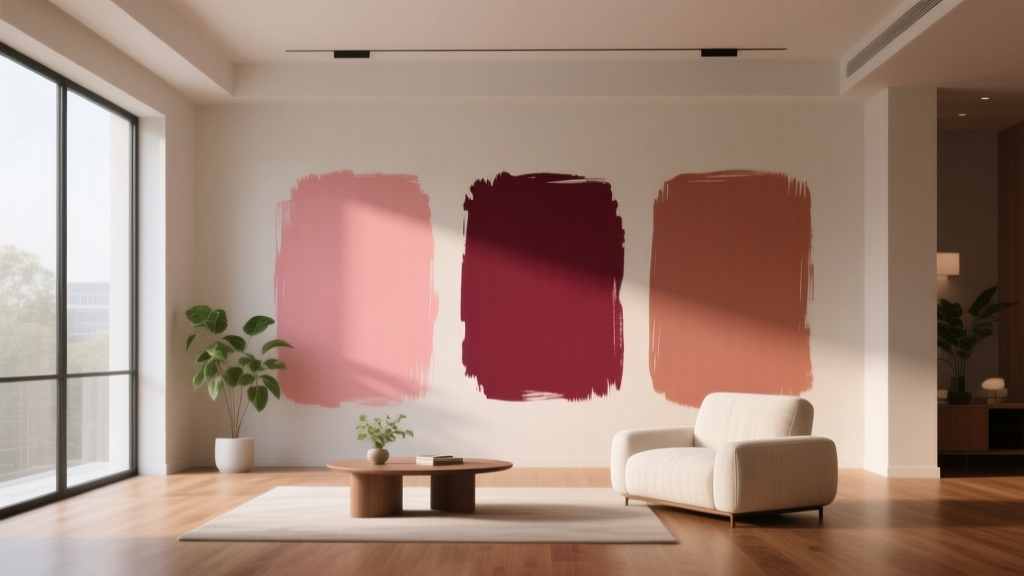 Best Rose Red Paint Colors - The Decor Mag
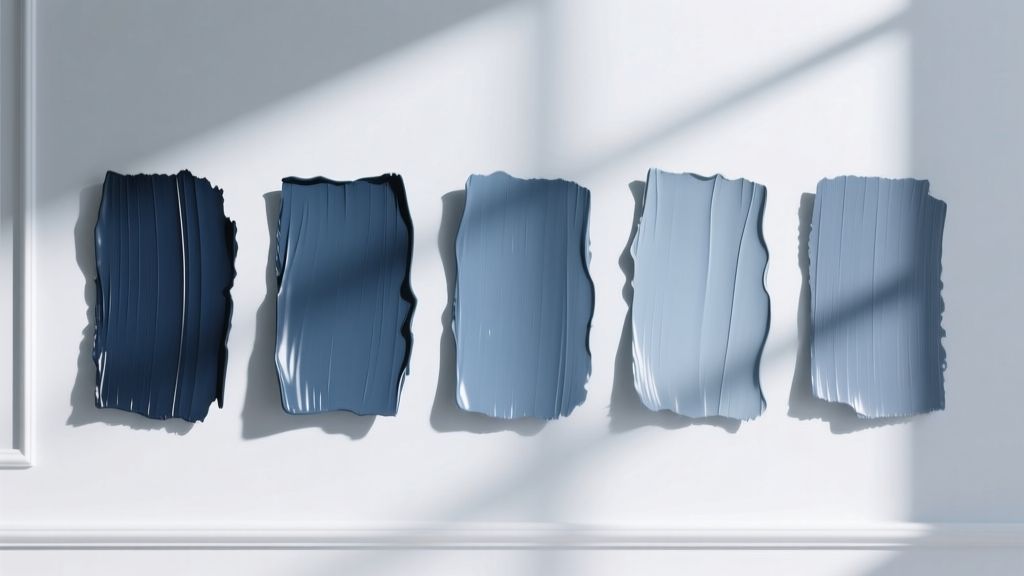 Best Slate Blue Paint Colors - The Decor Mag
 How to Choose Colors for a Sunroom - The Decor Mag
 Best Bathroom Floor Solutions: Performance, Safety, and Style Compared
 How to Choose Bedroom Colors for Sleep - The Decor Mag
 How to Choose Colors for a Terrace - The Decor Mag
 How to Create a Traditional Color Palette - The Decor Mag
 Complementary Color Pairing Ideas - The Decor Mag
 How to Use Analogous Colors in Decor - The Decor Mag