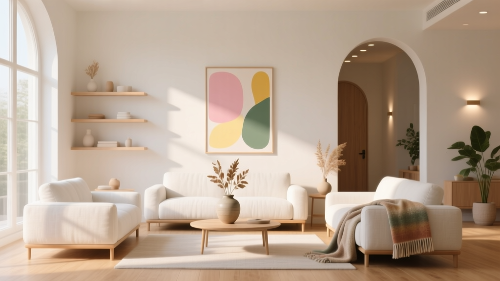
How to Create an Uplifting Color Palette - The Decor Mag
Color has an uncanny way of changing how a home feels—often faster than new furniture, new lighting, or a full renovation. The right palette can make a dark hallway feel hopeful, a busy kitchen feel more cheerful, or a bedroom feel like a restorative retreat. When homeowners say they want a space that feels “lighter,” “happier,” or “more energizing,” they’re usually describing the emotional impact of an uplifting color scheme.
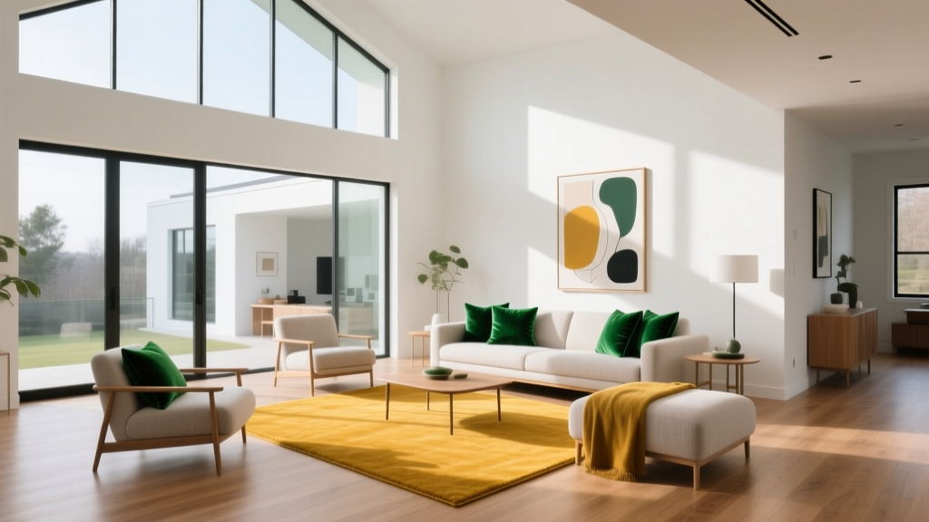
An uplifting palette isn’t the same as “bright” or “bold.” It’s a thoughtful mix of hues, values (lightness/darkness), and undertones that supports your daily life. Color psychology plays a role—warm tones can feel welcoming, greens can feel balanced, and blues can feel serene—but the real magic happens when you apply design principles like contrast, repetition, and proportion. This guide breaks down how to create uplifting interior color design that looks intentional and lives beautifully.
What Makes a Color Palette Feel Uplifting?
Color psychology basics (without the clichés)
While personal preference matters, research and long-standing design practice point to general emotional patterns:
- Warm whites and soft creams often feel optimistic and inviting.
- Sun-washed yellows can read joyful and energizing, especially in kitchens and breakfast areas.
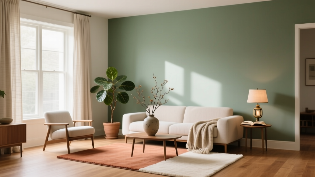
- Greens are associated with restoration and balance—great for living rooms and home offices.
- Blues skew calm and airy; lighter blues can feel fresh rather than sleepy.
- Corals, peaches, and warm pinks feel friendly and flattering, especially in north-facing rooms.
The design principles behind “uplift”
Uplifting color schemes share a few common traits:
- Higher light reflectance: lighter colors bounce more light and increase perceived openness.
- Clean undertones: muddy undertones can dampen a space; crisp undertones feel clearer.
- Balanced contrast: enough depth to keep the room grounded (trim, accents, or a deeper anchor color).
- Repetition: the same 2–4 key colors repeated across textiles, art, and paint creates harmony.
Step-by-Step: Build an Uplifting Color Palette That Works
1) Start with your home’s fixed elements
Before you pick paint colors, look at what’s not changing. These “fixed” items drive undertones and keep your palette cohesive:
- Flooring (warm oak, cool gray tile, reddish hardwood)
- Countertops and backsplash (marble veining, quartz warmth, grout color)
- Large upholstered pieces (sofa, headboard)
- Metal finishes (brass, nickel, black)
Practical tip: If your floors lean warm (golden oak), avoid icy whites. If your stone has gray veining, a warm greige or clean white often looks more uplifting than a beige-heavy cream.
2) Choose a “hero” color and two supporting players
A reliable formula for interior color design is:
- Main wall color (60%) – the backdrop that sets the mood
- Secondary color (30%) – furniture, rugs, curtains, or an accent wall
- Accent color (10%) – art, pillows, lampshades, a painted door, or cabinetry
Uplifting palettes usually do best with a light-to-medium main wall color, then a secondary color with slightly more depth, plus a bright or warm accent.
3) Make undertones your non-negotiable
Two whites can look wildly different depending on undertone (yellow, pink, gray, green). Undertones are often the reason a paint color looks “off” after it’s on the wall.
- Warm undertones (creamy, peachy) feel cozy and upbeat in low light.
- Neutral undertones feel clean and flexible across rooms.
- Cool undertones can feel crisp and modern, but risk feeling chilly in north-facing rooms.
4) Sample correctly so you don’t chase the wrong “uplift”
- Test at least 3 candidates per room.
- Paint large swatches (or use peel-and-stick samples) on multiple walls.
- Observe at three times: morning, afternoon, evening with lamps on.
- View next to white paper to spot undertones.
Uplifting Paint Colors: Specific Recommendations (By Mood)
Bright-but-soft whites (the backbone of uplifting color schemes)
Whites are powerful when they’re not stark. These are designer favorites for airy, welcoming spaces:
- Benjamin Moore White Dove (OC-17): creamy, versatile, uplifting in most exposures; excellent for walls or trim.
- Sherwin-Williams Alabaster (SW 7008): warm and gentle; great in bedrooms and living areas.
- Farrow & Ball Pointing (No. 2003): soft, sophisticated warmth that feels “sunlit.”
Where they shine: open-concept living spaces, hallways, and rooms with lots of wood tones.
Sunlit neutrals (when you want warmth without “beige”)
- Benjamin Moore Pale Oak (OC-20): a warm greige that reads light and calm; uplifting in family rooms.
- Sherwin-Williams Accessible Beige (SW 7036): a balanced neutral that plays nicely with warm woods and black accents.
- Benjamin Moore Edgecomb Gray (HC-173): soft and inviting; reads airy with white trim.
Optimistic yellows (fresh, not neon)
Yellow is the classic “happy” hue, but choose softened versions to avoid glare.
- Farrow & Ball Dayroom Yellow (No. 233): gentle and sophisticated, ideal for dining rooms.
- Benjamin Moore Hawthorne Yellow (HC-4): warm, historic, and welcoming; great in kitchens with white cabinets.
- Sherwin-Williams Friendly Yellow (SW 6680): a lively choice for playrooms or sunny breakfast nooks.
Tip: Pair yellow walls with clean white trim and natural textures (oak, rattan, linen) for a grounded, uplifting look.
Fresh greens (balanced, restorative uplift)
- Sherwin-Williams Sea Salt (SW 6204): a blue-green that feels airy and spa-like in bathrooms and bedrooms.
- Benjamin Moore Saybrook Sage (HC-114): a timeless sage that feels calm yet optimistic.
- Farrow & Ball Mizzle (No. 266): soft green-gray that reads serene in changing light.
Airy blues (light, open, and cheerful)
- Benjamin Moore Palladian Blue (HC-144): a classic uplifting blue-green for living rooms and sunrooms.
- Sherwin-Williams Sky High (SW 6504): bright and breezy for ceilings, nurseries, or small offices.
- Benjamin Moore Woodlawn Blue (HC-147): soft, clean, and welcoming—excellent in guest rooms.
Warm pinks and corals (the secret weapon for “glow”)
Used thoughtfully, warm pinks and corals can make skin tones look better and rooms feel friendlier.
- Benjamin Moore First Light (2102-70): a pale pink that reads like morning light.
- Sherwin-Williams Intimate White (SW 6322): a warm blush-neutral for bedrooms and dressing areas.
- Farrow & Ball Setting Plaster (No. 231): earthy pink with depth; uplifting in living rooms with warm woods.
Ready-to-Use Uplifting Color Combinations
These interior color schemes are designed for real homes—balanced, flexible, and easy to repeat from room to room.
- Warm Airy Classic: Benjamin Moore White Dove + Benjamin Moore Pale Oak + brass accents + touches of terracotta
- Fresh Coastal (not themed): Sherwin-Williams Alabaster + Benjamin Moore Palladian Blue + sandy beige textiles + matte black details
- Modern Botanical: Benjamin Moore White Dove + Farrow & Ball Mizzle + warm oak + deep green accents (art or pillows)
- Sunny Kitchen Energy: Sherwin-Williams Alabaster cabinets + Benjamin Moore Hawthorne Yellow walls + soft gray stone + natural jute runner
- Soft Rosy Glow: Farrow & Ball Setting Plaster + crisp white trim + caramel leather + muted olive accents
Real Room Examples and Application Scenarios
Example 1: A dim hallway that feels more optimistic
Goal: brighten without turning the hallway into a sterile white tunnel.
- Walls: Benjamin Moore White Dove (OC-17)
- Trim: same color in a higher sheen for seamless continuity
- Accent: a painted front door in a cheerful mid-tone (try a muted coral or a clear blue)
Application tip: Add a gallery wall with repeated white mats and warm wood frames to reinforce the uplifting warmth.
Example 2: A living room that needs “happy calm”
Goal: uplifting, but not overstimulating.
- Walls: Benjamin Moore Pale Oak (OC-20)
- Built-ins or a subtle accent: Farrow & Ball Mizzle (No. 266)
- Textiles: cream boucle, oatmeal linen, and a small hit of yellow (pillow or art)
Why it works: Pale Oak reflects light and stays soft; the green-gray adds nature-based balance.
Example 3: A kitchen that feels energetic and welcoming
Goal: make mornings easier with an optimistic paint color scheme.
- Cabinets: Sherwin-Williams Alabaster (SW 7008)
- Walls: Benjamin Moore Hawthorne Yellow (HC-4) or a lighter wash of it
- Hardware: warm brass or antique brass
Application tip: If you’re nervous about yellow, keep walls yellow and choose a white backsplash and light counters to maintain a clean, uplifting look.
Example 4: A bedroom that feels like a reset
Goal: a palette that reads fresh in daytime and soothing at night.
- Walls: Sherwin-Williams Sea Salt (SW 6204)
- Ceiling: crisp white to keep it airy
- Bedding: white + one warm accent (camel throw, blush pillow)
Why it works: Sea Salt’s airy tone supports relaxation, while warm accents prevent it from feeling cold.
Common Color Mistakes That Steal the “Uplifting” Effect
- Choosing paint in isolation: A perfect swatch can look wrong next to your flooring or countertop undertones.
- Overusing one bright color: Too much saturated yellow or bright blue can feel frantic. Use brights as accents.
- Ignoring value contrast: If walls, trim, and furnishings are all the same mid-tone, the room can look flat. Add a crisp trim, darker anchor, or layered textures.
- Picking a “cool” white for a low-light room: North-facing rooms often make cool whites look gray and gloomy. Try warmer whites (White Dove, Alabaster).
- Forgetting finish and sheen: Flat can look velvety but may dull light; eggshell or satin often keeps walls more luminous and cleanable.
Practical Tips for Making Any Palette More Uplifting
- Repeat your accent color 3 times in a room (art, pillow, vase) for intentional harmony.
- Use color to guide movement: paint an interior door a joyful accent to create a “moment” at the end of a hallway.
- Try a colored ceiling in a soft tint (pale blue or warm white) for a gentle lift without bold walls.
- Layer warm neutrals (cream + sand + caramel) to make bright spaces feel welcoming, not clinical.
- Balance with nature: plants, woven textures, and light wood amplify the positive effect of fresh greens and soft whites.
FAQ: Uplifting Paint Colors and Color Schemes
What are the best uplifting paint colors for small rooms?
Look for light, warm-leaning colors that reflect light well: Benjamin Moore White Dove, Sherwin-Williams Alabaster, or a gentle greige like Benjamin Moore Pale Oak. Add uplift with a brighter accent in art or textiles rather than painting every wall a saturated color.
How do I choose an uplifting color scheme that flows through an open floor plan?
Pick one main wall color for the shared areas, then vary the secondary and accent colors by zone. A simple approach is warm white walls throughout, with shifts like sage in the living area and soft blue in the dining nook, repeating metals and wood tones for cohesion.
Are bright colors always uplifting?
No. Highly saturated colors can feel energizing, but too much can become visually exhausting. Uplifting interior color design usually relies on light-filled neutrals plus controlled pops of brighter hues.
What’s the most foolproof uplifting wall color?
If you want a crowd-pleaser, start with Benjamin Moore White Dove (OC-17) or Sherwin-Williams Alabaster (SW 7008). Both are warm enough to feel inviting and flexible enough to work with many flooring types.
How can I make a north-facing room feel more cheerful with paint?
North light can skew cool and gray. Choose paint colors with warm undertones—creamy whites, warm greiges, and blush-leaning neutrals. Consider Edgecomb Gray, Alabaster, or Setting Plaster and add warm lighting (2700K–3000K) to reinforce the uplift.
Next Steps: Turn Your Palette Into a Plan
To build an uplifting color palette you’ll love long-term, take these steps:
- Identify your fixed undertones (floors, counters, upholstery).
- Choose one main wall color that reflects light well and suits the room’s exposure.
- Add a secondary color with a touch more depth for balance.
- Select one joyful accent (yellow, coral, fresh blue) and repeat it in small doses.
- Test samples in real lighting before committing.
If you’re ready for more paint color ideas, room-by-room palettes, and expert guidance on color schemes, explore the color guides here on thedecormag.com.
More Articles
 2026 Color Trends: Earth Tones Making a Comeback
 Color Psychology in Home Design Guide - The Decor Mag
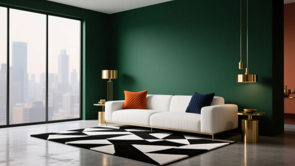 How to Create a Dramatic Color Palette - The Decor Mag
 Best Apple Green Paint Colors - The Decor Mag
 Best Teal Paint Colors for Calm Spaces - The Decor Mag
 Best Mango Paint Colors - The Decor Mag
 Best Steel Blue Paint Colors - The Decor Mag
 Trends vs Island: How Color Forecasting and Brand Identity Diverge in Commercial Design
 How to Choose Colors for South-Facing Rooms - The Decor Mag
 How to Choose Colors for a Garden Room - The Decor Mag