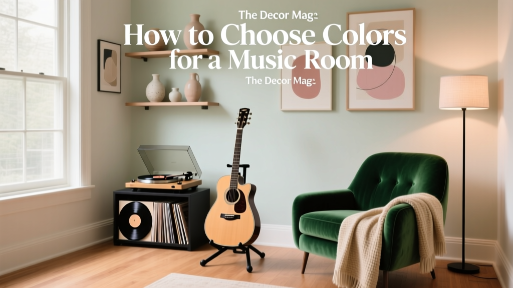
How to Choose Colors for a Music Room - The Decor Mag
A music room is one of the few spaces in a home where mood and performance meet. It’s where you practice, teach, listen, record, host jam sessions, or simply decompress with your favorite album. The right paint colors can make the room feel energizing and creative, calm and focused, or intimate and immersive—often all at once.
Color also affects how a music room functions day to day. A bright, high-contrast palette can feel lively for group rehearsals, while softer, lower-contrast color schemes reduce visual fatigue during long practice sessions. Layer in lighting, wood tones, and instrument finishes, and suddenly the wall color you choose becomes the backdrop for every note.
This guide breaks down color psychology, practical interior color design principles, and actionable paint color recommendations—plus real room scenarios and common pitfalls—so you can build a music room color scheme that looks intentional and supports the way you use the space.
Start With the Room’s Purpose: Practice, Listening, Recording, or Entertaining
Before sampling paint colors, clarify what you do most in the room. Different uses call for different emotional cues and levels of visual energy.
Match color energy to the activity
- Practice-focused rooms (piano, strings, voice): Favor calming, low-distraction hues—soft greens, warm neutrals, or dusty blues. These support concentration and reduce visual “noise.”
- Listening lounges (hi-fi, vinyl, media): Deeper, richer colors create intimacy and reduce glare—navy, charcoal, forest green, oxblood, or moody browns.
- Recording studios or hybrid workspaces: Balanced neutrals plus controlled accents keep the room feeling professional and flexible for video calls.
- Jam rooms and creative hubs: More saturated colors and bolder contrasts can boost energy—teal, terracotta, mustard, or punchy accent walls.
Quick decision prompt
- Do you want the room to feel calm, energizing, or immersive?
- Will you spend more time looking at sheet music/screens or socializing?
- Is the room used day, night, or both?
Color Psychology for Music Rooms (How Colors Influence Mood)
Color psychology isn’t about rigid rules—it’s about choosing hues that support how you want to feel while you play or listen.
- Blues: Often read as calming and focused. Mid-tones work well for practice rooms; deeper navies feel cinematic for listening rooms.
- Greens: Balanced and restorative. Great for long sessions and reduces “edginess” in a high-energy creative space.
- Reds: Stimulating and dramatic. Best as accents or in controlled doses for a lounge vibe (especially with warm lighting).
- Yellows: Optimistic and lively. Muted ochres and golden tones add warmth without becoming visually tiring.
- Neutrals: Flexible and timeless. Warm whites and greiges pair beautifully with wood instruments and brass.
If you’re sensitive to visual stimulation, lean into lower contrast: choose a wall color, trim color, and ceiling color that are closer in value (lightness/darkness). If you want a bolder, stage-like feel, increase contrast with darker walls and crisp trim.
Assess Lighting and Undertones Before You Pick Paint
Lighting is the quiet decision-maker in interior color design. The same paint color can look serene in the morning and muddy at night if the undertone clashes with your bulbs or natural light direction.
How natural light changes paint colors
- North-facing rooms: Cooler, dimmer light. Warm up the palette with creamy whites, warm greiges, and earthy tones.
- South-facing rooms: Bright, warm light. You can use cooler colors (blue/green) without the room feeling cold.
- East-facing rooms: Warm morning light, cooler later. Choose balanced neutrals or colors that hold steady across the day.
- West-facing rooms: Cooler mornings, golden evenings. Great for rich colors that glow at sunset.
Bulb temperature matters
- 2700K–3000K: Warm, cozy—ideal for listening rooms, libraries, and lounges.
- 3500K: Neutral—good for practice and multi-use rooms.
- 4000K+: Crisp—can make warm paints look flatter and cool paints feel colder; use carefully.
Tip: When you test paint samples, view them under your evening lighting and daytime light. A music room is often used after work—nighttime color is the color you’ll live with.
Choose a Color Scheme: 5 Winning Approaches for Music Rooms
1) Calm Studio Neutrals (focused and timeless)
This is the “let the instruments shine” approach—great for acoustic spaces and mixed decor styles.
- Wall color: Benjamin Moore Classic Gray OC-23 (soft greige) or Sherwin-Williams Agreeable Gray SW 7029
- Trim: Benjamin Moore Chantilly Lace OC-65 for crispness, or White Dove OC-17 for warmth
- Accent: Blackened bronze, walnut, or deep charcoal details
Application scenario: A piano practice room with oak floors and a black upright piano. Use Classic Gray on walls, White Dove trim, and add a charcoal felt pinboard for sheet music.
2) Moody Listening Room (immersive and cinematic)
Darker paint colors reduce glare and create an enveloping feel—ideal for vinyl, home audio, and evening listening.
- Navy: Farrow & Ball Hague Blue No. 30 or Sherwin-Williams Naval SW 6244
- Charcoal: Benjamin Moore Wrought Iron 2124-10
- Deep green: Benjamin Moore Essex Green HC-188 (classic and rich)
Application scenario: A basement music lounge with a record wall and low seating. Paint walls Naval, keep trim slightly softer (White Dove), and add warm brass picture lights over album art for a gallery vibe.
3) Creative Energy Palette (playful but sophisticated)
Great for jam rooms, hobby spaces, and homes where music is a social activity.
- Teal: Sherwin-Williams Cascades SW 7623
- Terracotta: Benjamin Moore Terra Cotta Tile 2090-30
- Mustard/ochre accents: Farrow & Ball India Yellow No. 66 (best as an accent)
Application scenario: A garage-converted band room. Use Cascades on the main walls, paint a single terracotta accent wall behind the drum kit, and keep the ceiling a clean warm white to avoid making the space feel shorter.
4) Modern Minimal + High Contrast (graphic and clean)
For contemporary homes, a sharp contrast palette looks purposeful and photographs well—useful if you record content.
- Walls: Benjamin Moore Simply White OC-117 (warm white that reads clean)
- Accent/doors: Sherwin-Williams Tricorn Black SW 6258
- Secondary neutral: Sherwin-Williams Repose Gray SW 7015 for built-ins or a feature zone
Application scenario: A multi-use music office with wall-mounted guitars. Keep walls Simply White, paint the door Tricorn Black, and add a black acoustic panel grid for a crisp, studio-inspired look.
5) Warm, Vintage-Inspired (inviting and layered)
If you love jazz, classic rock, or a more traditional vibe, warm colors pair beautifully with wood instruments, leather, and vintage posters.
- Warm neutral: Benjamin Moore Edgecomb Gray HC-173
- Warm brown: Sherwin-Williams Urbane Bronze SW 7048 (excellent for an accent wall)
- Muted red: Farrow & Ball Preference Red No. 297 (use strategically)
Application scenario: A spare bedroom turned sax and guitar room with a tufted leather chair. Use Edgecomb Gray on walls, Urbane Bronze behind shelving, and bring in oxblood textiles to echo the instruments’ warmth.
Where to Put Color: Walls, Ceiling, Trim, and Accents
Choosing paint colors is only half the job—placing them well creates the effect you want.
Smart placement strategies
- Accent wall behind the “stage” area: Paint the wall behind the piano, drum kit, or mic stand a deeper color to anchor the room.
- Color-drenched rooms (walls + trim same color): Works beautifully with moody hues like Hague Blue or Wrought Iron; it feels intentional and reduces visual clutter.
- Ceiling as a design tool: A slightly tinted ceiling can feel cozy. Try 50% strength of the wall color or a soft tonal shift (e.g., pale gray-blue ceiling with navy walls).
- Two-tone walls: A darker lower half can hide scuffs from stands and cases while keeping the room airy above.
Practical finish recommendations
- Walls: Matte or eggshell for most rooms; matte hides imperfections and feels sophisticated.
- Trim/doors: Satin or semi-gloss for durability and definition.
- Ceilings: Flat to minimize glare.
Real Room Examples: Color Schemes That Work
A small music room that needs to feel bigger
- Goal: Open, calm, and bright for daily practice
- Palette: Benjamin Moore White Dove OC-17 walls + slightly brighter trim (Chantilly Lace OC-65)
- Accents: Black frames, natural wood, a muted blue rug
- Why it works: Low-contrast whites expand perceived space, while dark accents keep it from feeling bland.
A shared family room + music corner
- Goal: Blend instruments into a living space without looking cluttered
- Palette: Sherwin-Williams Accessible Beige SW 7036 walls + Urbane Bronze SW 7048 built-ins or a niche
- Accents: Woven textures, warm metals, coordinated instrument stands
- Why it works: Warm neutrals unify the room; a darker zone visually “organizes” the music area.
A dramatic listening den with album art
- Goal: Cozy, immersive, gallery-like
- Palette: Farrow & Ball Hague Blue walls + brass lighting + walnut shelving
- Accents: Cream textiles, deep green plants, black speaker fabric
- Why it works: Dark walls make art pop and create a focused atmosphere for sound and conversation.
Common Color Mistakes to Avoid in a Music Room
- Choosing a color without testing it at night: Many music rooms are used most after dark. Always sample under your actual bulbs.
- Too much high-chroma color on every wall: Bright, saturated hues can become exhausting during long sessions. Use them as accents or balance with neutrals.
- Ignoring undertones: A “gray” can lean green, blue, or purple. If your floor is warm oak, a cool gray may look icy.
- Harsh contrast with shiny finishes: High-gloss walls + stark contrast can create glare, especially with lamps and screens. Choose softer sheens.
- Forgetting the instruments are part of the palette: A glossy black piano, honey-colored acoustic guitar, or brass instruments all influence what looks harmonious.
Practical Tips for Getting the Color Right (Without Guesswork)
- Build a mini palette first: Choose one wall color, one trim color, and one accent (textile or paint). Keep it to three before expanding.
- Sample large: Use peel-and-stick samples or paint poster boards (at least 12" x 12") and move them around the room.
- Check next to fixed elements: Hold samples near flooring, the piano finish, speaker cabinets, and any wood paneling.
- Use repetition: Repeat the same accent color 2–3 times (rug, art, pillows, or a painted shelf) so it feels deliberate.
- Plan for future changes: If you might swap instruments or furniture later, choose a flexible neutral and bring personality through accents.
FAQ: Choosing Paint Colors and Color Schemes for a Music Room
What are the best paint colors for a small music room?
Light, warm neutrals and soft hues tend to expand the feel of the space. Try Benjamin Moore White Dove, Classic Gray, or Sherwin-Williams Accessible Beige. Add depth with a darker accent wall behind the main instrument.
Are dark paint colors a good idea for a music room?
Yes—especially for listening rooms or cozy practice spaces. Deep colors like Sherwin-Williams Naval or Benjamin Moore Wrought Iron create an immersive atmosphere. Balance them with warm lighting and lighter textiles so the room doesn’t feel heavy.
What color helps with focus while practicing?
Soft greens and muted blues are popular for focus and calm. Consider Benjamin Moore October Mist 1495 (a gentle green) or a dusty blue-gray in the same family. Pair with low-glare finishes like matte walls.
How do I choose a color scheme if I have a lot of wood instruments?
Wood tones look best with warm whites, greiges, and earthy colors. Benjamin Moore Edgecomb Gray or Sherwin-Williams Agreeable Gray are easy starting points. For contrast, add a deep green or bronze accent like Essex Green or Urbane Bronze.
Should the ceiling be white in a music room?
Often, yes—especially in smaller rooms. If you want a cozier, more enveloping look, consider a ceiling that’s a softened version of the wall color or a gentle tonal shift (lighter value, same undertone).
How do I keep bold colors from overwhelming the room?
Use bold paint colors strategically: one accent wall, built-ins, or the lower half of a two-tone wall. Keep the rest of the room in calm neutrals, and repeat the bold color in smaller decor pieces for balance.
Next Steps: A Simple Plan to Choose Your Music Room Colors
To move from inspiration to a confident paint choice, follow this quick sequence:
- Define the vibe: Focused studio, immersive lounge, or creative hub.
- Audit lighting: Natural direction + bulb temperature.
- Select one of the five color scheme approaches: Neutral, moody, energetic, high-contrast, or vintage-warm.
- Test 2–3 paint colors: View them day and night next to floors and instruments.
- Commit with placement: Decide if it’s full-room color, an accent wall, or built-ins.
Your music room deserves a palette that supports the way you live with sound—whether that’s quiet morning scales or late-night listening sessions. For more paint color ideas, color schemes, and interior color design how-tos, explore the color guides at thedecormag.com.
More Articles
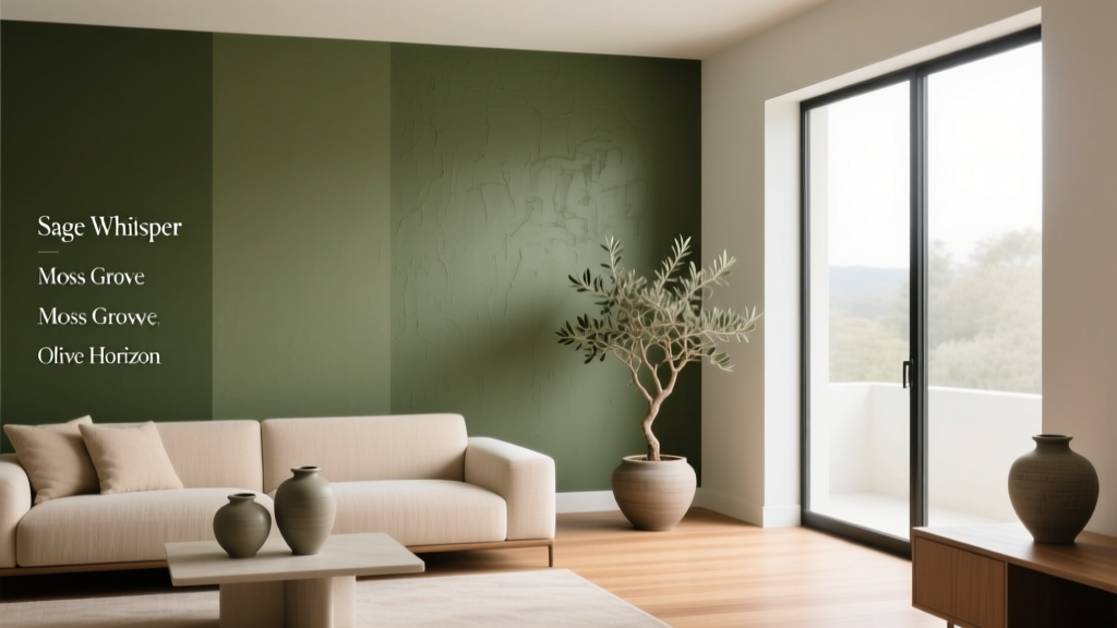 Best Olive Green Paint Colors (2026) | The Decor Mag
 How to Choose Colors for a Loggia - The Decor Mag
 Best Seaweed Green Paint Colors - The Decor Mag
 How to Use Undertones to Match Colors - The Decor Mag
 How to Choose Colors for an Attic Room - The Decor Mag
 How to Create a Playful Color Palette - The Decor Mag
 Color Psychology in Home Design Guide - The Decor Mag
 How to Choose Colors for South-Facing Rooms - The Decor Mag
 Best Beige Paint Colors That Aren't Boring - The Decor Mag
 Friendly and Smart Compared: How Human-Centered Design and AI Intelligence Shape Modern Product Experiences