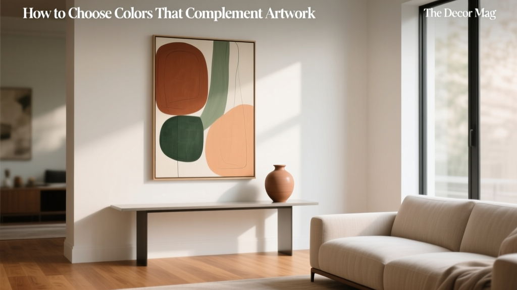
How to Choose Colors That Complement Artwork - The Decor Mag
Artwork has a unique way of setting the emotional temperature of a room. A bold abstract can energize a living space, a serene landscape can quiet a bedroom, and a black-and-white photograph can add instant sophistication to a hallway. Yet even the most beautiful piece can fall flat if the surrounding paint colors fight it, mute it, or make it look out of place.
Choosing paint colors that complement artwork isn’t about matching a wall to a canvas pixel-for-pixel. It’s about creating a color scheme that supports the art’s mood, enhances its palette, and guides the eye through the room. When you align wall color, trim, textiles, and lighting with the artwork, the space feels intentional—like the art truly belongs there rather than being “hung after the fact.”
This guide breaks down practical color theory, interior design principles, and real-room scenarios so you can confidently pick paint colors and supporting accents that make your artwork shine.
Start With the Artwork: Your Built-In Color Palette
Step 1: Identify the dominant, secondary, and accent colors
Most artwork contains a hierarchy of colors. Before you open a paint deck, spend a few minutes analyzing the piece:
- Dominant color: The color that occupies the most visual space (often background tones).
- Secondary colors: Supporting hues that shape the subject or composition.
- Accent color: A small but high-impact pop (a red scarf in a portrait, a streak of cobalt in an abstract).
Pro tip: Take a photo of the artwork in natural light and use the “picker” tool in a photo editor to sample 5–8 colors. You’re not hunting for perfect matches—just a reliable palette direction.
Step 2: Decide what you want the artwork to do
Color choices shift depending on your goal:
- Make the art the focal point: Use quieter wall colors and repeat one subtle hue from the piece elsewhere in the room.
- Create a gallery effect: Choose a wall color that enhances contrast with the art’s overall value (light vs. dark).
- Blend art into a cohesive scheme: Pull a mid-tone from the artwork and use it on walls or large textiles.
Use Color Theory That Works in Real Homes
Complementary, analogous, and triadic color schemes
These classic color schemes are the backbone of interior color design and help you avoid “almost right” combinations that feel off.
- Complementary colors (opposites on the color wheel): High contrast, high energy. Example: blue artwork + warm terracotta wall accents.
- Analogous colors (neighbors on the wheel): Harmonious and calming. Example: green artwork + blue-green or yellow-green wall color.
- Triadic colors (three evenly spaced hues): Balanced but lively. Example: artwork featuring blue, red, and yellow—use one as the wall color, one as upholstery, one as accents.
Value and contrast: the “gallery rule” designers rely on
Value means how light or dark a color appears. When wall value is too similar to the artwork’s overall value, the piece can visually disappear. A helpful approach:
- If the artwork is mostly light, consider mid-tone to deeper walls for contrast.
- If the artwork is mostly dark, consider light to mid-tone walls to lift it.
- If the artwork has strong contrast (black/white or bold color blocks), keep surrounding colors simpler so the art remains crisp.
Undertones: why “beige” isn’t just beige
Undertones are the subtle warm/cool notes that can make paint either sing with your art or clash unexpectedly. Compare your artwork to common undertone families:
- Warm undertones: red, orange, yellow, golden beige
- Cool undertones: blue, violet, gray, blue-green
- Neutral-leaning: greige, soft taupe, balanced whites
Quick check: If the artwork’s whites look creamy, avoid icy blue whites. If the artwork’s neutrals look gray-based, avoid overly yellow beiges.
Practical Strategies for Choosing Paint Colors That Complement Artwork
Strategy 1: Pull a quiet background color (most reliable)
Look for the “supporting actor” color in the artwork—often a muted background tone. This creates harmony without feeling matchy.
Paint color ideas (great for living rooms and bedrooms):
- Benjamin Moore Classic Gray OC-23: a soft greige that supports colorful art without competing.
- Sherwin-Williams Agreeable Gray SW 7029: versatile warm greige; works with both modern and traditional art.
- Farrow & Ball Skimming Stone No. 241: a warm, elevated neutral for art-forward spaces.
Strategy 2: Echo the accent color (small, intentional doses)
Use the artwork’s accent color in:
- throw pillows
- a lampshade or vase
- an area rug detail
- a single painted piece of furniture
This is where color psychology matters: small doses of red or orange add vitality; blues and greens calm; yellows lift mood; purples feel creative and luxe.
Strategy 3: Use a “gallery wall” neutral for multiple artworks
If you have a collection with varied palettes, choose a wall color that supports the group rather than any single piece. Think in terms of value and temperature.
- Crisp white gallery look: Benjamin Moore Chantilly Lace OC-65 (clean, bright) or Sherwin-Williams Extra White SW 7006.
- Soft white (warmer, less glare): Benjamin Moore White Dove OC-17 or Sherwin-Williams Alabaster SW 7008.
- Deep, dramatic gallery vibe: Sherwin-Williams Iron Ore SW 7069 (charcoal) or Benjamin Moore Wrought Iron 2124-10.
Strategy 4: Color drench for immersive art moments
For a moody dining room or intimate den, consider color drenching—painting walls (and sometimes trim) in one hue pulled from the artwork’s deeper tones. The art reads bold and intentional against a saturated envelope.
Designer-friendly saturated picks:
- Farrow & Ball Hague Blue No. 30: deep blue-green that flatters gold frames and warm artworks.
- Benjamin Moore Salamander 2050-10: near-black green; dramatic with botanical prints and modern abstracts.
- Sherwin-Williams Cavern Clay SW 7701: earthy terracotta that pairs beautifully with desert photography and warm-toned paintings.
Real Room Examples and Application Scenarios
Example 1: Neutral sofa, bold abstract in a living room
The art: Large abstract with cobalt, rust, and cream. The goal: Make it the focal point without overpowering the room.
- Wall color: Benjamin Moore Classic Gray OC-23 (quiet backdrop with subtle warmth).
- Accent echo: rust-toned pillows or a throw (pick up the art’s warm accent for cohesion).
- Trim: Benjamin Moore White Dove OC-17 to keep edges soft, not stark.
- Finishing touch: add one matte black element (frame, floor lamp) to repeat any dark lines in the painting.
Example 2: Black-and-white photography in a hallway
The art: High-contrast monochrome. The goal: Gallery-like crispness with depth.
- Option A (bright): Sherwin-Williams Extra White SW 7006 for clean contrast; keep frames consistent (black or white).
- Option B (dramatic): Sherwin-Williams Iron Ore SW 7069 for a museum feel; use white mats to separate art from wall.
- Lighting tip: install picture lights or adjustable ceiling spots; art needs directional light to avoid looking flat.
Example 3: Soft landscape painting in a bedroom
The art: Misty landscape with sage, dusty blue, and warm gray. The goal: Calm, restorative color scheme.
- Wall color: Sherwin-Williams Sea Salt SW 6204 (a light blue-green that supports landscapes and promotes relaxation).
- Bedding: warm white linens (Alabaster SW 7008 as a reference point) to balance cool walls.
- Wood tones: light oak or warm walnut to keep the room from feeling too cool.
Example 4: Colorful art in a small dining room
The art: Vibrant piece with teal, coral, and mustard. The goal: Make the room feel intentional and elevated.
- Wall color: choose the deepest “anchor” from the art—try Farrow & Ball Hague Blue No. 30.
- Chair upholstery: neutral (oatmeal, warm gray) so the art remains the star.
- Table styling: repeat coral in candles or flowers; repeat mustard in a runner or ceramics.
How to Test Paint Colors Next to Artwork (Without Guesswork)
- Test at the right scale: Use large sample swatches (at least 12" x 12") or peel-and-stick samples.
- Place samples around the art: Tape them above, beside, and below the piece to see shifting contrast.
- Check morning, afternoon, and evening: Lighting changes perceived undertones dramatically.
- Compare finishes: Matte walls reduce glare near framed art; eggshell is washable but can reflect more light.
- Factor in frame and mat: A gold frame warms everything around it; a bright white mat pushes a scheme cooler and cleaner.
Common Color Mistakes to Avoid
- Matching the wall to the loudest color in the artwork: A saturated match often overwhelms the piece. Use that color as an accent instead.
- Ignoring undertones: A “warm white” can make cool-toned art look dingy; a cool gray can make warm art look muddy.
- Choosing paint under store lighting: Always test at home; LEDs and daylight expose undertones differently.
- Forgetting about adjacent rooms: Sightlines matter. A perfect gallery wall color can look strange next to a clashing hallway paint color.
- Too many competing colors: If the artwork is complex, simplify the room palette: one wall color, one upholstery neutral, one metal finish, one wood tone.
- Overlooking glare: High-sheen paint, glossy frames, and unshaded lighting can create reflections that wash out the art.
FAQ: Choosing Paint Colors That Complement Artwork
Should I match my wall color to my artwork?
Rarely. A near-perfect match can flatten the artwork and make the room feel overly themed. Instead, pull a muted background tone for the walls and repeat the artwork’s accent color in decor pieces.
What wall colors work best if I have lots of different artwork?
Soft whites and balanced greiges are the easiest. Try Benjamin Moore White Dove OC-17 for warmth, or Benjamin Moore Chantilly Lace OC-65 for a cleaner gallery feel. If you want drama, Sherwin-Williams Iron Ore SW 7069 can unify diverse pieces when mats and frames are consistent.
How do I choose between warm and cool paint colors?
Let the artwork lead. If the art features warm whites, earthy reds, and golden tones, choose warm-leaning neutrals. If it has crisp whites, grays, and blues, lean cooler. When in doubt, a balanced greige like Sherwin-Williams Agreeable Gray SW 7029 bridges warm and cool palettes.
Can I use bold wall colors with artwork?
Yes—especially when the artwork has strong contrast or when you’re aiming for a moody, curated look. Choose a deeper “anchor” hue from the artwork (not the brightest accent) and keep furnishings more restrained.
What paint finish is best for walls with art?
Matte is ideal for minimizing glare and keeping attention on the artwork. Eggshell is a good compromise in high-traffic areas, but be mindful of reflections near framed glass.
How do I coordinate trim color with art-focused wall colors?
Use trim to control contrast. Crisp whites make art and wall color feel sharper and more modern; softer whites feel calmer and more traditional. A go-to pairing is colored walls with Benjamin Moore White Dove OC-17 trim for a clean but not stark edge.
Next Steps: Build a Room Color Scheme Around the Art You Love
Use your artwork as the starting palette, then choose a wall color based on the feeling you want—calm, energized, dramatic, or gallery-clean. Prioritize undertones and value contrast, test large samples beside the piece, and repeat one or two colors from the art across textiles and decor for a finished, cohesive look.
If you’re ready for more paint color ideas, color scheme formulas, and room-by-room guidance, explore more color guides on thedecormag.com.
More Articles
 Earth Tone Color Palette Inspiration - The Decor Mag
 Best Cardinal Red Paint Colors - The Decor Mag
 Best Palette Reading: Science, Standards, and Real-World Accuracy for Designers and Brand Managers
 How to Create a Restraint Color Palette - The Decor Mag
 Best Turquoise Paint Colors - The Decor Mag
 How to Create a Dramatic Color Palette - The Decor Mag
 How to Choose Colors for a Deck - The Decor Mag
 How to Create a Modern Color Palette - The Decor Mag
 Kitchen & Bedroom Inspiration Essentials: Functional Design, Proven Color Systems, and Space-Smart Layouts
 How to Create a Serene Color Palette - The Decor Mag