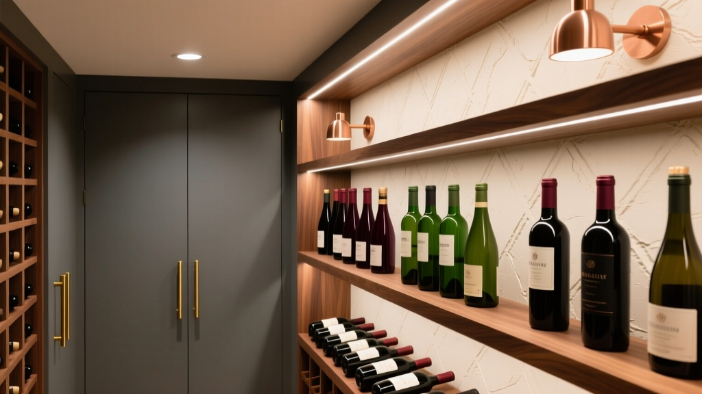
How to Choose Colors for a Wine Cellar - The Decor Mag
A wine cellar is part storage, part sanctuary. It’s where bottles age quietly, labels tell stories, and a simple pour can feel like a ceremony. Color plays a bigger role here than in many other rooms because a wine cellar is usually compact, dimmer, and filled with materials that already have strong visual presence—wood racking, stone, glass doors, cork, and foil.
The right color scheme can make your cellar feel warmer and more intimate, cleaner and more modern, or luxuriously moody like a private club. It can also help highlight your collection (and the craftsmanship of your racks) instead of fighting it. When homeowners choose wine cellar paint colors thoughtfully, the space looks more intentional, photographs better, and feels like an extension of the home’s design story.
This guide walks through color psychology, lighting, real application scenarios, and specific paint colors—from Benjamin Moore, Sherwin-Williams, and Farrow & Ball—to help you build a wine cellar color palette that feels elevated and lasting.
Start With the Cellar’s Mood: Color Psychology for Wine Spaces
Wine cellars tend to benefit from colors that feel grounded and calming. You’re designing for a slower pace—tasting, collecting, and lingering—rather than high-energy productivity.
What different color families communicate
- Deep neutrals (charcoal, warm black): Sophisticated, gallery-like, makes labels and bottle shapes pop. Helps a cellar feel purpose-built.
- Earth tones (clay, camel, olive, mushroom): Warm, organic, pairs beautifully with wood racks and stone floors.
- Jewel tones (burgundy, forest, navy): Dramatic and luxurious, classic “wine lounge” energy when lighting is right.
- Soft neutrals (greige, warm white): Brightens small spaces and works well in glass-enclosed cellars visible from adjacent rooms.
In most wine cellar interior design, the goal is a controlled, comforting atmosphere. Bold color can work, but it needs balance—especially with reflective glass, metal racking, or glossy finishes.
Assess Your Fixed Elements Before Choosing Paint Colors
The fastest way to pick the wrong paint color is to choose it in isolation. Wine cellars are full of “fixed” materials that strongly influence undertones.
Key elements that should drive your color scheme
- Racking material: Redwood and mahogany read warm; white oak can lean neutral to golden; black metal feels modern and crisp.
- Flooring: Slate and concrete skew cool; terracotta and warm stone skew warm; wood floors add amber undertones.
- Countertops or tasting ledges: Marble and quartz can pull cool; butcher block and walnut pull warm.
- Door style: Glass doors expose the cellar from the hallway or kitchen—your paint color needs to harmonize with adjacent wall colors.
- Label colors: If your collection has many white labels, dark walls create contrast; if labels are dark, lighter walls help readability.
Pro tip: Match undertones, not just “dark vs light”
If your racks are warm (redwood, walnut), avoid icy grays that can make the wood look orange. If your stone is cool (blue-gray slate), beware overly creamy beiges that can turn yellow under cellar lighting.
Understand Lighting: The Make-or-Break Factor in Wine Cellar Paint
Lighting in a wine cellar is often low and warm—recessed LEDs, strip lighting inside racks, or small sconces. That changes how paint reads on the wall more dramatically than in sunlit rooms.
How lighting affects color in a cellar
- Warm LEDs (2700K–3000K): Make creams and warm neutrals glow; can make some beiges look yellow and some greens look muddy.
- Neutral LEDs (3500K–4000K): More balanced; helps deep greens and navies read true.
- Spot lighting on bottles: Creates bright highlights and deep shadows—dark paint can look even darker.
Practical sampling guidance
- Test large swatches (at least 12" x 12") on multiple walls.
- View samples with cellar lights on at night—this is when you’ll use the space most.
- Check the paint color next to your racking wood and any stone/tile.
Best Wine Cellar Color Schemes (With Specific Paint Colors)
Below are reliable interior color schemes that work across traditional, transitional, and modern wine cellar styles. Each palette includes specific paint colors you can sample immediately.
1) Classic Moody Neutral: Charcoal + Walnut + Brass
This is the go-to look for homeowners who want a “private club” feel without committing to bold color.
- Wall color: Benjamin Moore Wrought Iron (2124-10) — a soft black with depth
- Alternative: Sherwin-Williams Iron Ore (SW 7069) — slightly warmer charcoal
- Trim/ceiling (if needed): Benjamin Moore Chantilly Lace (OC-65) for crisp contrast, or a tinted version of the wall color for a seamless look
- Accents: Aged brass hardware, warm LED lighting, walnut or mahogany racks
Where it shines: Glass-front cellars off a dining room, or a cellar with a tasting niche where you want intimacy.
2) Earthy and Inviting: Mushroom Greige + Natural Oak
Earth tones feel timeless with wine because they echo barrels, cork, and cellar stone.
- Wall color: Benjamin Moore Revere Pewter (HC-172) — a balanced greige that pairs with many woods
- Alternative: Sherwin-Williams Accessible Beige (SW 7036) — warm, approachable, great in smaller cellars
- Accent color (optional): Benjamin Moore Kendall Charcoal (HC-166) on a back wall for depth
Where it shines: Basements with stone flooring, traditional wood racking, and homeowners who want a cozy wine room without darkness.
3) Statement Jewel Tone: Deep Green + Black Metal Racking
Green is a natural partner to wine cellar design: it’s calming, grounded, and looks rich under warm lighting.
- Wall color: Farrow & Ball Studio Green (No. 93) — dramatic, heritage feel
- Alternative: Sherwin-Williams Ripe Olive (SW 6209) — warmer olive-green depth
- Modern alternative: Benjamin Moore Essex Green (HC-188) — classic, saturated green that reads luxurious
- Pair with: Matte black racking, white oak shelves, unlacquered brass
Where it shines: Contemporary cellars with glass doors, especially when you want the cellar to be a focal point from adjoining rooms.
4) Quiet Luxury: Inky Navy + Warm White Stone
Navy offers drama without feeling as heavy as black. It also flatters stainless appliances if your cellar sits near a bar or kitchen.
- Wall color: Benjamin Moore Hale Navy (HC-154) — a designer staple that holds up in low light
- Alternative: Sherwin-Williams Naval (SW 6244) — deeper, more saturated navy
- Ceiling option: Paint the ceiling the same color for a cocoon effect in small cellars
Where it shines: Wine cellars with light stone floors or pale countertops, where you want contrast and a tailored finish.
5) Bright and Clean (Yes, It Can Work): Soft White + Natural Materials
Not every wine cellar needs to be dark. If your cellar is visible from a bright kitchen, or you’re designing a glass-enclosed display wall, a soft white can feel intentional and modern—especially with beautiful wood and lighting.
- Wall color: Benjamin Moore White Dove (OC-17) — warm, soft, forgiving
- Alternative: Sherwin-Williams Alabaster (SW 7008) — creamy without being too yellow
- Pair with: White oak racking, black hardware, warm LED strips to create depth
Where it shines: New-build homes with minimalist millwork, or a “wine wall” off a living area where you want the collection to look curated and airy.
Real Room Examples and Application Scenarios
Scenario A: Small under-stair wine cellar with wood racking
Goal: Make it feel intentional, not like leftover space.
- Color scheme: Sherwin-Williams Iron Ore on walls + same color on ceiling
- Why it works: A single dark color blurs awkward angles and makes the racking the star.
- Finish tip: Choose a matte or eggshell finish to reduce glare from strip lights.
Scenario B: Glass-enclosed wine room off the dining room
Goal: A showpiece that complements the main floor palette.
- Color scheme: Benjamin Moore Hale Navy + brass accents + medium walnut racks
- Why it works: Navy reads refined through glass and feels elevated next to dining spaces.
- Styling cue: Add a single art light or sconce; navy looks especially rich with layered lighting.
Scenario C: Rustic cellar with stone walls and terracotta tones
Goal: Keep it warm and authentic without going orange.
- Color scheme: Benjamin Moore Revere Pewter + black iron hardware
- Why it works: Greige bridges stone warmth and wood tones, keeping everything grounded.
- Accent idea: Paint the door (or door trim) in Kendall Charcoal for definition.
Scenario D: Modern cellar with black metal racks and LED lighting
Goal: Crisp, architectural, high-contrast display.
- Color scheme: Farrow & Ball Studio Green or Benjamin Moore Wrought Iron
- Why it works: Deep walls + black racks create a seamless frame; bottle labels become the graphic element.
- Material tip: Balance the darkness with a lighter floor (light oak, pale stone, or concrete).
Choosing Sheen and Placement: Where Each Color Should Go
Paint sheen affects how light bounces in a cellar. Because bottles, glass, and metal already create reflection, most wine cellars look best with lower sheen.
- Walls: Matte or eggshell for a velvety, upscale look.
- Trim/doors: Satin for durability and a subtle highlight (especially around glass doors).
- Ceilings: Flat or matte; consider painting the ceiling the same color as the walls in small cellars for a tailored feel.
Placement ideas that add depth
- Paint the back wall darker than side walls to visually extend the space.
- Create a “label spotlight” zone: Use a slightly lighter tone behind display racks so labels are easier to read.
- Use one color throughout when the cellar has odd angles—fewer transitions look more architectural.
Common Wine Cellar Color Mistakes to Avoid
- Choosing a color that’s too bright or too saturated for low light. Bright colors can look harsher and smaller when lighting is limited.
- Ignoring undertones in wood racking. Cool grays can clash with warm woods, making the racks look overly red or orange.
- Using high-gloss paint on walls. Gloss amplifies glare from LEDs and makes the space feel shiny rather than luxe.
- Going too dark without a lighting plan. Dark paint needs layered lighting (ambient + accent) to avoid a cave effect.
- Forgetting the view from outside the cellar. If you have glass doors, your wine cellar paint color becomes part of the adjacent room’s color scheme.
FAQ: Wine Cellar Paint Colors and Color Schemes
What are the best paint colors for a wine cellar?
Popular, reliable choices include Benjamin Moore Wrought Iron, Hale Navy, and Revere Pewter, plus Sherwin-Williams Iron Ore and Naval. These shades tend to read rich and stable under typical warm cellar lighting.
Should a wine cellar be dark or light?
Either can work. Dark wine cellar paint colors create drama and highlight labels; light colors suit glass-enclosed wine walls or cellars that need to feel open. Decide based on visibility from nearby rooms, cellar size, and how much lighting you have.
Do paint colors affect wine storage?
Paint color itself doesn’t change temperature control, but sheen and lighting choices can influence glare and heat from fixtures. Use LED lighting (low heat) and choose matte or eggshell paint to keep the space visually comfortable.
What wall color looks best with walnut or mahogany wine racks?
Warm charcoals and deep neutrals are especially flattering: Benjamin Moore Wrought Iron or Sherwin-Williams Iron Ore. For a softer look, try Benjamin Moore Revere Pewter to bridge warm wood undertones.
What colors work with black metal wine racking?
Black metal pairs well with deep greens and inky neutrals. Farrow & Ball Studio Green, Sherwin-Williams Ripe Olive, and Benjamin Moore Hale Navy all create a high-end contrast without feeling stark.
What’s the best sheen for a wine cellar?
Matte or eggshell is typically best for walls to minimize glare from accent lighting. Use satin on trim and doors for durability and subtle definition.
Next Steps: A Simple Color-Choosing Checklist
- Photograph your fixed finishes (racks, floors, counters) in the same lighting you’ll use in the cellar.
- Pick a direction: moody neutral, earthy warm, jewel tone, or bright display style.
- Sample 3–5 paint colors and review them at night with cellar lighting.
- Confirm your sheen (matte/eggshell walls, satin trim) and plan layered lighting for darker colors.
- Coordinate the view from adjacent rooms if the cellar is visible through glass doors.
A well-chosen wine cellar color scheme makes the room feel curated, enhances your collection, and ties storage to style. For more paint color ideas, color psychology guides, and interior color design tips, explore the color library on thedecormag.com.
More Articles
 How to Create a High Contrast Color Scheme - The Decor Mag
 Best Charcoal Paint Colors for Modern Spaces - The Decor Mag
 How to Use Color to Define Spaces - The Decor Mag
 How to Create a Harmonious Color Palette - The Decor Mag
 How To Organize Island: A Practical, Space-Smart Guide for Kitchens of All Sizes
 How to Choose Colors for a Potting Shed - The Decor Mag
 How to Choose Colors for a Garage Conversion - The Decor Mag
 Triadic Color Scheme Applications - The Decor Mag
 Best Lemon Paint Colors - The Decor Mag
 Best Kiwi Green Paint Colors - The Decor Mag