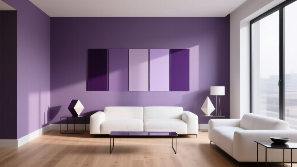
Best Purple Paint Colors for Sophistication - The Decor Mag
Purple has a rare talent in interior design: it can feel historic and modern at the same time. From the velvety depth of aubergine to the soft hush of lavender gray, sophisticated purple paint colors bring a sense of intention—like a room that knows exactly who it is. Used thoughtfully, purple reads as tailored, elevated, and quietly expressive rather than loud or trendy.
This topic matters because purple is one of the most misunderstood paint families. It’s complex: undertones can swing pink, blue, or gray depending on lighting, surrounding finishes, and even the time of day. A “perfect” purple swatch can become too sweet, too dark, or oddly muddy once it hits a wall. With the right shade selection and a clear color scheme, purple becomes a powerful design tool for adding depth, contrast, and a polished mood.
Below you’ll find designer-approved purple paint colors, how to use them in real rooms, the best pairings for sophisticated color schemes, and common mistakes to avoid—so your purple walls feel refined, not risky.
Why Purple Feels Sophisticated: Color Psychology Meets Design Principles
Purple has long been associated with craftsmanship and luxury—partly historical (rare pigments) and partly psychological. In modern interiors, sophisticated purple works because it balances warmth and coolness, giving a space dimensionality that simpler neutrals can’t always deliver.
- Deep purples (plum, aubergine) create intimacy, gravitas, and a “collected” feeling—ideal for dining rooms, libraries, and moody bedrooms.
- Muted purples (dusty mauve, purple-gray) feel grown-up and architectural, especially when paired with warm whites and natural textures.
- Soft lavenders can read serene and airy when they lean gray or blue rather than candy-pink.
Design principle to keep in mind: purple looks most elevated when it has a controlled undertone and is supported by a clear palette—think one dominant wall color, one neutral, and one metal/wood tone that repeats through the room.
How to Choose the Right Purple Paint Color
1) Understand Undertones (Pink vs. Blue vs. Gray)
The undertone determines whether purple feels romantic, crisp, or smoky:
- Pink-leaning purples (orchid, berry) feel softer and more playful—best when muted and paired with warm neutrals.
- Blue-leaning purples (violet, iris) feel cleaner and cooler—great with crisp whites, chrome, and cool stone.
- Gray-leaning purples (heather, lilac-gray) read sophisticated and versatile—excellent for open-plan spaces.
2) Consider Light Direction and Bulb Temperature
- North-facing rooms (cool light): choose warmer, red-leaning or muted purples to avoid a chilly cast.
- South-facing rooms (warm light): blue-leaning purples hold their structure and won’t look overly rosy.
- LED lighting: 2700K–3000K tends to flatter plum and mauve; 3500K+ can push purples cooler and more clinical.
3) Pick a Finish That Matches the Mood
- Matte: hides wall flaws, looks velvety, ideal for deep purples.
- Eggshell: practical for living rooms and hallways while still looking refined.
- Satin: better for trim or kids’ rooms; on purple walls it can reflect light and emphasize undertones.
Best Purple Paint Colors for a Sophisticated Home (Designer-Favorite Picks)
These shades are widely used by designers because they behave well in real interiors and pair beautifully with classic materials like wood, stone, linen, and aged metals. Always sample first—purple shifts dramatically from swatch to wall.
Deep & Dramatic Purples (For Moody Elegance)
-
Benjamin Moore “Dark Purple” (2073-10)
A saturated, statement-making purple for accent walls, powder rooms, and dramatic dining spaces. Pair with warm brass, creamy white trim, and walnut wood. -
Sherwin-Williams “Impulsive Purple” (SW 6832)
A bold violet that feels modern and artsy. Best as an accent or in a curated space with strong styling (black, charcoal, gallery lighting). -
Farrow & Ball “Pelt” (No. 254)
A rich aubergine with depth that reads luxurious, especially in matte. Stunning with limestone, antique brass, and off-black accents.
Application scenario: Paint a home office in a deep purple and balance it with a warm white ceiling, a large neutral rug, and one high-contrast element (black bookcase or framed art). The result feels focused and expensive, not heavy.
Muted Plum & Raisin Tones (The Most Livable Sophisticated Purples)
-
Benjamin Moore “Grape Juice” (No. 2065-20)
A refined plum that works beautifully in bedrooms and dining rooms. Pair with ivory bedding, dark oak, and soft, warm lighting. -
Sherwin-Williams “Plum Brown” (SW 6272)
A complex, earthy purple that reads tailored and grounded. Great with leather, camel tones, and aged bronze hardware. -
Farrow & Ball “Brassica” (No. 271)
A chic, muted purple with a contemporary feel. Excellent for built-ins, a reading nook, or a sophisticated nursery when paired with warm neutrals.
Application scenario: Use muted plum on a bedroom’s headboard wall, then repeat the color subtly in textiles (a throw, a patterned cushion) to create a cohesive interior color design story.
Soft Lavender-Gray & Lilac Neutrals (Elegant, Airy, and Modern)
-
Benjamin Moore “Purple Heather” (2072-40)
A gentle purple-gray that reads calm and architectural—great in living rooms, hallways, and primary bedrooms where you want softness without sweetness. -
Sherwin-Williams “Sensitive Tint” (SW 6267)
A whispery lavender with a gray base, ideal for quiet sophistication. Pair with warm white trim, light oak, and linen textures. -
Behr “French Lilac” (PPU16-07)
A soft lilac that can feel refined when paired with tailored finishes (matte black, marble, and clean-lined furniture).
Application scenario: In an open-plan space, a lavender-gray can act like a “colored neutral.” Use it on walls and keep larger furnishings in cream, taupe, or gray-beige, then add one deeper accent (ink blue or charcoal) for structure.
Color Schemes That Make Purple Look Expensive
Great paint color schemes rely on contrast and repetition. Purple becomes sophisticated when it’s supported by intentional neutrals and a consistent metal/wood tone.
Winning Purple Pairings (Use These as a Blueprint)
- Purple + Warm White + Brass: classic, flattering, slightly glamorous. Warm whites prevent purple from looking cold.
- Purple + Greige + Natural Oak: modern organic, perfect for livable family rooms.
- Purple + Charcoal + Matte Black: editorial and contemporary, best for offices and dining rooms.
- Purple + Navy + Cream: deep, layered, and timeless—excellent for libraries and bedrooms.
- Purple + Sage Green + Warm Linen: a sophisticated complementary balance (purple/green) when both colors are muted.
Trim and Ceiling Choices
- Crisp white trim (cooler white): sharpens blue-leaning purples and makes them feel modern.
- Warm white trim (creamy): softens plum and mauve, making the room feel welcoming.
- Color-drenched look (walls + trim in the same purple): dramatic and high-end when done in a muted or deep shade with a consistent finish strategy (e.g., matte walls, satin trim in the same color).
Real Room Ideas: Where Purple Paint Shines
1) Sophisticated Bedroom Walls
Best picks: muted plum, raisin, lavender-gray. Purple supports rest while still feeling intentional.
- Choose a mauve or plum if you want warmth and romance without pink.
- Choose a lavender-gray if you want a calm, modern hotel vibe.
- Layer with cream bedding, walnut nightstands, and brushed brass for an upscale finish.
2) Dining Rooms with Depth
Deep purple is a natural fit for dining rooms because it creates intimacy under evening lighting.
- Try aubergine in matte on walls.
- Add wainscoting or picture-frame molding in the same shade for tailored architecture.
- Finish with a statement chandelier and warm dimmable bulbs to enhance the color’s richness.
3) Living Rooms as “Colored Neutral” Spaces
If you love purple but fear commitment, use a softened purple-gray across the main walls.
- Keep the sofa in a neutral (oatmeal, cream, greige).
- Introduce purple again through art or a rug pattern to create repetition.
- Ground the palette with one dark anchor: charcoal, espresso, or navy.
4) Powder Rooms and Small Spaces
Small rooms can handle bolder paint colors because the visual exposure is short—perfect for saturated purples.
- Pair a deep purple with wallpaper (tonal floral or geometric) for a boutique feel.
- Use unlacquered brass or matte black fixtures for contrast.
- Consider a high-gloss ceiling in a related tone for a polished, designer look.
Common Purple Paint Mistakes (and How to Avoid Them)
-
Choosing purple from a tiny swatch
Purple is sensitive to light and surroundings. Sample on multiple walls and view it morning, afternoon, and night. -
Ignoring undertones in adjacent finishes
Warm woods can pull purple warmer; cool grays can make it bluer. Compare your sample next to flooring, tile, and countertops. -
Pairing purple with the wrong white
A stark, icy white can make some purples look harsh. If your purple has red in it, try a warmer white; if it leans blue, a cleaner white can work. -
Overusing purple across too many elements
Sophistication comes from restraint. If walls are purple, keep major upholstery neutral and repeat purple in smaller accents. -
Forgetting about sheen
Shiny finishes can highlight patchiness and make undertones louder. For deep purples, matte or eggshell usually looks richer.
Practical Tips for Sampling Purple Paint Like a Pro
- Sample large: paint a 2' x 2' area (or use large peel-and-stick samples) on at least two walls.
- Check at night: purple can turn more dramatic or more dull under artificial lighting.
- Test next to textiles: hold your rug, drapery, and upholstery samples against the painted area.
- Decide on your “anchor neutral” first: warm white, greige, charcoal—then pick the purple that harmonizes.
- Repeat the undertone: if your purple leans blue, repeat a cool element (chrome, navy, cool marble). If it leans red, repeat warmth (brass, cognac leather).
FAQ: Purple Paint Colors and Sophisticated Color Schemes
What shade of purple is best for a sophisticated look?
The most reliably sophisticated purples are muted plums and purple-grays. They read intentional but not loud, and they pair easily with warm whites, natural woods, and classic metals.
Will purple paint make a room feel smaller?
Dark purples can feel more enveloping, which some people interpret as smaller—but often it reads as cozy and elevated. To keep balance, use lighter trim, add layered lighting, and include reflective elements like mirrors or glass.
How do I stop lavender from looking childish?
Choose a lavender with a gray or blue base, then pair it with tailored finishes: matte black accents, warm white trim, and natural textures (linen, oak). Avoid pairing it with bright candy colors.
What colors go with purple walls?
For sophisticated interior color design, pair purple with:
- Warm white or cream
- Greige and taupe
- Charcoal and matte black
- Navy
- Muted greens like sage or olive
- Metals: brass, aged bronze, or polished nickel (depending on undertone)
Should I use purple on all walls or as an accent?
If the purple is deep or very saturated, an accent wall or a smaller room (powder room, office) is often the most foolproof. For purple-grays and muted plums, full-room application can look stunning—especially with consistent trim color and well-planned lighting.
How can I make purple paint look more “designer”?
Use one of these upgrades:
- Color-drench walls and trim in the same muted purple
- Add molding or paneling for architecture
- Choose a cohesive metal finish (all brass, all black, etc.)
- Layer textures: velvet, bouclé, linen, wood grain, stone
- Use warmer, dimmable bulbs to enrich deeper tones
Next Steps: Bring Sophisticated Purple Into Your Home
Start by choosing the mood you want—moody aubergine, tailored plum, or airy lavender-gray—then sample two to three candidates in your actual lighting. Build a simple, elegant color scheme around your purple: one supporting neutral, one dark anchor, and one consistent metal/wood tone. That structure is what turns a beautiful purple into a sophisticated room.
If you’re ready for more paint color inspiration and expertly built color schemes, explore our latest color guides on thedecormag.com.
More Articles
 How to Create a Traditional Color Palette - The Decor Mag
 Best Maroon Paint Colors - The Decor Mag
 Best Lime Green Paint Colors - The Decor Mag
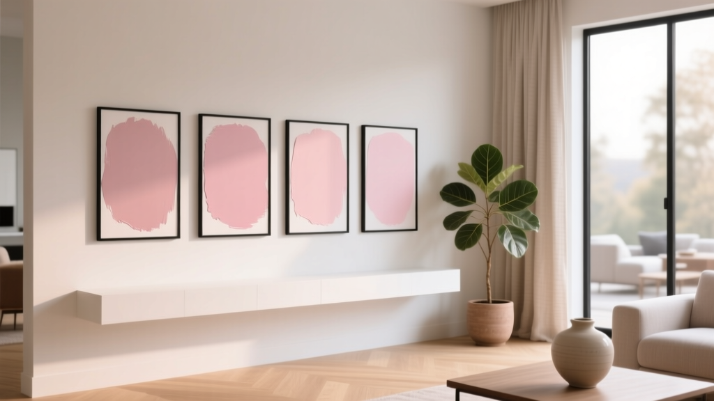 Best Blush Pink Paint Colors - The Decor Mag
 How to Choose Colors for East-Facing Rooms - The Decor Mag
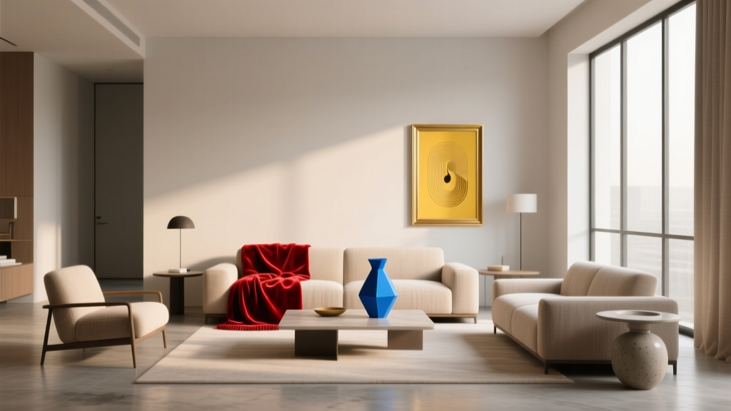 How to Use Color to Create Rhythm - The Decor Mag
 Reading for Options: How Visual Literacy Drives Strategic Decision-Making in Design and Branding
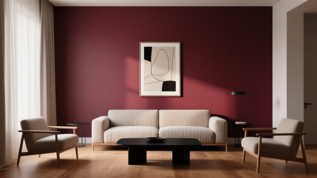 Best Burgundy Paint Colors - The Decor Mag
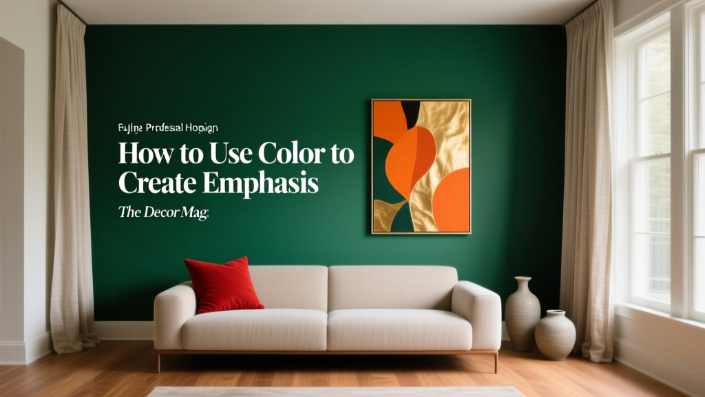 How to Use Color to Create Emphasis - The Decor Mag
 How to Choose Colors for Kitchen Cabinets - The Decor Mag