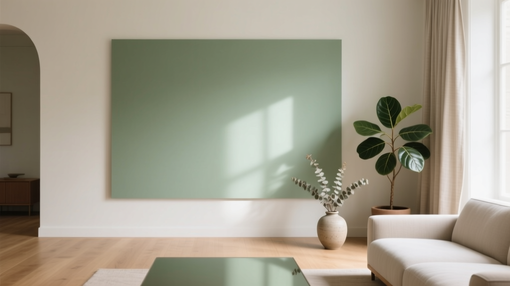
Best Sage Green Paint Colors for Serenity - The Decor Mag
Sage green has become a modern classic for homeowners who want a space that feels calm but not bland, fresh but not stark. It sits in the sweet spot between green and gray—softened by a dusty, muted quality that reads as soothing in bedrooms, welcoming in living rooms, and quietly sophisticated in kitchens. When used well, sage green paint colors create a restorative backdrop that still has enough pigment to feel intentional and designed.
This topic matters because “serenity” isn’t just a vibe—it’s a design outcome you can plan. Color psychology suggests muted greens help signal safety, balance, and renewal. In interior color design, sage also plays nicely with today’s favorite materials (white oak, natural stone, warm metals) and works across styles from modern farmhouse to organic modern to traditional. The trick is choosing the right sage for your home’s light, your existing finishes, and the mood you want.
Below, you’ll find designer-approved sage green paint color recommendations, real-room application ideas, and the most common mistakes that prevent sage from looking serene. If you’ve been searching for “best sage green paint colors,” “sage green wall paint,” or “sage green color schemes,” this guide will help you move from inspiration to confident paint decisions.
Why Sage Green Feels Serene: Color Psychology Meets Design
Green is associated with nature, restoration, and equilibrium—qualities we instinctively crave in our homes. Sage green takes those benefits and turns down the volume, which is why it tends to feel more livable than brighter botanical greens.
What makes a paint color “sage”?
- Muted chroma: Sage has a gray or earthy undertone that softens it.
- Balanced value: Most sages sit in the light-to-medium range, brightening a room without reading pastel.
- Undertones that matter: Sage can lean warm (yellow/olive), cool (blue/gray), or earthy (beige/khaki).
Serenity comes from harmony
Serene rooms usually share a few design principles:
- Low contrast between walls, trim, and major furnishings
- Natural textures (linen, oak, jute, stone)
- Consistent undertones across paint, flooring, tile, and fabric
How to Choose the Right Sage Green for Your Home
1) Read your natural light
Light direction changes how sage behaves:
- North-facing rooms: Cooler, grayer light can make sage look more muted or slightly bluish. Choose a warmer sage to avoid a “flat” look.
- South-facing rooms: Warm, abundant light can bring out yellow/olive undertones. Choose a balanced or cooler sage if you want a cleaner look.
- East-facing rooms: Bright mornings, softer afternoons. Many sages look crisp early and more gray later—test both times.
- West-facing rooms: Warm afternoon glow can turn some sages too yellow. Consider a sage with a hint of gray-blue.
2) Match undertones to fixed finishes
Sage green wall paint should coordinate with what you’re not changing soon:
- Warm woods (oak, maple): try warm or earthy sages
- Cool stones (gray tile, bluish marble): try cooler, grayer sages
- Warm metals (brass, champagne bronze): most sages look beautiful—avoid very icy sages
- Stainless/black hardware: cooler sages look tailored; warmer sages look cozy
3) Sample like a designer
- Paint a large sample (at least 12" x 12", larger is better) on two walls.
- View it morning, mid-day, and evening under your actual lighting.
- Place it next to your countertop, flooring, and a white paper sheet (to reveal undertones).
- Commit only after you’ve seen it with the lamps on—many sages shift under warm bulbs.
Best Sage Green Paint Colors (Designer-Approved Picks)
These sage green paint colors are widely used by homeowners and designers because they tend to be versatile, calming, and forgiving. Always test first—paint color is highly dependent on light and surroundings.
Benjamin Moore Sage Green Favorites
- Benjamin Moore Saybrook Sage (HC-114): A timeless, earthy sage with classic warmth. Great for dining rooms, built-ins, and traditional homes that want cozy serenity.
- Benjamin Moore October Mist (1495): Soft, silvery green with a modern feel. Works beautifully in open-concept spaces where you want calm continuity.
- Benjamin Moore Healing Aloe (1562): A pale, spa-like green that reads airy and clean. Ideal for bathrooms, laundry rooms, and low-contrast bedrooms.
- Benjamin Moore Gray Wisp (1570): A light blue-green that can feel coastal and serene. Best in bright rooms where you want a whisper of color.
Sherwin-Williams Sage Green Favorites
- Sherwin-Williams Clary Sage (SW 6178): A warm, grounded sage that feels natural and stable. Excellent for kitchens, mudrooms, and home offices.
- Sherwin-Williams Evergreen Fog (SW 9130): A popular, balanced green-gray with subtle depth. Strong choice for living rooms, hallways, and cabinetry when you want a modern, serene mood.
- Sherwin-Williams Sea Salt (SW 6204): A light green-blue with a fresh, airy feel. Beautiful for bedrooms and bathrooms, especially with white trim and soft textiles.
- Sherwin-Williams Retreat (SW 6207): A deeper, moody green that still feels sophisticated rather than heavy. Great for accent walls, libraries, and dining rooms.
Farrow & Ball and Other Noteworthy Picks
- Farrow & Ball Mizzle (No. 266): A gentle green-gray that shifts elegantly with light. Ideal for heritage homes and refined modern spaces.
- Farrow & Ball Green Smoke (No. 47): A richer, smoky sage with dramatic depth. Stunning on cabinetry or in a cozy study.
- Behr Jojoba (PPU10-01): A soft, approachable sage that pairs well with warm neutrals. Great for budget-friendly refreshes.
Real Room Examples: Where Sage Green Looks Best
Living Room: Calm backdrop, layered texture
Try: Sherwin-Williams Evergreen Fog or Benjamin Moore October Mist.
Design scenario: Sage walls + cream sofa + oak coffee table + black metal accents. Add calm through texture: boucle pillows, a wool rug, and linen curtains.
- Trim: soft white (not icy) for a gentle contrast
- Art: warm-toned landscapes, line drawings, or black frames for definition
Bedroom: Soft, sleep-friendly color scheme
Try: Benjamin Moore Healing Aloe or Sherwin-Williams Sea Salt.
Design scenario: Sage walls with warm white bedding, a light wood bed frame, and a woven pendant. Keep the palette quiet for a true serene bedroom.
- Best companions: ivory, oatmeal, pale taupe, muted blush
- Tip: choose bulbs in the 2700K–3000K range to avoid making sage look chilly
Kitchen: Sage cabinetry or walls for an organic modern look
Try: Sherwin-Williams Clary Sage for warmth or Farrow & Ball Green Smoke for depth.
Design scenario: Sage base cabinets with warm white uppers, creamy quartz countertops, and brushed brass pulls. Add a natural stone backsplash or handmade-look ceramic tile for softness.
- Countertops: warm white quartz, cream marble, or honed stone
- Hardware: brass for warmth, matte black for modern contrast
- Cabinet finish: consider satin for durability and a gentle sheen
Bathroom: Spa serenity that doesn’t feel cold
Try: Benjamin Moore Gray Wisp or Sherwin-Williams Sea Salt.
Design scenario: Sage walls with white tile, warm wood vanity, and soft gray towels. Bring in serenity with layered whites: white shower curtain, white trim, and creamy countertop tones.
- Tip: if your bathroom tile is very cool gray, choose a cooler sage to keep undertones aligned
- Finish: use a moisture-resistant bathroom paint and choose satin or semi-gloss where needed
Home Office: Focused, grounded energy
Try: Sherwin-Williams Retreat or Benjamin Moore Saybrook Sage.
Design scenario: Deep sage on the walls with a walnut desk, warm leather chair, and minimal brass lighting. It feels calm, not sleepy—perfect for concentration.
Entryway and Hallways: Instant calm for high-traffic zones
Try: Benjamin Moore October Mist or Sherwin-Williams Evergreen Fog.
Design scenario: Sage walls, bright trim, and a patterned runner. Add a mirror and warm lighting to keep the color welcoming, not dim.
Winning Sage Green Color Schemes (Easy Pairings)
Sage green shines when you build a supporting cast of calm neutrals and natural materials. Use these combinations for cohesive interior color design.
Serene, low-contrast palettes
- Sage + warm white + oatmeal: soothing, airy, timeless
- Sage + greige + natural oak: modern, organic, grounded
- Sage + soft gray + matte black: tailored, contemporary calm
More personality (still serene)
- Sage + dusty blush: gentle warmth and softness (great in bedrooms)
- Sage + clay/terracotta accents: earthy, Mediterranean-inspired calm
- Sage + deep navy: classic contrast for offices and dining rooms
Materials that amplify serenity
- Linen, cotton, and wool in warm whites and beiges
- White oak, ash, or walnut depending on warmth level
- Honed stone, travertine, handmade-look tile
- Brass, aged bronze, or blackened steel for subtle structure
Application Guidance: Getting the Finish and Placement Right
- Walls: eggshell is a go-to for most rooms; it’s durable with a soft look.
- Trim: satin or semi-gloss for cleanability and crisp edges.
- Cabinetry: satin or a cabinet-grade finish; consider professional spraying for the smoothest results.
- Ceilings: a warm white ceiling keeps sage from feeling heavy; in cozy rooms, a softly tinted ceiling can be beautiful.
Placement tip: If your room has many shadows (small windows, heavy drapery), choose a lighter sage to maintain that serene, open feeling. For large, bright rooms, a medium sage can look rich and enveloping without darkening the space.
Common Sage Green Paint Mistakes to Avoid
- Choosing by online photos alone: Screens distort undertones. Always sample in your room.
- Ignoring undertones in fixed finishes: A warm olive-leaning sage can clash with cool gray tile, making both look “off.”
- Using a stark, blue-white trim: Cool, bright whites can make sage look dull or muddy. Try a softer, warmer white for harmony.
- Forgetting nighttime lighting: Warm bulbs can pull yellow from some sages; cool LEDs can make them look icy. Test with your actual bulbs.
- Too much contrast everywhere: Serenity often comes from restraint. If you want bold contrast, keep it to one or two elements (hardware, art frames, one accent color).
- Painting every room the same sage without a plan: Use sage as a connecting thread, but adjust depth by room—lighter in low-light spaces, deeper where you want cozy drama.
FAQ: Sage Green Paint Colors
What is the most popular sage green paint color right now?
Sherwin-Williams Evergreen Fog (SW 9130) is one of the most requested green-gray paint colors because it feels current, calming, and versatile across styles and lighting conditions.
Does sage green work with warm wood floors?
Yes—sage green is a natural partner for warm wood tones like oak and maple. Choose a sage with gentle warmth (like Sherwin-Williams Clary Sage or Benjamin Moore Saybrook Sage) to keep the palette cohesive.
What trim color looks best with sage green walls?
Soft warm whites tend to look best with sage green wall paint because they keep the overall scheme serene. Avoid icy, high-contrast whites if you want a calmer, more blended look.
Will sage green make a room look darker?
Light sages typically keep rooms bright, while medium-to-deep sages can feel more enveloping. If your room has limited natural light, choose a lighter sage (such as Benjamin Moore Healing Aloe) and use warm, layered lighting.
Is sage green a good choice for kitchen cabinets?
Sage cabinets are a strong choice for homeowners who want color without loudness. Pair with warm whites, natural stone, and simple hardware. For cabinetry, choose a durable finish and sample the color next to your countertop and backsplash.
How do I keep sage green from looking muddy?
Make sure your undertones match (paint, flooring, tile, fabrics), avoid overly cool bright whites, and bring in clean neutrals (warm white, cream, light greige) plus natural textures to clarify the palette.
Next Steps: Make Sage Green Work in Your Home
Start by picking two to three sage green paint colors that fit your light (one lighter, one mid-tone, one slightly deeper). Sample them on multiple walls, then build a simple sage green color scheme using warm whites, natural wood, and one accent color (like navy, terracotta, or matte black). With the right undertones and thoughtful contrast, sage green becomes more than a trend—it becomes a daily dose of serenity.
For more paint color inspiration, room-by-room palettes, and interior color design guides, explore our latest color articles on thedecormag.com.
More Articles
 Best Lilac Paint Colors for Gentle Spaces - The Decor Mag
 Best Honeydew Paint Colors - The Decor Mag
 Cheap vs Premium Placement: What $0.12 CPM Really Costs Your Brand
 Best Mango Paint Colors - The Decor Mag
 Best Blue Paint Colors for Every Mood - The Decor Mag
 How to Create a Modern Color Palette - The Decor Mag
 Best Bathroom Floor Solutions: Performance, Safety, and Style Compared
 How to Choose Colors for a Nursery - The Decor Mag
 Paint Colors That Work With Flooring (2026)
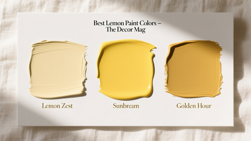 Best Lemon Paint Colors - The Decor Mag