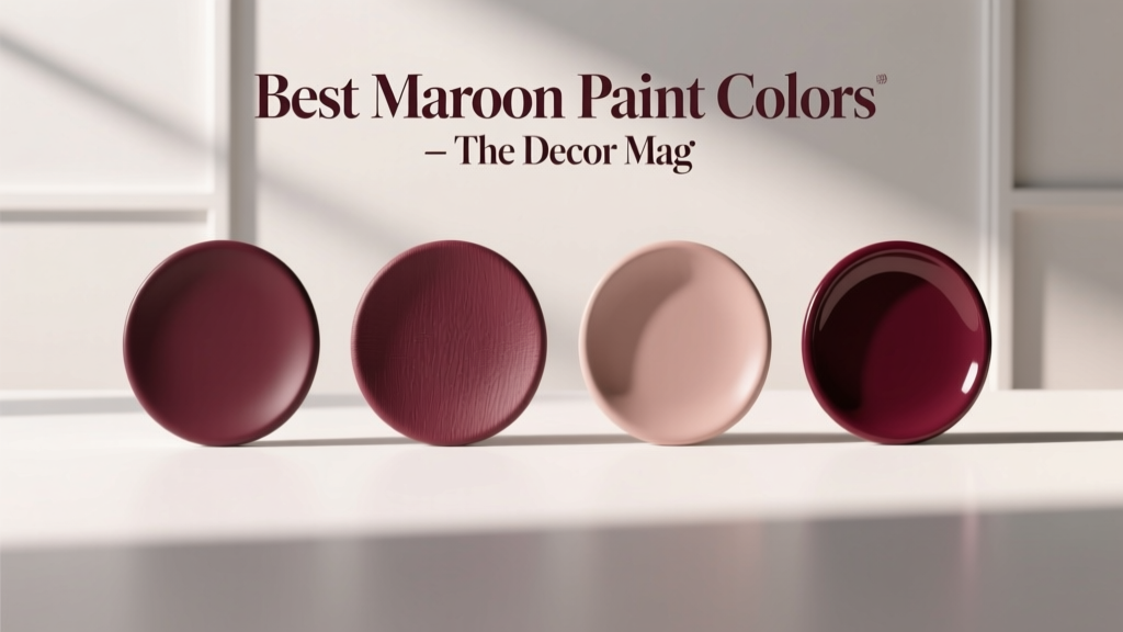
Best Maroon Paint Colors - The Decor Mag
Maroon is one of those “quiet power” colors: deep, sophisticated, and emotionally grounding without feeling as stark as black or as expected as navy. It carries the warmth of red, the stability of brown, and—depending on the undertone—can lean velvety, smoky, or even slightly plum. Used well, maroon paint colors create rooms that feel curated and intentional, whether your style is modern, traditional, or eclectic.
This topic matters because maroon sits in a tricky zone of color psychology and design principles. It can read cozy and luxurious, or heavy and dated, depending on lighting, sheen, and what you pair it with. Homeowners often love maroon in theory but hesitate in practice: “Will it make my room look smaller?” “Will it feel too dark?” “What trim color works?” With the right shade and placement, maroon becomes a versatile design tool—especially for accent walls, dining rooms, libraries, bedrooms, and front doors.
Below, you’ll find expert-vetted maroon paint color recommendations (with popular paint brand references), real-room application scenarios, foolproof color schemes, and the most common mistakes to avoid when decorating with maroon.
What Counts as “Maroon” in Interior Design?
Maroon is a deep red with brown (and sometimes purple) undertones. In paint terms, it often overlaps with categories like burgundy, oxblood, wine, and garnet. The best maroon paint colors typically share these traits:
- Depth: A lower light reflectance value (LRV), often under 20.
- Warmth: Brown or brick undertones that prevent the color from turning neon-red.
- Complexity: Subtle undertone shifts under different lighting (north vs. south exposure).
Color Psychology: Why Maroon Feels So Inviting
Maroon is associated with comfort, confidence, and tradition. As a wall color, it can:
- Make large rooms feel more intimate
- Support “slow living” spaces like dining rooms and dens
- Signal luxury when paired with warm metals (brass, aged gold) and natural materials (wood, leather)
How to Choose the Right Maroon Paint Color
1) Check the Undertone (Brown vs. Purple vs. Brick)
Undertones decide whether maroon reads classic and earthy or moody and dramatic.
- Brown-leaning maroons: Cozy, traditional, great with warm woods and cream trim.
- Purple-leaning maroons: More jewel-toned; can feel glamorous and modern.
- Brick/oxide maroons: Slightly more muted and historic; excellent in older homes.
2) Consider Your Lighting
- North-facing rooms: Cooler light can make maroon look more purple or flat. Favor warmer, brown-based maroons.
- South-facing rooms: Warm light amplifies red. Choose a slightly muted or deeper shade to keep it elegant.
- Evening use: Dining rooms and bedrooms often shine with maroon under warm bulbs (2700K–3000K).
3) Decide: Full Room vs. Accent
Maroon works beautifully as an all-over wall color in the right setting, but it’s also one of the best accent paint colors for creating depth.
- Best for full rooms: Dining rooms, libraries, powder rooms, cozy bedrooms
- Best for accents: Headboard walls, built-in bookcases, fireplace surrounds, entry doors
Best Maroon Paint Colors (Top Picks by Brand)
These shades are widely loved because they stay rich rather than overly bright, and they tend to coordinate well with popular trim whites, wood tones, and stone finishes.
Sherwin-Williams: Best Maroon Paint Colors
- SW 6301 Rockwood Red – A historic, earthy red with brown undertones. Reads “heritage” rather than trendy, ideal for dining rooms, brick fireplaces, and traditional millwork.
- SW 6309 Georgian Bay – A deeper wine-leaning shade that feels moody and tailored. Great for libraries, offices, or a dramatic powder room.
- SW 7593 Rustic Red – A muted red-brown that works as a softer maroon alternative. A strong choice for open concept spaces where you want warmth without heaviness.
- SW 2801 Rookwood Dark Red – A saturated, old-world maroon that pairs beautifully with warm whites and antique brass. Excellent for a feature wall or built-ins.
Benjamin Moore: Best Maroon Paint Colors
- BM 2074-10 Wrought Iron (for pairing) – Not a maroon, but a near-black that makes maroon look expensive and intentional. Pair it with a maroon accent for a classic, high-contrast scheme.
- BM 2004-10 Moroccan Red – A bold, saturated red that can read maroon in lower light. Use in small doses (powder room, front door) or balance with creamy trim.
- BM HC-64 Townhouse Tan (for pairing) – A warm neutral partner that helps maroon feel grounded rather than overly formal.
- BM 2113-10 Mysterious (for pairing) – A deep blue-black that pairs beautifully with brown-based maroons for a library-like mood.
Tip: Benjamin Moore has many regionally named historic reds; if you’re matching an antique rug or vintage fabric, bring a swatch and ask the store to pull similar deep red-browns and wine tones, then test in your room’s lighting.
Farrow & Ball: Best Deep Red/Maroon Alternatives
- F&B Preference Red – A deep, sophisticated red that can read maroon depending on light and adjacent finishes. Stunning with gallery-white trim and dark wood floors.
- F&B Eating Room Red – A classic choice for dining rooms; it creates a flattering, warm glow in evening light.
Behr: Accessible Maroon Options
- Behr Cordovan Brown (family) – Look for Cordovan-inspired shades that sit between maroon and chocolate. They tend to be forgiving in mixed lighting.
- Behr Oxblood (varies by collection) – “Oxblood” labels typically lean darker and more modern—excellent for a dramatic accent wall.
Real Room Examples: Where Maroon Paint Colors Shine
1) Dining Room: Candlelit Warmth and Conversation
Maroon is a design classic in dining rooms because it feels intimate and flattering at night. Try a full-room application with satin or matte walls and crisp trim.
Try this color scheme:
- Walls: Sherwin-Williams Rockwood Red or Rookwood Dark Red
- Trim/Ceiling: Warm white (think creamy, not icy)
- Metals: Aged brass, antique gold, or blackened bronze
- Textiles: Natural linen, plaid, or velvet in camel, cream, or deep green
2) Bedroom: A Cozy, Hotel-Luxe Headboard Wall
If you’re nervous about a fully maroon room, start with a headboard accent wall. Maroon reads romantic and grounded, especially with layered neutrals.
- Accent wall: Sherwin-Williams Georgian Bay
- Other walls: Warm greige or soft beige
- Bedding: Crisp white + camel throws + a touch of black
3) Home Office or Library: Focus and Depth
Deep maroon can reduce visual glare and create a cocooning environment—ideal for reading, working, and displaying art.
- Paint built-ins: Sherwin-Williams Rookwood Dark Red in a satin finish
- Walls: A warm neutral to keep the room balanced
- Pair with: Walnut, cognac leather, and framed prints with cream mats
4) Front Door: Instant Curb Appeal
A maroon front door feels classic, welcoming, and upscale. It’s especially strong with white trim, stone, and warm brick.
- Door color: A deep oxblood/maroon (test in sunlight)
- Hardware: Aged brass for warmth or matte black for modern contrast
- Exterior tip: Use an exterior-rated enamel in satin or semi-gloss for durability
5) Powder Room: Small Space, Big Character
Maroon in a powder room can look like a boutique hotel—dramatic, but contained. Pair with reflective finishes to keep it from feeling too dark.
- Walls: Deep maroon in matte
- Vanity: Black, walnut, or warm white
- Mirror: Antique brass or black frame
- Lighting: Warm bulbs, layered if possible
Best Color Combinations with Maroon (Foolproof Schemes)
Maroon plays well with both warm and cool partners—your goal is contrast and balance.
Classic Pairings
- Maroon + Creamy White: Timeless, architectural, and brightening
- Maroon + Camel/Tan: Warm, earthy, inviting
- Maroon + Walnut/Dark Wood: Library vibes, high-end and grounded
Modern Pairings
- Maroon + Charcoal/Soft Black: Graphic and sophisticated
- Maroon + Dusty Pink/Blush: Tonal, soft, and layered (great in bedrooms)
- Maroon + Warm Gray (Greige): Balances richness and keeps spaces current
Unexpected-but-Beautiful Pairings
- Maroon + Olive Green: Earthy and refined, especially with brass accents
- Maroon + Deep Teal/Navy: Jewel-toned drama with a designer feel
- Maroon + Terracotta: Warm-on-warm layering for Mediterranean or boho interiors
Application Guidance: Finish, Trim, and Sampling
Choose the Right Paint Finish
- Matte/Flat: Best for walls where you want a velvety look; hides imperfections; ideal for moody maroon rooms.
- Eggshell: A practical choice for living spaces; slightly more washable.
- Satin: Great for built-ins and accent details; can highlight wall texture if used on large wall expanses.
- Semi-gloss: Best for trim and doors; makes maroon feel polished on a front door.
Trim and Ceiling Colors that Work with Maroon
- Warm whites: Keep maroon feeling inviting (especially brown-based maroons).
- Soft black trim: Bold and editorial, best in well-lit rooms with strong architectural detail.
- Ceiling tip: If walls are very dark, a ceiling in a warm white helps lift the room. For a dramatic, enveloping look, paint the ceiling a lighter tint of the wall color.
Sampling Tips That Prevent Regret
- Test at least two maroon options: one warmer/browner and one wine/plum-leaning.
- Paint large swatches (or use peel-and-stick samples) on multiple walls.
- View samples in morning, afternoon, and evening light.
- Check the color next to your flooring, countertop, and major upholstery.
Common Maroon Color Mistakes to Avoid
- Choosing maroon without checking undertones: A wine-leaning maroon can clash with orangey floors; a brown-leaning maroon can look muddy next to cool gray tile.
- Pairing maroon with stark, icy whites: This can make maroon look dull or overly purple. Creamier whites usually harmonize better.
- Using maroon in a dark room with minimal lighting: The result can feel heavy. Add layered lighting (overhead + lamps + sconces) and reflective accents.
- Overdoing red across the room: If walls are maroon, keep other reds (rugs, art, pillows) minimal to avoid a “themed” look.
- Ignoring sheen: High sheen on large maroon walls can look patchy or highlight texture. Matte/eggshell is safer for most walls.
FAQ: Maroon Paint Colors
Does maroon make a room look smaller?
Deep colors can visually bring walls in, which can feel cozy rather than cramped when balanced with good lighting and lighter trim. In large rooms, maroon often improves proportion by making the space feel more intimate.
What white trim color looks best with maroon walls?
Warm, creamy whites tend to pair best with maroon paint colors. They soften contrast and keep the palette inviting. If your maroon leans purple, a neutral white (not overly yellow) is usually the best match.
Is maroon a good choice for an open floor plan?
Maroon can work in open concept homes when used strategically—think an accent wall, built-ins, or a defined dining area. For all-over use, make sure adjacent spaces have coordinating warm neutrals to prevent abrupt transitions.
What colors go with maroon in a modern design style?
Try maroon with charcoal, soft black, warm greige, and clean-lined woods like walnut. Add contrast with matte black fixtures and keep the palette tight for a modern, tailored feel.
How do I keep maroon from looking dated?
Update the supporting cast: use cleaner trim lines, modern lighting, simple window treatments, and a restrained palette (maroon + warm white + black + wood). Avoid overly busy borders, heavy drapes, and too many red accessories.
Can maroon work with gray floors?
Yes, but undertone matters. If floors are cool gray, choose a maroon that isn’t overly brown or orange. Test a wine-leaning maroon and add warm elements (wood, brass, creamy textiles) to keep the space from feeling cold.
Next Steps: Make Maroon Feel Effortless
Start by picking the role maroon will play—statement wall, cozy full-room color, cabinetry, or front door—then narrow your options by undertone and lighting. Sample generously, pair it with a warm white and one strong contrast color (charcoal, olive, or navy), and build the room with texture: wood, linen, leather, and warm metals make maroon look intentional and elevated.
If you’re ready for more paint color inspiration and designer-tested color schemes, explore more color guides and palette ideas on thedecormag.com.
More Articles
 Best Eucalyptus Paint Colors - The Decor Mag
 How to Choose Colors for a Library - The Decor Mag
 Best Rose Red Paint Colors - The Decor Mag
 Best Pine Green Paint Colors - The Decor Mag
 Jewel Tone Color Scheme Ideas - The Decor Mag
 How to Create an Eclectic Color Palette - The Decor Mag
 How to Use Color to Define Spaces - The Decor Mag
 How to Choose Colors for South-Facing Rooms - The Decor Mag
 Best Honey Paint Colors - The Decor Mag
 Best Lilac Paint Colors for Gentle Spaces - The Decor Mag