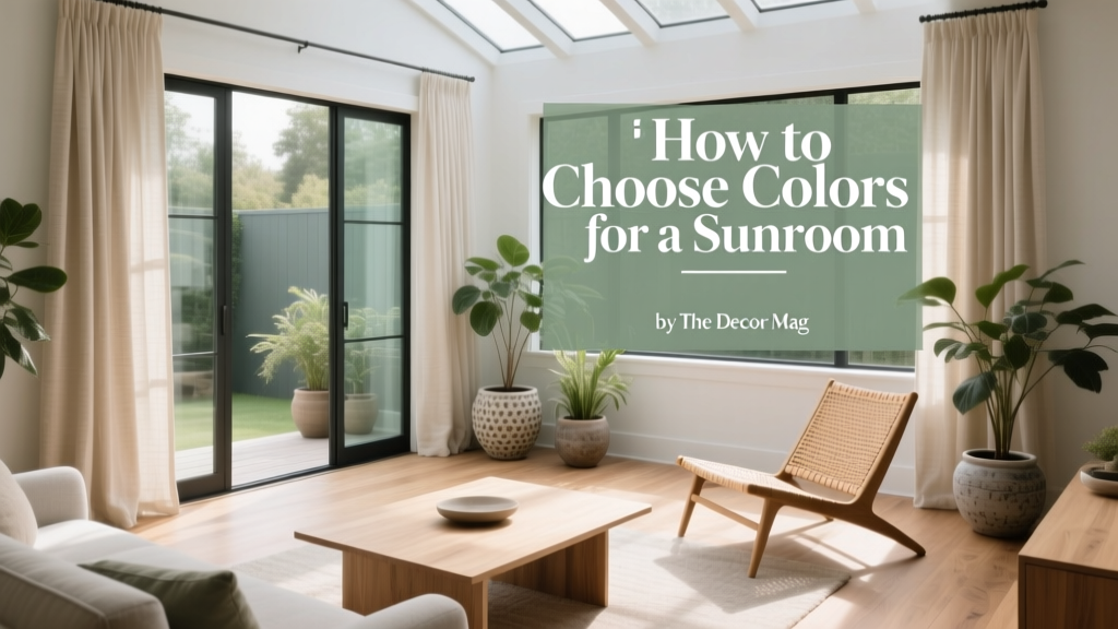
How to Choose Colors for a Sunroom - The Decor Mag
A sunroom is the most light-driven space in a home. Unlike a bedroom or den where lamps and evening lighting shape the mood, a sunroom is defined by shifting daylight—cool and blue in the morning, bright and neutral at noon, warm and golden in late afternoon. That makes paint colors and color schemes feel more “alive” here than almost anywhere else.
Choosing sunroom paint colors isn’t just about picking something “light and airy.” It’s about understanding how intense natural light can wash out color, amplify undertones, and change the way furniture, flooring, and plants read throughout the day. The right palette will make the space feel comfortable year-round—fresh in summer, cozy in winter—and visually connected to the rooms around it.
This guide breaks down how to choose a sunroom color scheme like a designer: start with the light, clarify the mood, test undertones, then build a layered palette with paint, trim, textiles, and greenery. You’ll also find specific paint color recommendations (with brand references), real-room scenarios, and the most common mistakes homeowners make when coloring a sunroom.
Start With the Sun: How Light Direction Changes Color
Before you sample a single paint swatch, identify your sunroom’s primary exposure. The same white paint can look crisp, creamy, or even slightly green depending on the direction of light and surrounding landscape.
North-Facing Sunrooms: Cool, Consistent Light
North light is steadier and cooler, often pulling gray or blue forward. A sunroom with north exposure can feel serene, but it may also feel a touch flat if you choose a too-cool palette.
- Best approach: Warm up the room with soft warm whites, gentle greiges, and muted clay tones.
- Avoid: Icy whites and steely grays that can turn gloomy.
South-Facing Sunrooms: Bright, High-Contrast Light
South light is intense for most of the day and can wash out color, making midtones look lighter and brights feel extra punchy.
- Best approach: Use slightly deeper or more complex colors than you think you need; choose grounded neutrals and sun-friendly greens and blues.
- Avoid: Ultra-pale pastels if you want noticeable color—strong sun can erase them.
East-Facing Sunrooms: Sunny Mornings, Softer Afternoons
East exposure brings warm, cheerful morning light, then cooler and dimmer light later.
- Best approach: Balanced neutrals and versatile hues that don’t rely on constant sunshine, like soft sages, warm whites, and light terracottas.
- Avoid: Colors that look perfect at 9 a.m. but dull at 4 p.m.—test at multiple times.
West-Facing Sunrooms: Dramatic Golden Hour Glow
West light can be dim earlier and then intensely warm later, exaggerating yellow and red undertones.
- Best approach: Creamy whites, muted greens, and soft taupes that can handle warm light without looking overly yellow.
- Avoid: Strong yellow-beige paints that can become brassy at sunset.
Choose the Mood: Color Psychology for Sunrooms
A sunroom can be a plant-filled conservatory, a reading lounge, a casual dining space, or a playroom. Color psychology helps align your paint colors and décor with the way you want the room to feel.
- Restful and retreat-like: Soft greens, watery blues, warm whites. These reduce visual noise and support calm.
- Energetic and social: Sun-warmed terracottas, optimistic corals, cheerful yellow accents (used sparingly). These feel inviting and lively.
- Elegant and timeless: Creamy neutrals, greige, dusty blues, and quiet charcoals in small doses. These create a tailored backdrop for rattan, linen, and classic furniture.
- Nature-forward: Botanical greens, clay, sand, and sky tones. These echo outdoor landscaping and make the room feel like a bridge to the yard.
Understand Undertones: The Secret to Sunroom Paint Colors That Don’t “Go Weird”
In a sunroom, undertones are amplified. The paint color you think is neutral can reveal a hidden green, pink, or yellow cast once sunlight hits it. Use these quick checks before committing:
- Compare to a true white: Hold your sample next to a bright white paper. If it suddenly looks pink, green, or yellow, that undertone will show on the wall.
- Check against fixed finishes: Flooring, brick, stone, roofline beams, and window frames don’t change easily—your paint should coordinate with them.
- Watch the “light loop”: Observe the sample in morning, midday, and late afternoon. Sunrooms can shift dramatically.
- Factor in outdoor reflections: A lawn can bounce green into the room; a red brick patio can warm everything up.
Go-To Sunroom Color Schemes (With Paint Color Recommendations)
These sunroom color schemes are built to work in high natural light, with paint colors that have proven track records. Always sample first, but consider these as designer-tested starting points.
1) Airy Warm White + Natural Textures
Best for: Traditional sunrooms, coastal looks, rattan furniture, rooms with lots of plants.
- Wall color: Benjamin Moore White Dove (OC-17) for a soft warm white that doesn’t turn stark.
- Trim: Benjamin Moore Chantilly Lace (OC-65) for crisp contrast, or White Dove in a higher sheen for a quieter look.
- Accent colors: Linen, camel, olive, and matte black for structure.
Application scenario: White Dove walls with natural woven shades, a jute rug, and linen slipcovers. Add olive throw pillows and a black metal side table to keep the room from feeling too sweet.
2) Soft Sage Green + Creamy White Trim
Best for: Plant lovers, cottage style, sunrooms facing lush greenery.
- Wall color: Sherwin-Williams Sea Salt (SW 6204) for a light green-blue that reads fresh in sunlight.
- Alternate (more grounded): Benjamin Moore Saybrook Sage (HC-114) for a classic sage with more warmth and depth.
- Trim: Sherwin-Williams Alabaster (SW 7008) for a creamy, sun-friendly white.
Application scenario: Sea Salt walls, Alabaster trim, and terracotta pots. Pair with oak or teak furniture and warm brass accents. The green ties into the outdoors, while creamy trim prevents the palette from turning chilly.
3) Sunwashed Blue + Bright White for a Coastal Feel
Best for: Beachy or lakeside homes, reading nooks, spaces with white-painted woodwork.
- Wall color: Benjamin Moore Palladian Blue (HC-144) for a soft blue-green that stays light but noticeable.
- Trim: Benjamin Moore Simply White (OC-117) to keep the palette crisp and clean.
- Accent colors: Navy, sand, and driftwood tones.
Application scenario: Palladian Blue walls with white beadboard or trim, striped cushions in navy and cream, and a sisal rug. Add a warm wood coffee table so the room doesn’t feel overly cool.
4) Greige That Holds Up in Bright Light
Best for: Modern sunrooms, open-concept spaces, homeowners who want a neutral paint color that doesn’t turn yellow.
- Wall color: Benjamin Moore Edgecomb Gray (HC-173), a warm greige that stays soft and elegant in sunlight.
- Alternate (slightly cooler): Sherwin-Williams Agreeable Gray (SW 7029), a popular neutral that can look lighter in sunrooms—sample carefully.
- Trim: Sherwin-Williams Pure White (SW 7005) for a clean, flexible white.
Application scenario: Edgecomb Gray walls, Pure White trim, and layered textiles: cream curtains, a patterned indoor-outdoor rug, and black or bronze lighting. This scheme is excellent if your sunroom connects to a kitchen or living room and you want flow.
5) Soft Terracotta or Clay as a Warm “Sun Filter”
Best for: West-facing rooms, Mediterranean style, boho sunrooms, spaces that feel cold in winter.
- Wall color: Farrow & Ball Pink Ground (No. 202) for a gentle clay-leaning blush that glows in afternoon light.
- Alternate (more muted): Sherwin-Williams Redend Point (SW 9081), a modern clay-beige that pairs beautifully with cream and wood.
- Trim: Benjamin Moore Swiss Coffee (OC-45) for a creamy, cozy envelope.
Application scenario: Redend Point walls with Swiss Coffee trim, cane chairs, and woven pendants. Add deep green textiles (think olive or forest) for a grounded, botanical counterpoint.
Real-Room Examples: Matching Color to How You Use the Sunroom
A Sunroom That Doubles as a Dining Space
Goal: Appetite-friendly warmth and flattering light on faces.
- Try: Benjamin Moore White Dove walls, warm wood dining set, and accents in muted terracotta and olive.
- Why it works: Warm neutrals make food and skin tones look inviting, while greenery accents link to the outdoors.
A Reading Lounge Sunroom
Goal: Calm, low visual fatigue, cozy in every season.
- Try: Sherwin-Williams Sea Salt walls with Alabaster trim; add soft navy in pillows/throws.
- Why it works: Blue-green hues reduce stress and feel restorative, while a deeper accent color adds definition in bright light.
A Plant-Forward Conservatory Look
Goal: Make greens look vibrant and intentional, not chaotic.
- Try: Benjamin Moore Edgecomb Gray or a warm white backdrop; use black metal shelving and terracotta pots for repeatable structure.
- Why it works: A calm neutral supports the plants as the “art,” and repeating materials creates visual rhythm.
A Kids-and-Pets-Friendly Sunroom
Goal: Hide scuffs, keep it cheerful, avoid over-stimulation.
- Try: Benjamin Moore Edgecomb Gray walls in an eggshell finish; add color through washable rugs and pillow covers.
- Why it works: Midtone neutrals are forgiving. You can swap accent colors seasonally without repainting.
Practical Tips for Testing Paint in a Sunroom
- Use larger samples than you think: Paint a 2' x 2' square on multiple walls or use large peel-and-stick samples.
- Test near windows and interior walls: Sunlight intensity changes dramatically across the room.
- Check at three times: Morning, midday, and late afternoon.
- Match sheen to function:
- Eggshell for most sunroom walls (easy to clean, soft look).
- Satin for beadboard or paneling (durable, slightly more reflective).
- Semi-gloss for trim if you want crisp definition and wipeability.
- Account for glare: Very reflective paints can bounce light harshly. If your sunroom is extremely bright, choose a softer sheen and avoid overly glossy walls.
Common Sunroom Color Mistakes to Avoid
- Choosing a color that’s too pale for the light: High sun can wash out subtle hues. If you want color, go one shade deeper than your first instinct.
- Ignoring undertones: A “neutral” can turn green next to lawn reflections or pink next to warm brick. Compare samples against your fixed finishes.
- Using stark bright white everywhere: In intense sun, it can feel glaring and clinical. Opt for warm whites (White Dove, Alabaster) to soften the brightness.
- Overcommitting to trendy saturated colors on all walls: A bold color can be stunning, but in a glassy room it may overwhelm. Consider using saturated hues on a single accent wall, built-ins, or furniture.
- Forgetting adjacent rooms: A sunroom is often visible from the kitchen or living room. Clashing undertones break the flow—coordinate your paint colors like a whole-home palette.
FAQ: Choosing Sunroom Paint Colors
What are the best paint colors for a sunroom?
Reliable choices include warm whites (Benjamin Moore White Dove, Sherwin-Williams Alabaster), nature-inspired green-blues (Sherwin-Williams Sea Salt, Benjamin Moore Palladian Blue), and sun-friendly neutrals (Benjamin Moore Edgecomb Gray). The “best” depends on exposure and the finishes you can’t change.
Should a sunroom be painted white?
White is popular because it amplifies brightness and works with plants and natural textures, but it’s not required. Warm whites often feel better than stark whites in a very sunny room, and soft greens, greiges, and clay tones can make the space feel more comfortable and designed.
How do I pick a color scheme that works from morning to night?
Choose paint colors with balanced undertones (not too icy, not too yellow), then layer contrast through trim, textiles, and furniture. Test samples at multiple times of day; east- and west-facing rooms shift the most.
What colors make a sunroom feel cooler in summer?
Soft blue, blue-green, and sage tones help visually “cool” a space. Try Benjamin Moore Palladian Blue or Sherwin-Williams Sea Salt, paired with crisp white trim and natural fiber rugs.
What colors make a sunroom feel warmer in winter?
Creamy whites, warm greiges, and muted clay tones add visual warmth without feeling heavy. Consider Sherwin-Williams Redend Point, Benjamin Moore Edgecomb Gray, or a warm white like White Dove.
Should trim match the walls in a sunroom?
Matching trim and walls creates a calm, enveloping look—great for modern or minimalist sunrooms. Contrasting trim (a cleaner white) highlights architecture and window frames, which can look beautiful in traditional spaces.
Next Steps: Build Your Sunroom Palette With Confidence
To choose colors for a sunroom that look beautiful all day, start with your light direction, decide the mood you want, and pick a foundation paint color that harmonizes with your flooring and outdoor reflections. Then add depth with a trim color, a grounded accent (like olive, navy, or matte black), and texture through natural materials.
Action plan for this week:
- Identify exposure (north/south/east/west) and note the brightest and dimmest times of day.
- Select 3 paint candidates (one warm white, one nature hue, one neutral) and sample them on different walls.
- Choose a trim white that coordinates with your wall color undertone.
- Finalize a simple 60-30-10 color scheme: 60% walls, 30% upholstery/rugs, 10% accents.
For more paint color ideas, color psychology tips, and room-by-room palettes, explore our latest color guides on thedecormag.com.
More Articles
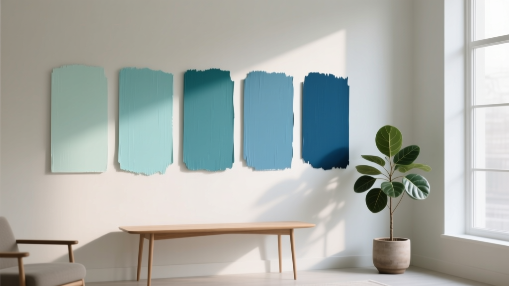 Best Aqua Paint Colors - The Decor Mag
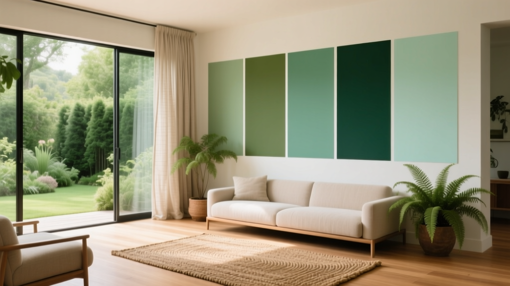 Best Green Paint Colors for Nature Lovers - The Decor Mag
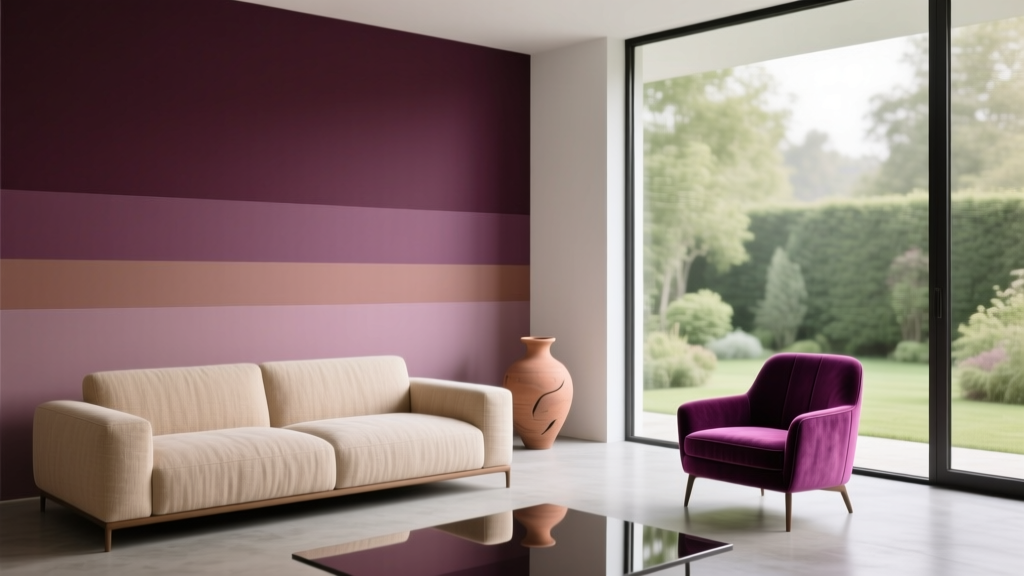 Best Plum Paint Colors for Drama - The Decor Mag
 Cheap vs Premium: Why 'Premium' Isn’t Just Marketing—It’s Measurable Performance
 Best Blush Pink Paint Colors - The Decor Mag
 How to Choose Colors for a Nursery - The Decor Mag
 Best Beige Paint Colors That Aren't Boring - The Decor Mag
 How to Choose Colors for Kitchen Cabinets - The Decor Mag
 Best Kitchen Design for Cozy: Warmth, Function, and Timeless Comfort
 Best Denim Blue Paint Colors - The Decor Mag