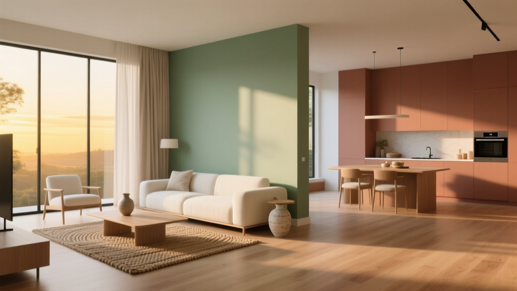
Open Floor Plan Color Transitions (2026)
Open floor plans are loved for their light, flow, and flexibility—yet they also create one of the most common color design challenges: where does one “room” end and the next begin? Without walls to separate spaces, paint colors can either blend beautifully or clash loudly, making the entire home feel visually restless.
Thoughtful color transitions solve more than an aesthetic problem. They help define zones (kitchen vs. living vs. dining), influence mood and energy, and support everyday function. A calm color scheme can make an open plan feel expansive and cohesive, while strategic contrast can add architecture and intention where walls are missing.
This guide breaks down designer-approved ways to transition paint colors and color schemes across open layouts—complete with real-room scenarios, specific paint recommendations, and common mistakes to avoid—so you can create a home that feels connected, not chaotic.
Start With a Color Strategy: Cohesion First, Variety Second
Before choosing individual paint colors, decide how you want the whole space to feel. In open layouts, the goal is usually a unified “color story” with controlled variety.
Choose Your Whole-Home “Anchor” Color
An anchor color is the shade that appears most consistently across the open plan—often on the main walls, trim, or a dominant feature. It doesn’t have to be boring; it just needs to be flexible.
- Warm-leaning anchors (creamy whites, greiges, soft beiges) make an open plan feel welcoming and layered.
- Cool-leaning anchors (crisp whites, soft grays) feel modern and airy, but can skew cold if finishes are also cool.
- Mid-tone anchors (mushroom taupe, gentle clay, muted sage) add depth and hide wear, especially in high-traffic homes.
Anchor paint ideas:
- Benjamin Moore: White Dove OC-17 (warm white), Classic Gray OC-23 (light greige), Edgecomb Gray HC-173 (warm greige)
- Sherwin-Williams: Alabaster SW 7008 (creamy white), Agreeable Gray SW 7029 (balanced greige)
- Farrow & Ball: Pointing (warm neutral), Skimming Stone (stone-like greige)
Use the 60-30-10 Rule Across the Entire Open Space
Instead of applying the 60-30-10 rule room by room, treat your open floor plan like one big composition:
- 60% = dominant field color (usually walls or a large neutral)
- 30% = secondary color (cabinets, large rugs, sectional upholstery)
- 10% = accent color (art, pillows, bar stools, a painted island)
This prevents the “every area has its own theme” problem—one of the most common open-plan color scheme issues.
Read the Fixed Elements First (They Control Your Paint)
In open layouts, paint colors must cooperate with elements you’re not changing: flooring, kitchen cabinets, countertops, fireplace stone, and major upholstery. These fixed finishes create undertones that dictate whether a paint color will harmonize or fight.
Undertones: The Hidden Driver of Smooth Color Transitions
- Warm undertones: yellow, red, orange (common in honey oak floors, warm quartz, brass hardware)
- Cool undertones: blue, green, violet (common in gray tile, some marbles, chrome fixtures)
- Neutral undertones: balanced, minimal pull (rare, but ideal)
Practical tip: Hold your paint swatches next to the countertop and flooring (not just the wall). The “right” color is the one that makes your fixed finishes look intentional.
5 Designer Methods to Transition Colors Without Breaking the Flow
1) One Wall Color, Layered Zones (The Easiest Win)
Use a single wall color throughout the open plan, then define zones with textiles, furniture, and accents. This approach is especially effective for homeowners who want a cohesive, resale-friendly palette.
Example scenario: Great room + dining + kitchen with continuous hardwood floors
- Walls: Benjamin Moore White Dove
- Kitchen cabinets: Soft contrasting color like Sherwin-Williams Pure White SW 7005 (slightly cleaner than White Dove)
- Living room zone: Rug with warm clay + muted blue accents
- Dining zone: Darker wood table + black metal chandelier to “ground” the space
Color psychology: A consistent neutral backdrop reduces visual noise, making the space feel calmer and larger—ideal for busy households and entertaining.
2) Transition With One Shared Undertone (Cohesion Without Matching)
If you want different wall colors in connected zones, choose shades that share an undertone. You can vary depth and saturation, but keep the undertone consistent so the shift feels intentional.
Winning combination (warm greige family):
- Main living area: Benjamin Moore Classic Gray OC-23
- Dining area (deeper): Benjamin Moore Revere Pewter HC-172
- Kitchen accent (even deeper): Benjamin Moore Edgecomb Gray HC-173 or a warm taupe island
Application guidance: Keep trim the same color throughout (for example, White Dove in a semi-gloss) to act as the “thread” tying zones together.
3) Use a “Bridge” Color in a Connector Area
Open plans often include natural connectors—hallways, stair walls, or a short transition wall near the kitchen. These are perfect for a bridge color that blends two adjacent shades.
Example scenario: Living room (soft white) flows into kitchen (muted sage)
- Living walls: Sherwin-Williams Alabaster SW 7008
- Kitchen walls: Sherwin-Williams Sea Salt SW 6204 (soft, airy green-blue)
- Bridge wall or stair wall: Sherwin-Williams Accessible Beige SW 7036 (warm neutral that harmonizes with both)
Practical tip: A bridge color works best when it appears at least twice (a wall plus a cabinet color, or a wall plus a rug tone), so it reads as part of the palette—not a random third paint choice.
4) Create Contrast With Architectural “Stops” (Fireplace, Built-Ins, Ceiling Changes)
When there’s no doorway, you can still create a clean color stop by using an architectural feature as the boundary:
- A fireplace wall
- Built-in shelving
- A kitchen peninsula or island
- A coffered ceiling or beam
Example scenario: Open plan with a fireplace separating living and dining
- Main walls: Farrow & Ball Skimming Stone
- Fireplace feature: Farrow & Ball Hague Blue (rich, moody blue)
- Dining area emphasis: Repeat Hague Blue in dining chairs or art for continuity
Color psychology: Deep blues and charcoals add a sense of stability and sophistication—perfect for “anchoring” a large open room that otherwise feels floaty.
5) Shift Sheen Instead of Color (Subtle, High-End, and Underused)
For homeowners who love a monochromatic look but still want definition, consider keeping one paint color and changing sheen by zone:
- Living room walls: eggshell
- Kitchen walls: satin (more wipeable)
- Trim throughout: semi-gloss
Pro note: Sheen changes are most successful on smooth walls with excellent prep; imperfect textures can highlight sheen differences in an unflattering way.
Real Room Examples: Color Transitions That Work
Example 1: Warm Modern Farmhouse (Kitchen + Dining + Living)
- Walls: Benjamin Moore White Dove
- Trim: Benjamin Moore Chantilly Lace OC-65 (crisper trim against warm walls)
- Kitchen island: Sherwin-Williams Iron Ore SW 7069 (soft charcoal)
- Dining accent: Rust-toned rug + natural oak table
- Living accents: Black hardware + linen textiles + muted green plants
Why it works: The palette is warm and natural, with one dark anchor (Iron Ore) that repeats in lighting and hardware for a confident, cohesive interior color design.
Example 2: Airy Coastal Contemporary (Open Plan With Lots of Daylight)
- Main walls: Sherwin-Williams Snowbound SW 7004 (soft white with a modern feel)
- Kitchen perimeter cabinets: Snowbound (for continuity)
- Island: Sherwin-Williams Naval SW 6244
- Living room accents: Sand + flax + pale blue textiles
Why it works: The blue island gives the kitchen an identity without breaking the flow. Blue also supports a calm, restorative mood—great for open plans that double as relaxing family spaces.
Example 3: Cozy Contemporary (Open Plan That Needs Warmth)
- Main walls: Benjamin Moore Edgecomb Gray
- Kitchen backsplash + counters: Creamy whites and warm veining
- Dining wall (feature): Benjamin Moore Wrought Iron 2124-10 (deep charcoal)
- Trim: White Dove
Why it works: A single dark feature wall creates depth and a “destination” for the dining area. Charcoal adds intimacy and visual structure—two things open layouts often lack.
Application Guidance: Where to Change Color (and Where Not To)
Color transitions feel most natural when they align with how you move through the space.
Good Places to Transition Paint Colors
- At a natural break: a fireplace bump-out, built-ins, or a change in ceiling height
- In a dedicated dining nook or breakfast area with clear boundaries
- On a single feature plane (a long wall behind the sofa, a stair wall)
- On cabinetry (island color shifts are open-plan heroes)
Places That Often Create Awkward Breaks
- Mid-wall changes with no architectural reason
- Color changes that stop at a random corner while sightlines continue
- Switching colors at the edge of a rug (rugs move; architecture doesn’t)
Common Color Mistakes to Avoid in Open Floor Plans
- Using too many unrelated paint colors. If every zone has a different wall color, the home can feel smaller and busier.
- Ignoring undertones. A gray with a blue undertone can look jarring next to warm oak floors or creamy cabinets.
- Choosing paint in isolation. Paint must coordinate with countertops, tile, flooring, and upholstery—especially in an open concept.
- Overusing high-contrast transitions. Too many bold shifts (white to black to bright color) can create a chopped-up look.
- Forgetting about lighting shifts. North-facing areas cool down colors; south-facing areas warm them up. In open plans, you can see both at once.
Practical Tips for Testing Paint Colors in an Open Layout
- Test large samples. Use 12x12 peel-and-stick samples or paint poster boards; small chips won’t show how color behaves across distance.
- View from multiple sightlines. Stand at the kitchen sink, the entry, and the sofa—your open plan is experienced in motion.
- Check day and night. The same paint color can read warmer under incandescent and cooler under LEDs.
- Keep whites consistent. Pick one trim white and one ceiling white (often the same) to prevent a “patchwork” effect.
- Repeat colors at least three times. A color feels intentional when it shows up in paint, textiles, and decor.
FAQ: Transitioning Paint Colors and Color Schemes in Open Floor Plans
Should open floor plans be the same color throughout?
Not always, but it’s often the easiest path to a cohesive look. If you want multiple colors, keep them related (shared undertones) and use trim color consistency to unify the space.
How many paint colors are too many in an open concept?
For most open layouts, aim for 1 main wall color plus 1 accent color (feature wall or cabinetry), with additional variety coming from furnishings. More than 3 strong paint colors in one open plan can start to feel fragmented.
What’s the best way to transition from a warm living room to a cool-toned kitchen?
Use a bridge element: a warm-neutral wall color that connects both, or shift the “cool” into a controlled area like the island or backsplash while keeping walls warmer and consistent.
Do I need to match my kitchen cabinet color to my living room walls?
No. A cabinet color can act as the secondary (30%) color in your overall scheme. The key is coordination—repeat that cabinet color in smaller ways in the living area (pillows, art, rug pattern) for flow.
How do I choose a white paint that works across an open floor plan?
Start with your fixed finishes. For warm floors and creamy stone, try whites like Benjamin Moore White Dove or Sherwin-Williams Alabaster. For a crisper modern look with more neutral finishes, Benjamin Moore Chantilly Lace or Sherwin-Williams Pure White can work—test in multiple areas before committing.
Can I use a bold color in an open concept without overwhelming it?
Yes—contain it. Use bold color on a feature wall, built-ins, or a kitchen island, and repeat it in smaller accents across the space. Deep blues (like SW Naval) and charcoals (like SW Iron Ore) are bold but versatile choices.
Next Steps: Build Your Transition Plan
To create seamless color transitions in your open floor plan, start with one anchor color, confirm undertones against your fixed finishes, and choose a transition method that matches your home’s architecture—single-color layering, shared-undertone families, bridge colors, architectural stops, or sheen shifts.
Your action checklist:
- Pick an anchor wall color and one trim white
- Identify undertones in floors, counters, and cabinets
- Select one secondary color (often cabinetry or an accent wall)
- Test large samples in at least three sightlines and two lighting conditions
- Repeat key colors through textiles and decor for a cohesive color scheme
If you’re ready for more paint color ideas, whole-home palettes, and room-by-room interior color design guidance, explore more color guides on thedecormag.com.
More Articles
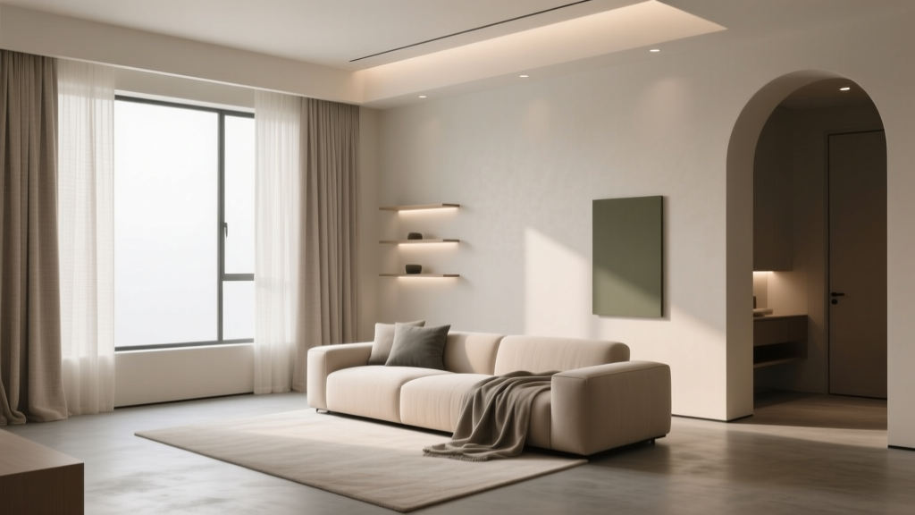 How to Create a Low Contrast Color Palette - The Decor Mag
 Match Buying Guide: Safety, Performance, and Practical Selection Criteria
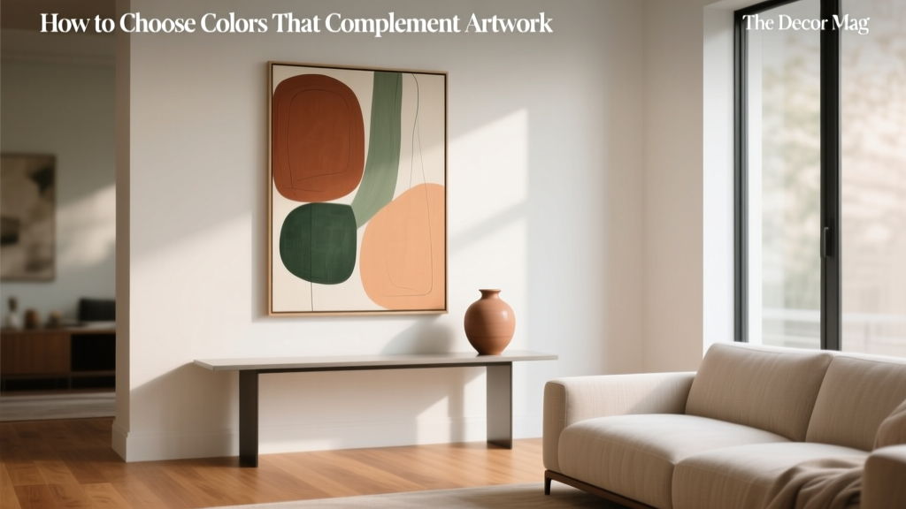 How to Choose Colors That Complement Artwork - The Decor Mag
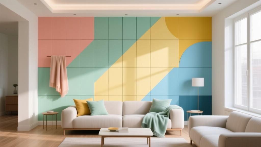 How to Create a Playful Color Palette - The Decor Mag
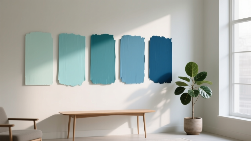 Best Aqua Paint Colors - The Decor Mag
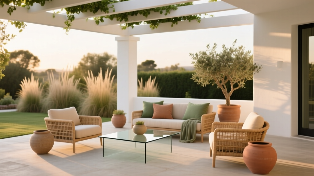 How to Choose Colors for a Patio - The Decor Mag
 Reading for Options: How Visual Literacy Drives Strategic Decision-Making in Design and Branding
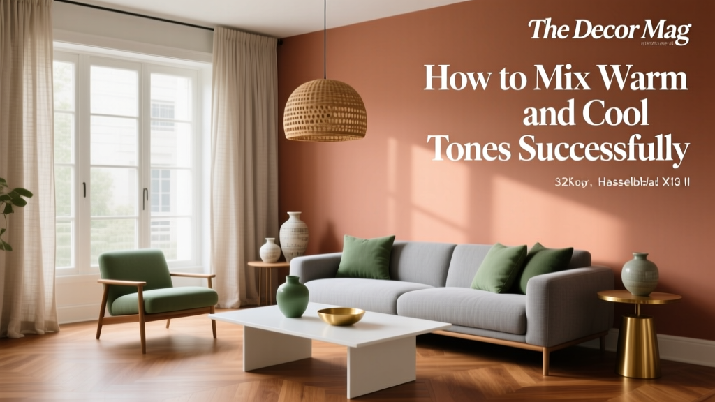 How to Mix Warm and Cool Tones Successfully - The Decor Mag
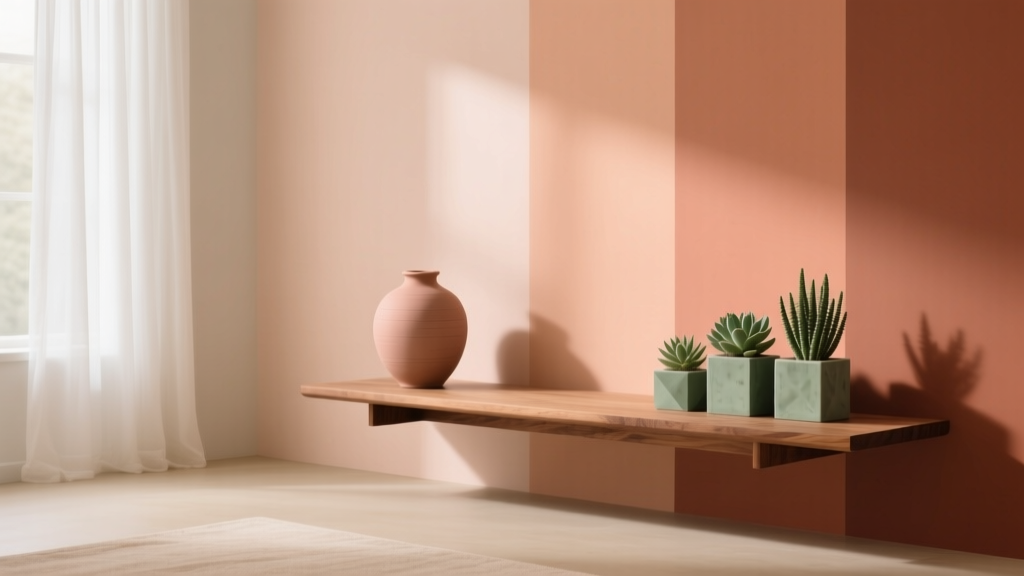 Best Apricot Paint Colors - The Decor Mag
 How to Choose Colors for a Scullery - The Decor Mag