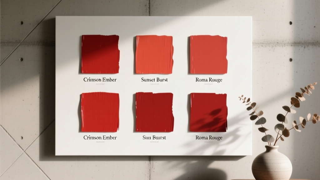
Best Tomato Red Paint Colors - The Decor Mag
Tomato red is one of those rare paint colors that feels instantly alive. It’s warm without being muddy, bold without reading as neon, and timeless in a way that spans everything from vintage kitchens to modern, gallery-like interiors. When used thoughtfully, tomato red can energize a room, flatter wood tones, and create a focal point that makes the whole space feel designed rather than simply decorated.
Homeowners often hesitate with red because it can swing too dark, too orange, or too “holiday” depending on lighting and surrounding finishes. Tomato red sits in a sweet spot—typically a clear, warm red with an orange undertone—making it more welcoming and easier to style than blue-based, wine, or burgundy reds. If you’ve been searching for the best tomato red paint colors, this guide will help you pick the right shade, pair it confidently, and avoid the common pitfalls that make red feel overwhelming.
What Makes a Paint Color “Tomato Red”?
Tomato red is generally a mid-to-bright red with noticeable warmth. It’s not a deep oxblood and not a pink-leaning cherry. Think of a ripe tomato: saturated, juicy, and slightly orange-tinged.
Undertones: The Detail That Changes Everything
- Orange undertones: Most tomato reds lean orange, which makes them feel sunny and appetizing (great for kitchens and dining rooms).
- Brown undertones: Some “tomato” shades are softened with a hint of earthiness, making them easier on large walls and more traditional.
- Clean/clear pigments: The best tomato reds look crisp, not dusty or gray, especially in daylight.
Color Psychology: Why Tomato Red Works
Red is associated with energy, warmth, confidence, and sociability. In interior color design, tomato red often boosts a room’s sense of activity and connection—one reason it shines in entertaining spaces. Used in smaller doses, it adds vitality and draws the eye; used on walls, it can make a room feel cozy and enveloping, particularly in north-facing light.
How to Choose the Right Tomato Red for Your Home
Start With Lighting (Natural + Bulbs)
- North-facing rooms: Cooler light can make tomato red look deeper and slightly more muted. Consider a brighter, clearer tomato to keep it from feeling heavy.
- South-facing rooms: Warm light amplifies warmth. A tomato red can read more orange here—choose a slightly “truer” red if you want balance.
- Evening light: Warm bulbs (2700K–3000K) intensify the cozy glow. Cool bulbs (3500K+) can make reds look harsher and more primary.
Decide: Statement Wall, Full Room, or Accents?
- Full room: Best in dining rooms, libraries, powder rooms, and cozy dens; choose a tomato red with a touch of depth for comfort.
- Accent wall: A smart entry point—pair with warm whites and natural materials.
- Trim, doors, cabinetry, furniture: Tomato red on a front door, island, or built-ins creates a designer “pop” without overwhelming.
Pick Your Finish Like a Designer
- Matte/flat: Sophisticated, softens brightness; best for walls in lower-traffic rooms.
- Eggshell: Great everyday wall finish; easier to clean while still refined.
- Satin: Ideal for kitchens, baths, doors, and trim; richer color payoff.
- High-gloss: Dramatic on front doors and furniture; reflects light and highlights surface imperfections.
Best Tomato Red Paint Colors (Designer-Approved Picks)
Below are standout tomato red paint colors from trusted brands. Always test with peel-and-stick samples or sample pots in your actual lighting—red is famously sensitive to surroundings.
Benjamin Moore Tomato Reds
- Benjamin Moore Caliente AF-290
A saturated, confident warm red that feels modern and classic at once. It’s a go-to for front doors, dining rooms, and accent walls when you want a rich tomato vibe without going too orange. - Benjamin Moore Classic Red 2000-10
A bold, straightforward red with strong presence. Use it when you want that crisp, celebratory tomato red—especially striking on lacquered furniture or a statement door. - Benjamin Moore Raspberry Blush 2008-30
A warm red with a lively, juicy character. It can read tomato-red-adjacent in warmer light and is gorgeous in creative spaces or playful powder rooms.
Sherwin-Williams Tomato Reds
- Sherwin-Williams Heartthrob SW 6866
Bright and energetic with a clean, warm undertone. Great for accent walls, art studios, and modern kitchens when paired with crisp whites. - Sherwin-Williams Real Red SW 6868
A strong, clear red that reads confident and graphic. If you’re after a classic tomato punch for a front door or built-ins, this is a contender. - Sherwin-Williams Show Stopper SW 7588
A vivid red that grabs attention. Best as an accent color—think a powder room vanity, a pantry door, or a bold entry.
Farrow & Ball Tomato-Style Reds
- Farrow & Ball Incarnadine No. 248
A sophisticated deep red that can still feel “tomato” in the right context, especially with warm whites and brass. Beautiful in dining rooms and studies. - Farrow & Ball Red Earth No. 64
More earthy than classic tomato, but a strong choice if you want a softened terracotta-tomato effect that’s easy to live with on multiple walls.
Behr Tomato Reds
- Behr Fireworks (similar bright warm red family)
Behr offers several vibrant reds; look for warm, orange-leaning reds in the Fireworks range for a tomato-like statement wall or front door. Verify undertones with a sample in your light.
Pro tip: If you’re matching a true tomato red, compare samples against a pure white sheet of paper. This makes orange, pink, and brown undertones easier to spot.
Real Room Examples: Where Tomato Red Looks Best
1) A Welcoming Front Door That Pops
Tomato red is a classic for curb appeal because it reads friendly and confident from the street.
- Best pairings: warm white siding, creamy trim, natural stone, black hardware
- Try: Benjamin Moore Caliente AF-290 in a satin or high-gloss finish
- Designer move: repeat the red subtly inside (a small bench cushion, artwork, or a runner stripe) for a cohesive color story
2) A Dining Room That Feels Cozy and Elevated
Red is rooted in hospitality—great for dining rooms where you want people to linger. Tomato red keeps the mood warm rather than formal.
- Best pairings: walnut or oak furniture, brass lighting, creamy ceilings, linen drapery
- Try: Farrow & Ball Incarnadine No. 248 for drama, or a clearer red like SW Real Red for a brighter vibe
- Paint approach: color-drench walls and trim (same color, different sheen) for a tailored, enveloping look
3) A Kitchen Island or Lower Cabinets With Instant Character
If full red cabinetry feels intimidating, paint the island or base cabinets tomato red and keep uppers light. This creates a grounded, designer focal point.
- Best pairings: warm white walls, cream subway tile, butcher block, honed black granite, brushed brass pulls
- Try: Benjamin Moore Classic Red 2000-10 or Sherwin-Williams Heartthrob SW 6866
- Finish: satin or semi-gloss for wipeable durability
4) A Powder Room That Feels Like a Jewel Box
Small rooms can handle saturated color beautifully. Tomato red adds bold personality and looks striking with reflective finishes.
- Best pairings: warm white marble, brass mirrors, graphic black-and-white tile, vintage sconces
- Try: Sherwin-Williams Show Stopper SW 7588 for high-impact, or a deeper tomato-leaning red for a moody twist
5) A Living Room Accent Wall Behind Art or Shelving
If your living room already has neutrals and texture, a tomato red accent wall adds structure and a focal point—especially behind a sofa or built-in bookcase.
- Best pairings: warm greige, creamy white, camel leather, natural jute, black accents
- Try: Benjamin Moore Caliente AF-290 for a refined statement
Color Schemes That Make Tomato Red Feel Intentional
Classic Pairings (Timeless and Easy)
- Tomato red + warm white: Clean, bright, and architectural
- Tomato red + navy: High-contrast and tailored (great for traditional homes)
- Tomato red + black: Graphic and modern (best with natural wood to soften)
Earthy Pairings (Relaxed and Livable)
- Tomato red + clay/terracotta: Tonal warmth; use varied textures to keep it sophisticated
- Tomato red + olive or sage green: A proven complementary scheme; feels organic and grounded
- Tomato red + warm wood tones: Especially walnut, oak, or cherry for a cohesive palette
Fresh, Modern Pairings (Unexpected but Beautiful)
- Tomato red + blush: Works when the red is warm and the blush is muted; great for eclectic interiors
- Tomato red + teal (sparingly): Use teal as a small accent (pillows, art) to avoid visual noise
Practical Tips for Sampling Tomato Red Paint
- Sample at least 2–3 reds side by side to compare undertones.
- Test on multiple walls (especially the wall opposite the window) to see how it shifts.
- View at different times: morning, afternoon, and nighttime under your actual bulbs.
- Surround the sample with your finishes: countertop material, flooring, cabinet color, upholstery, and metal finishes.
- Consider sheen early: a glossier finish makes red feel brighter and more saturated.
Common Tomato Red Paint Mistakes (and How to Avoid Them)
- Choosing red without checking undertones: A “tomato red” can suddenly look coral, brick, or pink once it’s up. Always sample in your room.
- Ignoring the fixed elements: Red fights with cool gray flooring or icy white tile. If your finishes are cool, choose a slightly less orange tomato red or balance with warm whites and wood.
- Using cool, harsh lighting: Very cool LEDs can make red look flat or aggressive. Aim for warmer bulbs (2700K–3000K) for a welcoming glow.
- Overdoing strong contrasts: Tomato red with stark bright white and lots of black can feel too graphic. Add texture—wood, woven materials, creamy textiles—to soften.
- Painting every room the same red: Red is powerful. Use it strategically and repeat it in smaller accents elsewhere for flow.
FAQ: Tomato Red Paint Colors
Is tomato red a warm or cool color?
Tomato red is typically a warm red with orange undertones. It tends to feel inviting and energetic, especially in rooms with warm natural light.
What neutrals work best with tomato red walls?
Look for warm whites, creamy off-whites, beige, and warm greige. These keep tomato red from feeling harsh and help create a cohesive color scheme.
Can I use tomato red in a small room?
Yes—small rooms like powder rooms, entryways, and breakfast nooks are ideal. Saturated color can make compact spaces feel intentional and elevated.
What trim color goes with tomato red?
For a classic look, pair tomato red with a warm white trim. For a modern look, try soft black or even color-drenched trim (same red in a different sheen).
How do I keep tomato red from feeling too bright?
Choose a tomato red with a hint of depth (slightly earthier), use a matte or eggshell finish on walls, and balance with natural textures like wood, linen, jute, and warmer metals.
Which rooms are best for tomato red paint?
Tomato red shines in dining rooms, kitchens (especially islands), front doors, powder rooms, and accent walls. It’s less common in bedrooms unless you’re aiming for a bold, cocooning look.
Next Steps: Bring Tomato Red Home With Confidence
Start by choosing 2–3 tomato red paint colors that match your home’s fixed finishes, then test them in your room across a full day of lighting. Decide whether you want a statement (front door, island, accent wall) or a fully saturated moment (powder room, dining room), and build a supporting palette with warm whites, natural woods, and grounding accents like olive green or navy.
For more guidance on paint colors, undertones, and curated color schemes, explore more color guides on thedecormag.com.
More Articles
 Best Sage Green Paint Colors for Serenity - The Decor Mag
 Best Indigo Paint Colors - The Decor Mag
 How to Choose Colors Based on Room Lighting - The Decor Mag
 Jewel Tone Color Scheme Ideas - The Decor Mag
 How to Choose Colors for a Wine Cellar - The Decor Mag
 How to Choose Colors for West-Facing Rooms - The Decor Mag
 Best Berry Red Paint Colors - The Decor Mag
 Best Purple Paint Colors for Sophistication - The Decor Mag
 How to Use Color to Create Warmth - The Decor Mag
 Best Green Paint Colors for Nature Lovers - The Decor Mag