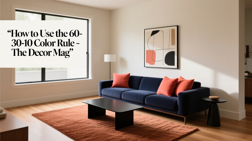
How to Use the 60-30-10 Color Rule - The Decor Mag
Color is one of the fastest ways to change how a home feels—calmer, brighter, warmer, more modern, more classic. Yet for many homeowners, choosing paint colors and coordinating them across a room can feel surprisingly high-stakes. One wrong wall color can make the space look smaller, clash with flooring, or fight with furniture you already love.
The 60-30-10 color rule is a simple design principle that brings structure to color decisions without limiting creativity. It helps you build a balanced color scheme, avoid “everything is competing” syndrome, and make bold choices in a controlled way. Whether you’re picking interior paint colors, selecting a rug, or styling shelves, this rule gives you a repeatable formula for cohesive interior color design.
Below, you’ll learn exactly how the 60-30-10 rule works, how to choose the right palette for your room, and how to apply it with real-life examples—including paint color recommendations from brands like Sherwin-Williams, Benjamin Moore, and Farrow & Ball.
What Is the 60-30-10 Color Rule?
The 60-30-10 rule is a guideline for proportioning color in a space:
- 60% = the dominant color (usually walls and large visual surfaces)
- 30% = the secondary color (upholstery, large furniture, drapery, rugs)
- 10% = the accent color (pillows, art, objects, florals, lampshades)
Think of it like a well-composed outfit: the dominant color is your main garment, the secondary is your layering piece, and the accent is your jewelry or shoes. The result is visual hierarchy—your eye knows where to go, and the room feels intentional.
Why Designers Rely on It
- Creates balance: Prevents a room from feeling overly busy or overly bland.
- Makes color choices easier: You don’t need 12 “feature colors” to make a room interesting.
- Supports color psychology: Dominant color sets mood; accents add energy and personality.
- Works with any style: Modern, traditional, coastal, farmhouse, eclectic, minimal.
Step-by-Step: How to Apply the 60-30-10 Rule in Your Home
Step 1: Choose Your 60% Dominant Color (The Mood Setter)
Your dominant color typically appears on walls, but it can also be a large rug or even kitchen cabinetry if that’s the biggest visual field. This color should support the function of the room and align with the atmosphere you want.
Color psychology cues:
- Soft whites/creams: airy, clean, expansive
- Warm neutrals (greige, beige, taupe): grounded, cozy, welcoming
- Blues/blue-greens: calm, restorative, focused
- Greens: balanced, natural, soothing
- Deep charcoals/navies: dramatic, intimate, luxe
Designer-approved dominant paint color ideas:
- Benjamin Moore White Dove (OC-17): a warm white that plays nicely with wood tones
- Sherwin-Williams Alabaster (SW 7008): creamy and soft—great for open plans
- Farrow & Ball Cornforth White (No. 228): a sophisticated mid-light grey with depth
- Benjamin Moore Pale Oak (OC-20): a gentle greige that reads calm and refined
- Sherwin-Williams Sea Salt (SW 6204): a blue-green that shifts subtly with light
Step 2: Add 30% Secondary Color (The Support Act)
The secondary color creates contrast and structure. This is where you can introduce a deeper neutral, a wood tone, or a related hue that complements your dominant color. In living rooms, it often shows up in:
- Sofas or sectional upholstery
- Area rugs
- Accent chairs
- Drapery
- Case goods (media console, bookcases)
Easy secondary-color strategies that rarely fail:
- Go 2–4 shades darker than your dominant for a layered monochrome color scheme.
- Use a warm/cool counterbalance: warm dominant + cooler secondary (or the reverse) to keep the room from feeling flat.
- Lean on natural materials: walnut, oak, rattan, leather—these count as “color” in interior design and add warmth.
Secondary paint color options (also great for built-ins or cabinets):
- Benjamin Moore Edgecomb Gray (HC-173): warm, versatile greige for a grounded layer
- Sherwin-Williams Accessible Beige (SW 7036): classic warm neutral for upholstery pairings
- Benjamin Moore Hale Navy (HC-154): strong, timeless navy for contrast
- Sherwin-Williams Iron Ore (SW 7069): near-charcoal with warmth—modern and flexible
Step 3: Finish with 10% Accent Color (The Spark)
The accent color is the “pop,” but it doesn’t have to be neon or loud. It can be a saturated jewel tone, a crisp black, a metallic, or even a lively botanical green. The goal is to create moments of emphasis—small, repeated notes that tie the room together.
Best places for the 10% accent:
- Throw pillows and blankets
- Artwork and frames
- Ceramics, books, and decorative objects
- Accent paint on a door or a piece of furniture
- Flowers and greenery (yes, plants count)
Accent paint color favorites (use for a front door, powder room vanity, or a statement piece):
- Farrow & Ball Hague Blue (No. 30): moody blue-green that reads elegant
- Benjamin Moore Caliente (AF-290): energized red—best in small doses
- Sherwin-Williams Tricorn Black (SW 6258): crisp black for modern definition
- Benjamin Moore Kensington Blue (840): bright classic blue for playful hits
- Sherwin-Williams Cavern Clay (SW 7701): earthy terracotta for warmth and character
Real Room Examples: 60-30-10 Color Schemes You Can Copy
Example 1: Serene Living Room (Light, Airy, Timeless)
- 60% (walls): Sherwin-Williams Alabaster (SW 7008)
- 30% (sofa + rug tones): Benjamin Moore Edgecomb Gray (HC-173) or a warm greige upholstery
- 10% (accent): deep navy (Benjamin Moore Hale Navy HC-154) in pillows, art, and a table lamp base
Application scenario: An open-plan living room where you want calm continuity. Keep trim the same as the wall color in a higher sheen to reduce visual breaks, then let navy accents add depth without shrinking the space.
Example 2: Cozy Bedroom (Restorative and Soft)
- 60% (walls): Benjamin Moore Pale Oak (OC-20)
- 30% (bedding + drapery): warm oatmeal linen, light wood furniture, or taupe (Sherwin-Williams Accessible Beige SW 7036)
- 10% (accent): muted sage or eucalyptus tones via pillows and art (consider Sherwin-Williams Evergreen Fog SW 9130 as an accent inspiration)
Application scenario: If your bedroom gets cool north light, Pale Oak’s warmth keeps it from feeling icy. Add black hardware or a thin black picture frame to sharpen the palette without changing the 10% accent plan.
Example 3: Modern Dining Room (High Contrast, Elevated)
- 60% (walls): Farrow & Ball Cornforth White (No. 228)
- 30% (dining table + chairs): dark stained wood or charcoal (Sherwin-Williams Iron Ore SW 7069)
- 10% (accent): brass + a punchy color in art (try a restrained red like Benjamin Moore Caliente AF-290 in a single large artwork)
Application scenario: Use the accent strategically: one statement pendant with brass, one bold piece of art, and a simple centerpiece. The room reads curated, not cluttered.
Example 4: Family-Friendly Kitchen (Bright but Grounded)
- 60% (cabinets or walls): Benjamin Moore White Dove (OC-17)
- 30% (island or lower cabinets): Benjamin Moore Hale Navy (HC-154) or Sherwin-Williams Iron Ore (SW 7069)
- 10% (accent): warm terracotta accessories (Sherwin-Williams Cavern Clay SW 7701), wood cutting boards, and greenery
Application scenario: If you don’t want to repaint cabinets, treat the backsplash and countertops as part of the 60% field, then bring the 30% through barstools or a runner.
Choosing a Color Scheme Type That Fits the Rule
The 60-30-10 framework works with any classic color scheme. Pick the scheme first, then assign proportions.
- Monochromatic: one hue in multiple shades (great for minimalists and small rooms)
- Analogous: neighboring hues on the color wheel (blue + blue-green + green = smooth and calming)
- Complementary: opposites on the color wheel (blue + orange accents = energetic, balanced)
- Neutral + color: neutrals as 60/30, color as 10 (easy to live with and update)
Practical Tips for Getting the Proportions Right
- Count “big visual surfaces,” not square footage: A large dark sofa can visually outweigh two light walls.
- Repeat your accent 3 times: For example: pillow + vase + artwork detail. This builds rhythm.
- Use undertones to prevent clashing: Pair warm whites with warm woods; cool greys with crisp blacks and cooler blues.
- Sample paint the right way: Paint large swatches (at least 12x12) on multiple walls and check morning, afternoon, and evening.
- Let fixed finishes lead: If you have existing floors, stone, or countertops, treat them as part of your 60% or 30% and build around them.
Common Color Mistakes to Avoid
1) Making the Accent Color Too Dominant
If your “10%” ends up on a giant rug or a wall of drapery, it stops being an accent and starts hijacking the palette. If you love bold color, move it into the 30% slot and choose a quieter accent.
2) Ignoring Undertones
That “white” paint might be pink, yellow, green, or grey underneath. A greige with a green undertone can look muddy next to a pink-beige tile. Compare swatches directly to your fixed finishes.
3) Using Too Many Competing Colors
When every item has a different saturated color, the room feels chaotic. Limit your main palette to three colors, then vary texture and pattern within those boundaries.
4) Choosing Paint Colors Without Considering Lighting
North light cools colors; south light warms them; LED bulbs can skew blue or yellow. If you’re selecting interior paint colors, test them under your actual bulbs and at night.
5) Forgetting About “Quiet” Contrast
A palette can feel flat if the 60 and 30 are too similar in value (lightness/darkness). Add contrast through:
- Black or dark bronze hardware
- Natural wood
- Textiles with visible weave
- Matte vs. sheen differences (eggshell walls, satin trim)
FAQ: 60-30-10 Color Rule
Does the 60-30-10 rule work in open-concept spaces?
Yes. Treat the open plan as one “room” for the 60% dominant color (often wall color), then assign 30% and 10% per zone. Repeating the same accent across zones helps the whole space feel cohesive.
What if I want more than three colors?
You can add supporting shades as long as they behave like variations of the main three (lighter/darker versions, or patterns that include your palette). Keep the overall read consistent: one dominant, one secondary, one primary accent.
Is black considered a color in this rule?
Absolutely. Black can be a powerful 10% accent (frames, hardware, lighting), or even part of the 30% secondary if you have large black furniture or built-ins.
Should the 60% always be a neutral paint color?
No. A colored wall (like a dusty blue or soft green) can be your 60%, especially in bedrooms, offices, and dining rooms. If you go bold for the 60%, keep the 30% more restrained and the 10% crisp.
How do I use the rule if I’m not painting?
Start with what’s largest: rug, sofa, or bedding. That becomes your 60%. Then choose a 30% supporting color in large textiles or furniture, and finish with 10% accents through art and decor.
What’s the best way to pick an accent color?
Pull it from something you already love in the room—artwork, a patterned rug, or even a favorite pillow. This ensures your accent feels connected rather than random.
Next Steps: Build Your Own 60-30-10 Palette
If you want a room that feels pulled together, start with a simple plan you can execute in a weekend:
- Identify your fixed finishes (floors, countertops, tile) and decide whether they belong in your 60% or 30%.
- Choose your dominant paint color and test it on multiple walls in your room’s lighting.
- Select a secondary color through one major piece (sofa, rug, cabinetry, or drapery).
- Add one accent color, then repeat it in 3–5 small places for a designer-style rhythm.
- Edit before you add: remove decor that introduces extra competing colors.
Color becomes much less intimidating when you have a framework—and the 60-30-10 rule is one you’ll use again and again, from paint colors to pillows to full-home color schemes.
Want more palette ideas and paint color guides? Explore more color and interior design articles on thedecormag.com.
More Articles
 Best Pistachio Paint Colors - The Decor Mag
 How to Choose Colors for a Conservatory - The Decor Mag
 Best Black Paint Colors for Dramatic Spaces - The Decor Mag
 Best Sky Blue Paint Colors - The Decor Mag
 Best Grapefruit Paint Colors - The Decor Mag
 How to Choose Colors for South-Facing Rooms - The Decor Mag
 Best Steel Blue Paint Colors - The Decor Mag
 Best Wine Red Paint Colors - The Decor Mag
 Where to Place Outdoor Essentials: Strategic Placement for Safety, Function, and Longevity
 Best Cucumber Paint Colors - The Decor Mag