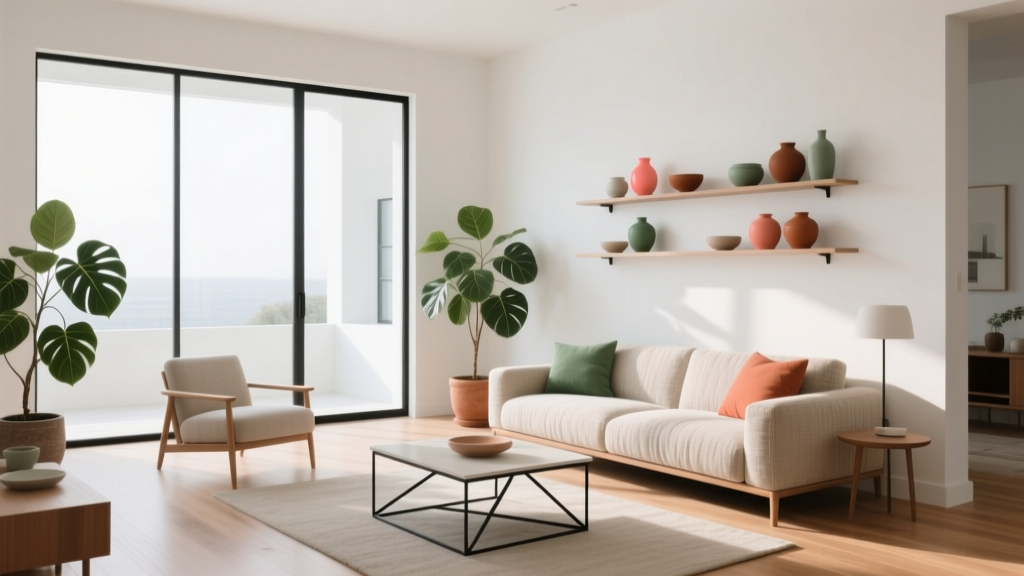
Studio Color Palettes That Expand Small Rooms
How Color Changes the Perception of Space
Color doesn't physically enlarge a room, but it profoundly changes how spacious it feels. Light, cool tones recede visually—they seem to push walls outward. Dark, warm tones advance—they make walls feel closer. In a studio apartment where every square foot counts, understanding this principle lets you manipulate perception to create a space that feels open, calm, and distinctly yours.
The Foundation: Warm Neutrals
Start with a warm neutral base for walls and large furniture. This doesn't mean sterile white—think soft warm grays (like Benjamin Moore's Classic Gray), pale taupes, or creamy off-whites. These colors reflect light effectively while feeling welcoming rather than clinical. Paint the ceiling the same color as the walls or one shade lighter—this blurs the boundary between wall and ceiling, making the ceiling appear higher.
The 60-30-10 Rule for Studios
- 60% dominant color: Your warm neutral on walls, large furniture, and flooring
- 30% secondary color: A complementary tone for curtains, area rugs, and accent furniture
- 10% accent color: A bold or saturated hue for pillows, art, and small decor items
Accent Wall Strategy for Small Spaces
An accent wall in a studio can work beautifully—but placement matters. Paint the wall furthest from the entrance in a deeper tone. This draws the eye through the room, creating a sense of depth. Avoid accent walls on side walls, which can make the room feel narrower. Deep navy, forest green, or warm terracotta all work well as accent colors against a light neutral base.
Ceiling Tricks That Add Visual Height
Paint the ceiling a lighter shade than the walls to create the illusion of height. High-gloss or semi-gloss ceiling paint reflects more light, amplifying the effect. If your studio has exposed pipes or ductwork, paint them the same color as the ceiling—they'll visually disappear, making the space feel less cluttered.
Color Zoning in Open-Plan Studios
In a studio, color can define zones without physical dividers. Use a slightly different wall color or a large area rug in a distinct hue to separate the sleeping area from the living area. Keep the transitions subtle—two shades from the same color family maintain visual flow while signaling different functions. A soft sage in the sleeping area and a warm gray in the living area creates a gentle boundary.
Lighting's Effect on Color
The same paint color looks dramatically different under warm (2700K) versus cool (5000K) lighting. Test your paint choices under the actual bulbs you'll use. North-facing studios get cool natural light—warm up with warm-toned neutrals. South-facing spaces get warm light—cooler grays and blues balance the warmth. Always buy sample pots and observe the color at different times of day before committing.
More Articles
 How To Match Aging With Space: Designing Environments That Support Lifelong Well-Being
 How to Choose Colors for a Rental Property - The Decor Mag
 12 Practical DIY Furniture Ideas You Can Build in a Weekend (With Exact Materials & Dimensions)
 The Ultimate Reading Guide: Science-Backed Strategies for Faster Comprehension, Retention, and Lifelong Engagement
 How to Match Colors to Furniture and Fabrics - The Decor Mag
 Color Psychology in Living Rooms: Why Your Space Feels Off
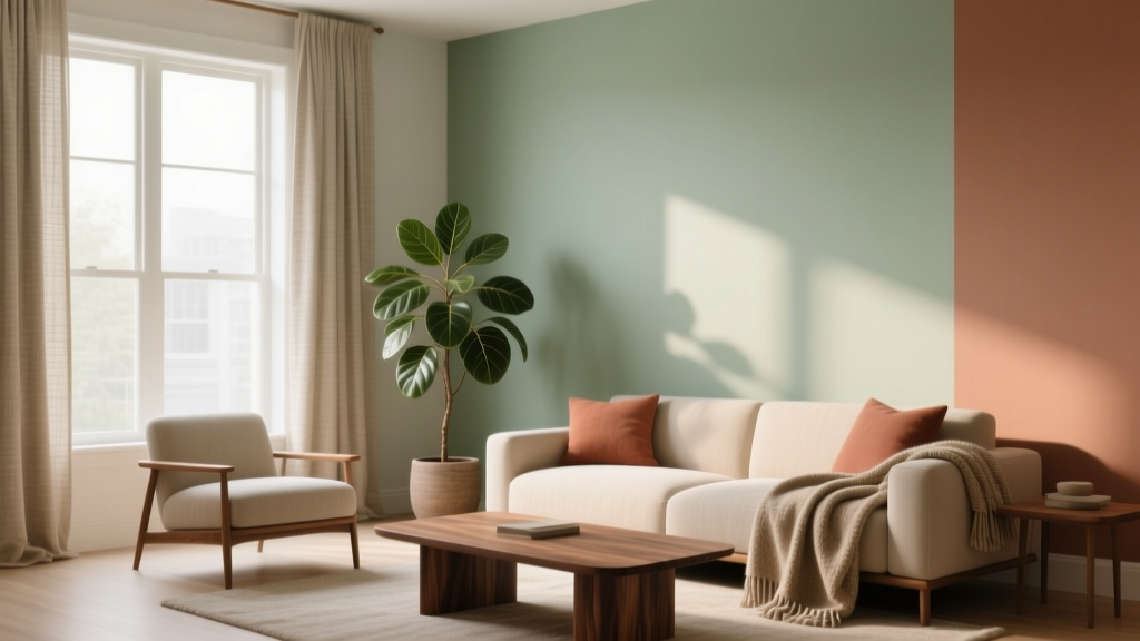 How to Use Analogous Colors in Decor - The Decor Mag
 Best Banana Paint Colors - The Decor Mag
 Best White Paint Colors Compared - The Decor Mag
 How to Create a Soothing Color Palette - The Decor Mag