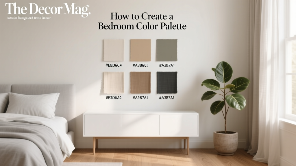
How to Create a Bedroom Color Palette - The Decor Mag
Your bedroom is one of the few places in your home where your nervous system should feel safe enough to fully exhale. Color plays a quiet but powerful role in that process. The hues you choose can influence how calm (or alert) you feel, how cozy the room reads at night, and how visually “busy” your environment becomes when you’re trying to fall asleep.
A well-built bedroom color palette does more than look pretty on a mood board. It helps your space feel consistent and soothing, supports a sleep-friendly design approach, and makes everyday decisions easier—from selecting bedding to picking lampshades and even choosing storage. Whether you’re a homeowner planning a full refresh or a renter working within limitations, a smart palette can dramatically improve the way your bedroom supports rest and relaxation.
Below, you’ll find a practical, step-by-step approach to choosing colors, pairing them with furniture and textiles, and avoiding common pitfalls that can undermine a calming sleep environment.
What “Color Palette” Really Means in Bedroom Design
A bedroom color palette is a planned set of colors used consistently across the room—walls, bedding, furniture, rugs, curtains, art, and accents. The goal is harmony, not matching everything perfectly.
A Simple, Sleep-Friendly Formula: 60–30–10
- 60% Dominant color: Usually walls and large visual areas (paint, large rug, big curtains).
- 30% Secondary color: Upholstered headboard, bedding base color, dresser/wardrobe finish, or major textiles.
- 10% Accent color: Pillows, throws, art, ceramics, a small bench, lamp bases—small hits for personality.
Undertones Matter More Than Most People Realize
Two colors can share the same name and still clash because of undertones. A “warm white” with a yellow undertone can fight with a “cool gray” that leans blue. For a restful bedroom decor scheme, pick a temperature lane and stay in it:
- Warm lane: Creams, warm whites, greige, clay, terracotta, muted olive, warm woods.
- Cool lane: Crisp whites, blue-grays, soft navy, sage leaning cool, charcoal, black accents.
- Balanced lane: True neutrals and soft, “muddied” midtones (taupe, mushroom, muted sand).
Start With How You Want the Room to Feel (Not a Trend)
Before you choose paint chips, decide on the emotional target. Color psychology isn’t magic, but it’s useful—especially when designing a sleep environment.
Pick a Mood Goal
- Deep calm: Soft blue, dusty blue-gray, muted green, warm off-white, light taupe.
- Cozy cocoon: Warm neutrals, clay, terracotta, caramel, chocolate brown, deep olive.
- Airy and clean: Warm white, pale greige, whisper gray, light sand, pale sage.
- Moody retreat: Deep navy, charcoal, forest green, espresso, black accents with warm lighting.
Sleep Wellness Tip: Choose Lower-Stimulation Colors for the Largest Surfaces
High-saturation brights (neon, primary red, intense orange) can feel visually activating—great for a gym, less ideal for winding down. If you love bold color, reserve it for the 10% accent zone.
Build Your Palette Step by Step
Step 1: Anchor With What You’re Keeping
Your biggest “fixed” items should lead the palette:
- Wood floor tone (honey oak vs. dark walnut vs. gray laminate)
- Large furniture (bed frame, dresser, wardrobe)
- Rental limitations (wall color you can’t change, existing carpet)
Quick trick: Pull one color from the undertone of the floor or the dominant wood finish. That creates instant cohesion.
Step 2: Choose Wall Color Based on Light Direction
Lighting changes everything in bedroom design. Test paint samples on multiple walls and look at them in morning light, afternoon light, and with lamps on at night.
- North-facing rooms: Cooler light can make colors look grayer. Consider warmer whites, greige, warm taupe, or muted clay.
- South-facing rooms: Lots of warm light. Soft cool tones (blue-gray, sage) can feel balanced and serene.
- East-facing rooms: Bright morning light, softer later. Calm neutrals and soft greens work well.
- West-facing rooms: Warm afternoon glow can intensify color. Choose muted versions of your favorites.
Step 3: Add a Secondary Color Through Textiles
Textiles are the most sleep-relevant decor layer because they’re close to the body. They also make color changes affordable. Use your secondary color in:
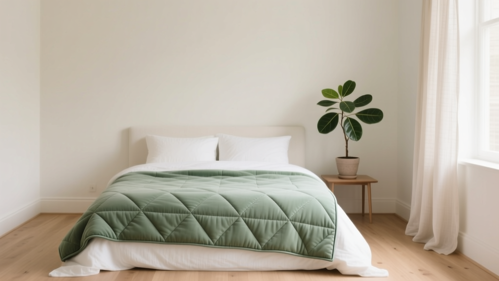
- Duvet cover or quilt
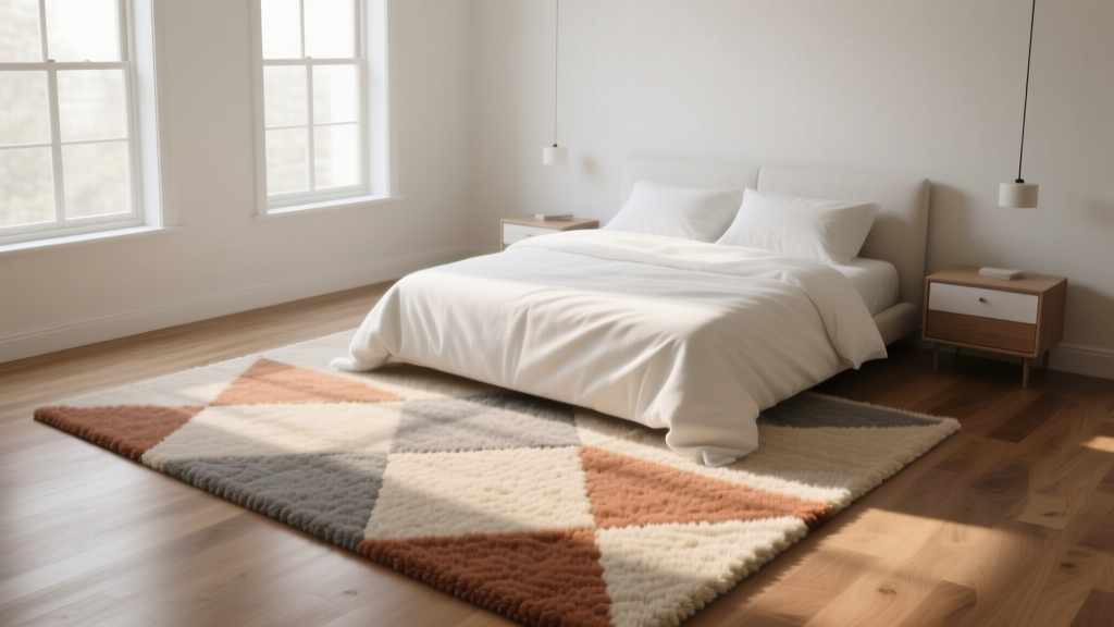
- Area rug
- Blackout curtains or lined drapes
- Upholstered headboard
Step 4: Choose One Accent Color (Then Repeat It)
Accents feel intentional when repeated at least 2–3 times around the room. For example:
- Accent color = terracotta: pillow + art detail + small vase
- Accent color = brass: lamp base + drawer pulls + mirror frame
- Accent color = deep navy: throw + framed print + bedside tray
Sleep-Friendly Bedroom Color Palette Ideas (Ready-to-Use)
1) Soft Blue + Warm White + Natural Wood
Feel: Fresh, calm, classic. Best for: Most light conditions.
- Walls: Misty blue or blue-gray (low saturation)
- Bedding: Warm white cotton percale or linen blend
- Furniture: Oak or walnut nightstands, simple shapes
- Accents: Brushed brass or matte black
2) Sage Green + Cream + Black Accents
Feel: Grounding and restorative. Best for: Nature-inspired bedroom decor and renters.
- Walls: Soft sage (avoid overly yellow-green)
- Bedding: Cream duvet + white sheets for a layered look
- Furniture: Light wood or white-painted pieces
- Accents: Black picture frames, a black reading lamp
3) Greige + Warm Taupe + Textured Neutrals
Feel: Quiet luxury without trying. Best for: Small bedrooms and open-plan apartments.
- Walls: Greige (balanced undertone)
- Bedding: Taupe quilt + ivory pillows
- Furniture: Upholstered bed in oatmeal or stone
- Accents: Woven baskets, boucle, matte ceramic
4) Deep Navy + Crisp White + Walnut
Feel: Cocoon-like and hotel-inspired. Best for: Bedrooms with good natural light.
- Walls: Navy feature wall behind the bed (or full room if you love moody)
- Bedding: White sheets + textured white coverlet
- Furniture: Walnut or espresso finish for warmth
- Accents: Antique brass, amber glass, soft beige rug
Match Your Palette to Furniture, Bedding, and Materials
Furniture Finishes That Support Rest
For a calming bedroom design, prioritize finishes that feel visually quiet:
- Light-to-medium wood: Oak, ash, birch (pairs well with blue, sage, greige)
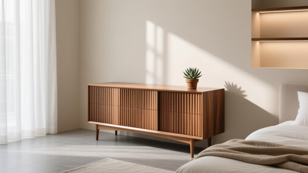
- Warm dark wood: Walnut, espresso (beautiful with cream, navy, olive)
- Painted finishes: Soft white, mushroom, muted gray (ideal for small rooms)
Design note: If your palette is soft and low-contrast, choose furniture with gentle lines. If your palette is neutral, you can add interest with shapely nightstands or a curved headboard.
Bedding as the Color “Bridge”
Because bedding covers a large visual area, it’s the easiest way to connect wall color to furniture tone. Sleep-friendly material picks:
- Cotton percale: Crisp, breathable; great for hot sleepers.
- Cotton sateen: Smoother, slightly warmer feel; good for cooler rooms.
- Linen or linen blend: Textured, relaxed, temperature-regulating.
- Wool blanket (lightweight): Excellent for temperature control and layering.
Lighting: The Unsung Hero of Bedroom Color
Even the best palette can feel “off” under harsh bulbs. For a sleep-friendly bedroom, aim for warm, dimmable lighting in the evening.
- Bulb temperature: 2200K–2700K for bedside lamps and ambient lighting
- Best product types: Dimmable LED bulbs, shaded table lamps, wall sconces with diffusers
- Layer your light: Ambient (ceiling) + task (reading) + accent (soft glow)
Wellness tip: Reduce bright overhead light 1–2 hours before bed and rely on warm bedside lamps. Your color palette will look softer and your body gets a clearer wind-down signal.
Budget Ranges: How to Build a Palette Without Overspending
Under $150: High-Impact Color Updates
- 2–3 throw pillow covers in your accent color ($10–$25 each)
- A throw blanket with texture (cotton, linen blend) ($25–$60)
- Coordinating curtains or curtain liners (including blackout liner) ($30–$80)
- Warm LED bulbs for lamps ($15–$30)
$150–$600: Palette-Defining Changes
- Duvet cover set in your secondary color ($60–$200)
- Area rug to ground the scheme ($120–$400)
- Matching bedside lamps or sconces ($80–$250)
$600–$2,500+: Foundation Upgrades
- Upholstered headboard or new bed frame in a neutral fabric ($250–$1,200)
- Quality mattress and supportive pillows to match your sleep needs ($600–$2,500+)
- Dressers/nightstands in a consistent finish ($300–$1,500)
Layout Tips That Make Your Palette Feel Calmer
- Keep the bed as the visual anchor: Center it on the main wall when possible, then repeat colors outward (rug, curtains, art).
- Reduce visual clutter: Open shelves can make a palette feel chaotic. Favor closed storage in your palette’s main neutrals.
- Use symmetry for instant calm: Matching nightstands or lamps create a more restful, balanced look.
- Let negative space exist: Not every wall needs decor. Breathing room is part of good sleep environment design.
Common Mistakes to Avoid
- Choosing paint first without checking undertones: Always compare samples against your floor and largest furniture.
- Too many competing “accent” colors: One accent is enough. Two can work if they’re related (e.g., rust + blush), but keep it controlled.
- Overusing stark white: In bedrooms, bright white can feel clinical. Warmer whites often read softer and more relaxing.
- Ignoring nighttime lighting: A color that looks perfect at noon can turn muddy at night under cool bulbs.
- High contrast everywhere: Black-and-white can be striking, but too much contrast may feel visually loud. Soften with warm wood and textured neutrals.
- Matching everything exactly: A calming palette is layered—mix tones and textures rather than hunting for identical shades.
FAQ: Bedroom Color Palettes and Sleep-Friendly Decor
What are the best bedroom colors for sleep?
Low-saturation, softer tones tend to feel most restful: muted blues, blue-grays, soft sages, warm neutrals (greige, taupe, cream), and gentle earth tones. The “best” choice also depends on your light exposure and whether you want airy or cocoon-like.
Should bedroom walls be lighter or darker for better sleep?
Both can work. Lighter walls feel open and bright, while darker walls can feel enveloping and cozy—especially with warm, dimmable lighting. If your room gets plenty of daylight, a moody color (navy, forest green, charcoal) can create a retreat-like sleep environment.
How many colors should be in a bedroom color palette?
Three is a reliable sweet spot: one dominant color, one secondary color, and one accent. You can add small variations through texture and tone (ivory vs. cream, light oak vs. walnut) without introducing new “colors.”
How do I create a bedroom palette if I can’t paint (renter-friendly)?
Use removable design layers: bedding, curtains, rug, artwork, and lighting. Choose a bedding set as your dominant color, then add a secondary color via curtains or a rug, and finish with an accent through pillows and decor. Peel-and-stick wallpaper on a single wall can also work if your lease allows it.
What lighting makes bedroom colors look more relaxing?
Warm bulbs in the 2200K–2700K range, ideally dimmable. Soft, shaded lamps and wall sconces reduce glare and make colors look richer and calmer at night.
How can I add color without overstimulating the room?
Keep bold color small and repeated: a pair of accent pillows, a throw, and one piece of art. Use texture (linen, boucle, wool) to add depth without adding visual “noise.”
Next Steps: Create Your Palette This Week
- Pick your mood goal: airy, cozy, deep calm, or moody retreat.
- Identify your fixed elements: floors, large furniture, existing wall color.
- Choose 3 colors: dominant (60), secondary (30), accent (10), all with matching undertones.
- Test at night: look at samples under your actual bedroom lighting.
- Upgrade one sleep-supporting layer: breathable bedding, blackout curtains, or warm dimmable lamps.
Your bedroom color palette should make decisions easier and evenings quieter. When the tones around you feel cohesive and soft, the whole room becomes a better cue for rest—an atmosphere that supports sleep quality, not just style.
For more calming bedroom decor ideas, sleep-friendly lighting tips, and cozy palette inspiration, explore the latest guides on thedecormag.com.
More Articles
 How to Choose Bedroom Quilt Style - The Decor Mag
 Natural Bedroom Materials: Stylish Ideas for 2026
 Best Bedroom Sleep Temperature Guide - The Decor Mag
 Best Bedroom Bedside Carafe and Glass - The Decor Mag
 How to Style a Bedroom Around a View - The Decor Mag
 How To Start Living Room Ideas: A Practical, Step-by-Step Framework for Real Homes
 How to Choose Bedroom Duvet Cover Style - The Decor Mag
 Bedroom Fluted Wood Dresser Trend - The Decor Mag
 Best Bedroom Sleep Weighted Blanket Guide - The Decor Mag
 Best Bedroom Rugs for Underfoot Comfort (2026)